Software
Houzz Logo Print
terirwin

Choosing the right gray paint

13 years ago
I'm having a paint issue and need help! My kitchen is facing the west and I had the cabinet's painted BM White Dove, the countertops are quartz Waterford (dark black/gray's) and flooring is a chocolate brown wood. I painted the wall's light pewter and it looks green. I want a soft gray and need suggesions for a true gray under these circumstance. thanks

Comments (28)

  • 13 years ago
    West facing is tough as you get that afternoon sun which turns paint colors into ugly surprises. I once painted a west facing dressing room Monroe Bisque. It was so awful…
    Take a look at BM Touch of Gray 2116-60. It has pale lavender tone to it, but it looks great with charcoal gray, your floors and your faucets.

    If your walls are nice and smooth you can try BM veil cream. It is a pearl grey but it looks so beautiful at night. I used it in a dark hallway with one west window.
  • PRO
    13 years ago
    Get a bunch of paint chips, tape them up, and rate them at different times of day. See what you like. There is no substitue for real life circumstances and personal taste.
  • 13 years ago
    judyg, thanks for the suggesion! But if the gray has to pull a color, I would prefer blue. Other ideas?
  • 13 years ago
    Have you tried revere pewter?
  • 13 years ago
    No, I haven't tried revere pewter because it appeared a darker shade of gray and I was going for a lighter gray???
  • 13 years ago
    I just put a revere pewter paint chip in the room and it looks very beige.
  • 13 years ago
    Maybe something in this article will help you. Hope it can.


    http://www.mariakillam.com/2009/11/what-everyone-should-know-about-gray.html
  • 13 years ago
    I had a few gray shaded on the wall you may want to look at, Ben Moore sidewalk gray, classic gray, gray tint. I hope you find the perfect light gray .
  • 13 years ago
    Just a thought, more stronger in colour put darker and light in to show colour difference good luck with choice
  • 13 years ago
    Also make sure you use big paint samples (at least 11x17) . You can paint sheets of foam core or poster board in the shades you are considering. You can buy small tester-sized paint pots for a few dollars.
  • PRO
    13 years ago
    We just painted a client's keeping room the BM Revere Pewter and it looks terrifc. It is a lighter grey and looks terrific with their cabinets. Paint a board and see what it looks like.
  • 13 years ago
    My husband said I should go out and buy different light bulbs. So, I bought the "coolest" (compared to the warm light) pot light bulbs and the wall still looks green. The paint chip with Revere Pewter looks very beige. I'm thinking about trying gray owl or stonington gray. We just painted the whole kitchen yesterday, crown molding, soffit, trim, etc. :(
  • 13 years ago
    We are having the exact same delimma right now. I painted benjamin moore Hazy Skies and expected some green undertones, but didn,t expect it to be SO green. We are not in a position to repaint so I'm trying to make it work by adjusting the lighting. Did you try any other type of bulbs? Our pot lights are very yellow, which is not helping! I hope that when i have pictures, curtains, etc in the space they will quiet the green tones and pull out the gray.

    I used ralph lauren stone UL21 (matched at home depot) in our hall and it is a pretty taupey gray.
  • 13 years ago
    ljones76, yes I tried cool light bulbs (daylight R30 flood lights) and I didn't see any difference. I have 8 flood lights in my kitchen. Four of them are on one switch and the other four on another. I changed out four of them with the cool lights and left the warmer, softer light bulbs on the other side of the kitchen. I can really see a difference in the lighting but in both cases the gray paint looks green.
  • PRO
    13 years ago
    Stonington gray is a beautiful colour, a very light gray. Grays have one of 3 undertones, green, blue or purple. Stonington has the slightest blue to it which will work perfectly with your countertop and flooring. Revere Pewter might be too beige/green. Try this out on a large sample of poster board, I'm sure you will love it.
    Jil McDonald
    www.ReflectionsInteriorDesigns.com
  • 13 years ago
    Thank you Jill. I'm going to try it on a poster board, which is what I should have done before we did two days of painting this weekend.
  • 13 years ago
    Thanks terirwin. I wish we could repaint, but we are moving in on Friday with 3 kids and it really isn't an option. Just going to try to live with it and cover it up as much as possible! I would love to see pictures of what you end up with.

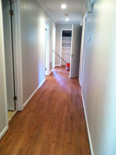
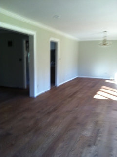
    I included some pictures of Hazy skies in our DR (which almost looks like BM Camoflauge it is so green). Also our hall, which is Ralph Lauren UL21. It's amazing what lighting does as the floors are the same throughout the house and look completely different in the pictures.
  • PRO
    13 years ago
    Stonington should be perfect. Please don't use Gray Owl, it will definitely go green!
    Jil McDonald
    www.ReflectionsInteriorDesigns.com
  • 13 years ago
    Jill, thanks sooooo much for the advice about Gray Owl, I was going to get a sample. Can you recommend a second choice for me to put on a poster board? TIA
  • 13 years ago
    Sorry Jill, but one more question. I put Stonington Gray on four different areas of the wall to test the color. If it is a bit too dark would it be OK to make it 3/4 gray and 1/4 white? Thanks so much
  • PRO
    13 years ago
    Usually cutting the formula doesn't give you a direct "let down" (lighter ) colour. It does go lighter but can pull more blue. You can try it. Wickham gray HC-171 is lighter but has a touch of green in it. Very very slight though, mostly blue undertone. I'd try Wickham and will also give you another colour...
  • 13 years ago
    last modified: 13 years ago
    Yes, I have one more suggestion Farrow and Ball Clunch
    Farrow & Ball - Clunch · More Info
  • PRO
    13 years ago
    If you want a lighter gray with blue undertone, you can try Moonshine OC-56.
    So to clarify,
    1. Yes you can try cutting Stonington gray down to 50 or 75% strength (I'd try 50%). Be warned the colour may shift a little and become more blue.
    2. Wickham gray is a nice colour that is lighter - it has a touch of green in it, but only a touch.
    3. If we want to go much lighter try Moonshine OC-56.

    My thought is to try the very small samples of #2 and #3. But #1 would have to be made up in at least a quart size - it's very difficult to make a smaller can of paint when you are altering the colour.

    Let me know how it goes! Jil
    www.ReflectionsInteriorDesigns.com
  • 13 years ago
    Jill, I can't thank you enough for your input on my choice of gray paint. I painted the kitchen with Benjamin Moores Stonington Gray and I'm so happy with the results. My kitchen is still a work in progress but I will post pictures after the work is completed. Thanks again!!
    PS My daughter hasn't had the baby yet, so I'm still pushing to finish before I'm called to babysit. ;)
  • PRO
    13 years ago
    Thank you so much for letting me know, I'm thrilled to have you trust me!
    I can't wait to see the photos (whenever you are finished - and not babysitting!)
    PS your kitchen would look divine with some silver accents, just a little bling helps to finish it off nicely!

    All the best, Jil
    Reflections Interior Designs
  • 10 years ago
    I want to put burnt orange. Accessories with grey in my bedroom please help with walls and bed linen