Software
Houzz Logo Print
akl_vdb

Last backsplash post. I promise! (maybe;))

11 years ago
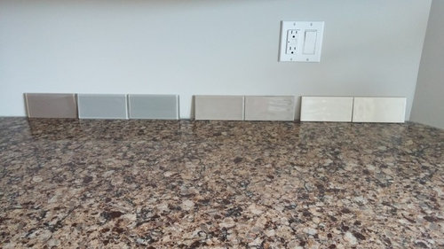
I have searched high and low. Ordered samples from Fireclay-nothing spoke to me. I did a post here a while ago. I think there was a consensus on one but it wasn't the best. Plus with the Canadian dollar being so so bad, I want perfect if I were to go that route. So I'm going local.

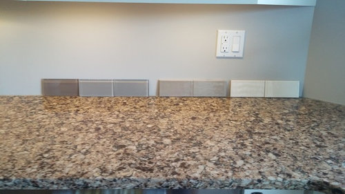
Here are the last of the ones I am picking ever. So 1 better work. I've been looking at the backsplashless wall for close to 2 years. We've done other things, but our tile guy is coming November 12.

So...go.

And thank you all!


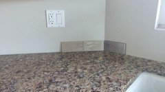
Ucl on. Its 4 pm here. Not dark yet.


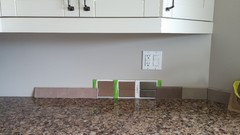
Other side. No ucl on

Other side ucl on

So the are actually on groups of 2s. Except the extreme left chocolatey one is the only one. The others I have 2 samples each.

Thanks!

Comments (97)

  • 11 years ago

    I like the chocolate one too. A nice contrast against the cabinets. I don't like end caps. We used the metal trim with subway tile. It makes a cleaner, modern look.

  • 11 years ago
    last modified: 11 years ago

    Thank you aktillery9. I have to say, this sways me away from the latte mid range one. I know it's not exact but it gives me a great visual! Thank you so much!! I think the chocolate one or one similar maybe in ceramic might do it.

    Here is a photo of my Fireclay graveyard. It's dark here. Lights are on. Ucl and overhead pot lights.


    I don't expect anyone to examine the fireclay tile, just threw them up to show you what I've tossed around!

    Ellendi6161- I would say a yellow undertone, yes. Colour is seashell by kitchen Craft. Creamy.

  • 11 years ago

    I like the 5th from the left or the 12th.

  • 11 years ago

    #9 or 12 or 13. Is 13 the milkshake one? from the left. Hard to really tell what the colors are in that pic.

    I think a deeper tile will give your kitchen some warmth and a more traditional look while a lighter tile will make it more modern, cold and austere.

  • 11 years ago

    I know, I just threw the tile up to show you the choices I've tossed around. Don't expect anyone to analyze, there's too many! Relooking though, the last one isn't bad. The dark one. Quail feather. But it's still the US. Price is ok even with the exchange. But think I'm on the right tract thanks to you all!

    Yes, tibbrix, #13 is the milkshake one!

  • 11 years ago
    last modified: 11 years ago

    Akl, if you need me to do another mock up for you I'd be happy to!!

    akl_vdb thanked amykath
  • 11 years ago

    I prefer the lightest one. I like to see a contrast between the counters and the backsplash.

    akl_vdb thanked Holly- Kay
  • 11 years ago

    If you have a small piece of the counter material you could take it along and try to pick up the lightest shade in your counter. Bring the sample home and see how it plays with the rest of the components. I llove a chocolatey brown but you don't want to end up with too much brown.

  • 11 years ago

    At the tile store now. Again!

  • 11 years ago

    Lol. "Norm!" "Akl!"

  • 11 years ago

    My car just veered this way, no control!

  • 11 years ago

    Have you checked this site for visuals?

  • 11 years ago

    Go with the chocolate. It's a terrific neutral that gives your kitchen some real "zing" and allows you then to play with color in accessories.

  • 11 years ago

    Because I'm lazy this morning and don't want to reread everything (I know, bad...) what colour are your walls?

  • 11 years ago

    Ok, more samples. I am surprisingly leaning towards one. This could be due to my lack of sleep, too much wine last night, pure insanity from looking at tile.

    The one to the left is too light and pinky. The one next to it is brown and there are 2 that are the same. The next one is metallicy. The one next to that is milkshake:)

  • 11 years ago

    Ok. Cleaned it up a little.

  • 11 years ago

    I like that one on the right, but again ,it's really hard to tell what they're really like from the pics. Can you post actually closeups of each tile you're contemplating?

    akl_vdb thanked User
  • 11 years ago

    Will do tib. At the hardware store now. Sigh. These renos are never ending!

  • 11 years ago
    last modified: 11 years ago

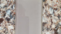
    This is allumino. Why do i love it?

  • 11 years ago
    last modified: 11 years ago

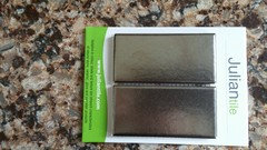
    Oh, the Julian is metallic! I'm changing my vote and going for that. I think it would compliment the hardware beautifully as well as being a wonderful color for the counter and contrast to the white cabs. Seems to have a beautiful sheen to it.

    akl_vdb thanked User
  • 11 years ago

    Wow the metallic are really interesting. Maybe I can do a mockup for you.

    akl_vdb thanked amykath
  • 11 years ago

    Not so sure about the metallic. Mmmmm. Someone once posted a suggestion of looking at how the color of the counter "reads" when you step away. We are all looking to match up the counter with the bits of color that we see in the counter. And, yes, one tile can look like an exact match.

    But, the overall look will not be the close up, but the view from across the room. If you can see the lighter tones, as well as the dark, I would go with the lighter. It will still be a contrast to your cabinets.

    I like Ak's mock up of the brown, but again it doesn't read as a dark chocolate in her mock up.

    When I was googling your counter, a suggestion was to go for a tan or sand color. Many of the photos shows the travertine or tumbled which is not a good option.

    akl_vdb thanked eld6161
  • 11 years ago

    Yes please aktillery9! That would be awesome.

    Tib- I'm kind of reading it as an interesting neutral. It perfectly matches our hardware ( not like it really matters but we'll probably never change them)

    Like a stainless but just...more.

  • 11 years ago

    "...interesting neutral." Exactly!

    akl_vdb thanked User
  • 11 years ago

    I agree ellendi6161- the tan/stone/travertine doesn't do it for the counter. I do understand with what you're saying about picking a colour in the counter and going from there. The counter has a lot of grey and taupe and chocolate, but reading it from afar it reads warm. So I don't want cool(made that mistake once!) but I don't want peachy pink.

  • 11 years ago

    I also like the white one. Does either have a name so I can maybe see full pics and put them in your kitchen to see what you might like?

    akl_vdb thanked amykath
  • 11 years ago

    I know this isn't what you are looking for but it sure is pretty. Really like your latest samples!!!

    akl_vdb thanked just_terrilynn
  • 11 years ago

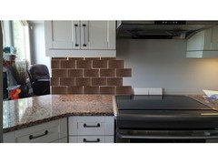
    The size and exact color are likely off but might give you an idea. I used the dark metallic tile.

    akl_vdb thanked amykath
  • 11 years ago

    Thank you aktillery! I do like the darker look with the counter. Hmmmm. Great visual! Also, the metallic one is on a 12×12 mesh, so they aren't staggered. Would that be a bad idea?

  • 11 years ago

    Not if you like that look. I personally have always liked subway but that is just me.

  • 11 years ago
    last modified: 11 years ago

    http://www.juliantile.com/appiani/

    They are 2x4 on a sheet.

  • 11 years ago

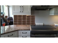
    Pretty rough mock up of straight.


    akl_vdb thanked amykath
  • 11 years ago

    akl, those you sent with the link look greenish gray to me. Is that the right color?

  • 11 years ago

    definitely prefer Aktillery's pattern to the way they have it on the sheets.

  • 11 years ago

    Hmm, the one that comes up for me is the soft white and the beige.

  • 11 years ago
  • 11 years ago

    Hmm. Straight looks cuter than I thought! I really appreciate it aktillery!

  • 11 years ago

  • 11 years ago

    I didn't think dark was the answer but I really like the metallic, in the running bond pattern of Aktillery's mockup, it seems to lose a lot in the stacked pattern.

    akl_vdb thanked ghostlyvision
  • 11 years ago

    Top one.

    akl_vdb thanked k9arlene
  • 11 years ago

    How about also posting over in Kitchens?

    akl_vdb thanked eld6161
  • 11 years ago

    Can you find a metallic ceramic tile that isn't a solid brown? Something with a little brighter bronziness in the glaze? Your counter does read as solid brown so I don't think you want a solid brown back splash.

    This is kind of going in the direction of your rustic style in your bedroom. But then your structural elements are contemporary, your cabinets and trim are traditional.... You added wainscoting recently.... Do you know what I'm thinking..... ;)

  • 11 years ago

    Yep, for sure I like the darker and the metallic could be rather cool as well. Now with that tile you have two sort of "dramatic" elements in it - the fact that it is dark and the fact that it is metallic.

    With the fact that your kitchen is quite open and it doesn't look like there would be that much backsplash I would go for it.


    akl_vdb thanked blfenton
  • 11 years ago

    Love the metallic.


    akl_vdb thanked Suzy
  • 11 years ago

    I know mayflowers!! But this tile isn't brown. It's just aluminum coloured/graphite like. And we didn't do wainscotting. We'll just drywall the powderroom. Boy you have a good memory!

    I agree I think now. A solid brown would not be cool. Too much. Thank you for helping me!

  • 11 years ago

    Ok, I think my flash in the pan allumino will be too dark. Milkshake for the win!

    The cream would also look good, but my sink is white cast iron, so when I look at the 2 next to each other it would drive me nuts as they are different.

  • 11 years ago

    Must feel good to have made a decision. It's a good one, IMO.

    akl_vdb thanked User
  • 11 years ago

    Nice choice akl!

    akl_vdb thanked amykath
  • 11 years ago

    nice choice! I am going thru the same thing right now trying to pick a backsplash for my kitchen: http://ths.gardenweb.com/discussions/3420922/need-help-with-backsplash?n=30 I will be glad when I finally have a selection. Can't wait to yours finsihed!

    akl_vdb thanked xclusive