Software
Houzz Logo Print
aigredoux

Check my work?

10 years ago
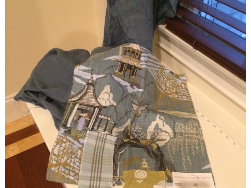
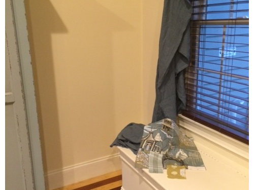
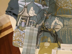
I'm having custom window seat cushions made out of this blue toile fabric. The curtains are blue linen (hanging) and the piping on the cushions is also the blue linen.

I want to put some accent pillows along the back of the window seat. I read an article that a room should have a large print (the toile), a stripe, and a small print.

I chose this plaid (stripe) fabric with a grey stripe that matches the grey in the toile. And the green/gold fabric that matches the green/gold in the toile.

Does it work?

farther back showing wall color, curtain fabric, and armoire.

Comments (28)

  • 10 years ago
    last modified: 10 years ago

    I think I like everything together except the plaid. Was the plaid for the cushions? Just a bit confused what's going where.


    Eta: I like the plaid, it just doesn't seem as refined as your coordinating fabrics.

    Butternut thanked akl_vdb
  • 10 years ago

    Works for me.

    Butternut thanked User
  • 10 years ago

    Sorry can't see. The detail well enough but at quick glance looks good

    Butternut thanked bossyvossy
  • 10 years ago

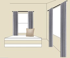
    The cushions are the toile. The plaid and the goldish print will be pillows. This isn't the right colors but the arrangement more or less.

  • 10 years ago
    last modified: 10 years ago

    I still think I stand by my earlier comment. But what do I know, have you seen my posts ? ;)

    I know this colour is different, but here were some coordinating fabrics to go with that toile. Just throwing ideas around!

    http://www.tonicliving.com/Neo-Toile-Indigo-P3286.aspx

    Butternut thanked akl_vdb
  • 10 years ago

    I like the plaid. The colors look spot on to me.

    Butternut thanked User
  • 10 years ago

    maybe this one will show up better?

  • 10 years ago

    My opinion could be tainted because I pretty much dislike plaid, but it doesn't seem to have the same "vibe" as your beautiful toile. The colors are good, it just doesn't seem to go together to me. I do like the smaller print. I might try to find a solid or print, maybe a stripe that provides a little more contrast in texture and color, too.

    Butternut thanked Olychick
  • 10 years ago

    I think they look great. Beautifully matched on my monitor. I especially like the gold.

    Butternut thanked OutsidePlaying
  • 10 years ago

    I am not crazy about the undertones in the gold small print. I think it doesnt play nice with your wall color. Could just be me and my monitor though, as color is not true on line. Also, I always like to vary texture, as well as pattern size. Have you thought about introducing any other textures?

    Butternut thanked localeater
  • 10 years ago

    Not crazy about the plaid. It doesn't seem to have the presence of the other fabrics.

    Butternut thanked deeinohio
  • 10 years ago
    last modified: 10 years ago

    I love plaids but have to agree, even though you did a great job matching the colors with the print, the feel or vibe is off. When I see plaid, I think rustic or more casual. The toile is a little more refined.

    Butternut thanked User
  • 10 years ago

    I love the colors, and they definitely work together, but the plaid seems out of place. What about something with a heavy texture or a very small, busy print instead?

    Butternut thanked melle_sacto is hot and dry in CA Zone 9/
  • 10 years ago

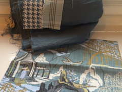
    I also liked this houndstooth, but wondered if it overpowered the toile.

    Sorry, I photographed it with the plaid. I would use the toile, gold tree print, and houndstooth, I think.

  • 10 years ago

    I think the plaid brings some much-needed casualness, especially when viewed in the second photo near the painted hutch.

    Butternut thanked User
  • 10 years ago

    I'm an outlier in that I like the plaid but not the gold fabric. The plaid pulls out a variety of colours from the toile and the scale is really good. The colour of gold is, for me, overwhelming the toile. Just my 2c!

    Butternut thanked blfenton
  • 10 years ago

    Either the plaid OR the houndstooth with the toile and gold. LOVE both combinations!!!!

    Butternut thanked User
  • 10 years ago

    I love the gold print. The plaid is a very subtle accent, but aren't you aiming for a serene atmosphere? The gold is active enough to carry the quiet plaid I think. And neither of the prints identify themselves as of this exact moment (a good thing to me).

    Butternut thanked lisaam
  • 10 years ago

    If it were me, I'd do the cushion in a solid, picking the color you like best, then make several pillows, each a diff fabric, ie one plaid, one houndstooth, one toile, you get the pic. I like all the fabrics but don't know for sure whether a print bench with diff print pillows will be too busy. The only person I've noticed that can put such thing together masterfully has been Sara Richardson from HGTV. Call her

    Butternut thanked bossyvossy
  • 10 years ago

    Haha! I'll call Sara! :)

    I've already ordered the bench cushions, so no going back on that now :)

  • 10 years ago

    Your linen toile is gorgeous as well as the linen for the draperies I like the yellow a lot but, not crazy about the plaid. I love hound tooth. It matches, but does it have too much white. Maybe a ticking or small check could work.

    Butternut thanked cran
  • 10 years ago

    I like them all, well done! My personal preference is for the houndstooth over the plaid. Love that toile, and the gold print.

    Butternut thanked jlc712
  • 10 years ago

    Great choices. I do love the toile, gold print and plaid. Maybe use the hounds-tooth as a border on a plain cushion. Not a lover of hounds tooth, as t reminds me of a bag used by department store here David Jones

    Butternut thanked Laurie Gordon
  • 10 years ago

    I love houndstooth, but don't think it really works with your fabrics in this case. Like the plaid better and think it will look more like a stripe at a distance anyway. I think you need that little bit of brightness the gold will bring in the form of a couple of pillows.

    Butternut thanked OutsidePlaying
  • 10 years ago

    i love your original 3. the toile is gorgeous and i think the plaid and the gold will look great with it.

    Butternut thanked Suzy
  • 10 years ago

    One more vote for the plaid and not the houndstooth. It just seems too bold with the others and might want to steal the show from the toile

    Butternut thanked Kippy
  • 10 years ago

    I like plaid in a mix of patterns such as you are doing because I find that it helps to bring order and structure to the mix of patterns and plain colours. It's important to find a plaid with the colours as you have done as it also helps to ground the colours.

    I find nothing rustic or informal about the plaid that you have chosen.

    Butternut thanked blfenton