Software
Houzz Logo Print
ennea4

Open Concept Color Crisis

10 years ago
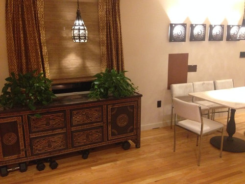
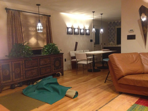
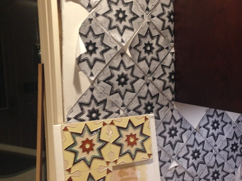
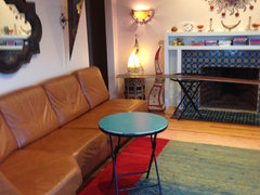
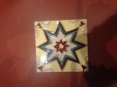
My aim was "Moroccan modern style" for my ranch house. Long story short, I originally wasn't planning to open up the kitchen. The backsplash tiles were the first thing I bought...my inspiration for the rest of the kitchen. I coordinated the countertop color (Silestone "Haiku") and the dark burgundy cherry cabinets with the secondary colors in the tiles. Now, I'm worried that the yellow kitchen tiles clash with the living room decor. Also, someone told me they look like "country kitch" tiles. That shook my confidence in my own judgement. Am I failing at being "eclectic"?

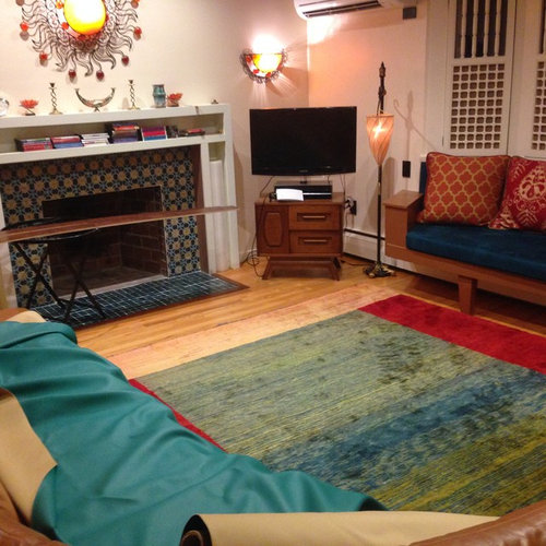
I was going to use that roll of teal fabric for the kitchen banquette. The teal matches the green in the kitchen tiles, but clashes with the blues in the living room. Though, you can't really tell how much they clash until you bring the roll of fabric into the living room. Anyway, my head is spinning. Should I proceed or change course? How would you edit this? No holds barred.


Comments (35)

  • 10 years ago

    I don't believe the tiles look kitch. I am not sure how moroccan they look though. i believe the kitch comes from someone who does not like peel and stick tiles?

    My second problem is the way they look on my system, i do not see the turquoise in there.

    i like a lot of your things, some feels a little over like the various light fixtures, but if you are happy? i am fine with it. I would be happy to let you bounce off me and try to help you shop. i will be honest but will not hack you to death over decisions. Honestly, you will probably get a few willing to help you. but, this is going to be a harder sell, because there is nothing average about it. Which to me is a great thing.

    Since you are feeling insecure and i have to toddle off to bed. Why do you not type moroccan and moroccan tile in photos. it might make you feel better. Have a great night and don't worry, i think you just might need a little tweak or two. You have done a lot of good stuff. Have fun, nite!

  • 10 years ago
    last modified: 10 years ago

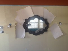
    Thank you Having Fun. The paper "tiles" are just a template. I'm getting cold feet about the actual tiles (which I've already purchased/own). Do you think I should install them (in the kitchen)?

    Here:

  • 10 years ago

    I like your space/style. I don't like your choice of tile though. I think it's too busy. Maybe find something more subtle. It reminds me of the old batman show, the graphics they showed when someone was punched...sorry

    ennea4 thanked pitbulls
  • 10 years ago
    YES YES YES YES! It will be beautiful. Your style is lovely, and the tiles reflect it. Use them!
  • 10 years ago
    And, by American tastes, Moroccan style is "busy", in that a lot of different color and patterns are used. Find a way to bring the colors and pattern into the LR, like a tile tray or table top. You do not need our validation to use what you love.
  • 10 years ago
    last modified: 10 years ago

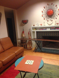
    Thanks teamaltese. My feeling is that the yellow tiles are really lovely/striking next to the dark cherry/burgundy cabinets. My worry is the yellow tiles don't "go with" what is going on in the living room. I actually tried your tray table idea: I painted a table with one of the secondary colors on the tiles (see attached photo). But, I think the resulting table looks like an odd duck in the living room. Now that I've opened up the kitchen, this is my main concern: that the main hues in the kitchen tiles (yellow and green) clash with the living room theme (blue, orange, red). (The secondary beige and brown hues in the kitchen tiles ARE picked up in the living room, but it's a subtle effect.) Any thoughts?

  • 10 years ago
    I would have gone with the red for the table (according to my monitor), to tie in the tiles. I would bring in the yellow with a creamy wall paint in the LR, or a pale green in the kitchen. To help bridge the colors.

    You can also hire, wait for it...an artist! For a color consult! An artist that works in color, a painter, water colorist, etc, friend, family, local studio, may be willing to come in for an hour and help you tie in the colors and patterns. At a fee of course. A designer also, but my experience is designers willing to work with eclectic clients wanting different are few and far between. An artist may be able to work outside the box, with a different eye.

    But the only critic you have to please is yourself. Remember that Houzz is "decor by committee ", a consensus usually ends in a neutral result.

    If your results are heading away from Moroccan, you might want to consider Bohemian, again, a mix of colors and patterns. Houzz has a great bunch of photos for this style.
    ennea4 thanked teamaltese
  • 10 years ago

    Yeah! A little sleep and the whole world changes, look at the wonderful crew you have here! i don't think you could be in better hands enne, and everyone likes your style. I agree about the table too, it was not quite what i thought when poster said it. So are you feeling better about your tile?

  • 10 years ago

    I have to ask another question. The only way you see the kitchen from the living room is past the dining room, right? So if i stand at that intersection, i will see the tile to my left and the lights straight ahead, which are yellow with red, just as your tile is. My question would be more, what ties the turquoise of your banquet to the tile in the kitchen?

  • 10 years ago

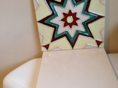
    Hmm Teamaltese, you got me thinking. The "red" color in the tiles matches C2 "Chipotle". It's a dark brownish ketchup color. Here's a closer look:


    It looks bright ketchup-y with the recessed light shining down on it:


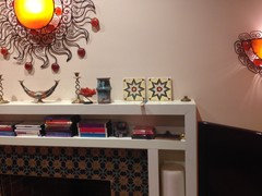
    But, you can see how brownish it really is, when you put it on the wall over the mantel:


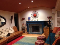
    It kinda clashes with the leather couch. But, I'm wondering if I should repaint the ceiling (ugh) with this color. That might tie the living room together better with the kitchen theme. (Right now, the ceiling is painted C2 Tortoise). It goes nicely with the wall color, "C2 Linger".


  • 10 years ago

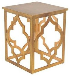
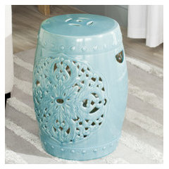
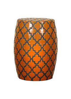
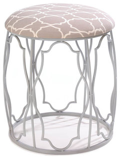
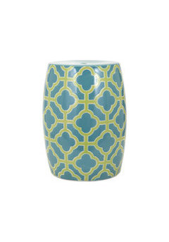
    nah, i don't think you have to repaint the ceiling? Like i said you will barely see that kitchen tile, and not from anywhere you will concentrate on it. Oh yes and i found these on sale while i was out. all under $100 most under $90, just seem to work to me. might help some of that melding?


    think you can paint the top of the first.

    drum side table | Joss and Main · More Info

    Garden Stools | AllModern · More Info

    Garden Stools | AllModern · More Info
    Give one below a more appropriate cushion color?
    Moroccan Wish Stool · More Info

    Garden Stools | AllModern · More Info

  • 10 years ago
    last modified: 10 years ago

    Clarification: "Chipotle" looks nice with "Linger". And, both colors are in the tile. Re wall colors: it was hell picking one. "Cream" (anything with a tinge of yellow), and greens were nasty. The living room, which is dark, except during the late afternoon, turned most of the light colors dirty, and most medium tones were puke-inducing and/or claustrophobic. Painting the different rooms different colors broke up the flow too much. I'm certain that "Linger" is the best color. It matches the undertone of my kitchen countertop, as well as the beige in the kitchen and living room tiles. It's not harsh, and it doesn't compete with everything else that's going on.

    Here are some of my more horrifying paint flashbacks:

    Lovely to require a flashlight in order to traverse your living room in the middle of the day:

    This kind of looked alright for about 45 minutes in the early afternoon. Before and after that, it looked like my walls were dying of liver disease:

    I was in cream/off white purgatory for a long time:


    Thank God for C2 Linger.

  • 10 years ago

    Paint & ceiling is lovely, Tiles are nice. They have sass. Go for it!

    ennea4 thanked happyleg
  • 10 years ago
    last modified: 10 years ago

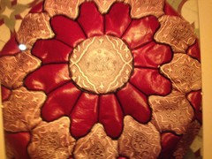
    Havingfun: even better, I bought two of these poufs yesterday on an online Black Friday sale!:

    (They're actually deep red, not pink as it appears in this photo)

  • 10 years ago

    You all are great! You're giving me back the courage of my convictions...and some new ideas...

  • 10 years ago

    Use the tiles. And the turquoise fabric. Go straight ahead with your plans. Moroccan style is a riot of colors and everything you've chosen goes with everything else.


    The only thing I would do is restyle the fireplace. Remove the CDs from the shelf, put fewer, bigger items on the mantel, and arrange them asymmetrically.


    You've got a great sense of style.

    ennea4 thanked groveraxle
  • 10 years ago

    Oh yes, the mantel is a work in progress. I'm going to put hinged panels on it. Haven't gotten to that yet, nor choosing a color for it. Ideas?

  • 10 years ago

    I like it. I would say the kitchen is visible from the front room but it is not really "open" Your cabinets and countertop sound conventional. Do you do the tiling yourself? If you are really worried, just post a picture of that area. Good job so far

    ennea4 thanked emmarene9
  • 10 years ago
    Re wall color, you don't have to match exactly. I read a designer's advice that when matching wall color to a printed fabric, she always tried to match on the "wrong"side, where the colors were muted. She got the look, without it being too heavy or bright. Does the paint manufacturer provide lighter colors of the chipotle? Maybe that would work.

    And now that you have groveraxle's and havingfun's blessings (they give some of the best advice!). You're good to go.
  • 10 years ago

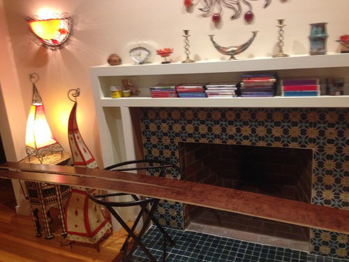
    Agree with grover, get rid of the cds and small stuff on mantel. What is the ironing board looking thing in front of the fireplace? The tiles for the kitchen are great and look good with the tiles in the living room.

    ennea4 thanked greyorbrown
  • 10 years ago

    I dont think the teal fabric clashes at all! Its all saturated jewel tones and those all go together regardless. I think it could be interesting to see the rug run perpindicular to the room just to give it a little bit of push/pull tension. Can't wait to see the poufs in place and see what you have in store for your mantel! Your style is unique and you have a clear direction, I agree with decluttering the tiny knick knacks and keep with strong shapes, but also nothing wrong with a little negative space. The only other thing I think you could add is some cool terracotta pots with some greenery- succulents or leafy plants to bring more of the organic Moroccan feel. Good luck!

    ennea4 thanked Susan Schulz
  • 10 years ago

    What company is your source for the tile?

  • 10 years ago

    I got the mantel tile from Mosaic House in NYC. I got the kitchen tile from a local tile store in Massachusetts. It was on clearance (being discontinued). The manufacturer of that tile is Solistone.

  • 10 years ago

    Susan, I go back and forth on the teal fabric for the kitchen banquette. It's a big block of color. Sometimes, I think if the different seating fabrics were patterned, then I wouldn't notice as much if the shades were a bit "off" from each other. I read somewhere that each color should be represented throughout the (visible) room at least 3 times. Maybe these "rules" just drive me mental.

    What do you mean by "negative space"? What's an example of that?

  • 10 years ago

    Greyorbrown, those are my exercise dvds. They will be hidden by the hinged wood panels (shelf doors) I plan to put on the front of the mantel. The "ironing board" in front of the FP are some extra trim pieces left over from when they assembled my kitchen cabinets. I put them there to stare at them. I'm wondering if I could "inset" them in the paint grade poplar FP panels that I plan to install (the scraps are too narrow to use as the panels themselves). Then, some of the wood from my kitchen cabinets would be on my mantel. Weird?

  • 10 years ago

    Teammaltese, can you define the "wrong side" of a color? Not sure I understand: I'd love to read that article you're referring to.

    Re Chipotle: I don't think it would be any more intense than the burnt orange color that is currently on the ceiling. Instead of burnt dark earthy orange, it would be burnt dark earthy red. I'm back in forth as to whether that would look better or not.

    Gotta head to work...I'll take some more photos of the kitchen, etc. and show all of you later..,

  • 10 years ago
    last modified: 10 years ago

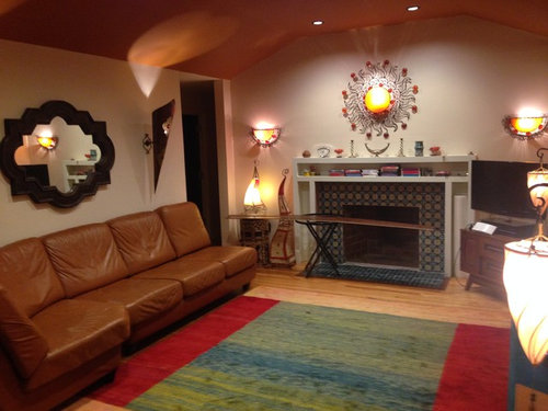
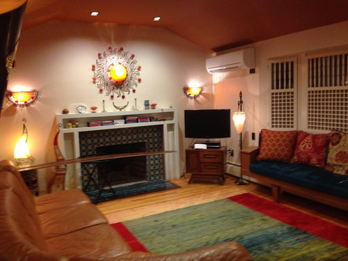
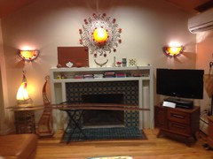
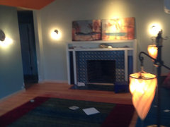
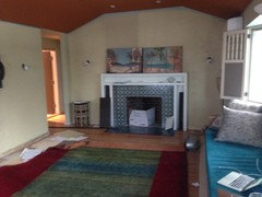
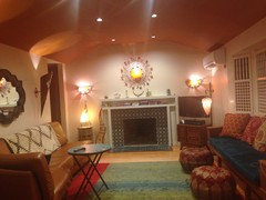
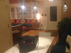
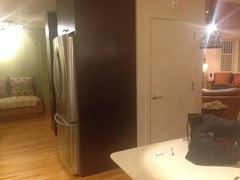
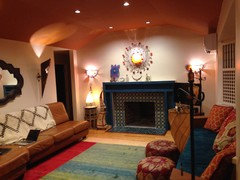
    I'm posting some more pictures of my living room/dining area/kitchen and the weird little rear "bedroom" with two doors on either end of it abutting the kitchen. The new poufs are in view. I'm stumped regarding what to do with the mantel. I'm planning to have my handyman put plain paintable poplar panels on it to hide the inside storage spaces. So, it'll just look like a very plain, boxy cabinet with hinges surrounding the fireplace. Right now, it's painted white. Because I have no other white in the living room or kitchen, the white looks kind of stark. I've thought of faux painting it, or stenciling it. Every color I try seems wrong somehow. Any suggestions?

  • 10 years ago

    Have you tried switching the mirror above the sectional with the piece above the fireplace? BTW - I LOVE the kitchen tile! I say, go for it!

    ennea4 thanked er612
  • 10 years ago

    Thanks er612, Yes, I realized kitchen tile is fine after previous discussion, which you're referring to. My latest question is about what to do with the mantel (see above). The piece above fireplace looks great where it is, and it's hardwired there electrically.

  • 10 years ago
    last modified: 10 years ago

    Oh, and I did have the sun over the sofa for a long time before deciding I like it better over the FP. Currently, the issue is what to do with the mantel.

  • 10 years ago

    Poster started another post on mantel issue with more pictures.

    ennea4 thanked Angel 18432
  • 10 years ago

    Mantel Painting Attempt....Feeling Uneasy

    ennea418 minutes ago

    Well, I painted the mantel the same color (more or less) as the tiles and window seat cushion. Not sure if I like it. It's pretty intense in both color and scale. What do you all think?

  • 10 years ago

    Well, I kind of like it. Seems to fit right in with your style.

    ennea4 thanked Angel 18432
  • 10 years ago

    I'm acclimating to the color.. Now, I'm worried it's going to look to too blocky and crude when my handyman puts the flat slab doors on the front of it. Wondering if I should hold off, and later splurge for some carved Moroccan panels to put in front. It kind of looks interesting just the way it is, open...but it's kind of weird to have those openings in the mantel with nothing inside of them. But, filling the voids with a lot of little knick knacks would look too busy. Any ideas?