Software
Houzz Logo Print
ennea4

Mantel Painting Attempt....Feeling Uneasy

10 years ago
last modified: 10 years ago
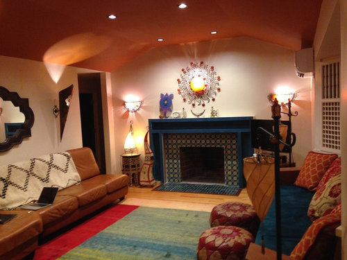
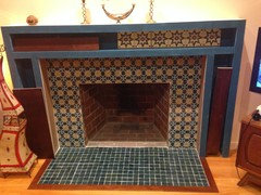
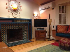
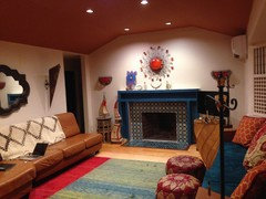
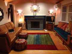
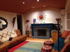
Well, I painted the mantel the same color (more or less) as the tiles and window seat cushion. Not sure if I like it. It's pretty intense. What do you all think?

Comments (56)

  • 10 years ago

    I think it looks terrific! Very boho chic. I love it.

    ennea4 thanked Darzy
  • 10 years ago

    I think it looks great and would look even better if it was all blue & if you painted the mirror over the couch the same colour. You can do better than the throw on the leather couch as well. Embrace your adventurous sense of colour!

    ennea4 thanked mramsey
  • 10 years ago
    last modified: 10 years ago
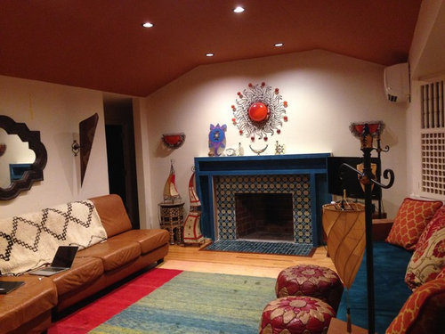
    Any more of this blue and you run the risk of it starting to look like
    the interior of an alien spacecraft...embrace the wonderful earthy colors in your decor! lol

    ennea4 thanked Tems
  • 10 years ago

    Thanks everyone for your ideas. It seems like the majority of you prefer a dark mantel. Some like the blue paint, and more of you like the idea of stripping the wood and staining it dark brown. And, of couple of you like it white or wall color. White bugs me, because nothing else in the room is white I'd have to do some major repainting, or add white crown molding or something so that the white repeated elsewhere in the room. Painting it the wall color is a possibility. But, here's another idea: how about if I get deep mahogany or burgundy/cherry stained wood for the panel doors but leave the rest painted blue.?

    It would be a lot easier than stripping the paint off the paint grade plywood. And, it would related it visually to the window seat which is a 2-tone (reddish brown paint with blue fabric) combo:

    I've seen examples of painted/stained furniture online. Like this piece:

  • 10 years ago
    last modified: 10 years ago

    mramsey's idea of painting the mirror is a good idea...But I'd say as she says...embrace your adventurous sense of color and paint the mirror the raspberry color from the rug and opposite cushions. Then, throw a couple blue cushions on the left sofa to tie the two sides together. Done!

    ennea4 thanked Darzy
  • 10 years ago

    Lol, I've never been on a spaceship, Tems, but I take it you've been abducted by aliens and have observed their interiors? Maybe spaceship decor will be the next big thing.

    I've been trying to post photos of furniture that is both painted and stained, like painted drawers with a wood stained cabinet or vice versa. I'm having trouble attaching them (maybe Houzz only let's you attach your own photos). Anyway, that's the direction I'm leaning in now: making the mantel "two-toned" dark wood stain overlaid panels + blue box/frame. So, it'll be both earthy (wood stain) and other worldly (blue).

  • 10 years ago

    I think making the FP a two toned wood/paint would over do it. In a boho chic style, every piece or color is interesting in a space on it's own. So making the FP a major two tone "focal point" will take away from the other interesting color/style/texture in the entire space. So, looking at the room as a whole to be "boho cohesive" to me mean means everything is beautiful and interesting without a dominant feature. Does that make sense?

    ennea4 thanked Darzy
  • 10 years ago

    I like it blue! I would add some more of that color to the brown sofa with a few throw pillows.

    ennea4 thanked pcmom1
  • 10 years ago

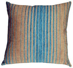
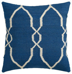
    Throw pillows for brown leather sofa:


    Pillow Decor - Shasta Blue Stripes Throw Pillow · More Info

    ennea4 thanked pcmom1
  • 10 years ago
    last modified: 10 years ago

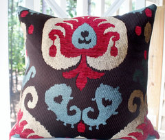
    Love this one...

    Gold Red Raspberry Brown Blue Modern Embroidered/Velvet Damask Pillow Cover · More Info
    Fallon Decorative Pillow, Blue-Neutral, Down Filler Square 18" · More Info

    ennea4 thanked Darzy
  • PRO
    10 years ago

    You could try General Finishes Java paint (not their stain). It gives the look of a dark stained wood. Going over the blue I would prime a lighter color first or you might wind up with purple.

    If you want real stained wood but have plywood try some pressure stick veneer. You basically cut it with a razor or veneer saw ($10) and then peel the backing and stick it on. You can then simply clear coat or stain to finish.

    ennea4 thanked Brian Gannon
  • 10 years ago

    I tried putting pillows on the leather sofa, but wound up using them in another room, instead. Pillows on a leather sofa are just too fussy. They are always sliding down, because leather is slippery. And, they are not comfortable...the sofa is comfortable without pillows, versus the window seat needs the pillows to be comfortable. I've thought of putting an exotic throw on the sofa to make it less monochromatic. Someone commented that they didn't like the Moroccan rug I put on the sofa back.

  • 10 years ago

    There are leather pillows if change mind. I also like it as is. Yes to throw.

    ennea4 thanked happyleg
  • 10 years ago

    im with happy!

  • 10 years ago
    Love the rug on the sofa back! Either tuck it in tighter, or use it like a throw, off a corner of the back. I also like the FP color, and the panel inserts will help break up the blue, if it's too much for you.
  • 10 years ago

    looks great!

  • 10 years ago

    Oh, that is so true about slippery leather and pillows.!

  • 10 years ago
    I thought I commented last night but I guess I didn't push send anyway
    I love the tile work on your fireplace!
    The boxiness of the mantle seems to hide it but maybe that's just the pictures. I like your idea of the cherrywood a lot. The one thing I notice is there are so many different colors that are not cohesive, for instance the green in the rug and the brightness of the red in that same rug it just doesn't seem to go with some of the other colors you have in the room like burgundy, gold,dark blue or navy, Brown and tan.
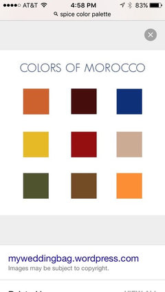
    There's nothing wrong with using color but I would stick to "spice" colors which go beautifully with the blue in the tiles. Spice colors are also used with Moroccan style which you mentioned-I think you mentioned the throw over the couch is Moroccan.
    I'll try to attach a photo of a spice palette
    ennea4 thanked zenith4
  • 10 years ago
    last modified: 10 years ago

    Hi Zenith4, Yeah, sometimes I think a more subtle/traditional rug would have been better, but other times I like my rug because I don't consider my style strictly Moroccan (it's a very un-frilly 60's ranch tract house...so I'm aiming for a style that's both Moroccan + modern + a little bit minimalist (crazy as that sounds). BTW, there's no navy blue in the room. The blue in the rug, window seat and mantel/tile is exactly the same dark teal color. And, the green in the rug is also picked up in the mantel (the mantel tile pattern contains avocado green, beige, and two shades of teal blue). And, also the red in the rug is picked up in the window seat pillows.


  • 10 years ago
    Wow Yes now I see that it's Teal -funny how till you mentioned it really looked navy to me but I totally see teal now. I love teal it's been one of my fav colors since ... Well since forever! Can't believe I didn't see the teal altho looking at tiny pictures on my phone doesn't help .
    Anyway If you are still considering the cherrywood finish I think it would be gorgeous!!
    ennea4 thanked zenith4
  • 10 years ago

    Hi Zenith4, Do you mean you like my idea of making the panel doors cherry wood and leaving the rest painted teal?

  • 10 years ago
    Yes I saw the picture where you put what looks like cherrywood in the panel sections I like that but I do also think the whole thing could be cherrywood and it would look very nice as well. I think cherrywood is such a nice warm rich depth of color, a little bit (in the panels) or a lot of it (the whole thing ) I think would look really good either way.
    ennea4 thanked zenith4
  • 10 years ago

    Glad you like the panel idea. Doing the whole thing over in cherrywood would be too much time/effort/expense.

  • 10 years ago
    last modified: 10 years ago

    I think your personal style is one of those rare people that can break the design "rules" and look fab and interesting. Trust yourself and let your personality shine in your home. What "bugs" me in the space is the tv that is too large for the little table that it's sitting on. But, it's boho chic, Morrocan, modern, minimalist, ennea4 style!

    ennea4 thanked Darzy
  • 10 years ago

    Aw, thanks for the complement, Darzy. Yeah, I heard what you said about the TV cabinet, but I really don't have space in that corner for a cabinet that's more than a foot wider. And, I wouldn't want it to be taller, because I don't like looking up at a TV (hate when people put TVs over the fireplace). Plus, I like how the angled legs on the TV cabinet mimic the angled arms on the window seat.

  • 10 years ago
    I like it.
    ennea4 thanked Chikka BangBang
  • 10 years ago
    last modified: 10 years ago

    Flip the mirror over the mantle for a weightier look.

    Put the swoopy pointy red/gold things on the mantle on one side of mirror, You need more impact on the fireplace wall with fewer heavier things. Love your sconces they are stylin. Replace all pillows with variations of the teal you have on the fireplace to add more impact contrast and drama to the room......find big horizontal picture to place over the sofa and taking up almost all the space between sconces.

    Note art work is the accent color in the room with pillows in same colors.

    Beeton Living Room · More Info

    ennea4 thanked Susan Davis
  • 10 years ago
    last modified: 10 years ago

    Hi soosun2, What are the swoop things on the mantle? Do you mean the henna lamps on the floor? They would not fit on either side of the mirror, because the sofa takes up that entire wall. And, they are too wide at the base to put on the mantle.

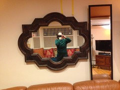
    I did have a friend hold the mirror vertical and horizontal before I installed it. Mirrors placed any higher than the height of that mirror reflect the dark ceiling (and the glare of the recessed lights) which makes the room feel both darker and weirdly unnerving. Versus, when the mirror is placed horizontal, it reflects the large window across the room from the sofa, which brightens my dark living room. Unlike a lot of the boho chic photos, my living room is light deprived. I find I need mirrors/light colored walls, or it feels oppressive during the daytime.

    I wish I could bring more mirrors into the room...I've tried moving a mirror around the room to see where I might add one, but the views look weird or distracting for one reason or another.

    I often have pillow lust...there are so many pillows that might work as well or better than the ones I selected. Maybe I'll switch them out over time. It's not cheap to get pillows that are at least 24 x 24 (I need that size for comfort).

    I've received a few comments that there is not enough "stuff" over the mantle. One person suggested I put the sun over the sofa. It used to be there. Problem was, the people sitting across the room on the window seat would get blinded by the "sun" which was right behind the heads of the people sitting on the sofa, lol.

    I suppose I could find some more "stuff" to go over the mantel. Maybe two more big round disc like things to hang on either side of the sun. Or, tall vases on the mantle.

  • 10 years ago

    Bigger stuff on mantel.

    ennea4 thanked happyleg
  • 10 years ago

    Okay, I'll keep looking...it has to be very tall skinny (not deep) stuff to make an impact. Less than 7" deep. Or, attached to the wall.

  • 10 years ago

    For this room and your style it works. Did you say it is just paint grade plywood? If so and you tire of it, you can rebuild and do something else later on.

  • 10 years ago

    Yes, it is paint grade plywood.

  • 10 years ago

    Here are photos of my experiments with "mirror fails":

    You can see that where I placed the mirror "doubles" the window. Versus, placing a mirror on the mantel, or moving/changing the direction of the mirror over the sofa would have bad views/weird affects/darken the room.

  • 10 years ago

    Try turning the rug so the red is on the ends, and move the ottomans to the sofa side. I like the blue with your decor.

    ennea4 thanked User
  • 10 years ago

    There's almost nothing about this room that's my style and yet I LOVE it! So much color and energy! The blue(s) on the fireplace look great and fit perfectly with the eclectic/bohemian style of the room.

    ennea4 thanked ecpt
  • 10 years ago
    last modified: 10 years ago

    Okay, Advira, Here's the before and after:

    Before:

    After:

    Gotta say, I never thought of turning the rug, but I kind of like it! The only thing I don't like about it is that it's slightly too small for the sitting area now. I give up about a foot on each end by turning it sideways.

    What's the vote on this?

  • 10 years ago
    last modified: 10 years ago

    I personally prefer the rug the way you originally had it - but either way works. Keep the poufs with the wood-frame sofa.

    ennea4 thanked ecpt
  • 10 years ago
    last modified: 10 years ago

    Yes, I also like the poufs better on the window seat side, because it balances the bulk/mass of the sofa. But, I think the turned rug is kind of cool because the strong horizontal red lines echo the lines of the fireplace. Hmmm.

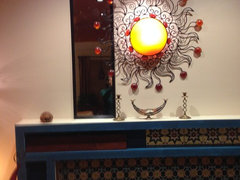
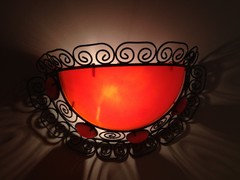
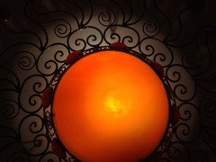
    BTW, my photos never do justice to the lit moroccan wall sconces. They always look glary in the photos, and you can't see the true colors I am seeing, which is orange:

  • 10 years ago

    I agree.

  • 10 years ago
    last modified: 10 years ago

    That last photo with the rug turned looks super. It looks better without the blanket over the leather sofa too. The room looks very nice.

  • 10 years ago

    I like it! Nice rich deep color!

  • 10 years ago

    BOHO CHIC COLOR QUESTIONS

    I have some questions about "color rules" for boho chic/eclectic style decorating. My walls are a pale brown color...or "pinkish beige" (C2 Linger). The reason I chose this color is because it is the same color as my solid color kitchen countertop, which is open to---and, very visible in--- the living room. Pinkish beige is also a prominent color in my kitchen tile backsplash, and in my poufs.. And, it is also a color that goes very nicely with my deep burgundy/brown cabinets, bronze wall sconces, etc.

    I have tried orange beige, yellow beige, etc. wall colors but these colors clashed with my kitchen. I have tried painting my walls an actual color, but this darkens my room too much. I have tried painting my walls white, but white turns dingy gray in my northwest facing living room.

    So, anyway, I settled on pinky light beige walls as the best compromise. I've also read Maria Killam and other decorator bloggers write about how pinky beige is a "bossy" color, and should be avoided like the plague. But, again, I'm trying to make the best of what I have.

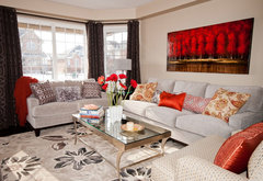
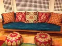
    In this photo, you can see that the wall paint is pinky beige, the window fabric (behind the window panels) is gold beige. The three middle pillows have green beige. And, the two end pillows contain gold beige. And, the poufs turned out to have pinky beige. Is this a travesty, or is it okay to mix beiges when you already have tossed caution to the wind and have chosen an eclectic/boho style decor?

    In this second photo, you can see that the lamps on each side of the window sofa or gold beige. They pretty much match the beige fabric in the window (which is hard to see at night).

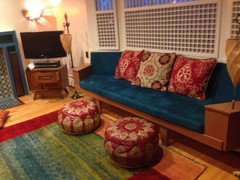
    In this 3rd photo, you can see what the window sofa would look like without the orange end pillows. I could theoretically replace those two end pillows with teal pillows, dye the tassel lamps a different color and replace the window fabric That way, I'd eliminate the gold beige which clashes with the pink beige walls. Is that a good way to go? Tone things down a bit? Narrow/focus the palette?


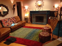
    In this 4th photo, I bring in a Moroccan rug from a bedroom, and put it on the back of the sofa. It's a totally different color palette. But, it's still Moroccan and colorful. Is doing something like this considered Boho chic style or color chaos? In other words, how much is TOO much? What's the right balance of matchy and un-matchy when you are working with boho/eclectic style


    Lastly, this 5th photo has a different Moroccan rug on the back of the sofa in a clashing beige from the wall color. BTW, the henna lamps and Moroccan side table in the far left corner are also more of a yellow/tan beige (versus, like I said, the poufs are more of a pinky/"natural" beige.

    I KNOW I can do "whatever makes me happy", but I'd like to get some honest opinions, especially from people who are familiar with boho and Moroccan decorating styles. Thanks! :)


  • 10 years ago
    last modified: 10 years ago

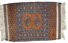
    What do you think of buying this rug for the back of the leather sofa? It is more colorful than the first, and I like the pattern and the blue it would bring to that side of the room.

    Afghan Rug, 1'7"x2'4" · More Info

    ennea4 thanked pcmom1
  • 10 years ago
    last modified: 10 years ago

    I love your room, although I am not bold enough to attempt such a color scheme. I broadcasts a friendly and casual attitude.

    Maria Killam aside, I think that all of your beiges work in this room because you have such strong colors for contrast. In my opinion, the rules apply when there are large swatches of the different beiges that aren't broken up with more dominant colors.

    ennea4 thanked yvonnecmartin
  • 10 years ago

    Been busy looking thru Moroccan, which certainly doesn't make me an instant expert! Everything from all white walls to deep rich saturated colors.

    I have been thinking that it might give more impact to the fireplace if you move that larger and heavier mirror from behind the sofa to above your mantle.

    But wall color wise, I am also wary to advise you.


    Custom Luxury Moroccan Furniture · More Info

    ennea4 thanked pcmom1
  • 10 years ago
    last modified: 10 years ago

    PcMom1: I used to have deep saturated artwork behind the sofa. It sucked too much light out of the room. Versus, the mirror reflects the light and view from the window that is directly across the room. I have a VERY dark living room that hardly gets any direct light. And, the light is tricky, because it is cold, depressing northern light for most of the day. So, that's why I don't want to put any more big dark heavy things on the walls. There's also something about the "shape" of a big rectangular piece of art or rug on the wall that I don't like. It seems to make the room feel more boxy and closed in. I like freeform shapes better. If you read my previous posts (scroll up) you'll see why mirror over mantel REALLY doesn't work (photo included).

    Yvonne: thanks for your perspective on the beiges. Anyone else have an opinion on the beiges, and on matchy versus "anything goes"?

  • 10 years ago

    I like the beiges, yes to the rug for sofa.

  • 10 years ago

    I really like the blue. It's original, and a perfect shade without looking like a crayola color, at all. You have a good eye.

    What I see and have done myself, is not put as much attention to what goes on and over the fireplace. Without it, commentary is difficult because it's not finished.

    I now see there is another comment regarding this.

    One thing that is very difficult for most people to do, is bring themselves to buy BIG.

    Everything on the mantel itself is way too small. The piece above is interesting, but too small and just a bit too fussy.

    If you can, invest in something, and big enough that you feel uneasy in the store, it will probably be perfect when you bring it home.

    You have some great detail in the poofs and pillows. It is all on one side of the room, though. I would experiment and move the pillows and/or one of the poofs to the leather sofa, and also maybe the throw on the leather sofa.......

    Basically you have a lot of color blocking, which looks great, but not with the delicate piece over the fireplace. That piece is definitely in keeping with your style and design, and would probably look great somewhere else.

    Thanks for allowing commentary. You have a great taste and courage to be bold! Cool place.


  • 10 years ago

    I didn't notice the photo in the thread where you moved the poofs and removed the pieces off the mantel. I think that's a great start, and I don't think the pink beige, or whatever is a big deal.