Software
Houzz Logo Print
mrivera7

POLL: Beautiful Or Ugly Chapter 5

10 years ago
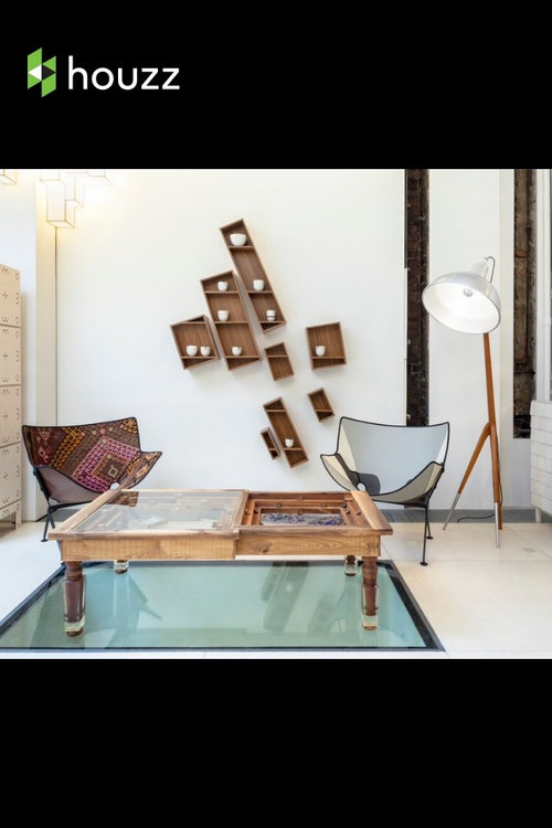
Is This Sitting area Beautiful Or Ugly?
Vote And Comment.
Beautiful
Ugly
Other-Comment

Comments (56)

  • 10 years ago

    pic is new? is everybody going pro?

  • 10 years ago
    It seems to follow some design rules, like religion of the wood, but feels off to me.
  • 10 years ago

    i do like that term peggy "religion of the wood". lol

  • 10 years ago

    Oh no. No, no. A jumbled mess.

    Keep 'em coming, Hannah, these are fun.

  • PRO
    10 years ago
    Ugly. Looks like the sale corner in a furniture shop
  • 10 years ago

    There are too many quirky items to look at - confusing to the eye. Neither chair looks particularly comfortable.

  • PRO
    10 years ago
    just needs bigger, plusher seating and some color or a much larger focal point on the main wall, instead of numerous spindly little objects. I like the floor lamp.
  • 10 years ago

    OMG! This is so bad, but the worst assault on my eyes are the leaning display boxes on the wall. The room is a joke, right? :)

  • 10 years ago

    Personally, I don't like it but I voted other, as there is always someone in the world that has different tastes. If you have watched Extreme Homes, then you will know what I mean lol

  • 10 years ago

    Uncomfortably quirky . Found objects thrown together in a classic set up disregarding The size and balance of the object within the negative and positive space.

  • 10 years ago

    I am with momof5x, while I don't like it and it looks cold and uncomfortable like a waiting room in quick oil change place, it's not in the true sense "ugly" either.

  • 10 years ago

    If it is functional and fits with the surrounding design then, whatever.

    Uncomfortable rather than ugly comes to my mind.

  • 10 years ago

    I find it looks very "campy". To each his own I guess, and it would certainly discourage any guests from overstaying their welcome as I can't see anyone wanting to sit in those chairs for very long.

  • 10 years ago

    This arrangement is not pleasing to the eye in anyway. The table looks out of proportion to the chairs, and impossible to use while sitting in said chairs. The chairs, to me, look like patio furniture. What is that on the wall? Very unattractive. The room looks like someone had an unproductive day at the thrift stores and yard sales.

  • 10 years ago

    Looks like a design show competition. Contestants are all trying to come up with something "new".

  • 10 years ago
    Their focal point is too weak. Need larger modern chairs to balance table/lamp and splash of strong color
  • 10 years ago

    Like the elements...don't care for the design....cold and uncomfortable


  • PRO
    10 years ago

    not understanding what that floor is. i think it ruins the vibe of the room as one might be intimidated to walk on it. some plushy pillows would help. the wall cubbies are kind of fun, but not all hanging on the same degree….a rookie mistake in my book.

  • 10 years ago

    "Sitting room?" That's the last thing I'd do in that space!

  • 10 years ago

    Get me the Dramamine! Too many dissimilar skewed angles for my brain.

  • 10 years ago

    Uninviting space. The colors are soothing but I'd opt for a little more warmth and texture. The wall thingys errrrrrrrr.

  • 10 years ago

    The scale of everything is off. The shelves are the worst part.

  • 10 years ago

    Odd

  • 10 years ago

    Cold. Not balanced. Needs at least one heavier chair. Would prefer two heavier chairs. What's under the table? Needs textiles! Or, totally against my taste, a mid- century coffee table with clean legs and closer to the floor.

  • 10 years ago

    Not ugly but looks uncomfortable and disorienting. The tilt would drive me crazy.

  • 10 years ago

    This area looks like a first apartment, before you can buy "real" furniture.

  • PRO
    10 years ago

    I agree: odd, cold, weird matches...etc...Sorry !

  • 10 years ago

    Honestly, it does not look like home design, but rather an art installation at a museum. Instead of a statement piece, it appears the whole jumbled conflation of items is a "statement" in and of itself.


    I agree with all the adjectives used thus far- cold, quirky, and uncomfortable all seem fitting.

  • PRO
    10 years ago

    Looks uncomfortable, physically and visually.

  • 10 years ago

    I like it, but when you start decorating with item that are meant to be crooked or off center, they need to perfectly crooked. The shelves on the wall are not even with each other, they need to tilt at the same angle. The spacing is very important, other wise it just looks messy. Cool idea with the shelves. I've never seen any like them.

  • 10 years ago

    The scratch-n-dent section of Ikea comes to mind. No. Just. No.

  • 10 years ago
    Ugh! To each his own!
  • 10 years ago

    Off-kilter angles, a table with half a top, and a lamp that would suit an interrogation room. Ugh! And why put the big table over the floor feature, like a barrier at a construction site? If the feature is dangerous to step on, fix it. If it's ugly, cover it with a rug. Otherwise, highlight the floor feature as the the most unique, intriguing thing in the room.

  • 10 years ago
    You vill answer the question!
  • 10 years ago

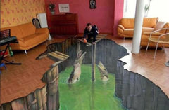
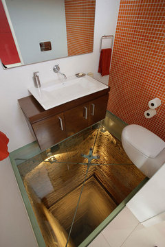
    see how it looks like it is standing on glass? just noticed it, bet it has one of these-

    12 Crazy Flooring Options Much Cooler Than Hardwood (For Example: Broken Glass) · More Info
    or
    33 Amazing Ideas That Will Make Your House Awesome | Bored Panda · More Info
    don't you just love these out of the box thoughts? lol

  • PRO
    10 years ago

    Very cool! Don't know after a few cocktails if I'd freak out, but very cool!


  • 10 years ago
    dhIDAHO

    Is my car ready yet?
  • 10 years ago
    I think its nice and very bold but, I could never pull it off with my OCD!
  • 10 years ago
    Boring
  • 10 years ago

    Don't think it's beautiful but I could live with it.

  • PRO
    10 years ago

    I have that affliction that sends me to anybody's wall to straighten a picture...this collection would drive me nuts! Never would look straight.

  • PRO
    10 years ago

    You have created a fresh different look. I just don't think you are quite there yet, but some good ideas you have shared with us. Thanks

  • 10 years ago

    Looks like it would be very uncomfortable to sit on those chairs.

  • 10 years ago
    It would interesting as a retail space but as a whole it would not match my preference in a residential space. I like the chairs and lamp though.
  • 10 years ago

    To each his own.

  • 10 years ago
    The space confuses me...
  • 10 years ago
    last modified: 10 years ago

    Neither beautiful nor ugly. Scattered, and easy to pass up. It has nothing to hold my eye, nor interest. Not practical in the way that a seating area should be comfortable. Not inviting. Looks like they are waiting for the real furniture and accessories to come. It looks like a space where I think, ''I can see where you are trying to go with this, but missed the mark.'' It's trying to be quirky, fun, eclectic. Didn't make it.


  • 10 years ago

    Just... weird. And not in a good way.

  • 10 years ago

    Looks like college apartment/dorm room decor, when you got most of your furnishings at a garage sale, reclaimed from the dumpster, or hand-me-downs (at least for most of us).

  • PRO
    10 years ago

    I wouldn't use the word beautiful, but it IS quirky. It does not look warm and inviting to be described as a sitting room. It is a little too disjointed with too many hard surfaces . . . it needs some "softening". I do like a number of the individual pieces, just not altogether.