Software
Houzz Logo Print
mommabearof5

plans back from architect

10 years ago
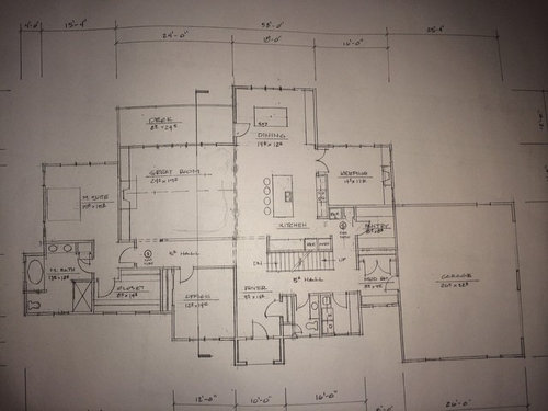
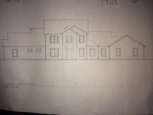
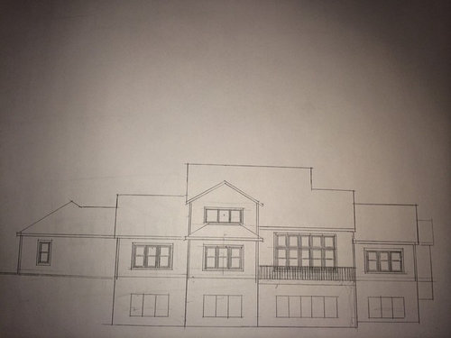
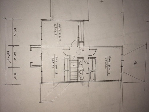
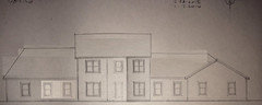
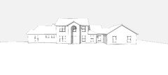
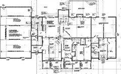
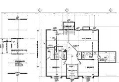
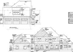
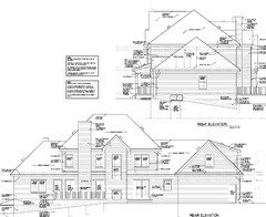
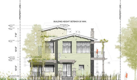
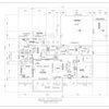
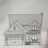
Okay...I am back with another revised set of plans - this time with elevations - and would love your feedback! Hopefully my pictures will be readable. A few things....great room will have 12 foot ceiling at the windows and go up to 16' cathedral in the center. Between the great room and hallway, that is a half wall for outlets and to put furniture against it. In the front elevation, we are thinking we would like to hip the rooves on the far left because we don't like the way all those "steps" on the roof look. I personally and not super-crazy about the front elevation, so any suggestions in that regard would be appreciated. My husband, however, loves it, so.....? :)

Comments (26)

  • 10 years ago

    The south elevation needs a lot of work. I will not sugar coat it: That porch looks terrible. I am sure the architect can do better.

    This is just an/my opinion.

  • 10 years ago

    I like your layout now. It looks good. I agree that front elevation is um, uh...ok it's just ugly. Sorry.

  • 10 years ago

    What kind of cooling/heating system will you have. If you are adding AC where will the returns be? where will the air handler be located?

    I really don't like doors to the patio that makes it hard to get outside from the kitchen and having to navigate obstacles like chairs and such to get in the way. Maybe an outswing door for the patio would work better, It looks to me like the table is a bit in the way there.

    What kind of washer are you planning on having? I'm asking because if it is a front loader the door only swings one way and the order of your washer/dryer isn't working too well. I know you want to went the dryer straight outside, but all side vent dryers we've had all have the punch out hole on the other side as well. Maybe switch the side you have the washer/dryer on. If at all I'd avoid having the dryer vent sideways. We've just not found it to work as well as in our old house where it vented straight outside.

  • 10 years ago

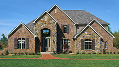
    It's not a 2-story entry - was designed to look that way because my husband really liked that look from another house we looked at, and the original elevation - believe it or not - without it was *really* boring. So ours has that stone section, but the top window is really just a bedroom window upstairs. Here is the link to the type of entry front he liked:

  • 10 years ago

    I think maybe we have 2 "wants" that are competing and screwing up the elevations: hubby really wants a second story, and I really want a cathedral ceiling great room on the back of the house. This is resulting in all the upstairs being pushed to the front of the house, which is giving the front of the house a big, flat look. I do really like the layout now, however, and am hoping we can salvage that and tweak the elevations. We don't need that much space upstairs. I am hating this process that I thought would be fun and oh-so-easy. :(

  • 10 years ago

    First take a deep breath. My process took 9 months, we are in permitting and I'm still finding a few small things that need to be reworked. It's a process and you can stress over it or you can decide that it's an interesting learning process where in the end you'll have something wonderful. And this is just the beginning and in some ways the easier part.

    Honestly the house your DH likes looks like a McMansion to me. Sorry. :( I think you can have interesting but better. How about posting pictures of houses you both like. I would start by looking at historical homes you like vs McMansions.

    Agree about the door to the patio. I'd do a slider there.

    I am also no fan of vaulted ceilings. They are nothing more than energy wasters, difficult to change bulbs, difficult to dust, etc. I'd rethink that.

    Simple solution on the W/D problem which lyfia is correct about. Just switch the W/D and sink to the opposite wall! Then the dryer vents right outside with no problem.

  • 10 years ago

    Forgot to mention: The elevation is not accurate, in other words, there is an extra line between laundry and powder room.

    It is shown as it the office and powder room are in the same level and the laundry is recessed, which is not the case, all 3 are in the same level.

  • 10 years ago
    last modified: 10 years ago

    I think your space is allocated nicely, but I see some details that could be improved -- especially doors:
    - Note that the only door providing access to the back yard is too close to the table. People'll have to scootch by, and it'll always be a hassle. I see two options: A slider next to the table, which is still problematic, but at least you don't have the door swing issue ... or move the door to the great room, where you have ample space.

    - Those double doors on the keeping room seem like they'd be a lovely and gracious choice, but in reality they're just derpy. You need two hands to open the door, and where's your light switch? Behind the door. I suspect this door'll remain open most of the time, so it's an ideal spot for a pocket door.

    - Note that when the pantry door is open, it blocks some of the shelves. You'd have to go into the pantry and close the door to access those items. Sure, you could use that space to store seldom-used items ... but a pocket door would remove the problem altogether.

    - I'd put a door on the whole mudroom (so it could be closed off when company's over) instead of on the coat closet. Kids -- kids of all ages -- are more likely to hang their coats and things if it's easy ... and hooks on that wall would be easier than opening a door and hanging the coat.

    - The office door and the closet door will bang into one another. You could move this door to the other end of the office, or even to the foyer, and eliminate this problem.

    - Ditto in the master bath: The linen closet and the bathroom door will bang into one another. I'd consider doing away with the linen closet door ... and instead have pretty open shelves for towel storage above ... and a wicker hamper below. It'd be a linen alcove instead of a linen closet.

    Other thoughts, not related to doors:

    - I think your master bedroom layout is perfect. The bed's in the right position, you have windows on two sides, and the bathroom /closet are located together but not together-together. The only thing I might do differently here would be to go with a door instead of windows on the back wall. My college nursing major daughter, who worked home health last summer, has convinced me that it's wise to have a quick fire-exit in a bedroom where an elderly person might sleep (not that you are an elderly person, but hopefully God'll give you the years to become one someday); as it's drawn now, your bedroom is a lot of steps to either the front or the back entrance.

    - Your master bath vanity appears to be smaller than your tub, smaller than your washer/dryer combo ... I don't think you have space to support two sinks. I'd go with one nice sink and storage drawers on both sides ... instead of two cramped sinks and no storage.

    - Finally, you have a 5' hallway for the mudroom /bathroom /laundry area ... unless you're going to install floor-to-ceiling bookcases or storage cabinets (which would be wonderful in this area), I don't see any reason to make a service hallway so wide -- 3 1/2' is fairly common, and 4' hallways are generous. When I was a kid, we lived in an old farmhouse without air conditioning; all five of us used to lay in the hallway and read under the attic fan in the middle of the hot summer days -- that's how wide 5' hallways are. My brother lives in that house now ... and he has installed built-in bookcases on BOTH SIDES of that super-wide hallway (and air conditioning in the whole house, but that's another topic). Anyway, given the choice, I'd rather have the extra foot of space in a room!

    - Oh, and I share everyone's thoughts on the exterior -- but, like color, that's not my strength, and I have no suggestions for improvement.

  • 10 years ago
    last modified: 10 years ago

    I'm with others on the exterior; sorry I'm not a fan. It looks like you could implement a more classic Georgian or Federal style, with a simplified middle section and two wings. But that's something I like and might not be your cup o' tea.

    This is what I mean, with the huge caveat that I'm not an architect. I'm just thinking about the general shape you already have, and how that facade might be simplified. Again, this is something I find pleasing (I've never liked the two story arched porch and gable in a gable look), but you and hubby may disagree and it's your house after all.

    Also, be sure to post your kitchen plan on the kitchens forum. Right now you have a sink back to back with a cooktop, which means only one person at a time there; and anyone at the dining table who wants a beverage or condiment has to pass the cooktop / work zone to access the refrigerator.

  • 10 years ago

    I'm sorry to say this but around here the two story arched entry screams '90s tract home.

  • 10 years ago

    Dated Nineties Builders Showcase entry. Lotsa roof -- but only two bedrooms under it? Shallow deck.

  • 10 years ago

    Okay, so I really like the main floor layout....is there hope for better elevations if I give up my up-til-now requirement of a cathedral ceiling great room and the upstairs bedrooms move back? Help!!! Our builder said at the beginning to find a floor plan we like and the elevations can be made to our liking....I feel like we have the first part done, but now the elevations suck. Not sure where to go from here.

    And, chisue, there are 3 bedrooms upstairs and one on the main floor.

  • 10 years ago

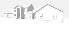
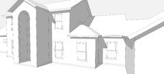
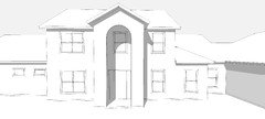
    I'm working on an idea for you, but for now here is quick model of the elevations you currently have. Might help with seeing the problem areas a little better... that awkward roof above the laundry, overpowering garage, tacked on master wing. Do you have any other exterior inspiration pics besides the one above?

  • 10 years ago
    last modified: 10 years ago

    Ok, first time back here in a while in the midst of pure hectictivity (is THAT even a word??).......anyway, Mommabear of 5, I remember a previous post with an earlier generation floor plan in which you noted that the plan was becoming bloated. You where shooting for 2600SF on the first floor but your architect handed you back a plan at 3000SF. Now, in this latest incarnation the plan appears to be around 3300SF.

    One of the greatest and most difficult tasks of any designer worth his/her salt is not the eave details or the or the door swing to a pantry or the bathroom lighting (although at the right time in the design process, those all matter), it's getting the most out of every square foot. Too many designers just go "willy nilly" when it comes to area. Like each square foot is an almost free commodity. Your guy/girl is being pretty free wheeling with square footage here which means free wheeling with your checkbook.

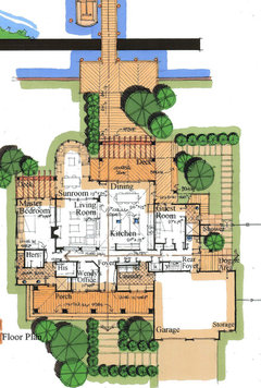
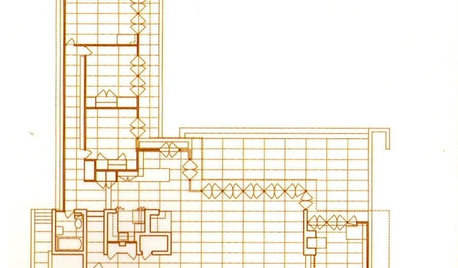
    So not to leave you floating, let me post a plan for another project, not as a solution, but as one with similar relationships and hopefully let it serve as an example of how bloated your plan is while accomplishing little more than depleting your hard earned resources.

    This first floor plan, including the sun room and exterior walls but not including the garage is 2495SF, 700 SF LESS than the bloated plan posted above. For area comparison, imagine the guest room here as your keeping room.

    As a designer I fight square footages every day. It's often something the client never sees but if I can get the same job done while spending less of those precious square feet then the client is being served well. Your designer needs to be made aware of the same.

    And don't get me started on your elevations!!!

  • 10 years ago

    tcufrog... Before I read any of the comments that was my very first thought too with that arched two story entry. So 90's! What style exterior do you and your husband want? I think that exterior could easily be turned into Federal like chicagoans said or modern farmhouse.

  • PRO
    10 years ago

    As others have pointed out you deserve a better plan and much better front elevation, and can get both if you persevere (assuming the professionals with whom you are working are truly experienced and creative, and not simply drafters putting into a computer what they hear you say). Strive for a more simple and harmonious interior-exterior relationship, and don't settle for some contrived builder's shapes from the last annual builder's convention. Nick's study demonstrates how it's possible to do all sorts of things with the exterior.

    FWIW, the photo of the builder's house, above, vividly demonstrates why and how brick masonry and stone masonry, each used in large amounts, are almost never harmonious with one another. Find a new materials vocabulary which both you and your spouse like!

    Good luck!

  • 10 years ago

    What Nick did with the exterior is far superior to what you have and what your inspiration photo was. Even if you switch the material to brick it would work better than that silly front entry.

  • 10 years ago

    Gotta say, I don't like the exterior suggestion above in B&W any better than the overblown two-story entrance. It's so wide that it looks like it stretches out to the next county.

  • 10 years ago

    architectrunnerguy - that plan you posted is incredibly close to ours as far as layout!

    As far as what we want for elevations, what we have is actually nothing like what I imagined, honestly. The architect never asked for what style we wanted, and we never showed him pictures....these elevations just appeared at one of our meetings.

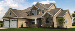
    The styles we have liked have been part siding, part stone; we thought we would replace the stone with brick. The below house is a very common style of new house where we live, but we are thinking these are going to look very dated in 15 years, and think of brick as more classic maybe. Sort of this kind of thing:

    This is just a picture I found quickly online. We currently live in a 1920's farmhouse with a huge wrap-around porch. While we like it, we would not want to build a new home with a farmhouse look. Most of the house plans I have been attracted to have happened to be craftsman style, but I suppose that has more to do with the floor plans than anything, so not sure that helps. We definitely want a country looking home (nothing modern); this house will be built on the family farmland.


    Nick - Wow - that really is helpful to see. How did you even do that?


  • 10 years ago

    I made a model from the dimensions on your floor plans using Google Sketchup. If you're good with computers, the software is free and isn't terribly hard to learn. If you spend a bit of time gathering images of what you imagining and post them/put them in an ideabook, I'd be happy to make some changes and post some more ideas.

    E K thanked Nick
  • 10 years ago

    You need to put together some ideas of what you like.

    E K thanked cpartist
  • PRO
    10 years ago

    Are you sure you are working with a independent licensed architect, or is it someone who is a designer or drafter recommended by the builder? It's hard for me to digest that an experienced and creative architect would produce the exteriors you have shown us unless he/she works directly for the builder and is used to providing what the builder has built in the past and likes to construct.

  • 10 years ago
    last modified: 10 years ago

    Not knowing any better, we started with the builder's drafter and spent many frustrating hours there, and when everyone here shot down our plans and said we need an architect, we found a local licensed architect and went to him. Totally independent and has nothing to do with our builder. We have been very happy with what he has done with the interior layout.

    And, actually, we really like the style of homes that our builder typically builds and it is nothing like what the architect did. The pic of a finished home I posted above was from our builder's website and is more of his typical look for a conventional home (they do lots of log homes and timbered homes, too).

  • 10 years ago

    Almost sounds like a disconnect then with the architect. What does this architect typically design? Did he show you a portfolio of his work? I am sure you shared with him what you thought you wanted your homes exterior to look like or similar to, what did he say?

  • 10 years ago

    Mommabear,

    When I sat down with the architect, she sent me a plan that she recently did that I think somewhat fits what you are looking for and in looking in your ideabook matches the style you like. The main floor is 2111 sqft

    Ill attach a couple of pics.


    Main


    Second


    Elevation Front and side


    Elevation back and side.