

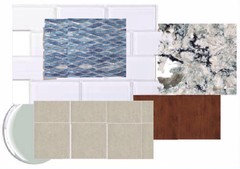
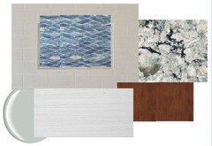
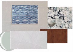
Flooring color- masterbath
10 years ago

Featured Answer
Sort by:Oldest
Comments (15)
 10 years ago
 10 years agolast modified: 10 years ago
Related Professionals
Orlando Interior Designers & Decorators · Portsmouth Interior Designers & Decorators · Grand Junction Interior Designers & Decorators · Clovis Interior Designers & Decorators · Casper Interior Designers & Decorators · Calgary Interior Designers & Decorators · Gary Kitchen & Bathroom Designers · Platteville Kitchen & Bathroom Designers · Palm Desert Kitchen & Bathroom Designers · Farmington Kitchen & Bathroom Designers · Raleigh Furniture & Accessories · Olean Furniture & Accessories · Stockton Furniture & Accessories · Pueblo Furniture & Accessories · Magog Furniture & Accessories 10 years ago
- 10 years ago
- 10 years ago
- 10 years ago
- 10 years ago
- 10 years ago
- 10 years ago
- 10 years ago
- 10 years agolast modified: 10 years ago
- 10 years ago
- 10 years agolast modified: 10 years ago
- 10 years ago



Related Stories
BATHROOM DESIGN18 Dream Items to Punch Up a Master-Bath Wish List
A designer shared features she'd love to include in her own bathroom remodel. Houzz readers responded with their top amenities. Take a look
Full Story
BATHROOM DESIGNRoom of the Day: Elegant Master-Bath Update
A 1970s redo didn't work with the rest of the gracious 1915 Colonial-style home. A new renovation brings elegance to the space
Full Story
BATHROOM DESIGNSweet Retreats: The Latest Looks for the Bath
You asked for it; you got it: Here’s how designers are incorporating the latest looks into smaller master-bath designs
Full Story
ROOM OF THE DAYRoom of the Day: Small Master Bath Makes an Elegant First Impression
Marble surfaces, a chandelier and a window seat give the conspicuous spot the air of a dressing room
Full Story
DECORATING GUIDESDecorating 101: How to Start a Decorating Project
Before you grab that first paint chip, figure out your needs, your decorating style and what to get rid of
Full Story
MOST POPULARHow to Work With an Interior Designer
Interior designers do much more than make a home pretty — they turn it into a harmonious haven that's uniquely yours
Full Story
DIY PROJECTSReinvent It: Salvage Savvy Keeps an Urban-Farmhouse Bath on Budget
See how resourceful shopping and repurposing gave a homeowner the new bathroom she wanted at the right price
Full Story
BATHROOM MAKEOVERSWasted Space Put to Better Use in a Large Contemporary Bath
Bad remodels had managed to leave this couple cramped in an expansive bath. A redesign gave the room a luxe hotel feel
Full Story
BATHROOM DESIGN14 Bathroom Design Ideas Expected to Be Big in 2015
Award-winning designers reveal the bathroom features they believe will emerge or stay strong in the years ahead
Full Story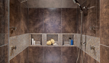
REMODELING GUIDESBathroom Remodel Insight: A Houzz Survey Reveals Homeowners’ Plans
Tub or shower? What finish for your fixtures? Find out what bathroom features are popular — and the differences by age group
Full Story



roarah