

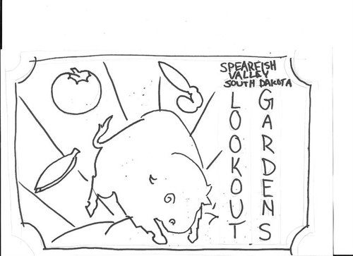
logo design
10 years ago
last modified: 10 years ago
Sort by:Oldest
Comments (6)
Related Stories

ARCHITECTUREHouzz Call: Show Us Your Logo!
A picture is worth a thousand words, but your company’s symbol may be worth its weight in gold. We’d like to hear the graphic details
Full Story
PATTERNCatch the Olympic Rings With Circular Decor
Let the famous logo inspire designs in your home and landscape for record-breaking style
Full Story
DESIGN PRACTICEDesign Practice: Start-up Costs for Architects and Designers
How much cash does it take to open a design company? When you use free tools and services, it’s less than you might think
Full Story
TRAVEL BY DESIGNTravel in Style: 10 Designer Hotels to Inspire You
Pick up some decorating ideas or just revel in the decor and furnishings of these eye-popping hotels by famous designers
Full Story
ARCHITECTUREDesign Practice: How to Start Your Architecture Business
Pro to pro: Get your architecture or design practice out of your daydreams and into reality with these initial moves
Full Story
FALL GARDENINGWhat Monarch Butterflies Taught Me About Garden Design
Thinking like a butterfly leads to fresh perspectives in the garden and in life
Full Story
PRODUCT PICKSGuest Picks: Treat Yourself to Teatime Designs
One more reason to quit coffee? Tea accessories are way cooler. Set the kettle on and see what's brewing in tea drinking design
Full Story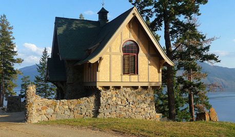
ARCHITECTUREHow to Design a Storybook Cottage
A client’s request: “Build me a house where Disney meets Tudor.” The architect explores the details that make the style
Full Story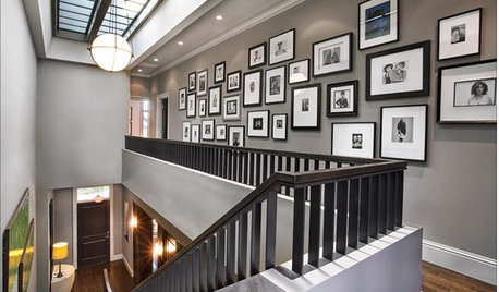
GREAT HOME PROJECTSHow to Design a Family Photo Wall
New project for a new year: Display your favorite images of loved ones for the most personal gallery wall of all
Full Story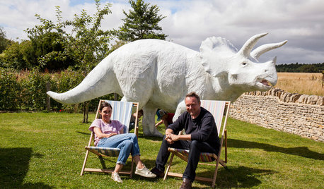
COLLECTIONSWorld of Design: 9 Cool Collectors and What They Keep at Home
Meet the people behind some museum-worthy assemblages — from a house of hats in Los Angeles to dinosaur art near London
Full Story
Sponsored
trianglejohn
jnjfarm_gw
Related Professionals
Brunswick Landscape Architects & Landscape Designers · Rome Landscape Architects & Landscape Designers · Leominster Landscape Architects & Landscape Designers · Saginaw Landscape Architects & Landscape Designers · Utica Landscape Architects & Landscape Designers · San Luis Obispo Landscape Architects & Landscape Designers · Victorville Landscape Architects & Landscape Designers · Victoria Landscape Contractors · Buffalo Landscape Contractors · Spokane Landscape Contractors · Jackson Architects & Building Designers · Laredo Architects & Building Designers · Auburn Architects & Building Designers · Kirksville Architects & Building Designers · Tucson Architects & Building Designerszzackey
User
jnjfarm_gw
Terry McGinn