

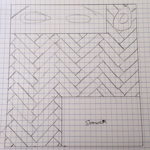
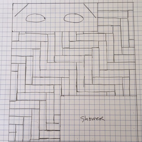
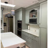
Which example do you like better for herringbone tile orientation?
10 years ago
Featured Answer
Sort by:Oldest
Comments (23)
Related Professionals
Aberdeen Interior Designers & Decorators · Minneapolis Interior Designers & Decorators · Newport Interior Designers & Decorators · Sterling Interior Designers & Decorators · Cowansville Interior Designers & Decorators · Columbia Architects & Building Designers · Newport News Architects & Building Designers · Worcester Architects & Building Designers · Aberdeen Architects & Building Designers · Wausau Architects & Building Designers · Elizabethtown Kitchen & Bathroom Designers · California Kitchen & Bathroom Designers · Norfolk Kitchen & Bathroom Designers · Lewiston Kitchen & Bathroom Designers · Seattle Kitchen & Bathroom Designers 10 years ago
- 10 years ago
- 10 years ago
- 10 years ago
 7 years ago



Related Stories

KITCHEN DESIGNHouzz Quiz: Which Kitchen Backsplash Material Is Right for You?
With so many options available, see if we can help you narrow down the selection
Full Story
REMODELING GUIDES20 Great Examples of Transitions in Flooring
Wood in One Room, Tile or Stone in Another? Here's How to Make Them Work Together
Full Story
KITCHEN DESIGNOpen vs. Closed Kitchens — Which Style Works Best for You?
Get the kitchen layout that's right for you with this advice from 3 experts
Full Story
BATHROOM DESIGNHow to Build a Better Shower Curb
Work with your contractors and installers to ensure a safe, stylish curb that keeps the water where it belongs
Full Story
DECORATING GUIDESChevron, Herringbone, Flame Stitch: What’s the Difference?
Make the right point by learning the differences among these 3 popular zigzag patterns
Full Story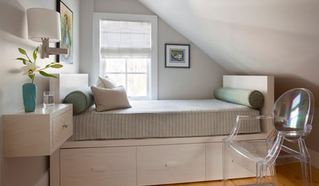
BEDROOMS7 Ways to Make a Small Bedroom Look Bigger and Work Better
Max out on comfort and function in a mini space with built-ins, wall mounts and decorating tricks that fool the eye
Full Story
HOW TO PHOTOGRAPH YOUR HOUSETake Better Photos of Your House in a Snap: Part 2
Think like a professional photographer and learn to capture stunning images of your home
Full Story
BEDROOMSDesigner Tips for Creating a Better Bedroom
In the dark about bedside lamps? Waffling over pillows at the store? Try these ideas for a more comfortable bedroom
Full Story
REMODELING GUIDESHerringbone-Patterned Firebrick Takes Style to Hearth
Fireplaces cross over into craftsmanship territory when the brick inside is laid in this graphic pattern
Full Story
KITCHEN DESIGN12 Great Kitchen Styles — Which One’s for You?
Sometimes you can be surprised by the kitchen style that really calls to you. The proof is in the pictures
Full Story




rebleckaOriginal Author