Software
Houzz Logo Print
rdsweet06

Paint choice dilemma...Please Help!

10 years ago
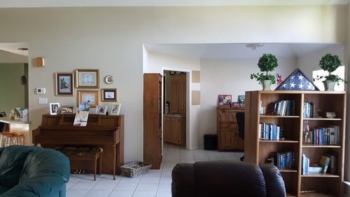
My wife and I have probably put six different color samples on our interior walls and cannot come to a good feeling about a paint color. We are approaching the project with two thoughts in mind. 1.) A color that would be appealing for resale in the near future. 2.) If for some reason we do not sell, a color that is appealing to our liking. Our home is a lake home, open concept with ceiling height in living area probably around 20 ft at the highest. The flooring throughout, except bedrooms, is white tile. Colors tried so far that we thought would work are SW HGSW3124- Palomino Pony, SW6101-Sands of Time, Valspar 3002-9C-Cincinnatian Hotel Carl Tan, Valspar-2008-9C- Faint Maple. What are your thoughts on these colors for a open concept home with white tile floors? We are at a point of having someone come in and assist with choosing an interior wall color but really don't need the full service of an interior decorator at this time. Are there services out there that could assist with choosing a interior color based on a homes interior concept?


Comments (28)

  • 10 years ago

    If you don't get replies here, try the Home Decorating forum.

    This forum is more about the technicals. Good luck!

  • 10 years ago

    Don't ask me. I am such a freak about colors. I ended up blending my own colors then I had them shoot the colors I liked and I got gallons on what I wanted. Each room works different with a color because of lighting. Needless to say I own a lot of small samples.

    The only one I stuck with unchanged was SW Oyster Bar. Great in the dining room, but too dark in the adjacent living room. I hate color selection. Bottomline is you would walk into my home and will not get distracted by any of these subtle colors.

  • 10 years ago

    You can say. "It was the color of the year"

    Click:
    Color-of-the-year-2016-SW

  • 10 years ago
    last modified: 10 years ago

    Only you can decide what is good in your particular exposure. Lighting is everything, from natural to what bulbs you use.

    That said, a good place to start is to look at the list of the best sellers. We like Benjamin Moore. Manchester Tan is a popular neutral.

  • 10 years ago

    Hello Ms. Ehrlich,

    Pardon my butting in but too have a paint dilemma and in desperate need of your assistance. I looked at your color libraries and the color that appeals to me based on how they look in the photos is Silver Satin by Benjamin Moore. Seems to be a light bright color when in lots of natural light.

    I live in a condo in Miami Beach with South facing living/dining & TV room with lots of natural light and would like to paint white/crisp/clean color with our modern decor. However, not stark white.

    It's currently painted an Almond (beige) color by Benjamin Moore. I've painted swatches on my walls throughout the space and just as you said, it can drive one crazy. I've narrowed it down to White Dove but seems too white in the living room which is next to sliding door/balcony/most natural light. Because of this I tried Cloud White, China White, Mountain Peak White, etc., but I don't like any of them much. Mountain Peak White is warmer, which I like, and holds it's brightness thought the evening in dim lighting but it's too yellow (too vanillaish). China White too gray... and so it goes. Thus, I haven't been able to pick a color. HELP please. Any suggestions?

    Thank you,

    Vivian

  • PRO
    10 years ago

    Hi Vivian!

    Lucky you to have coveted south facing living and dining rooms!

    Are you painting all the rooms the same color or are there existing colors in connecting rooms that will be changing or remaining a different color?

    Silver Satin is a beautiful neutral choice that is a shade of white, and will appear white throughout the day, but will also have a little more depth to it from different angles due to light and shadows. It is a sophisticated shade and a great choice considering your comments.

    Sherwin Williams Eider White SW-7014 is another excellent candidate. Let me know what you think about this.

    What color are the floors? If possible, post a picture.

    -j


  • PRO
    10 years ago

    @robert sweet-

    any updates?

  • 10 years ago

    Jaclyn, we just picked up two gallons of Valspar Reserve in Lyndhurst Stone. We are going to start with one of the guest bedrooms to ensure we picked the correct color for us. Dilemma now is that I touched up a few spots on the ceiling with the same color, same brand (Valspar) and same gloss (Flat), but the new paint leaves a glossier finish that the old paint. Even if I were to have to paint the complete ceiling, I would not want the gloss to be as glossy as the newest ceiling paint we purchased. So, wall painting is being held up by getting the ceiling paint gloss problem corrected. Will keep you all posted and thank you Jaclyn.

  • 10 years ago
    last modified: 10 years ago

    Robert,

    I had a major problem with Reserve's sister product from Ace called Optimus, it dries really fast with a slight sheen. This is bad when cutting in. I cut in and then went back to paint. The final result (which I did not find out until a year later when I walked in this seldom room and had a sun filled room) was that all the cut-in showed.

    The only way to avoid this is to REALLY FAN OUT the cut-in around switches, plugs and door trim, where you can see it. ceiling and crown cut in is too high to detect. Another solution is to try to cut-in one wall and paint that one wall fast. Pro painters try to keep all edges wet, but I don't paint that fast.

    I have a complaint form sitting on my computer opened and not completed right now that I plan to send to Valspar about this issue. Sheen over sheen becomes even more shiny.

    Problem down the road for unsuspecting homeowners is the sheen might make new paint, during a repaint, not stick without a primer.

    I buy flat for easy touch-ups. Not with this !@# product.

  • PRO
    10 years ago

    Robert,

    While I can see how choosing a neutral color will be in the best interests for both you and future buyers, I do think that the colors you are considering might be a little too rich. Buyers nowadays love coming into lighter, neutral colored rooms because it can help them picture their own furniture there. If I were you, I would go with either a light beige or a light gray which has become very popular recently. Both would look really pretty against the white tiles you described. I would look into maybe Icy Avalanche (gray) or Maison Blanche (beige). Hope this helps!

  • 10 years ago

    The wife and I are getting a bit nervous about the project. Hoping that the wall paint, Reserve in Flat, does not turn out to produce too much sheen. Out of necessity, very bold existing color scheme, we will be using a primer/bonding sealer before painting. Will keep you updated and thanks for your input.

  • 10 years ago

    It will not produce too much sheen :-) Looking at my wall, I call it flat. But, fan out cut ins and touch ups.

  • 10 years ago

    Hello again Ms Ehrlich,

    Sorry it took so long to reply and post the photos you requested. To answer you question about my floor ... it's a light beige with some white and brown/grey veining. I recently had it restored and left it a matte finish (no shine).

    As for the wall color, as trying MANY whites I think I'm liking Simply White from Benjamin Moore the best. However, this weekend I will look into the Silver Satin and Eider White you suggested.

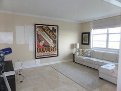
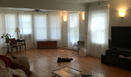
    As for the areas being painted and the adjoining rooms/areas ... below please find the photos of the living/dining area. The living room faces the second room with it's own bathroom and walk-in closet which we've converted into a TV which I keep open to the living room all the time and close it with pocket doors when guests visit and open up the sofabed.

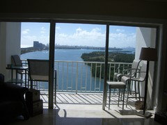
    The Living/Dining, TV room, and our bedroom face south with a bay and ocean view.

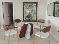
    We're in the process of putting up a new chandelier so we've taken off the glass table top from dining table which currently rests on the coffee table - so sorry about the mess.

    Once again,

    Thank you for your help.

    Vivian

  • 10 years ago

    Ms. Ehrlich,

    With regard to choosing a paint color, I forgot to mention that we plan to change our living furniture and eliminate the espresso furniture (the existing brown chairs and bar). We will purchase a white sectional or perhaps a couch and two light colored chairs. I'm seeking a modern coastal look (if there is such a thing) which is light and airy to reflect that we live on the beach. As you can see we have a gallery wall of very colorful art so we need to consider this as well when selecting a paint color I assume.

    I look forward to your reply/suggestions.

    Thank you again,

    Vivian

  • PRO
    10 years ago
    I love the floors, what a beautiful space! Any progress? Another color to consider is Paper White walls with Simply White trim:

    http://www.thehomecoloriste.com/hc-blog1/2016/3/18/bm?rq=Paper

    Keep me posted!
  • 10 years ago

    Hello again Ms. Ehrlich,

    Tried Silver Satin as you suggested. It's a very nice color but looks too gray in my space for my taste as it doesn't look clean and airy. Also tried Cloud White and White Dove but both are on the creamy vanilla (too yellow) side so I thought I'd try a white with more gray; tried Winter White which looks like a very pale gray. As usual, I like it on one wall and not on others where I think it looks too blue. I then turned back to Simply White which might be my choice in light that I think I've reached the end of my rope with choosing a color. It's a lovely white which I think will go well with our furniture, art, and should give me the clean, crisp look I'm looking for without being stark white. Think I've spent about $100 on approximately 10 sample colors and think I can't try one more sample right now as my living, dining, and tv room are painted different colors EVERYWHERE and I therefore need to pick a color now before we go CRAZY.

    Do you have an opinion about Simply White?

    Thank you again,

    Vivian

  • PRO
    10 years ago

    Hi Vivian! I can't stress enough how difficult it is to interpret a shade painted on a wall surrounded by other colors. We must end your frustration! Simply White is timeless, very beautiful and well, simple. It is a fabulous shade of white. Whites come off best when layered a little and pulling some color through somewhere else. Are you painting ceiling and trimwork? Will all rooms be painted the same color or is there an opportunity to add a different color in a different room? If you have time, take my color help quiz (don't worry about uploading your photos or the orientation questions as you have addressed all that here). Curious if you looked at Eider White?

    Quizz link is here (click button that says Launch Free Pro Help). And we'll get this!

    Quizz, Color Help

  • 10 years ago
    last modified: 10 years ago

    Farha,

    Tried to take a picture of the tile. That did not work.

    So here is almost the yellow. It is the second rose from the top. The most outer petals:


    light yellow

    I found that I can take color like this and make it look modern without changing it.

    It depends on everything that surrounds it. The key is to make it part of the solution, not the problem.

  • 10 years ago

    Hello again Ms. Ehrlich,

    You are so right about the difficulty interpreting paint shades while surrounded by other colors. I tried covering up surrounding colors in an attempt to make a good color selection and considered undertones. However, it didn't work because i can't stress enough how much a dislike how Simply White turned out!!! The yellow tint in it makes the color look slightly light green in the natural light in my home and it looks like a hospital. Absolutely terrible.

    As for Eidier White, I did try it but the magenta tint didn't look quite right in a couple of areas in my space due to the lighting. I'll try it again as well as White Dove and any other suggestions you may have. I'm thinking I'll have to go for a white that looks like will lean towards a light grey which would be preferable to this light yellow/green tint of the Simply White.

    To answer your questions, only painting walls; the trim and baseboards are in good shape. The living/dining, tv room, kitchen, bathroom & vanity were all painting Simply White all rooms are visible from each other. My bedroom and bathroom are on the other side of the condo and are painted a warm taupe which always makes us feel comfortable, relaxed, and cozy which is how I want my bedroom to makes us feel before going to bed.

    Vivian


  • PRO
    10 years ago
    Vivian,
    So here's the kicker. You are over evaluating the colors
  • 10 years ago
    last modified: 10 years ago

    It all depends on who the buyers will be for your home!. If it is the wealthy, they don't like neutral color walls. If it is the middle class buyers, neutral colors are perfect! I been in quite a few multi-millionaire homes for sale and most have vivid earth tone colors inside like rustic orange or light blue, mild green color interiors. Taupe use to be popular but no more!

  • PRO
    10 years ago
    @vivian- sorry, it looks like my whole message got cut off! Strange. Email me at Jaclyn@jaclynehrlich.com, I have some more tips for you. Hang in there!
  • 10 years ago

    Hi Jaclyn,

    Hello Jaclyn,

    Such great color advice! I am wondering/hoping you might weigh in on a current dilemma I have. I live in New York and am painting the exterior of my house BM white dove. My house is a combination of James Hardie shingles, brick, and wood paneling (bought the house — didn’t build it!). The shingles are fully painted white dove flat, trim and brick isn’t yet painted. White dove, which is my favorite white and which I’ve used it everywhere, is looking yellower and creamier than I wanted but only on the front of the house. The house faces southwest or west, changes if i take a slight step. The back and sides look great. I had planned to do the trim white dove semi-gloss. The window frames are bright white vinyl. Now I am thinking that the contrast with the bright white frames might make the rest of the house look creamier. I am wondering if I should choose a different trim color. I’ve sampled Simply white and Super white thinking the making the white pop could be an interesting way to go. My question is: will using a whiter white on the trim really make the body look a lot creamier? And will this look good or not so good? Or should I stick with a white dove trim in semi-gloss (hoping it won’t look too “builder special” if I do it all in one color.) I could also have the vinyl window trim painted to match the trim color.


    I so appreciate any help you can offer! Hope you don't mind if I email you too! I have been pulling my hair out over this, worrying that I am making a very expensive mistake!


    All the best,

    Jenny

  • 10 years ago

    Just want to thank Jaclyn, who very kindly recommended I try snowfall white for my trim with the white dove paint. Sounds like a great suggestion! Now on to the color of the door, but that's another thread, literally...

  • 10 years ago

    Hello Ms. Ehrlich

    Thank you for you help with paint color choice. It's been a while since I communicated with you because I needed a break from selecting paint.

    A colleague turned me on to Ralph Lauren Tibetan Jasmine and I love it!

    It's a lovely cream color. If you look at it on it's own on the wall it looks white (not stark white) but can see the cream color compared to the white baseboard and crown molding.

    Are you familiar with this color?

    Thank you again,

    Vivian

  • PRO
    10 years ago
    Thank you for the update! I am not familiar with this color but it sounds beautiful!
  • 10 years ago

    It is exactly what I wanted; creamy white, clean, airy.

    Thank you for helping us poor folks in need of color selection assistance, Your efforts are greatly appreciated!

    Vivuan