

Room with MANY angles- which ceiling color?
The house we are building has an open main area with tall ceilings. There are many, many angles going on in the walls as well as the ceiling. I want to paint the walls 50% Revere Pewter. I'm not sure if I should paint the ceiling white, or the same color as the walls. If I use white, it will accentuate the asymmetric angles. If I use the Revere Pewter, it may seem dark and drab. These pictures show some of what I am talking about. (Note: the tall ceiling connect with the lower ceilings of the darker upstairs.) Any advice would be cherished.
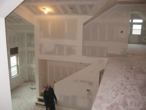
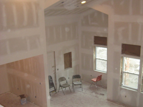
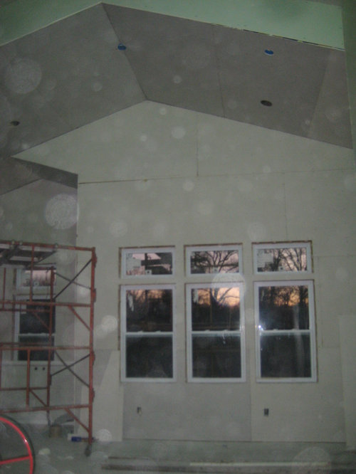
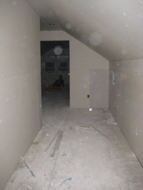
This is the hall of the upstairs:
Comments (87)
 PRO10 years agoI just left BENJAMIN moore store. I love Picket Fence CSP-370. This walks line between grey, beige without going funny. Here is the catch. It is only available in their top line paint Aura and it is $70/gal retail. You probably need 300 gal for this house--just guessing on overall size maybe more. So if you have general contractor, you need to check your contract and see what is in your base price. Guessing it is half that cost. But you will have to research that. It has their W1 white most, bits of R3 red; B1-blue; O1-orange and G1-green. That combo balances out everything. I might use this color so i got a sample can in eggshell finish.
Revere Pewter is out IMO. IT GETS MUDDY because it has red oxide in it which drives the muddy tendency.
I will post pic of Picket Fence when my sample board is dry and done. My suggestion to you is get a sample of this and paint on large patch of your wall. Thanks to the Houzzer above who suggested this color. A winner for me and maybe T
more later.
T L
Original Author10 years agoJust a note about Ballet White that I got from http://www.kylieminteriors.ca/the-best-chameleon-paint-colour-ballet-white-benjamin-moore/.
(If you have a different experience with it, please let me know These are some of the same reasons I've noticed why I think it may fit my space.):A few more things about Ballet White…
- If you are looking for a slightly warm greige paint colour, Ballet White might have TOO much yellow in it. It is far more cream than it is greige
- If you are looking for a cream colour and don’t like ‘grayish tones’ Ballet White will probably be too neutral feeling for you
- Northern Light can slightly enhance the gray undertones of Ballet White
- Direct natural light may wash Ballet White out slightly
- Ballet White is a great ‘whole home’ colour as it is light enough for hallways and interesting enough for larger rooms
Related Professionals
Georgetown Interior Designers & Decorators · Grand Rapids Interior Designers & Decorators · Sierra Vista Interior Designers & Decorators · Grand Junction Interior Designers & Decorators · Sheridan Interior Designers & Decorators · Poplar Bluff Architects & Building Designers · Auburn Architects & Building Designers · Waterloo Architects & Building Designers · Mesquite Architects & Building Designers · Everett Architects & Building Designers · San Marcos Kitchen & Bathroom Designers · Portsmouth Kitchen & Bathroom Designers · Watertown Kitchen & Bathroom Designers · Provo Kitchen & Bathroom Designers · Queens Kitchen & Bathroom DesignersT L
Original Author10 years agoI'm so glad you shared that info about Picket Fence. I live an hour away from our BM and I hadn't heard of it before. I'd love to see you sample board when it's ready! I do think that is going to be too expensive for us, but we can figure it out if need be. I'm guessing this is a big no no in the eyes of most, but we have no contractor, no decorator, etc. The only thing we hired out altogether was the exterior brickwork. (didn't think we could tackle that!) We are blessed to have friends who are knowledgeable about many areas- but I don't have an interior decorator friend :). The way we have had to make decisions hasn't been the ideal order. There will be a lot of things we look back on and say- we should have... It is nice to get suggestions to avoid a few of those things, though.
- PRO10 years agoI read that piece on Ballet White but it is yellow. I posted the previous notes on my stop at BM store. As an artist yourself, you know the power of yellow so i can't support that color. Of course, always subject to your goals and light in your space.
- 10 years agoTL, I understand you and your husband are building this yourselves with the help from friends.
There is a huge difference between a decorator and designer.
A decorator has no credentials, where a designer had at least four years of college and credentials.
You need design help at this point.
Why spend all this money with no plan or design? I don't get it.
First thing I would consider is flooring. It will greatly affect the tone of paint to select.
That being said, you have been given very excellent advice from the pros.
Please consider, save now, regret later. Good luck. T L
Original Author10 years agoI do get it. I am hearing you. We actually "needed" a designer from the start. One person's necessity is another person's luxury if you can see where I'm coming from. This is a huge undertaking for us when you add our actual lives in the mix. So, I definitely respect the knowledge and experience of a person who designs for a living. I would absolutely prefer to hire a designer (thank you for clarifying decorator/designer). I should benefit in knowing, before I ask future questions, if DIY'ers are frowned upon here?
- PRO10 years ago
OMG, no assistance!? That scares the bejezzees out of me! Agree with Sandy C. There are so many decisions that home owner's have to make and unless they are made in conjunction with one another, you wind-up with a hodge-podge. To say nothing of staying on some kind of budget and timeline. We will do what we can, but really, those of us who have been down this road, can see light and it is a huge train coming straight at you. I have designed, built and helped around 2 dozen folks design and build, including a large luxury home for ourselves and the ones who are "going alone" to save money, ALWAYS wind up totally blowing their budget and timeline, get some help. I will send a picture of the paint sample when it is totally dry (two coats) so probably tomorrow. But color on these screens is NOT reliable at all, so I highly recommend a trip to BM wherever you are. You could get a several sample cans, make some "sample boards" up and then take to Sherwin-Williams or Behr (Home Depot) and try to "match" whatever you ultimately like the best. The matches are NOT perfect because each company's base whites are slightly different. I have developed a headache just thinking about where you are going. But, your house, your life.
- 10 years agoNot frowned upon at all. This is not a DIY project. Hire a designer to help with the multitude of choices going forward. Will be money well spent, so you don't have regrets and end up tearing things out. Please read through Houzz dilemmas. So much wasted money and time on very poor choices of finishes, materials, colors, furniture, all from DIYers who thought they could do it themselves.
I would not want someone trying to practice my medical profession on a DIY basis.
If you are not aware of what is out there in the design world, a designer will stere you in the right direction. They have access through the trade, as I am sure your husband does as a builder. But design is so much than building.....
Just trying to stop you now, before you paint that humungous space. T L
Original Author10 years agoYou are really going to get a headache after you read this- my husband is not a builder :) He is a teacher (year-round at a youth facility for boys who have had various troubles), and that is the only income we chose to live on as I stay at home with our chillin's. I totally get a headache thinking about it, too! I already knew this was a big deal before we started- had to swallow my pride and accept that we were doing it anyway. Please don't think I have not thought about ANY of the other factors in the design. I am loving to hear these ideas as I live over an hour from a big city and designers are hard to come by out here. Flo Mangan I am excited to learn of BM Picket Fence and to get a sample asap, as I do have a concern of the yellow tones of ballet white on a large scale and in southern light. I think you would be pleasantly surprised with ballet white in a north facing room- but I may be wrong. Your warnings to hire a designer do not fall on deaf ears, I will research, some more, if I can make that happen- I'd LOVE it.
- PRO10 years agoFirst coat in my light. It is cooler but as I hope you can see it plays well with my stone mantel and it is more creamy. A couple more coming. I think artwork would display really well with this color or something close. I agree with Sandy C again, we love helping DIYErs, but this is really huge undertaking. But you r in it so let us do the best we can from afar. I think I might have an idea for you. What about locking in on an overall color palette that could help "bound" your field of choices. So I will call it "layered whites". Everything will be shades of white. Then, you can add your art, hopefully with color and kids rooms with their colors. Kitchen white cabinets with darker base cabinets under island. Countertops in Quartz, one of the Carrera look a likes. Now you say "I have six kids". We have 4 and I did this because we moved frequently and this allowed me to put things in new house where they best fit but color palette worked with everything! So, my head is hurting less. Hope this gives you a idea for a path forward.
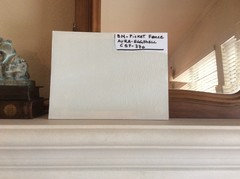
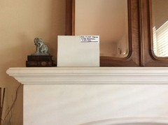
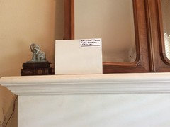
- PRO10 years agoThe third photo on far right I turned spot light on and with that light it gets warmer. I want to get second coat on, but I am liking it.
T L
Original Author10 years agopuremichigan60 The color specialists wouldn't come this far, sadly. Thank you for the encouragement! Flo Mangan shared the specifics of Picket Fence, which was nice. How would you describe it's undertone? Our a space seems to give a green-blue glow from the "nature" outside? I love many photos I see with greys and calm colors, but at the same time, i don't want our home to be gloomy.
Our flooring is going to be a rustic cherry- meaning it is not a dark cherry, rather and light to medium with tones of (subtle) red- orange. And our lighting will be (the name escapes me right now!) the warm bulbs, not the hospital white. We have planned on simple light fixtures hanging and also ceiling fans (have to throw some practicality in there, even if it supersedes my design preferences- haha) Haven't chosen fan colors, b/c I don't know if I want them to blend with the ceiling or stand out (opinions welcome)- either way they will be simple and not ornate. Since we will have a great deal of railing, I am thinking of something like this:
I also like the cable railing, in some photos, but it would be a ladder from the little ones. I just noticed the photo above actually shows a similar flooring to ours as well as a similar texture to our walls- which we are currently finishing up. We also have two segmental arches like this one, too. One thing we don't have- that natural light source.
T L
Original Author10 years agoFlo Mangan Oh, I'm liking that from the photos, at least! Yes, love those ideas. I'm right with you on the upper and lower cabinets. I will think on that some more. We are having a long center island in the kitchen area- what about a different tone/color on that than the surrounding lower cabinets? For a pop, but not too crazy? 4 kids- moving frequently? Lord bless you!
T L
Original Author10 years agoDo you know the color of the wall behind the sample, to get an idea of how light this is?
- PRO10 years agoIn my concept of layered whites, this photo kind of captures it. Medium gray island in kitchen, notice the medium honey floors (I think this is what you mean on floors?) and white cabinets with off white to a greyish walls. Some texture with some brick off to the far right wall, stainless hood and lighting fixture, etc. What do you think of this look? In answer to your question on the "undertones", it is illusive. Which is good. I need to get that second coat on and put it in different lights, but I think it might be one of those colors that picks up the colors around it as it blends in. I have a client that I think is going to love this. Anyway, in talking about the "layered whites", of course, with a large family, you have to use fabrics and finishes that work well with that dynamic. I understand. But slipcovers are great and I'm sure by now you have your own "tricks". I will post pictures when second coat dries and I can get pics in different lights. It is cloudy and raining here today, so not much natural light. Is this helping??
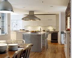 Winchester Kitchen · More Info
 - PRO10 years ago
Yes, the color of the wall behind is SW Croissant. It is light beige/gold. Looks more gold/yellow in pics but in our light, it is more subdued. Like I say, iPhone pictures aren't color perfect. I definitely think though if you want light color that changes with light and your angles, this color could be winner. Of course, on the cost front, if you can get a sample board done, you can "match" it fairly closely. I have an Eagle eye, so with your artistic abilities, you might not like the "match". However, another option might be to use the Aura in the main areas, then go to the "match" in other areas? That would help defer costs. That Aura paint is amazing stuff. Should be! But I like Behr and Sherwin Williams better paints as well, so cost/benefit is important.
- PRO10 years ago
puremichigan60 (I'm a Michigander in my youth!) - Picket Fence is not muddy to my eye at all. It is much "clearer" color. See what you think. I would be interested in your eye. There is no Red Oxide in the Picket Fence, which RP has and that is what gives the muddy look.
T L
Original Author10 years agoYes, it is helping. we like stainless and wood together also. (this house is in the country, but I'm from the suburbs of K.C.. In this area, cowboy ranch/rustic is kind of the norm. Looks fine, but not for me. I am more industrial/rustic, if that is a thing. But we won't have neighbors, so we won't clash.) Can you tell me what you think of the a long kitchen island being a deep color (maybe avalon- not avaon teal - or carribean teal) while the surrounding lower cabinets are a more muted grey tone that blends with it well? We will not have as many upper cabinets- but definately thinking a white of some nature, like you said. Maybe I can tie the colors into a large rug in the living room area or curtains? It's ok, you can admit if I'm making your headache worse.
T L
Original Author10 years agoSo, who do you think matches colors well? Home depot has Behr, right? Which Behr do you like? Premium Plus Ultra? Is it best to give them the formula to match it?
 PRO10 years ago
Don't worry about white paint. Use Benjamin Moore Regal. Washes well. You will still see fingerprints on Revere Pewter.
I vote for all white.
T L thanked JudyG Designs- PRO10 years agoBehr is from Home Depot. They all have access to formulas these days, but it gets back to the base white they use.
 10 years agoI think it all needs to be painted the same color. When there are slot of angles like that and the ceilings are different that the walls it ends up looking very choppy and abstract!! Revere pewter is light enough to do it all the same color and continue it into the hall and ceiling upstairs as well.. If done white, that would be a lot of white!! The color would looks best in my opinion, since it's a light color..T L thanked Tammy Lawhorn
- PRO10 years agoSecond coat on. I see a slight sage green undertone. The sofa is off white to a very light beige. At a distance it looks whiteish. I put a plain white board next to it to give u depth of color. I looked at your Caribbean teal and while I like it, it would be a bit harder to blend other elements. If u want cooler gray tone then I need to go back to the drawing board. Revere Pewter has a good bit of color. Let me think on it a bit. But, Picket Fence is a great color, just not quite right at least in my light. Of course, we have the low-e glass in double pane Windows and that tends to make things go a little green too. More thoughts later.
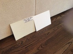
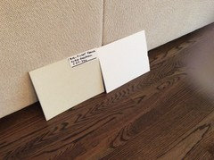
T L
Original Author10 years agopuremichigan60 You are thinking PF will also be too muddy for this project? If not, do you have any advice on matching it to avoid the $70/gallon price?
T L
Original Author10 years agoFlo Mangan No, I'm sorry if I said I want a cool grey. I think I just don't know all the right designer language.
- PRO10 years agoDo you mean kind of like this? With Caribbean type island base color? If you go in this direction, then the cabinets and walls needs to be pretty white like in this picture, and then your floors? Tile or wood? Wood like you mentioned would look something like this. They repeated the wood on the island countertop.
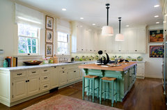 Hancock Park Residence · More Info
 - PRO10 years ago
No problem. Just a little clarification. Hard to communicate on these forums because there is so much to say! lol I think a color that is a bit warmer in your space would be pleasing, but grays (cooler color) are all the rage. I just don't know if I would tire of it. Keep thinking about the "other elements" and then perhaps we can come back to the paint color.
- PRO10 years ago
NOTE - puremichigan 60 - might want to call the BM store first. Mine doesn't carry the samples because of the cost. They didn't have color strips either. That is one reason why I bought the sample can. Just wanted to save you a trip if you were looking for that color in your store.
T L
Original Author10 years agoTammy Lawhorn abstract is a good description of our interior :) I think your'e right- all one color will put a little less emphasis on that, thank you. Flo Mangan sort of like that -the color is very different and the whole thing not really the style we're going for. But, the island being a different color- yes, that is what I'm meaning. I see what you mean about the other cabinets being white.
- PRO10 years agoOk I have cleared my color brain and offer the following:
Safest light beige with grey undertones-SW 7036-Accessible Beige - warm and kind of goes with anything.
Soft gray - SW-7029 Agreeable Gray. These two colors can be used in adjoining spaces too.
Grays in BM - Grey Owl -OC-52;
BM - Classic Gray - OC-23
More white-BM-Simply White. OC-117
Depending on how you want your color palette to go these are good choices. I think since you don't have all your finishes (flooring, cabinets etc) selected yet, my safe color is SW 7036 Accessible Beige. If you can get a idea book together with pictures of things you like this will show you trends on which colors and intensities you are drawn to. You are playing catch up for sure, but trust your gut. You have color sense with your artist flair, so trust yourself. Wishing you the best.T L thanked Flo Mangan - PRO10 years ago
That's what I said! lol Wow. If true match with Glidden, that would be worth getting a sample if it is more readily available to you than a 2 hour round trip drive. I think it might be worth getting a sample and trying it out in your light. The light of the home is very pivotal, as you have discovered. So, hope you can find best color for you and what you have pictured in your mind with all the inputs you have.
 PRO10 years agoi would go with a white ceiling and take advantage of the open space.
- PRO
 10 years agoBeautiful house!!!! You'll enjoy it so much. My parents designed and self-built a house with similar ceilings with lots of corners and angles. They did them white but not sure which one. They did the walls two different shades of sage. It looks beautiful. Your ceilings will look amazing. Do not doubt that you can do the rest yourself and trust your gut. Look what you did already!!! The only caution I guess is to remind that sometimes it's better to try a bit than total commitment. Choose the paint and buy one can and start in one place in one room. If you don't like it that's easier to fix than if you bought 10 cans and did the whole thing and then dislike it. Too expensive and time consuming. Also it can be a reasonable price and very helpful to hire a designer for 2 hours. Choose what you love and brings you joy. Post an update. Can't wait to see this gorgeous space and what you do with it.
T L
Original Author10 years agopuremichigan60 Nice! Silly question- is Glidden's quality going to be good? Would I want to paint the walls with it, or just get a sample of it? Do you still think it will be too muddy for my project?
T L
Original Author10 years agoJackie S I think that is just what I'll do. I want Ballet White (BM) for one of the bedrooms, for sure. I can get enough to do that and go from there. Thanks for the encouraging words, too. Yes, hiring a designer for wisdom, advice and a plan is a good idea- I'm going to see if I can work it out.
- PRO10 years agoIt is 10:15pm and this sample has taken on blue notes! Picket Fence is a wild color. Earlier, around 6 at twilight, it was decidedly gray. Kind of interesting. So, T L if you want color that remains basically the same this is not for you. But if you want one paint color that looks different in different rooms might be great! Let us know. I am am very curious now how this looks in your spaces.
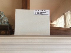
T L
Original Author10 years agoI see what you're saying! Ok, I'll have to get a sample and try it out. What do you think it will do in a space that sort of glows with blueish-greenish natural light, but uses warm light bulbs?
T L
Original Author10 years agoWell, strangely, it is in the south/ southwest facing rooms at certain times of the day- I read that houses surrounded by nature may get that from the trees and greenery. I don't know if that's it. Any bulbs we already have in are warm lights.
- PRO10 years agoWe have lots of trees and a stand of Giant Timber Bamboo in the yard outside the room I took pictures from. I can't say for sure how it would react in your space. You just have to experiment yourself I believe. But I think my input supports the info pure mich 60 provided. This paint changes look in different lights more than the average paint.
- 10 years agoT L - to you, and others buying paint to sample. You've probably already heard it, but just in case - buy a quart size, at least, mixed to order.
Do not count on the pre made samples or smaller samples, especially in the lighter colors. I've been told by BM, SW and others that the colors/tints don't get dispersed well in a small container. From much experience, this has been true for me.
Also, buy in the exact finish you want. Don't buy eggshell samples if you want matte.
TL - I love the big voluminous, angled feel of your house! My last house was like that and I loved it. No white ceilings but did use a lighter tint in a couple flat ceiling rooms.
Have fun in your new home! - PRO10 years agolast modified: 10 years ago
Jumping in again...this is my professional and personal experience with rooms similar to yours...not only do you have different angles, you have "drop boxes", too.
In that situation, I recommend all one color. My basement, for instance, has lots of drop boxes, and trimmed out support beams. I chose one color for everything and it is dark BM Racoon Hollow. You don't notice all the discrepancies as much.
I am doing work for a client (new construction) with lots of angles...just one color here, as well.
If you do more than one color...imagine....one color has to meet the other and each time they meet there is a line. I can't photo shop, but if I printed out your pictures, took a pen to every spot the paint colors would meet...it would be a room full of lines. Like a rubix cube.

Tell me about the natural light...from what direction do you get the most?
I think I have one idea....where the staging is in your last picture....painting that flat ceiling a color. Then that color can be inspiration for fabrics or rugs, whatever, in the front room.
Something like this:
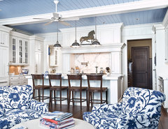 Wm Ohs Hampton Classics · More Info
 - PRO10 years agolast modified: 10 years agoI think your house will be great! And all those angles are going to turn out to be very dramatic and interesting.
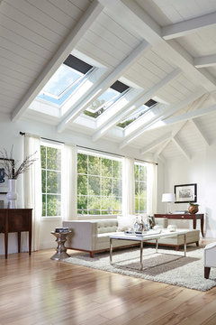 Skylights create a bright and fresh living environment · More Info
 - PRO10 years ago
I agree with Judy G, with the angles will provide great "interest" one color will do the trick. The "light" in the space with cast various shadows and architectural detail. More color not needed. You will add color in art work, accents, pops of color. Color on your ceiling I would not recommend, since it will add to the "eye confusion" That would create a "line" between vertical planes and ceiling all around the space. Also drive painters nuts! lol Just go with one color, with possible "eggshell" finishes in areas you want more "kid" durable. But in main areas, finish flat. Flat also hides sheetrock/mud problems or texture issues.
T L
Original Author10 years agoJudyG Designs Thanks for sharing. That blue ceiling is pretty. Not sure exactly which ceiling you are thinking of. Is it what I call our "bridge" that goes from one side of the second floor to the other?
In the very second picture I posted, the area just to the left of the four folding chairs is the dining area. The first picture attached is a better view of that dining area (also, you can see the "bridge" in the upper left corner):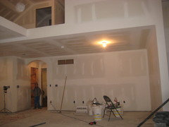
This one is taken from inside that dining area:
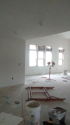
Is that what you are thinking could have a color on the ceiling? There is not natural lighting in that area. The windows you see are facing south and a little west. they give the most light in this large area. There are also some windows opposite those on the north wall.
T L
Original Author10 years agopuremichigan60 Do you see the arch where the boy is standing? One side ends at a wall perpendicular to it. In painting this area, I am scratching my head where I would end the color. Do you have any ideas?
In another moment of wild ideas, I was thinking of painting the dining room ceiling and short wall the same color, leaving that back wall (connected to the arch) the overall neutral of choice. Too crazy? 10 years agoDon't know if you changed your mind about Revere pewter, but I don't think half formula is dark at all. I have a 8' living room ceiling painted full strength revere pewter and it doesn't feel dark. I plan on painting my walls the same. IMO...you def need to do all one color.T L thanked Sandybean
 9 years agoWe are building ourselves as well and designing ourselves. Our home has angled ceilings like yours and I am unsure of paint colors. Could you tell me which color you decided on and post a picture. :)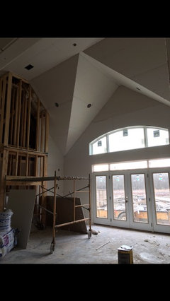
T L
Original Author9 years agoCarrie Johnson- That house looks so neat! I have been through so many paint color ideas and samples, I could never count. I finally chose (Sherwin Williams) Shoji White for the ceiling and walls; Colannade Gray for other walls. Shoiji is a creamy white (yet, with a touch of gray). I kept second guessing it b/c grays look so crisp with white and not so with cream. Anyway, I do like it a lot. It warms up and softens the atmosphere. I also did a not-so-noticeable wall with Sea Salt. And for window trim (and maybe upper kitchen cabinets)- Greek Villa. I decided we will put wainscoting on some high traffic areas and paint them Dovetail (and maybe lower kitchen cabinets). I'm so sorry I don't have pictures right now, maybe I can work on that soon. One word of advice: When I would paint a sample board here at our current house, then take it out to the new house, it would look very different. For example- what looks blue here, looks greener out there. Pinterest! Have fun and once you choose- you'll be relieved you did it!



Katie Truax