

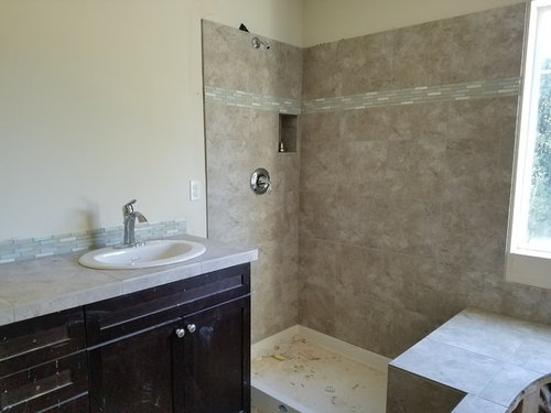
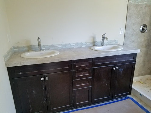
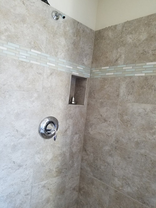
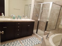
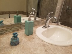
bad backsplash?
10 years ago
Featured Answer
Sort by:Oldest
Comments (16)
 10 years ago
Related Professionals
Hays Interior Designers & Decorators · Cape Girardeau Interior Designers & Decorators · Hannibal Interior Designers & Decorators · Natchez Interior Designers & Decorators · Olean Interior Designers & Decorators · Utica Interior Designers & Decorators · Erie Interior Designers & Decorators · Magog Interior Designers & Decorators · Sarnia Interior Designers & Decorators · Florence Architects & Building Designers · Concord Architects & Building Designers · Newark Architects & Building Designers · Petersburg Kitchen & Bathroom Designers · Concord Kitchen & Bathroom Designers · San Angelo Kitchen & Bathroom Designers- 10 years ago
- 10 years ago
 PRO10 years ago
 10 years ago
 10 years ago
- 10 years ago



Related Stories
WINDOW TREATMENTS6 Ways to Deal With a Bad View Out the Window
You can come out from behind the closed curtains now. These strategies let in the light while blocking the ugly
Full Story
KITCHEN DESIGNHow to Add a Kitchen Backsplash
Great project: Install glass, tile or another decorative material for a gorgeous and protective backsplash
Full Story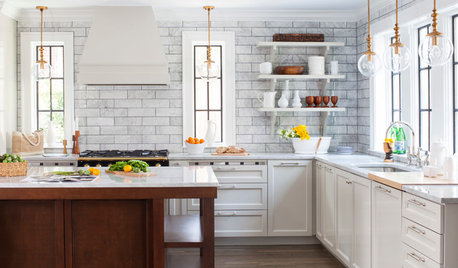
KITCHEN DESIGN7 Magnificent Oversize Backsplashes
They go up to the ceiling and don’t fall short on making a major impact. Are you ready to hop on the big-backsplash bandwagon?
Full Story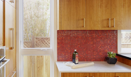
KITCHEN DESIGNKitchen Color: 15 Ravishing Red Backsplashes
Bring some zing to your kitchen with a backsplash of ruby-colored tiles or back-painted glass
Full Story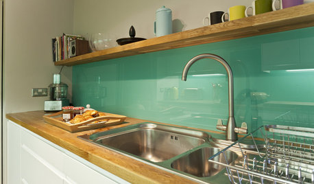
KITCHEN DESIGNHow to Pick a Kitchen Backsplash That Wows
Design your ideal backsplash with help from these Houzz guides and inspiring ideas for every kitchen style
Full Story
COLORKitchen Color: 15 Beautiful Blue Backsplashes
Blue is the new cool kid on the backsplash block, showing up in shades from pale ice to cobalt
Full Story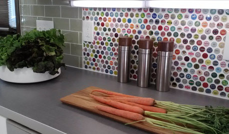
KITCHEN BACKSPLASHES15 Creative Kitchen Backsplashes for the Adventurous
Consider using snow skis, mirrors, bottle caps and other unusual materials for your next kitchen backsplash
Full Story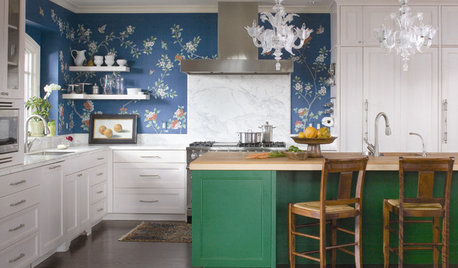
KITCHEN DESIGNTry a Shorter Kitchen Backsplash for Budget-Friendly Style
Shave costs on a kitchen remodel with a pared-down backsplash in one of these great materials
Full Story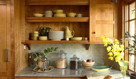
KITCHEN BACKSPLASHESHow to Choose a Backsplash for Your Granite Counters
If you’ve fallen for a gorgeous slab, pair it with a backsplash material that will show it at its best
Full Story
MATERIALSKitchen Ideas: How to Choose the Perfect Backsplash
Backsplashes not only protect your walls, they also add color, pattern and texture. Find out which material is right for you
Full Story



C F