Software
Houzz Logo Print
niamh_mccartney

Accepting you have made a mistake

10 years ago

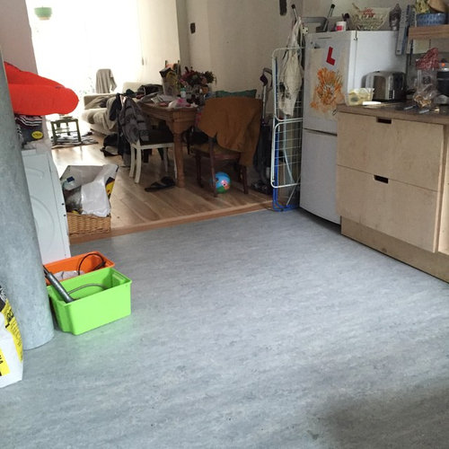
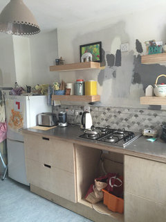
I think everyone feels like this when renovating, right?? That rush/panic to finish something because you can't stand walking on dust anymore, or the slow creeping denial of the fact that the expensive floors you put down are not the colour you want and that they are way bluer than the sample....

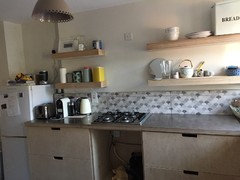
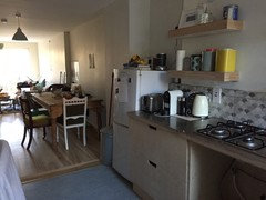
Trying not to admit it, but I can't pretend anymore. I don't love my kitchen! It's not meant to have a blue floor. It was meant to be light grey.

I can't justify or afford to redo it. My partner suggested painting the Marmoleum but I'm hesitant to do anymore. So I'm just going to sit here and wallow for a minute.

We haven't painted the walls yet so I guess that can make a big difference. Was going for light/dark grey with birch ply industrial feel/scheme but the floors have totally thrown me now :-(

Are they awful?? :-(

Comments (45)

  • 10 years ago
    Ps excuse the clutter
  • 10 years ago

    I would not paint the marmoleum. Gray very frequently reads a little blue. It looks fine in pictures; it is just not what you were expecting. Renovations are super stressful, and you second guess every decision you make. I would live with it for awhile. After a few months, you will probably hardly notice the finishes in the kitchen because you get so busy with the rest of live. Plus, it will give you an excuse to change the flooring in a few years when trends change.

  • 10 years ago
    I think when I have cleaned, painted and finished the kitchen cabinet properly and it in my proper wish list appliances (instead of these second hand placeholders that don't even work properly) I might feel better. Also, by the turn that happens as you say it might be time for a change anyway.

    I'm just learning that things never really turn out the way you saw them in your minds eye.

    I realise this is a major 'first world problem' too. The floors were so disgusting and unsanitary before so I should just be happy for good quality flooring underfoot really.

    I feel better now for writing this down
  • 10 years ago
    Sorry you're not loving the result of your planning. I think it look great! It's so refreshing to see a kitchen floor without grout, grooves or seams for a change. Besides updating the appliances, are you planning on painting the cabinets or changing countertops? Maybe more pictures of the rest of the space will give the Pros here ideas for the perfect paint colors to tie it all together.
  • 10 years ago
    Was going to treat the cabinets with lye and a top layer of osmo oil (raw) to keep the natural look of birch. The countertops are stainless steel and I like them. Will put up some pics when I have the cabinets done, hopefully getting time to do that next weekend. Also fitting an integrated dishwasher with birch ply cover and a matching floor to ceiling cabinet to hide the washer dryer, with a two seater bench with storage underneath to make up for our lack of hallway.

    Hopefully this will help.

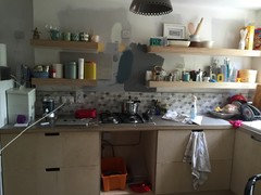
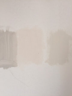
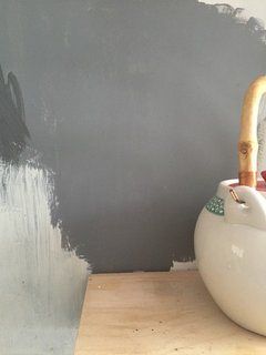
    Was going to do a feature wall behind then shelves of a colour called Grey wolf which is quite similar to farrow and ball moles breath...to pick up on the dark grey in splashback....and the rest of the room I wanted very light warm grey but my partner thinks we should go with Colortrend 'dairy parlour' which is off white, with the very slightest hint of pink/peach to it.
  • 10 years ago
    I love the look you are going for! Yes please do post more pics as other finishes will play into this. It's a little blue but it doesn't look bad (just maybe not what you expected). Greys are hard especially if you were working w small samples. What will your counters and backsplash be w the plywood cabs? Chilewich makes great really thin kitchen friendly rugs that go w your vibe and could bring in more of that true grey tone you want. Don't stress! All will be fine! And I love marmoleum as a product - great selection!
  • 10 years ago
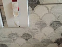
    Splashback and counter top is stainless steel which I'm happy with
  • 10 years ago
    I think you were posting while I was so now I see your other finishes....do you have more pics of the grey backsplash? Is it a done deal? I am a little leery of too much grey w your floors. I think the off white is the better direction but paint big sample areas to see the tones together.
  • 10 years ago
    I think the color of the floors looks fine as is as well! Try to do sample boards before painting so you can make sure the color you pick doesn't accidentally make the floor look bluer. Do you have inspiration pics you can share?
  • 10 years ago
    Love it so far! Ty for those pics....yes, definitely no more grey! Everything will come together fine w a white tone that comes from the backsplash. Is the splash done? Going any higher w it?
  • 10 years ago
    Oh I like that back splash a lot and love the stainless tops!
  • 10 years ago
    Would you get a shot a little farther back so we see the floor w the cabs and back splash?
  • 10 years ago
    I am leaning towards no more grey on the walls and stick w a warm chalk white that works w your backsplash.
  • 10 years ago
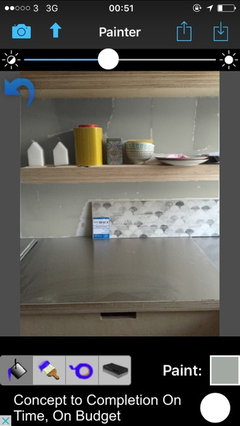
    Looks good! I think a contrast for paint color would be good so either the white or one of the dark colors. Is that a piece of the flooring on the shelf? If not is it possible to get a pic including floor and paint samples?
  • 10 years ago
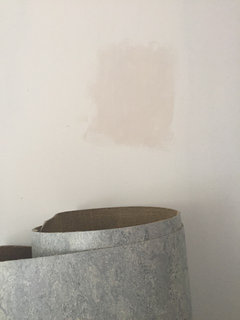
    The middle paint sample is dairy parlour - tried to take one next to spare flooring it looks more peachy in real life. The dark grey is behind the shelf but may do away with the feature wall idea. Will try add some better pics later!
  • PRO
    10 years ago
    last modified: 10 years ago

    I have seen some god-awful colors/materials used in beautiful spaces that fit in very well. It may be worth your while to engage a local design professional that can physically stand in the space and see the colors/materials to make recommendations to make it all come together. It is difficult selecting colors off a computer screen.

  • 10 years ago
    last modified: 10 years ago

    Splash is done. Was another 'learning curve' didn't have budget for full wall and thought it might be too busy. Two rows interfered with the line of the shelving. One row looked odd.Then the tiler cut one of the tiles and sort of forced a decision, so we opted to make the line meet the end of the cabinetry, and come just above the top of the plug sockets, and carried across to make a sort of 'nook' for my cookbooks. He managed to match up the pattern almost exactly in fairness to him! I could buy more of the tiles and do the whole wall but the cost is prohibitive and I think too busy anyway.

  • 10 years ago

    I think the floor looks great, I love the cabinets too! I think you may end up liking it. Sometimes it takes a few days even weeks to get used to things. I think it looks sophisticated and collected.

  • 10 years ago
    Please excuse the array of paint sample patches on wall as my partner got carried away making his modern art :-o

    Will probably add stainless steel kick board over the ply ( as it got destroyed already by my son playing soccer in the kitchen)
  • 10 years ago
    You have all made me feel a lot better this morning. Thank you. May employ a design pro Mark, if I can't figure it out. My partner is a painter decorator but we don't always see eye to eye on these things so that might be the best way forward
  • PRO
    10 years ago

    You are at the point where you start to doubt decisions. Don't let it upset you, you aren't finished yet.

  • 10 years ago
    My last 2 cents....the peachy off white is way too peachy and may bring out even more blue in your floor. Try all samples down low by the floor as well as by the backsplash so you can see all relationships. I am still seeing a clean clear chalk white. It's going to be a nice kitchen!
    peony grace thanked thinkdesignlive
  • 10 years ago

    I like the floor. Anything new and different takes a while to get used to. I'd just make sure the paint you choose doesn't bring out the blueness. Grey's are tough to get right. Been there myself.

    peony grace thanked wantsideas
  • 10 years ago
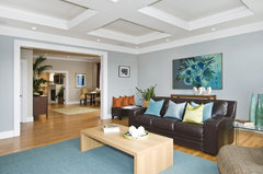
    I'm no pro but this photo reminded me of your color pallet with the blue rug and birch table. The grey on the walls is Benjamin Moore Coventry Grey which seems to have a hint of blue. Maybe something to try?

    Commodore House · More Info
  • 10 years ago
    last modified: 10 years ago

    @edwards4four - chalky white makes so much sense. I'm so glad I posted this because I guess I am still 'attached' to my original greys but I am seeing that I need to totally revisit the palette now with this floor. Chalky is ideal. Thank you! I think I will repaint the wall 'brilliant white' and start from scratch with my samples once I have cleaned up the birch ply!

    Also, we have plans to get an integrated fridge there, or at least a nicer fridge (like a SMEG or some form of stainless steel tall fridge) eventually, and I think the height of that / integrated cabinetry will help tie the kitchen together. Will have matching birch ply to cover the washer/dryer on the left, as well as a cute shelf/bench for 2 x cushions to sit on, with under-storage boxes for shoes etc.

    Originally I was going for Scandi flooring so asked for the ash to be whitewashed but it didn't really work. Going to revisit when I can make mental space for this task of re-washing and oiling the floor. Maybe a more whitewashed floor would also blend better with this blue marmoleum-chalkywhite kitchen :D

    Thanks again folks you have cheered me up, I had aproper reno-depression this AM!

  • 10 years ago
    I thought the picture with the kid with his/her head in a basket was how you felt about renovating. That's about how I feel sometimes! Try reading Maria Killiam's blog on color and undertones. I think that is how her name is spelled. She's helped me tons. You're mixing blue grey floors with warmer tile and walls. Maybe green grey or griege with green.
    peony grace thanked leemiller
  • 10 years ago

    when I married and moved into my husbands house he had painted the living room/kitchen yellow. I had him paint it gray matching a color from my sofa. he painted a small square, larger, then a whole wall. the yellow just made the whole room look purple. thought I made a major mistake on the color. but had him finish the room. until it was complete with furniture I couldn't see beyond the purple. the color was perfect when everything was in place and didn't look purple at all.

    maybe you have to finish the room, step back and live with it for a while. but sometimes you need to work with what you have. I know that flooring isn't cheap. I always say to work with the most expensive thing to replace in a room even it its something you really don't care for. bringing in things you do like that compliment it instead of fighting with it, somehow diminishes or camouflages it. its part of the whole not a piece on its own.

    bring a piece of the flooring and some of the backsplash with when you look for wall color. you'll eliminate some colors before you bring them home. ask for advice from the paint shop. there are so many colors to choose from. (I really didn't see the blue in it until the last picture you posted. maybe bring in more blue in accessaries, it looks like you already have a few. a pattern in curtains, art or seat cushions?

  • 10 years ago

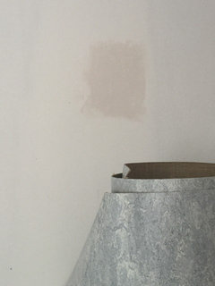
    more on this. Exploring the chalky white idea...have a colour called 'Oyster Bed' up now, will add a pic tomorrow. Any more suggestions for a chalky white colour that would work? Was looking at Wimborne White F&B (Not necessarily chalky but a nice white). Dulux apparently do a 'Chalky White' but I can't find it anywhere. Accessible paint colours here are Dulux, F&B, Little Greene and Johnstones. Any ideas welcome!


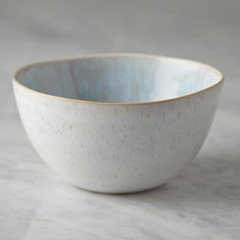
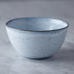
    Also...I have been eyeing up this serving ware for a LONG time. It comes with cups, plates and bowls.

    I can't decide on a colour. What do you think? (Assuming walls are some variation of white?)


  • 10 years ago
    last modified: 10 years ago

    chalky is a nice color but you don't want a flat paint in a kitchen.

    I like the first one easier to use with any color if you move or change your decor. blue is pretty but the creamy one is timeless. I love color but my dishes are white and so are my sheets now. don't have to buy new except when they wear out, they always work.

  • 10 years ago
    The blueish ceramic might make your floor look more intentional and tied in? As for chalk white look at Benjamin Moore Cotton Balls, Simply White, Acadia White or Pratt and Lambert Seed Pearl. Sherwin Williams Snowbound is a bit greyer but might work. Just grab as much as you can get sample card wise and then narrow down to 2 to get sample paint to paint on walls.
  • 10 years ago
    Although I do love the first whiter ceramic personally. It's a hard call. Would you ever mix and do half and half? Decisions decisions....
  • 10 years ago
    I like the greenish blue tone of the interior of the white one. Are you thinking recycled glass for glassware or clear glass? Recycled glass will prob look better w the first one. I'd look at your glassware w it to see what jives.
  • 10 years ago

    The floor looks great to me....hopefully it will to you too, before long.

  • 9 years ago
    Just thought I'd update - went with light colour on the walls - Dulux 'true fiction' and quite happy with it. Looking forward to installing my oven and hood next week...then all we need is an integrated dishwasher and to get the carpenter back in to build a cupboard around our washing machine with a little bench next to it, and the kitchen is complete
  • 9 years ago

    I'm redoing a one hundred year old cottage and if there isn't usable wood under the faux wood in the kitchen that I can refinish, I'm thinking about using Marmoleum. How is it to live with in the kitchen? Is it durable? I have read it is a very green choice, and I think it would fit in the tiny kitchen better than the modern choices, such as tile.

  • 9 years ago
    It looks nice! Thank you for the update!
  • 9 years ago
    I really really like marmoleum as a material and find it super easy to clean. One thing I'd suggest is be sure to get the largest sample possible as mine looked different than the smaller square I saw and I was a bit shocked at first. Also my neighbour put down some marmoleum and the finish was quite rough, so much harder to clean. I'm not certain it was marmoleum perhaps a similar product? Just be sure the surface on yours is suitable.
  • 9 years ago
    I like the first (cream) bowl. Your kitchen looks lovely. We just finished painting our kitchen , dining and living room very light grey and I thought I made a mistake. It looks almost white in the day, blue grey, lavender grey, and real grey in the evening, different on different walls! At first I wanted to repaint, but now, a week later I quite like it.
  • 9 years ago

    Thanks for the info. on Marmoleum. I'm trying to make the most charming kitchen I can within a limited budget and a space that doesn't allow for a wall to come down to open up the area. Just bought a vintage set of metal cabinets that I am anxious to put up.

    I'm glad you went with the light color. It looks great. My house was a color disaster decorated by a woman who was a self-described visionary of color. The house just seems to breathe a little easier as I replace all the harsh colors (red, raspberries, lime green - yes all in one little house) with ones that bring light into this traditional home.

  • 9 years ago

    I really like the wall color you chose. It looks so much nicer than some that you sampled.

  • 9 years ago
    Dancechris123 I would love to see pics of your house it sounds interesting. Yikes, visionary of colour - intrigued!!!

    The other thing I love about marmoleum is that it was not too costly and relatively easy to install. My fitter did a good job of trying to level my really awful sub floor and he graded it upwards so it met the wood floors. It is perceptible but marmoleum followed the floor perfectly so there was no warping or lumping so I think it's a great choice for wonky sub floors and more durable than cork flooring.

    Plus the wide range of colour choices!! I love the 'petrol' colour which I saw in a friends kitchen. They also do click tile options!
  • 9 years ago

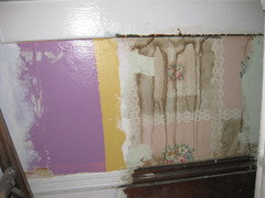
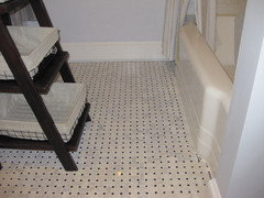
    Wonky is a good way to describe my house. Nothing is plumb or straight and that is ok. The main floor bedroom was painted bold yellow and raspberry strips. Below is a picture showing the strips and the wallpaper underneath the stripes. The ceiling was swirls of what looked like spackling compound put on by several non-professionals in various moods so the swirls were individual expressions from each helper - had to have new drywall put in over that to cover the uneven application. (By the way the new bedroom has a mistake I made that I have yet to think of a solution The downstairs bathroom was lime green with a big brown stain in the ceiling in the ceiling tiles put up in the 1940s. This isn't a great photo of the new bathroom, but it shows that the tub was turned the other direction to add 5 feet of length to the bathroom, the 1940s tub was re-enameled, a Carrera marble tile floor was put in, the lime green paint was traded in for a soft blue-grey. The living room was painted with tan and white checkerboard - again applied by the homeowner who had left the tape on the walls too long so there was adhesive all over the walls and bleed lines on the checkerboard. The dining room looked like two colors (orange and brown) had been mixed together. The hallway in the basement was green board with silver arts and crafts paint used for hand-painted squiggle design. Most of the house had ceiling tile from the 40s covering the plaster ceilings. The kitchen is currently being re-done the red walls will be repaired and this weekend the fake wood cabinets are being replaced with vintage metal kitchen cabinets.


  • 9 years ago
    Que faire, je ne peux accèder à mes "sauvegardés"
  • 9 years ago

    I love the color! it creates a visual harmony that allows you to then add depth and detail to the rest of the room. I have found when renovating, which we have had to do a bit at a time due to cost/my husband's time - that when we finish one individual piece, we get that sinking feeling. Uh oh, this isn't what we envisioned. That is just the creative process! Inspiration, planning, implementation and then that moment of bridging reality with inspiration. We find that after a bit of time, our gut instincts for our space were right on. And we have found that we can't really make a judgement until we see how the space as a whole space works. You have a great base in that floor. You have classic, clean taste and whatever you choose is going to work to pull together your space as a whole. As you can see from the comments, there are a hundred different directions it gets you going in. I love that you share your qualms and it is not all perfect and done up like fairies came in the middle of the night and waved a wand. It is inspiring for me in my projects! Thanks!