Software
Houzz Logo Print
dnkln2005

Update to floor stains

9 years ago
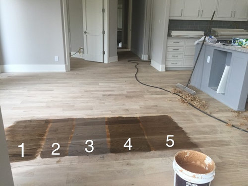
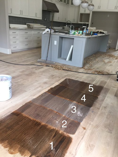
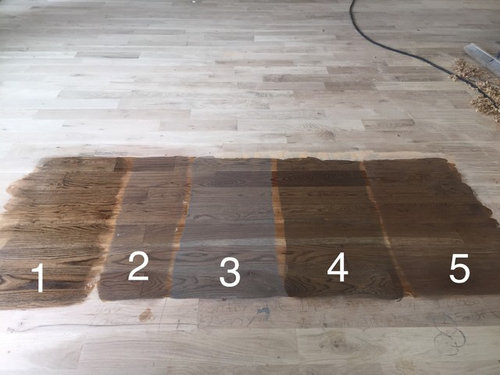
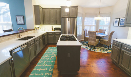
I took everyone's advice and asked for a polyurethane coat on the floor stain samples. I'm still liking both #1 & #4. I included some pictures of my kitchen for an idea on paint color. My style is more transitional and we have a lot of gray paint in the house with lots of natural light from windows.

Thank you for any input or advice!

Comments (17)

  • 9 years ago

    They look so different with the coat of poly on them, don't they? I still like #1 but it really highlights the grain of the wood, so you need to decide if that is what you want. I think #4 is too dark now. I like #5 (I thought it was too pink before, but the poly toned it down nicely).

    dnkln2005 thanked izeve
  • 9 years ago
    I don't like 1. My vote would be 2 or 3. 3 is more contemporary. 2 will match very well with plenty of wood.
    dnkln2005 thanked Steven
  • 9 years ago

    On my monitor, 2 looks like it would blend the best - 1 shows lots of wood grain, so if you like that look it is a possibility...3, 4, and 5 are not in the running for me.


    dnkln2005 thanked Sammie J
  • PRO
    9 years ago

    So here are some concerns I have...the wall colours and back splash would do very well with #2. The problem is the ISLAND is very blue and would work best with #3...But here is the fun part - #3 will clash with your wall colours. And #2 will clash with your island.

    Which means we are down to numbers 1, 4, and 5. Sigh. I prefer a lighter floor so #1 is my winner...but it doesn't quite have the tones needed to pull off the whole thing.

    The clash of undertones with the walls vs. island will limit you - severely. I am going to guess that #5 will offer a better colour than #4 (I'm still seeing some undertone clash with #4 and the island).

    If you want light gray...go with #2 and "live with" or "ignore" the island clash. The rest of the home will look very handsome with #2. The wall colours are meant to go with #2....but your island may bug you for several years before you throw up your hands and strip it all down to "natural" and just live with it.

    dnkln2005 thanked Cancork Floor Inc.
  • 9 years ago
    I like 1. It shows off the wood grains beautifully.
    dnkln2005 thanked Emily Jowers
  • 9 years ago
    I don't think number 1 clashes with anything that I can see. I agree some of the others don't go well with certain aspects of the rest of the home. I personally love seeing the wood grain and it adds a lot of warmth to all the gray and white, but that's my own personal preference.
    dnkln2005 thanked Emily Jowers
  • 9 years ago

    Oh man, now I realize perhaps my choice in paint colors weren't so great after all...this is more harder than I thought since all our home is wood floors except bathrooms...will have to sleep on this before deciding...


    Thank you you eveyone for your input!

  • 9 years ago
    I like #1.
    dnkln2005 thanked shars55
  • 9 years ago

    You have fun options. Let's narrow it down. First what does your countertop look like? Does it have a lot of movement? If so, don't go with a floor color that shows a lot of grain. It will look too busy. #1, as lovely as it is will make the entire floor look very busy. #3 is lovely, but to close in color to your island so I'd eliminate #3 altogether. #2 is still a contender, but could be too much permanent gray to your home. If you're like me, I like the mix of brown and gray. So that leaves me torn between #4 and #5. Between those 2, I like #5. While it still shows the wood grain, it minimizes the variances between the shades inherent in your wood floor. I have learned by experience, you can always add excitement and interest with rugs/paintings decor. You can't calm a busy looking floor. Try to visualize how all that wood grain will appear once it's everywhere in your beautiful open space. Good luck. To be honest, you can't make a big mistake with any of the options you have presented. Good Luck!


    dnkln2005 thanked Barbara Almandarz
  • 9 years ago

    Don't worry that your walls and island colors appear different. You will have other pieces of furniture, area rugs and decor that will help blend what you already have selected. Right now you are focusing on things that will have separation in the final room.


    dnkln2005 thanked Barbara Almandarz
  • 9 years ago
    1!! Will add warmth to the room and go beautifully with the cooler tones of the kitchen
    dnkln2005 thanked al Colasante
  • 9 years ago

    Seriously - you will have no worries no matter which floor stain you pick (well, maybe except #3). Your walls, backsplash, island, and cabinets will all blend into the background and your furnishings, artwork, and accessories will take the stage. You have set a beautiful backdrop for your "things"! Please repost updates once it is all finished.

    dnkln2005 thanked Sammie J
  • 9 years ago

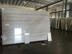
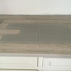
    Thanks for your kind help! Here are my counter top and backsplash. Backsplash is gray glass and counter is White Macaubas. Will post with pictures. Can't wait to be finished!

  • 9 years ago

    That counter is gorgeous! I've never seen it before.

    dnkln2005 thanked Emily Jowers
  • 9 years ago

    Number 1 gives you a little more warmth with all your gray walls, but is still neutral.

    dnkln2005 thanked calidesign
  • 9 years ago
    What colour is number 1?