Software
Houzz Logo Print
kittybart

Slate blue carpet mistake

13 years ago
last modified: 13 years ago
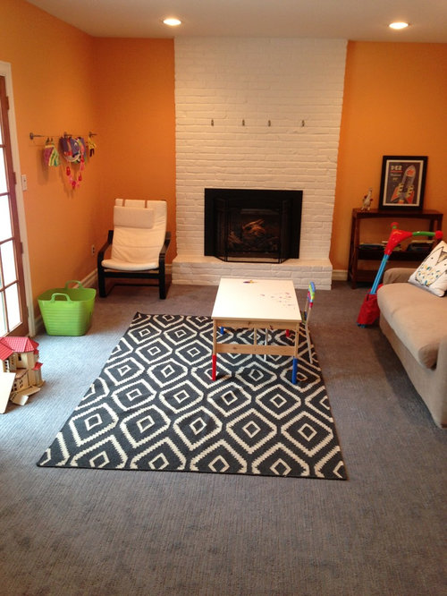
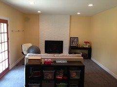
I've asked about this room before on here, but not about the color.

I originally painted this room SW Papaya. I loved it when we had cherry laminate. Since it's a playroom, I wanted to add carpet. Well..I thought I was picking slate gray and it's really more blue. I really really don't like it.

What color would you repaint the walls? I'd like to keep the white fireplace. I'm almost thinking white walls. I could slipcover the couch, so that's not much of a problem.

Thanks!

Comments (52)

  • 13 years ago
    last modified: 13 years ago
    although its difficult to see how bleu or gray the carpet a more citrus yellow i think for the wall and white is always ok...
  • 13 years ago
    Oh it's blue-ish alright - very blue.

    I did remove the area rug and have tried a different one. I still can't stand it.
  • 13 years ago
    In that case, I'll suggest greyed paint tones - of which that yellow looks to be - but test first.
  • 13 years ago
    This might help with the shade perhaps.
  • 13 years ago
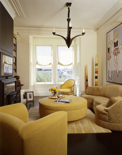
    Pittsburgh Paints quicksilver is a slate blue. The next lighter is Blue Dolphin - if you are open to embracing the blue that could work for you. We have PPG paints Greystone in a room adjacent to the Quicksilver which may work for you as well. I also like the idea of a cream. I recall your other posts and if you are going to do the oriental or kilim rugs in that room, I think any of those colors should work. (Though I still like that black and white!).
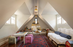
    Here's a link to one of my fav kids playrooms on Houzz - we kind of have a similar vibe in ours with walls painted PPG Fog and Greystone and a red oriental rug with some slate blue in it.
    Presidio Heights Residence · More Info
  • 13 years ago
    Love the wall color in the Presidio Heights pic.
  • 13 years ago
    last modified: 13 years ago
    Wow - Sam, yeah, that is gorgeous. I'm thinking I might have to embrace the blue in order to really tone it down - if that makes sense. It just screams MISTAKE to me because I wanted gray.

    Do you know what color the Presidio Heights is? I looked on info and didn't see it. I asked a question so maybe they'll respond.

    I did have the kilim in that room but I had to take it up because my daughter kept tripping over it. When she's a little older, I do want to put it back down.
  • 13 years ago
    last modified: 13 years ago
    Well, yellow is opposite blue on the color wheel, so if you don't like the blue that's in the carpet, I'd paint the walls a color that has some yellow in it, or yellow undertones. Probably a cream with yellow undertone. That yellow will block some of the blue, and then the rug might appear more of a neutral gray. Only use blue on those walls if you really want to bring out the blue in the rug. But right now the walls are making the rug appear bluer than it really is, I think. When I cover the walls and just look at the larger rug, with the cream sofa, it looks gray to me. So a warm white or beige with yellow undertones will really help eliminate the blue. An easy fix.

    Another thought is to paint the walls a warm white and the brick fireplace a deep charcoal gray (with no blue or green in it).
  • 13 years ago
    last modified: 13 years ago
    @dianahb - I would like to reduce the blue if at all possible. It sounds like adding yellow will work.

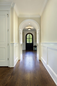
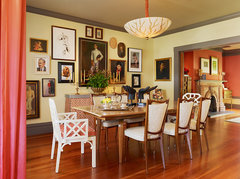
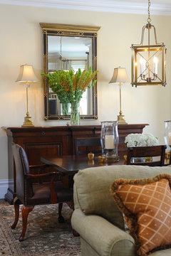
    Are any of these in the right cream/yellow family?

    Attention to details · More Info


    Home · More Info


    Presidio Heights traditional · More Info


    Presidio heights apartment · More Info
  • 13 years ago
    Benjamin Moore Standish White is a cream with yellow undertones that was recommended to me by a pro on houzz when I asked for a suggestion for a "warm cream". If you search houzz you will see some rooms using it. For me in the room I was using it in, it was a bit too yellow but maybe it would work for you. (Or maybe someone on this thread is familiar with it).
  • 13 years ago
    last modified: 13 years ago
    kittybart: The wall color on each of those images looks perfect, on my screen, for what you need.. A color I've also used in the past is Ben Moore's Ivory Tusk. That definitely has yellow undertones, but is very creamy. Lemon Ice is another, though I've not used that one myself. A dark gray color I've used-- which has zero blue in it-- is Ben Moore's Ashley Gray. It's a warm taupe gray, and darker than it appears online-- but it looks great with Ivory Tusk.

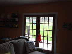
    Also, I notice that you have what looks like French doors to the left-- which brings in a lot of daylight, and daylight is blue, which will make a room appear cooler. So you could also add a couple of table lamps, or a floor lamp, with warm bulbs to offset that daylight blue cast. Or-- whatever bulbs you have in those recessed ceiling lights-- ensure that they are warm. Regular incandescent bulbs will give off the warmest light. That will make a big difference, too. The more blue you can remove from the room, the better-- and, before you know it, that rug will be gray. When you saw this rug (whether online or in an actual store), I will guarantee they had warm lighting going on, so it did appear more gray than blue to you.
  • 13 years ago
    Definitely repaint the walls. A tan color would be nice in the room to balance the rug color.
  • 13 years ago
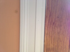
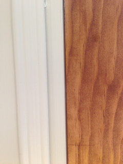
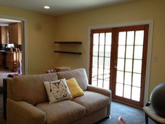
    Yes, the french doors are a light cherry stain. I was thinking of adding a wood mantel in the same color. Do the yellow/cream colors above still work with that?

    Here are the french doors.
  • 13 years ago
    I think a creamy color, with yellow undertones, would work just fine with it. We have cherry cabinets in our kitchen, and our walls are actually painted in Ivory Tusk-- it looks really nice. We've also used that Ivory Tusk in other parts of the house, and we have red oak hardwood floors everywhere-- it looks great. When you use a cream with yellow undertones (rather than a yellow paint), the yellow isn't really noticeable, the paint just looks warm and creamy-- and those yellow undertones just subtly do their job. And the paint color you've shown seems to bring out the warmth in the cherry stain, too. Looks great to me.
  • 13 years ago
    How about replacing the area rug with a sky-blue zig-zag (Urban Outfitters?) -- I've seen Greek blue too. It would clarify what's blue and what's not, and might even look good with existing paint. What were you thinking of recovering the couch with?
  • 13 years ago
    I'm probably going to be keeping a rug out of there for now. The couch is faced towards the fireplace and the rug in front of the couch, so you don't see the rug when you enter the room. I'm keeping the rug out because my daughter keeps tripping on it and I'm afraid she's going to do a header into the fireplace.

    Anyhow...no CLUE as to what to put on the couch, colorwise. White??
  • 13 years ago
    A warm charcoal gray would be a great fabric for the couch. I also think a deep gold fabric-- maybe with some texture to it-- would be nice. I like a warm off-white, but in my house, that would get dirty quick.
  • 13 years ago
    Maybe if you're getting rid of the rug, you could use a similar lively fabric for the couch, but instead of black, which brings out the blue in the carpet, again maybe blue on white or cream design, or something that would help the carpet lean gray.
  • 13 years ago
    I like the idea of darker charcoal on the fire place, maybe a grey to taupe on the sofa. What about some mint or pastel blue-greens in accents.The contrast should warm up the carpet.
  • 13 years ago
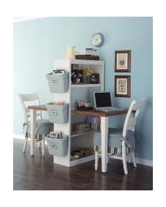
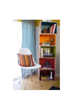
    the cover you have on there would be fine add cushions in different fabrics and the next picture i just wanted to share as i think it is brilliant!!
  • 13 years ago
    Great alternative! Etsy, when googled "blue throw pillows", has some nifty ones, and a cool blanket @ Wms-Sonoma.
  • 13 years ago
    And a few blue glass bottles/vases in the vicinity of the fireplace -- the table? the mantle? the hearth -- depending on how likely your daughter to break them -- could tie in, look great, and maybe make you not want to repaint.
  • PRO
    13 years ago
    I also like the Presido residence colour scheme ... If needed to, re-upholster the couch and add colour with funkie pillows. Also since you have kids ... Why not create a space for creativity by adding a board or even a wall with chalk black, so they can draw? Add colourful art piece above fireplace fr finishing touch.
  • 13 years ago
    Check out pictures of Bellevue, Rhode Island by Libby Langdon Interiors, Inc.on Houzz. She did a wonderful bedroom with grey and yellow. The walls are a butter yellow and work perfect with the grey tones.
  • PRO
    13 years ago
    last modified: 13 years ago
    Hi kittybart,

    I think the best option for you that @dianahb has stated already is to use a very light yellow to counteract the blue coming off of the rug.

    Another way to really harmonize the space is by adding some throw pillows that also have yellow and a slate grey color in them, preferably patterned. This will really tie everything together and trick the eye into thinking that the carpet is grey.

    I have created a 3D computer drawing of the things I have recommended, and you can also edit it to play around with different wall colors. Find it here - http://dwr.floorplanner.com/3d-design/design-dilemma/4504373/

    Hope this helps, and best of luck with your space!

    Best,
    Jill@DWR
  • 13 years ago
    Wow! That's really neat - thanks for taking the time to do that, Jill! I think that yellow looks great!

    I believe that is the direction I'm going to go in. Now to pick some samples and go to work.
  • 13 years ago
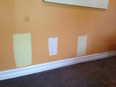
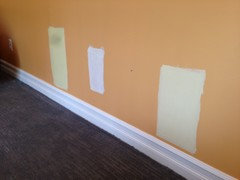
    I choose 3 samples.

    From left to right:

    BM Yellow Lilies
    BM Ivory Tusk (too white)
    BM Mushroom Cap

    I think I like yellow lilies best. Thoughts? I know it's impossible to tell on various screens.
  • 13 years ago
    On my monitor, mushroom pulls more of the grey.
  • 13 years ago
    Mushroom also matches the current sofa color. That might be good? Or bad if its too matchy-matchy.
  • 13 years ago
    Wow. That's really interesting. In our house, the Ivory Tusk is this warm creamy color, with definitely warm yellow undertones. On my screen here, it does look really white, though. Maybe because it's against that wall color? The far left looks like lime green to me. The last one, mushroom cap, looks the best (on my screen). I don't think it matters that it matches the current sofa; you can get around the "matchy-matchy" issue by using pillows and throws.
  • 13 years ago
    Kittybart... Whatever happened to your other room thread? Miss seeing finished product.
  • 13 years ago
    @Bevballew- thanks for remembering. I'm waiting on a wall shelf to be built. Once it's finished I'll be able to furnish with some art and decor accessories. I hope to be done with it soon!!
  • 13 years ago
    @diahnahb - yes the paint chip looked totally different to me at the store as well. I'm actually wondering if it wasn't mixed improperly.
  • 13 years ago
    I'm wondering, too, if you're getting a different cast from everything, because it's painted on that existing wall color. Not sure, but that really does look white on my screen. The paint store I go to, if I think they didn't mix it right, I do get them to look at the mix they made (all computerized), and I have found a couple of times that they were slightly off on something-- and it makes a difference. But it's definitely not a white like that. On my screen, it almost looks like a dead match for the baseboard. Still, I like the 'mushroom cap' a lot. In isolation, that already makes the rug look gray to me-- if that's what it's up against there.
  • 13 years ago
    Yeah diana, I know. It is a dead ringer for the trim. It's weird. Even out of the can it looks that white so I'm not sure it's the wall color.

    I'm leaning now toward the mushroom as well. I've seen it in several different daytime light and I do think the lilies might be too bright. I'll see what tomorrows morning brings.
  • 13 years ago
    Well, if that's the case, they probably didn't mix it right. But if the mushroom works for you, and on my screen it also looks great, then that's what I'd use. To see how paint looks throughout the day and in different light consistently amazes me. I typically try out lots of paint, and then nine times out of ten, I pick the original paint I first brought home. ;)
  • 13 years ago
    You might want to prime a wall then hang paint samples on big sheets (or paint them on the wall). I could NOT tell what colors would look like on my walls until I primed the color away...it looked VERY different then when I tried colors.
    I think a light gray or maybe a soft white could look nice. I wouldn't pick yellow for the walls, but for accents. Take a look at the color Grey Mirage (by Ben Moore) as well as a color like an "almond" (on the inside of the almond)...it might be nice.
  • 13 years ago
    Thanks kittybart. Cute room here. You do a nice job making a nice home!
  • 13 years ago
    Brooke Strong makes a good point. I suspect that coral wall color is not giving you a true color on any of those samples-- so it might help to prime a wall for that. I also recently used Ben Moore's Wind's Breath, which I really like (sort of a very pale gray/tan color)-- and Ivory Tusk on the trim. You could try that out-- put the Ivory Tusk on the fireplace wall and trim, and some kind of gray like that, that has no blue or green undertones. That would work, too, and then put the yellow in as accents. You could go in either direction (yellow on walls, or gray/tan) to bring out the gray in the rug. But I do get the sense (onscreen) that the Mushroom color is sort of tan, with yellow undertones?
  • 13 years ago
    since this is a kids playroom, i would paint it fun colors and incorporate the mushroom color.
  • 13 years ago
    Yes, dianahb - the mushroom is a tan with lots of yellow undertones.
    @brooke strong - I might try a gray too. The grey mirage looks nice. Can I ask why you wouldn't do yellow on the wal?
  • PRO
    13 years ago
    kittybart - I really like the mushroom color! I think it's important to have those yellow undertones in there to tone down the blue rug. I also think Wind's Breath (dianahb's recommendation) would be really pretty too. This color would give you plenty of opportunity to accessorize with fun colors!

    Best,
    Jill@DWR
  • 13 years ago
    last modified: 13 years ago
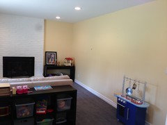
    Here it is - updated color! BM Mushroom Cap.

    I'll be painting the play kitchen something besides blue, and possibly replacing the wall shelves and floor shelf with white units instead of the black/brown. I can replace them with pieces from Ikea inexpensively so I think it might be worth it. Now...for my accent colors....any ideas? I know I'm going to throw some gray in, but what else?
  • 13 years ago
    last modified: 13 years ago
    Nicely greiged yellow; well done. This room looks to be a busy family area, so I would stick with neutrals on your soft goods, and leave any more colorful accents for the walls. Cooler tones will look well.
  • 13 years ago
    That's really nice, kittybart. I like the yellow a lot-- very inviting. (And that rug looks gray to me now!). I think a mix of cream and grays-- but also, one color I love (in moderation) and that I think always looks so good with gray is a soft lime green. I really like those two colors together--and I wouldn't be afraid to use a navy in there somewhere, either.

    How did you get this room painted so fast??
  • 13 years ago
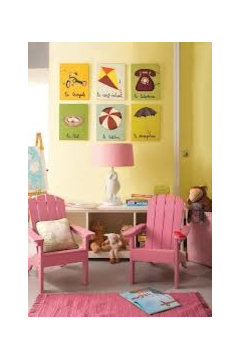
    looks grey now!!and yes,to the white cabinets,not sure if you are looking for a blind for the french doors,but i really liked this one,oh,and some other things i would put in a playroom,no idea how young your daughter is,so its all a bit random...
  • 13 years ago
    @dianahb - I called the painter the day I posted (or maybe 1-2 days later) and he was miraculously free the next day. I was surprised too!
  • PRO
    13 years ago
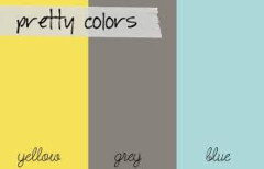
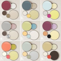
    Here are a few colour pallets
  • 13 years ago
    Wow-- I need to get your painter's number. ;)

    I love the color palette Wendy posted above. That soft gray/blue is pretty, too-- in the middle, under #5- and that middle lime green. In fact, I love that whole middle section.