

Naked and lopsided
My living room feels "off." I think it may have something to do with the naked corners by the windows, the heaviness of the furniture along what is currently "the couch wall," or both. I would love suggestions for arranging the furniture I currently have, but will consider replacements if that's what it takes for this room to feel "right." I think the rug may be too small, too?
We primarily use the space for watching television after supper. I know the tv is giant...my husband picked it and it's staying. We are able to hang it above where the couch is now (the hardware is hidden behind the blue and orange sound wave art) and have had it there before, but struggled with layout then, too. We are currently very comfortable watching tv from the recliners--no neck problems or discomfort from having it up high.
Looking toward the fireplace...
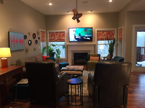
Standing at the fireplace.
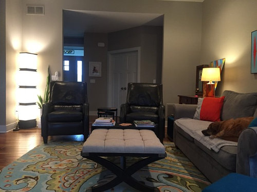
Sitting on the couch looking into the dining are and kitchen. The kitchen is a little lopsided, too...but I'm hoping once my husband finishes building a plate rack for the left side of the kitchen, it will feel a little more balanced.
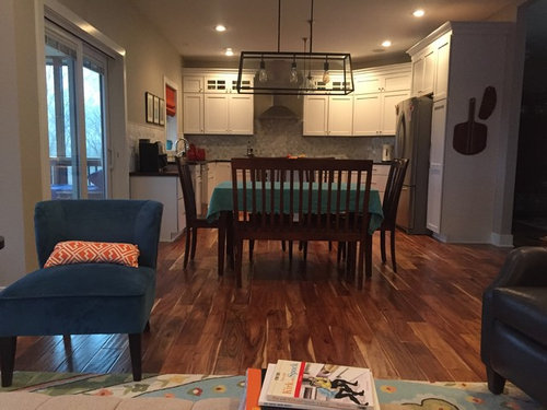
Standing by the range looking back into the living room area.
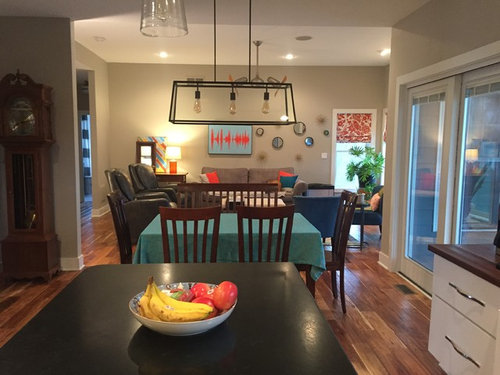
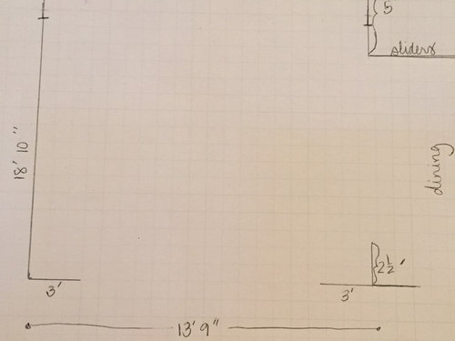
Finally...dimensions for the living room.
Any ideas for me? Thanks in advance!
Comments (39)
 9 years ago
Sorry, no suggestions. I like your house the way it is. I do understand what you are saying about the kitchen. I guess you had a reason as to why the range wasn't more centered. In any event, maybe the shelves you are adding will help move your eye around the room instead of focusing on the open space over the range.
macumber thanked eld6161- 9 years agolast modified: 9 years ago
I'm no decorator but I think the window treatment might be slightly off. Maybe a solid print? And I think the table cloth is slight distracting.
Edited to add: The room is actually really nice. I think when the real decorators give you some hints they will be about small changes only. You've got a great start.
macumber thanked JustDoIt Related Professionals
Montgomery Interior Designers & Decorators · Ardmore Interior Designers & Decorators · Virginia Beach Interior Designers & Decorators · Peoria Interior Designers & Decorators · Brainerd Interior Designers & Decorators · Youngstown Interior Designers & Decorators · Hudson Interior Designers & Decorators · Carlsbad Interior Designers & Decorators · Valdosta Kitchen & Bathroom Designers · Davenport Kitchen & Bathroom Designers · Huron Kitchen & Bathroom Designers · Gainesville Furniture & Accessories · Vidalia Furniture & Accessories · Athens Furniture & Accessories · Los Angeles Furniture & Accessories 9 years ago
Naked corners by the windows? I don't know what you mean. There isn't a good picture of the corners - you mean naked as in not enough furniture or naked because there's nothing on the walls or naked because the lower windows are bare?
 PRO9 years agolast modified: 9 years agoI think it is the horizontal line of things with the TV being the highest.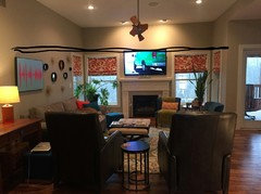
I would add window treatments (drapes, curtains, sheers) that begin halfway between the ceiling and window frame.
Would also substitute the blue/orange art and ? plates with more substantial pieces.
Maybe move the grandfather clock to the side of the couch where the lamp is.
Right now, the TV is the "star" of the room. Maybe offset that stardom with other competing things.
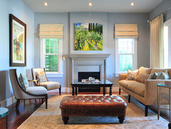
macumber thanked mdln- PRO9 years agoAs an example, imagine this would look "off" if the picture over the fireplace was hung higher than the window treatments.
 macumber thanked mdln
 macumber
Original Author9 years agolittlebug--You're right, my photos don't really capture the nakedness of the corners. I may try again tomorrow if I can get home before the sun sets. Right now the furniture feels a little heavy on the side of the room opposite the fireplace and I've "filled" the corner spaces with plants. I do have the two small blue chairs (with orange lumbar pillows, one has a green throw right now) in one corner...but they feel very unsubstantial and are about three feet away from the actual corner of the room.
mdln--Thank you for the photo example. Do you think the shades should be a solid fabric? I love the idea of more substantial artwork...it will be fun to start searching in earnest for artwork for the wall above the couch. The blue and orange art has sentimental value and can be moved, but the black mirror set and gold spiny "things" were picked up at Target to fill the space.- 9 years ago
From the pictures you've shown, I don't see any nakedness. The large plants look substantial enough. You don't have to fill every spot because sometimes less is more.
I would agree on the display of round things on the wall - they are too small to be meaningful. Maybe they just need to be closer together.
- 9 years ago
It all looks really nice.
The TV being taller than the windows bothers me, as was stated. I think your current window treatments look nice with your other decor... but I would consider adding drapes to bring the height up on either side of that TV. Otherwise, it will always look wrong.
I can't tell if it's the angles of the photos, but that pulse art seems like it should be centered over the couch. Then you can put those circle mirrors and little things on either side of the art piece. Together, it might look like a larger cohesive display. Right now it looks choppy.
macumber thanked User macumber
Original Author9 years agololauren--I really wanted (and still would love) drapery panels to add softness and color and/or texture to the windows. I've held off because my mantle bumps right up against the window frame on both sides. Would super skinny panels be the solution? Then would the panels need to be the same size between each pair of windows and then on the outside of the side windows?
 PRO9 years ago
Just re-hang your blinds higher - 1/2 way in blank area. That's your problem - everything else is fine.
macumber thanked Anglophilia- 9 years ago
Just hanging the blinds higher, won't work because they'll be too narrow. If higher, they should cover the trim.
What does the fireplace area look from closer up?
The current perspective seems to make everything recede and really focuses on the large tv and two huge chairs directly lined up with it.
And the tv is just not as attractive a view, so your eye wanders to find something else on that wall.
In the example pic, the painting actually makes the view extend through that meandering path in the painting.
Not sure I'm expressing myself properly here.
macumber thanked nosoccermom - 9 years ago
The only space that I would consider doing something different is the wall above the couch - something more substantial there...... but other than that, I love your living space and kitchen.
macumber thanked jpmom - 9 years agolast modified: 9 years ago
Get some larger roman shades (or similar) and have them meet in the corner. Hard to explain, but found a photo:
http://media-cache-ec0.pinimg.com/736x/00/af/8e/00af8ec43cd1c50576c0164789e5169d.jpgmacumber thanked chispa - 9 years ago
I actually like your space. I had to go back and look for your tv after you apologized for it. I thought it was a bright coloured art at first glance. Larger roman blinds would help raise the windows so the TV doesn't sit higher. But keep the colour and pattern. I think it adds some interest to an otherwise grey room.
The one thing that did stand out to me is the art above the couch. I think you either need 1 large piece, or centre the print and split up the circles.
macumber thanked amberm145  9 years ago
I would take all the art off of the couch wall and replace it with a bigger longer single piece of art centered on the wall and center the couch on the wall. The big desk table next to the couch is making that side much heavier. Can it be moved out and replaced with a smaller side table? That allows you to have more breathing room around the couch and center it. And possibly spread the recliners apart a bit. I agree the window treatment pulls the eye right there. Something needs to add height to the window. But I see that problem with the windows being right against the fireplace it would be difficult to do curtains.
macumber thanked ravencajun Zone 8b TX- 9 years ago
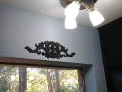
I have decorative metal art above some of my windows. This is not a finished state no window treatments up yet. But it would serve to pull the height up at your windows to raise it higher than the TV. It could even be some molding and a little shelf. I have seen lots of those.
 macumber thanked ravencajun Zone 8b TX
 - 9 years agolast modified: 9 years ago
Some ideas for over couch:
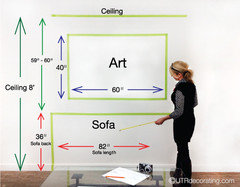
See these links:
http://dravenmade.blogspot.com/2015/01/ideas-for-that-blank-wall-behind-couch.htmlmacumber thanked jpmom  9 years ago
I think it's a beautiful space just as it is! To me, it feels friendly and inviting and you've managed to create ample seating and conversation areas in a small footprint, without looking too cluttered. I actually think your window treatments make a beautiful understated statement of style and color and I think adding drapes would be too heavy with everything else you have in the space. The only thing I can see you might feel off about is how "bottom heavy" the space feels, given that the area above the window line is all blank. But, I've learned over the years that 'negative' space isn't always a bad thing. It gives your eyes a break from color and patterns.
macumber thanked rebeccamomof123- 9 years ago
I took another quick look at your space, and maybe a large round mirror, flanked by two identically framed large b/w photos would be nice. (or just a mirror) There are a lot of linear elements going on (TV, valance, current artwork over couch) — I'm looking at the first photo you posted.
Just a suggestion, but something round to "soften" the lines. ???
macumber thanked jpmom - 9 years agolast modified: 9 years ago
I think it's generally a good space, but it looks like you are trying to pretend that all the space at a level above the top of the windows isn't there. Look at your photos. Except for the tiny protrusion of the TV, nothing but your kitchen cabinets ever exceeds that height.
I agree with those who have suggested that hanging your blinds higher will go a long way to improve the effect. I wouldn't describe it as "naked and lopsided" but rather as sort of squat and compressed down the way you have it now. You don't really need to add anything, just use that vertical space a bit more.
macumber thanked writersblock (9b/10a) - 9 years ago
I agree with what has been suggested already. Raising the window treatment in a blind or drape would do a lot for the room. The first thing I noticed was that your art seems too small, so I'd look for a substantial piece for above the couch.
macumber thanked ktj459 - 9 years ago
I think raising window treatments would help, but most of all make them in plain fabric..not figured...competes with the TV. Also center art over sofa...love the plants in the corners.
macumber thanked erinsean  9 years ago
"it looks like you are trying to pretend that all the space at a level above the top of the windows isn't there."
Writersblock articulated my reaction better than I could have. My first thought, though, was to address with crown molding. I don't know if that's appropriate for the age and style of your house, though. In my 1911 house we also have picture rails in a lot of rooms and usually paint the wall above the rail the ceiling color rather than the wall color. It visually shortens the wall a bit in my high-ceilinged house. However, adding moldings is not the cheapest or easiest suggestion that has been made here.
macumber thanked cawapsmacumber
Original Author9 years agoA big thank you to everyone for the kind feedback and suggestions.
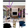
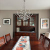
I can definitely think about adjusting the window treatments. I made the ones I have up now...and have some coordinating solid fabric leftover from making the shade for the kitchen. I will see if I have enough to add a border to each shade like Olychick's first picture. Fingers crossed, as I really like this idea.
If I end up needing to do more reconstruction than adding a border (which is likely, as these shades started as cheap mini-blinds), I may think about hanging the shades as in Olychick's second picture or one large shade that wraps the corner like chipsa posted. I will also start the hunt for some larger art for above the couch, as many of you suggested.
Most of the actual work will wait until the weekend but I'll keep you posted!
macumber
Original Author9 years agoCawaps--I do love the look of crown moulding--and think you and Writersblock are spot on in your assessment that I've tried to pretend the space above the windows isn't there. I'm just not at all sure what to do up there! Our house is only a few years old, so I wonder if crown moulding might look out of place?
- 9 years ago
I think it's less about age than style. I wouldn't put crown molding in something very contemporary or minimalist, but there are lots of new homes that are built mimicking older styles. Your fireplace mantle is traditional, and you have pretty substantial baseboards and door and window frames, so I think it could work in your house.
- PRO9 years agolast modified: 9 years ago
Another option, a trick to lower the look of your ceiling is to paint some of the upper wall the ceiling color.
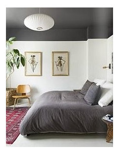 macumber thanked mdln
 - 9 years ago
What are the celing heights? I just looked at the room again, there is just so much wall space above the slider and windows. I think this is what makes the room look a bit squat and empty above. That ceiling height could have looked better with an 8 ft high slider and taller windows or transoms above the current windows.
A beefy crown moulding would help fill that space and would tie in with the moulding on your kitchen cabinets.
- 9 years ago
I think olychick's suggestion to add solid fabric to make your blinds wider and then hang them higher is spot on.
More visible window space behind the plants will draw the eye to the plants and beyond.
You have high ceilings, which are an asset, so I'd highlight them rather than hide them.
macumber thanked nosoccermom - 9 years ago
I think your space is lovely - the thing I notice , is that you have a lot of interest in the window/living room side of the room and pops of color. Can you bring that towards the kitchen end, and maybe tie the curtain fabric (whether the current fabric or a new fabric) into the dining room (maybe a runner on the table?), and into the kitchen with a few more pops of red - at the least, I think some red/orange is needed on the dining room table.
Have you tried taking the tablecloth off the dining room tab, and playing with that area more - no tablecloth, but a runner and some decorative items? You probably use the dining table, so this might be completely impractical on a day-to-day basis, but for days when you want to set the stage more?
macumber thanked Anne CK - 9 years ago
I'd echo the point about the space toward the ceiling in the living room - it seems strangely empty. Also, at least when looking at the room as a photo (as opposed IRL) the effect of the TV, the window treatments, and the blue/pink artwork over the sofa seems to create a bunch of similarly-sized rectangles. A differently shaped (and larger) piece of art over the sofa would balance things off a bit better. But all that's nitpicking in a sense - it's a lovely space!!
macumber thanked smalloldhouse_gw - 9 years ago
Ah - sorry, I should have read better, you were focusing on living room, please disregard my comments.
I agree staggering heights of items in the living room, and also - you have a great fixture in the dining room - I can't quite tell what you have in the living room (I can't quite parse the pictures) - could swapping that out help?macumber thanked Anne CK  9 years agolast modified: 9 years ago
Well, I'll be kind of an outlier. I think your windows and window treatments are fine and don't need to be changed or raised. This is what I would do.
- I would remove the desk entirely. I think the room is indeed visually unbalanced with all the weight on the sofa side
- I would pull the sofa out from the wall, as well as the rug, so that both chairs are on the rug, as opposed to one balancing on the edge. As you asked, this might require a bigger rug.
- I would consider a round or square coffee table, again to pull the chairs into a more squared configuration with the sofa. The current ottoman also places visual weight onto the sofa wall by relating only to the sofa.
- Nitpick Alert: If it were me, I would pull the sofa down away from the fireplace a bit, so it's lined up with the DR table and fixture when viewed from the kitchen.
- If it were me, I would also remove the tall light from the back corner and instead buy a tall arc lamp to sit behind/next to the pulled out sofa. I would probably try the plant currently in the left window in that back corner instead. (The wrapped window pattern is lovely and to my mind, should be left without obstruction. I understand you feel they look naked. The windows and blinds would be enough, for me,)
- P.S. try removing the tablecloth and putting a long bowl or tray, maybe colored glass, under your lantern, to highlight that space.
- I agree with the comments about the art/plates above the sofa. You might TRY a few of the plates on the wall in the plant corner if it looked sparse to you. I would be looking for a larger piece of art.
Good luck with your pretty room!
macumber thanked barncatzmacumber
Original Author9 years agochispa--the living room ceiling height is 10 feet. The dining and kitchen area has 9 foot ceilings.
Anne--I do appreciate the comments about the dining area--despite being outside my original focus, it really is one large space so your suggestions to pull more color through make sense. I can't try a runner only--that tablecloth hides some damage to the table top--but I can look for something to set on the table. I do alternate the aqua tablecloth with this orange/red one: https://www.amazon.com/Mahogany-Peacock-60-Inch-Tablecloth-Jacquard/dp/B002S0NHTG/ref=sr_1_51?ie=UTF8&qid=1484183209&sr=8-51&keywords=orange+tablecloth The living room doesn't have a light fixture. We can have can lights (that we rarely use) and a ceiling fan chosen by my husband.
barncatz--thanks for your suggestions. I have an arc lamp I can try where the table is this weekend and can easily try scooching the couch down a little bit. My one worry about doing that is that the chairs will then be virtually in the doorway--but I will play and see.
New art for above the sofa seems to be the one unanimous suggestion. I have spent hours so far looking at art on Art.com (so many that I ran out of time to get the big discount offered earlier this week)...if anybody has suggestions for specific art pieces I would love them.
- 9 years ago
Hi macumber, my nit pick about lining up the couch with the fixture was pretty random, lol. I wonder how it would look to remove the desk and put the tall light you have from the corner next to the sofa? At the least, I'd take the plant and stool out of that left corner and leave it bare. Right now the eye stops at the corners of the room. I think the fireplace and right side vignette should balance your long sofa wall.
Here are a couple of Houzz stories I've read about visual balance in a room. I apologize in advance if you've seen them already or if you aren't interested.
[Decorating Article[(https://www.houzz.com/magazine/fashioning-interiors-part-2-achieving-supermodel-balance-stsetivw-vs~129032)
[Decorating Article[(https://www.houzz.com/magazine/live-in-harmony-3-types-of-balance-in-design-stsetivw-vs~17686687)macumber thanked barncatz - 9 years ago
I love the look of your rooms, the colors, etc. I noticed the horizontal line right away. I think that is one issue. Also, I would try moving furniture around. Could the couch go where the two leather chairs are? The room seems like it has a lot of chairs/little pieces of furniture. I would mess around with the furniture layout and edit some of the items in the room. Go for fewer, bigger items. Please let us know what you do. You are off to a great start--the spaces have great personality.
macumber thanked kelleg69 macumber
Original Author9 years agoA snow day has given me a little time to move things around. I've scooched the couch down to line up with the dining room fixture. I've moved the big leafy plant to the back corner and brought an arc lamp up from the storage room. Over the weekend I brought home a larger piece of art to try. It's just resting on the back of the couch right now...and we've filled holes but haven't touched up paint yet.
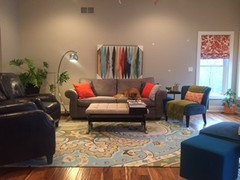
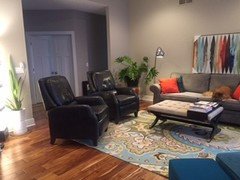
I slid the recliners around a little bit when I scooched the couch down. In the positions pictured they are functional.Kelleg69, I had the couch facing the fireplace at one point before we had the recliners. Now that the recliners are here, I'm not sure placing them in a position that doesn't facilitate TV watching would go over very well. I like the suggestion of replacing the smaller pieces (blue chairs and cubes, is we're thinking alike?) with something more substantial. What do you think of a comfy club chair & ottoman for reading in the corner to the right of the fireplace?
Thoughts about the artwork? I think the size looks better in proportion to the couch than the previous...but think it looks fairly lonely on that big wall, too.
- 9 years agolast modified: 9 years ago
I think it looks great! I love the sofa wall! I did think the right side vignette should be more substantial, taller or larger chair, but the recliners are pretty visually hefty and you don't want Big Chair Overload. Could you take a photo showing the fireplace wall? I think you may have tweaked it though!
I love the art. Thinking about the size.

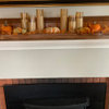
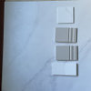
Olychick