Software
Houzz Logo Print
hzdeleted_28531818

Narrowing Down Counters and Paint

9 years ago
last modified: 9 years ago
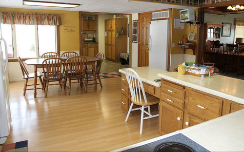
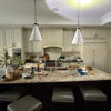
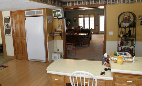
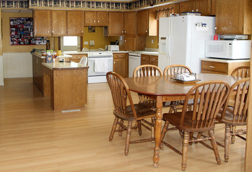
We have honey oak cabinets and yellowish-cream countertops that we are at least 35 years old. Although the whole kitchen needs to be changed someday, that's not in the cards right now so we are just trying to freshen the look with new paint, counters, and different cabinet hardware. Our appliances are white and that won't change. We just bought a new fridge and dishwasher (the ones in the picture are gone now). Our sink will most likely stay white. Our wainscoting will be light cream or ivory (not quite as yellow as currently).

I will show our current kitchen plus a couple paint colors and a handful of laminate designs we are considering. I would like to know if I'm on the right track with what we are thinking. I was originally thinking of darker countertops but I'm not feeling that as much now, plus I have seen some that have a lot of brown/gold in them and while they are pretty, I feel like they are too close to my cabinet color.

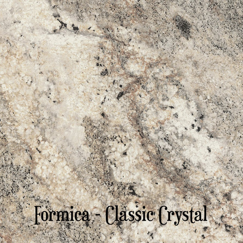
I like the classic crystal laminate the best at this point so I can introduce a little darker color to the room and use some dark accessories to change the look in there. The wallpaper border on the soffit will obviously be coming down, too.

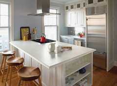
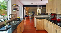
Current kitchen in all its yellow glory:

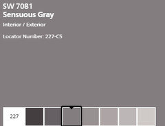
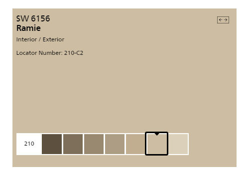
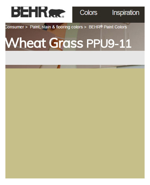
Top choices for paint right now:

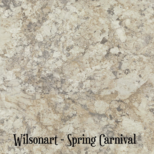
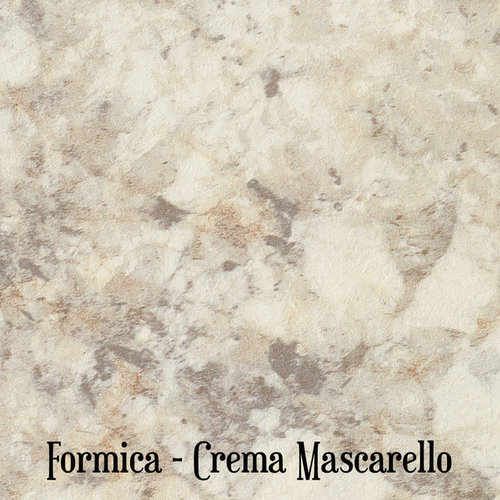
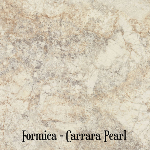
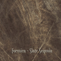
Laminate choices with classic crystal being my current fave:

I know that getting a new kitchen table will help, too. I won't choose that until I see the finished room, though.

Comments (32)

  • 9 years ago

    Prepare for the most unhelpful response ever:

    -i like your kitchen

    -every paint color you posted(wall, right? not cabinets?) would theoretically work. You'll need to sample them in your place and look at them in different light in order to decide which one you like best

    -same thing with laminates. theoretically anyone of them should be fine. bring samples to your kitchen(you probably did already), move them along the counter to get the idea which one works best/looks best. my inclination is always to go with the least busy..but since you don't have a backspash it's not that important here..go with what you like best

    -like your kitchen table. unless you're sick and tired of it-I'd just get a runner, a colorful jag, a something that breaks the expanse of the table a bit, and makes you happy to look at.

  • 9 years ago

    Kathryn P, my adjoining room (DR/LR) is grayish/blue so I don't want the same thing in the kitchen. If I find a kitchen paint I like, I might even consider taking that into the DR/LR and change that, too.

  • 9 years ago

    It seems to me that your new choices aren't that much different that what you have now in terms of color and tone and I'm wondering if it's worth spending all that money to end up with basically the same thing. Classic Crystal is pretty, but it's still a lot of cream. Unless the counters are worn out and need replacing, you could keep them and still paint the walls any color you like. No need to stay with the gold tones.

  • 9 years ago

    aprilneverends, you are right, it's the wall color I'm going to paint, not the cabinets. I thought about the laminate being too busy also but without the backsplash I guess the only thing it has to compete with is the grain of the oak. I'm so jealous of everybody that has a backsplash area to decorate! The area back behind the oven leads to one of our stairways (behind that wall with the bulletin board) so we can't really block it off or add a wall behind the oven to enclose that because it would make the traffic area too narrow behind there, I think. In the future remodeling job we will have a better floor plan.

  • 9 years ago

    When I was considering a darker laminate, this was the one. I still like it. I guess I just need to know if I want darker or lighter and go from there.

  • 9 years ago
    last modified: 9 years ago
    You are thinking about re-laminating your existing counters, right? You're not getting rid of the substrate, are you? Re-laminating will be very budget friendly if possible.

    Honey oak looks fantastic with white counters. I know it's less stone-like than the samples you're looking at, but white, not cream, could look so bright and fresh and new. It would set off your cabinets very nicely.

    You want to make sure you have some contrast. Right now you have beige cabinets, beige floors, you're thinking of using beige paint and getting beige counters. If you want darker counters you can go that way too... honey oak looks great with charcoal grey counters too. But beige paint and beige counters.... you may not like the look.

    Are you removing the wallpaper on the soffits?

  • 9 years ago

    eam44, yes, the soffit wallpaper will be coming down.

    I originally wanted to just relaminate over the existing counters but from what I understand now we can't do that at home because the laminate would need to be formed over the no-drip edge that is on our current counters but that we could have done that if we had a flat edge currently in place.

    I have also wondered about the possibility of cutting off those edges and applying some sort of new edge that we could deal with DIY.

  • 9 years ago

    Be careful of the SW Ramie. I have the color in several rooms and love it, but it is definitely greener that the sample card. My past experiences have shown that anything with green undertones does not play nice with the oak. As someone else suggested, really consider a color with some blue in the undertones. As for the countertops, are you absolutely sold on the stone look? Something plainer/simpler, but with a contrast to the cabinets will really help freshen the kitchen.

  • 9 years ago
    last modified: 9 years ago
    I'd also avoid adding more beige tones to this kitchen. I would even remove the wainscoting to eliminate beige/cream tones. To my eye, there's so much wood cabinetry with a strong oak grain that it's creating a lot of movement and pattern. The beadboard wainscoting adds another surface and makes the room feel even busier. Plain painted walls would be so much more calming.

    I like Classic Crystal. I'd use brushed nickel hardware. I was thinking black for the hardware and accessories but you have white appliances, so I think gray is the color to pick out from the laminate. Eam's suggestion of a solid charcoal gray counter is good, especially if you find the patterned samples to be too much with the oak grain. Not sure how that would affect the paint choices though. Maybe a lighter gray for paint? Grays have undertones so you'll need the right one. Seeing samples of the paint and laminates in your kitchen will help us guide you better.

    Here's a blog post about choosing paint colors with oak. I don't see a strong yellow or orange undertone in your cabinets. I think you have too much oak to camouflage it.

    http://www.kylieminteriors.ca/the-best-paint-colours-to-go-with-oak-wood/

  • 9 years ago

    Thanks to everybody for all the helpful ideas. My head is kind of spinning with now with ideas. If I go dark, one laminate I like a lot is the slate sequoia but don't know how that goes with the overall look I'm after. I have a large sample here at home and I like it a lot.

  • 9 years ago
    last modified: 9 years ago
    A color I like but I know breaks all the rules of using a cool color with oak cabinets is SW Sensuous Gray. I love it because of the plum undertone. It's gorgeous in person. I see it several times a week at a bank. I've always liked purple. My craft room is a strong purple called Luscious Fig and I wish I was bold enough to do that in my kitchen. Since we have wainscoting below, it's only part of the wall that gets color so it makes me feel like I could be more adventurous. I don't know what I'll end up doing!

    The wainscoting with stay (although we are redoing it with a board and batten look) because behind the wainscoting the walls need serious help so we would have to re-sheetrock and we aren't going to be doing that right now, so we are stuck with wainscoting of some type at this point. Home Depot has their countertop sale ending on Sunday so I want to get my color scheme figured out so I can order my laminate and figure out my paint.

    For fun, here is the Sensuous Gray even though I guess I won't be using it. It looks more purple in person and in image searches online.

  • 9 years ago

    Kylie suggests several grays, and I did see a purple undertone mentioned.

  • 9 years ago

    Here are some links:

    http://www.kylieminteriors.ca/the-best-paint-colours-to-go-with-oak-wood/

    I'd probably go for something a bit less beige, like BM Balboa Mist.

  • 9 years ago
    last modified: 9 years ago
    I remember reading that blog entry..it's a very good one. Because the author says the main thing which is: when you working with color you have several ways to go. it's not a given you want to make something less visible..you might want to contrast it, to underscore it, to..it all depends on how much you like the element you've got, and the feel, the rhythm you're going for.

    Oak is out of favor lately..as I've learned here lol..so people try to blend it. And it's true-if you take cool tones and put it next to the warm ones-warm will read warmer. But what if you like it enough, or even want to bring it out more?

    I have these walnut floors, they're more red that most people would prefer. I knew perfectly well that using greige or green with them will make them read even more red. But I like them:) I like them being red just fine. So I made this very conscious choice to go for contrast, at least in several rooms in the house. And I went to repeat it even more in master bath where the floors are not wood-but very similar in ciolor nevertheless. True it might be easier since I was the one picking the floors and it was my call so to say. I don't know whether you chose your cabinets. But I must say-that's a nice oak. It doesn't lean too orange, it doesn't lean too yellow, it doesn't lean too pink..even only that fact allows you greater freedom.

    I actually quite love your deep mustard. You're obviously a person that loves color..so try that gray with purple undertone you like, and try the purple you like, and experiment with samples..there are rules that's true..they exist for you to know them and decide which of them pertains to your situation:)

    Now stones etc are harder to work with if you're not a fan of them..wood is easier. I can't explain it properly, but it just lends itself to more possibilities in terms of paint. Maybe it being more organic, we're more wired to see different species of wood doing perfectly well together in some forest, surrounded by all sorts of other colors? I don't know.

    And if you like beige-I also see no reason not to have more beige if it pleases you.

    I love purple (aha. a lot. ) so I have plenty of purples. Why not to have plenty of beiges? It depends on what you like in a certain period of your life. Not only the colors are personal; they also know when we need to be calm and when we'd rather feel invigorated. I began to really like purple when I was a teenager; took me another 20 years to start fully embracing it, because the time was probably right.

    Similar thing with busyness. I always disliked granite(there are always exceptions of course) or this rainbow slate. But many people appreciate exactly the busyness. Right it dictates things around. But maybe they love them so much they're ready for these slates and granite to dictate things?

    It was quite hard to explain to my DH why I want to change the fireplace. He loved that rainbow slate; I didn't. I don't have happy associations with slate, so it was helpful when convincing him to still change it.

    It's all personal.

    I'd be left to work around that rainbow slate if he wouldn't go with my idea in the end. It would bother me, a lot. But not him, since he loves this stone.

    Okay it got too long. Bottom line: consider things, choose what you decide to disregard and why, and try these samples. But put white border around them; your wall color will change your perception of the samples otherwise.

  • 9 years ago

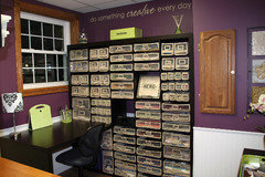
    aprilneverends is right that I am a person who likes color. I have no white walls in this house. Here is my vividly purple craft room. I love it! It's upstairs so nobody sees it but us and I wanted to just go with my gut on this color. Not tired of it yet after several years, so that's a good sign. This was taken back when the room was still clean. ;)

  • 9 years ago
    last modified: 9 years ago
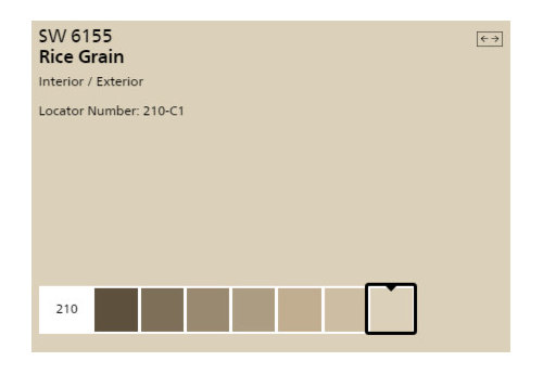
    We had rice grain in our last house's living room. It has a distinct green undertone. It didn't look good with our red undertoned wood floors and I doubt it would look good with your yellow undertoned cabinets.

    This is my favorite oak cabinet kitchen update. The walls are my favorite color, though.

    http://www.thekitchn.com/this-is-how-to-deal-with-honey-oak-cabinets-paint-the-walls-midnight-blue-kitchen-spotlight-201548

    A yellow beige I liked in a previous house was powell buff

  • 9 years ago

    Navy blue is a hot color. It's a fave in the home decorating forum and a popular color for kitchen islands.

  • 9 years ago

    Try the Sensuous Grey with your cabinets. I say that because the complement of Yellow is Purple and since your cabinets have a yellow undertone, it might just work beautifully with the cabinets. Buy a pint of the paint and try it.

  • 9 years ago

    Whoever is doing the work should be able to square up the edges and re-laminate. It's a huge difference in cost being able to keep your substrate. Do it by all means.

    The one thing you know you are keeping is your honey oak cabinets. It's time for you to get some more inspiration images, and start honing in on the look you want.

  • 9 years ago

    No more beige, gold or gray neutrals. You already have neutral. Any reason you don't have any area rugs?

  • 9 years ago

    I have a comment on your board and batten. That will be a nice improvement. In photos, it looks like your ceiling is high and the wainscoting at 3' or less. When you remove the wallpaper border, your ceiling will look even higher. The wainscoting looks skimpy, so how would it look if you added B&B so it stopped under the light switch by a few inches? Then you could use a darker paint without it adding too much of a dark tone.

  • 9 years ago

    :) but so what is the OP already has a neutral. it's like in this old joke: "-Let's give her a book for her birthday.-But she already has a book"

    Having said that-I don't mean to say the paint has to be neutral. But it doesn't have to be a non-neutral. "Neutral" is also a relative thing. Swedes consider many blues and greens to be neutrals for example. Or so I heard.

    Bring several samples of all kinds, try them all. why not

    I'm seeing this kitchen for a first time so I'm not tired of the current wall color it's new and nice to me..I'd do warm white countertops (much alike now), and bring a lot of white and black accessories. Polka dot, or ceramics by Bjorn Winblaad..doesn't matter much.

    only this is not my kitchen. so I'll have to keep that plan to myself lol

  • 9 years ago

    Mayflowers, we actually are thinking along the same lines, because we want the height to be the same as the chair rail in the adjoining dining room, which I think is at 36 inches. Our big question now on that is whether to paint the wainscoting a shade of white like we were planning (to tie into the appliances better) or to paint it the color of the rest of the wall. Then we'd still see the detail of the board and batten but have a different look with more color on the wall. The whole reason the wainscoting isn't totally going away is that the wall behind the existing stuff isn't good and we would need to do new drywall there, so we are covering that up until our big remodel which is probably at least 10 years away.

  • 9 years ago

    Practigal, where would you put the area rugs? Right now we have comfort mats two places (in front of sink and the work area by the stove, not pictured here) and then a small rug where the mudroom and kitchen join (which needs to be changed to something in our new color scheme when it happens). Where else could I put one? I know I don't want something under the table and have to vacuum it. Do you have any good ideas for me on area rug placement that could inspire me to think out of the box a bit?

  • 9 years ago
    last modified: 9 years ago
    Right now it looks like your chair rail is at or about the 36" mark which is too low. I would actually bring the beadboard up 2/3 of the way up the wall and paint it the darker color and then a lighter shade of the same color above the beadboard. I like that idea a lot. It will help draw your eye up.

  • 9 years ago

    The current wainscoting is 33" high.

  • 9 years ago

    Scharmda, 3" is not going to make enough of a difference. It will still be cutting the room too low

  • 9 years ago

    I vote for the purple color! It's beautiful and fun. I'd paint the wainscot the same color as the wall above, or a shade darker. Even if you use the same color, it will look different because it's a different texture. If you change the height of the wainscot, make sure you don't cut the wall in half. It should be at 1/3 or 2/3 the height of the whole wall. If you bring it up to 2/3, it will really make a statement, so make sure that's a statement you want to make. Although I don't really see how replacing the wainscot with another wainscot material is any less effort or money than just replacing it with drywall.

  • 9 years ago

    The hard part with our wainscoting height is that the ceilings in different areas of the kitchen are at 3 different heights. The height that may work well in one area might not work well in another. The main section, the middle of it all, is the highest. Lots of changes through the years in this 130-year-old house, and the kitchen is one of the rooms we haven't gutted and started over yet. The ceiling is actually very ugly (ceiling tile and fluorescent lights like an office in two areas!) so I didn't include it in the pictures to complicate the issue.

    When I make some decisions made and get this project completed, I'll check back in with some "after" pictures that will hopefully be an cosmetic improvement for now. Thanks to all for the suggestions.

  • 9 years ago

    If you're eventually planning on redoing the ceilings, I would pick the 2/3 height that you think will work best overall and then later on you can deal with the ceiling height. I also agree with cat builder to paint colors you love.

  • 9 years ago

    I wouldn't worry about the ceiling heights. The ratio of painted wall to wainscoting makes it looks top heavy to me in all the photos.