Software
Houzz Logo Print
laughablemoments

Curtain Ditherings

9 years ago
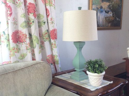
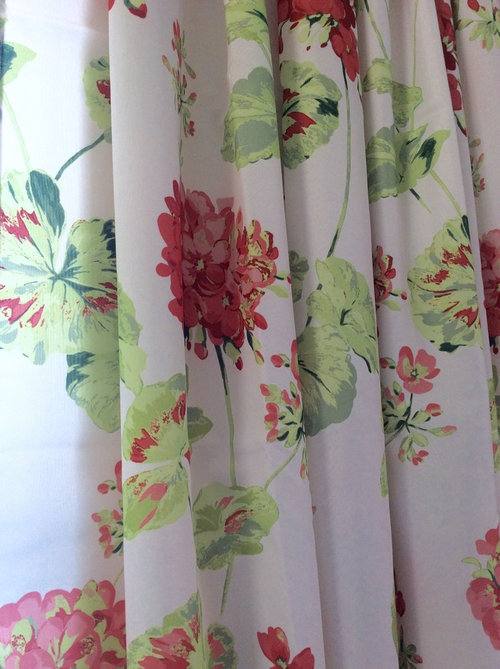
I've left my trial panel up all week.

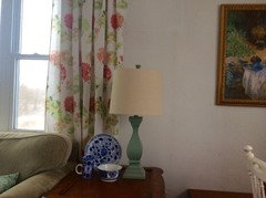
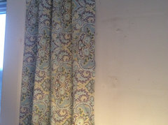
My "five shades of happy" has turned to five shades of maybe...and then again, maybe not. The cranberry and pink are very cheery, but...

  • There is this green in it that's almost a fluorescent highlighter green that's hard to catch in a photo, but I'll try.

    I'm not sure it's working with the couch, or my taste in greens, for that matter. (Beverlyfladeziner, I think this color discrepancy was what you were picking up on in an earlier thread!)

  • Some of the leaves remind me of lilypads... and more in a Leapfrog way than a Monet way... maybe I'm being too harsh, though.

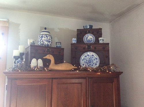
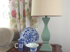
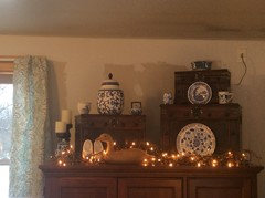
  • I really, really like my blue and white dishes, and I don't know if they work with the pink, green, and white scheme. Do they need to go away if I stick with green and pink??

  • Finding pink accent pillows was challenging when I went out looking the other day. I didn't make it to the fabric stores, though, so maybe I need to explore more. I did just go through Hobby Lobby's site and looked at 400+ upholstery options, no dice. I'll be making the curtains from tablecloths, which is fine for the curtains, but too slippery for throw pillows.

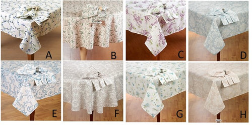
If I need to veer away from the pink and green geranium print for the curtains, these are my other options:

(expand to see better)

Should I stick with Hello, Green Fluorescence, or should I order some different cloths and try them out? Or, can we skip the ordering part, just pick a cloth, and move on.

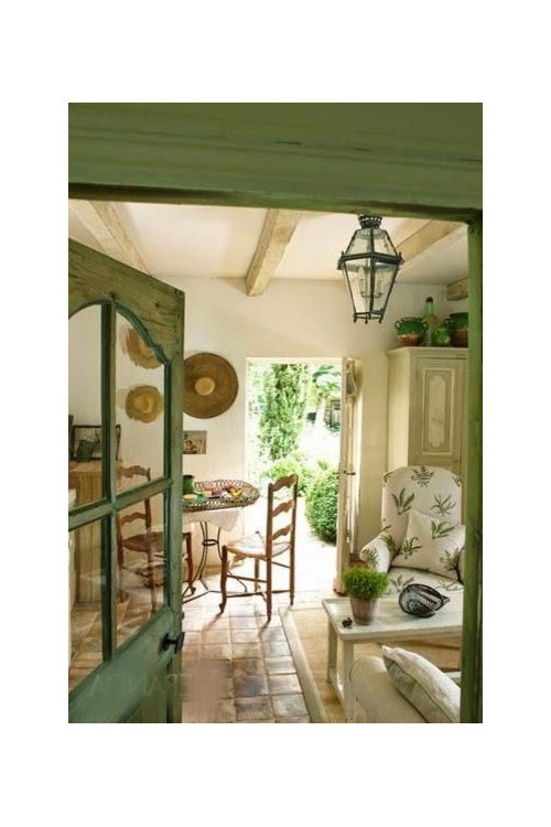
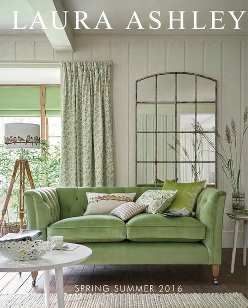
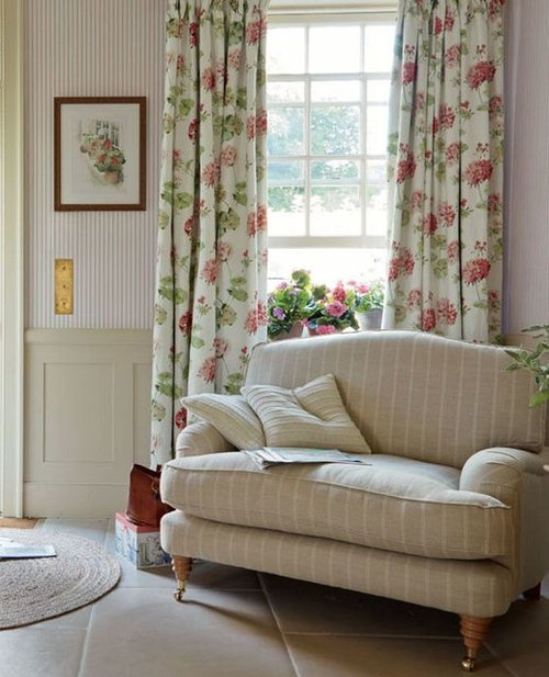
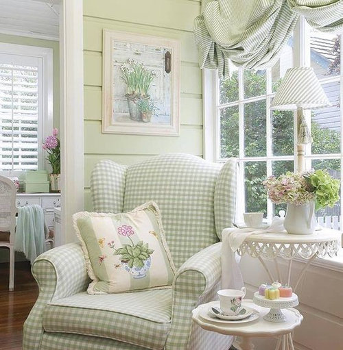
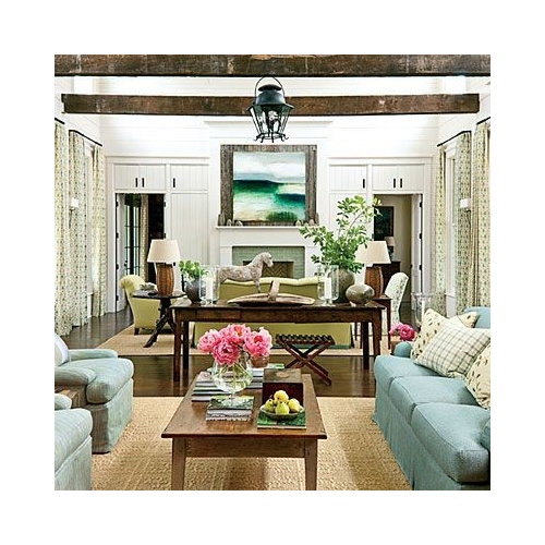
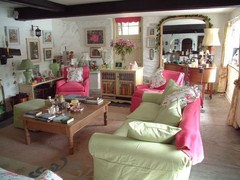
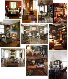
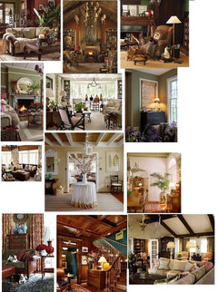
Here are some photo inspirations I've been mentally referencing:


Out of photo space, will continue with more inspiration pics in next post.


Comments (56)

  • 9 years ago

    Gonna ageee with Ingrid. Your sentiments about the greens now were mine when I first saw the curtain hanging. I didn't want to burst your bubble then, but since you seem to have reservations....... I also agree that they're the first thing you notice about the room....too prominent.


    laughablemoments thanked k9arlene
  • 9 years ago
    My only thought is that it's a little lighthearted and girly. Not for a room where the guys will gather and watch football IYKWIM.

    Ha! We have 6 daughters and one son, so there's already a lot of girlieness going on around here.

    I remember a similar fabric with jewel tones back in the 90s that I lusted after endlessly!!!

    This might be part of my reservation...is it (the dreaded word)...outdated? I know I can't do the current grays, even though they're fine in other people's homes. But am I putting in an "orange shag rug" when everyone else is ripping them out?

    Thanks, my3dogs. I'll get a picture as soon as we have enough daylight. See those bright green walls in your last picture? That's what the lighter green in these curtains makes me think of.

    I also think ....drumroll.... you might be over thinking it and complicating it.

    Who, me? Definitely!

  • 9 years ago
    last modified: 9 years ago
    Thank you for being honest, Ingrid. I was hoping that the geranium floral would be more muted in real life, but it turns out they are quite bright. I appreciate your vote in fabrics.

    Finding the right amount of brightness is challenging. I went for muted in our dining room, and while it's pretty,some days it feels kinda dull, especially in the frequently overcast conditions with which we live.

    Thank you, Torrey. This is what you do for a living, right? Going with something bold is a bit "scary." It came to me yesterday that I could order coordinating fabrics right from Laura Ashley. They're $$per yard, but since I'd only be getting enough for throw pillows, it's not that much fabric.

    Thank you for speaking up, k9arlene. It's ok to have a dissenting opinion. Remember the little boy in the Emperor's New Clothes? (I just read that to my kids last week, so it's fresh in my brain.) Sometimes it's better to just point out the obvious than to quietly disagree. : )

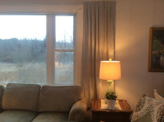
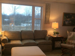
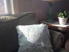
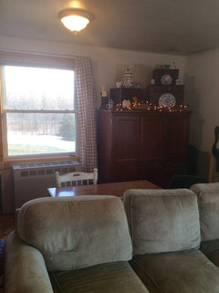
    The sun is up. Here are the pictures that were requested:

  • 9 years ago

    I love the print--it's beautiful. My main hesitation is that it looks a too "summery" to me, and I wouldn't want to use it year round. Another thought--it's a bit frilly and maybe dated? I like F or H, and you could add pops of color with pillows, etc. A rug with some color would be wonderful!


    laughablemoments thanked tvq1
  • 9 years ago
    That combo would bother me too. I would consider A or G

    laughablemoments thanked Kippy
  • 9 years ago
    I noticed that in your inspiration pictures only 1 had floral drapes. All of the others were at most 2-tone. In your first inspiration picture, the upholstered chair to the right of the door has a subdued print in a cream/beige tone with green. Something similar to that might work well in your room & would go with your blue TW. Then you could add in another color as an accent if you wanted to.

    laughablemoments thanked bothell
  • 9 years ago
    What did you pick?

    laughablemoments thanked Kippy
  • 9 years ago
    Thanks for checking up on me. I still haven't made a decision. I picked up a few more samples last night and pulled out some fabric from storage. I've taken the geranium print down. When pressed for his take on it, DH admitted that he wasn't a fan of those flowers.

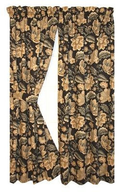
    I also got to thinking about how I have some black in each room, and wondered about carrying this theme through the living room, too, with these curtains. They only come in 84" length, so I'd have to get creative to make them longer, or hang them right on the sliding door molding to make them long enough.

    (A totally different feel for the room, I know...)


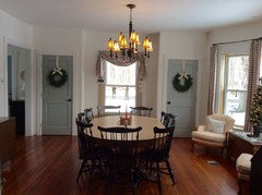
    Dining room, black chairs:

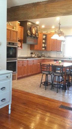
    Kitchen, black hood (and eventually, oven cabinet):

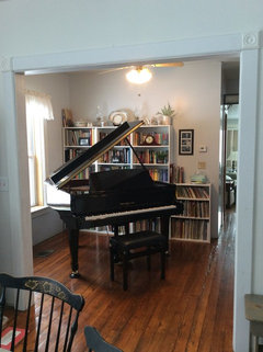
    Library, black piano:

    I'm waiting for the sun to come up to see how the samples look.


  • 9 years ago
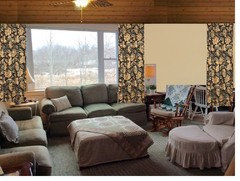
    Mockup:

  • 9 years ago
    I too prefer the first. Although the black curtains "go" with your family room, I don't really care for it there. However, I think if it's an option the black floral would look very nice in your dining room....just sayin'.
    laughablemoments thanked User
  • 9 years ago

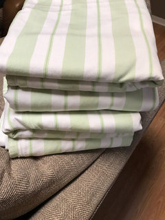
    I don't know if these are the right length you need, but check this auction on eBay, and see if they interest you. Pottery Barn 4 striped panels


    laughablemoments thanked My3dogs ME zone 5A
  • 9 years ago

    the first is my fav also. Sometimes it's hard to get used to something bold.

    laughablemoments thanked decormyhomepls
  • 9 years ago

    I like sewing too. We have a small house and a smaller decorating budget so my curtains are all about the cheapest I could find, all Walmart eclipse panels in a plain color. On the other hand, the pillow fabrics are easy to swap out for summer/winter looks.

    maybe something more neutral would allow for bringing in the black for pillows or throws

    laughablemoments thanked Kippy
  • 9 years ago

    Laughable, you seem caught between a rock and a hard place! Been there, done that. lol I haven't read all the posts, but in looking at the space with the floral drapes AND the blue/white dishes, I think you would be happier in the long run if you went with one or the other, not both. IMO, using brights(dishes)and pastels(drapes/lamp)becomes a little visually overwhelming, not to mention the differences between two distinct styles, cottage and traditional. I understand if you're wanting to have more of an ecletic style, but find it looking TOO diverse. Your furniture lends itself beautifully with the blue/white, but seems too heavy for a cottage style IMO. Slipcovering the furniture if you're 'stuck' on cottage is always an option too. As for the black print, I still find the floral not quite right, and rather drab. I know it can be almost impossible to wrap your head around something other than what you had in mind, but could save you a lot of aggravation. Good luck with your decision. I know it's not easy.

    laughablemoments thanked patty_cakes42
  • 9 years ago
    last modified: 9 years ago

    I think that new black floral is gorgeous with your couch and your wall color (eta: oh, wait. Is that soft gold wall in your room?) and complements the black furniture in the dining room, as well as your piano.

    laughablemoments thanked Olychick
  • 9 years ago
    last modified: 9 years ago

    Because I love to sew, and find fabric bargains... I have a 'spring/summer' set and a 'fall/winter' set. Is that an option here? Maybe, but for now I'd be happy to find one set that feels like "the one." : ) There is the 8' wide picture window, the 6' sliding glass door, plus two more windows to dress, which adds up to a large amount of fabric, unless I do valances. Even then I still have about 20' width of glass total.

    Thanks for the link to the PB curtains. Our couches are more of a sea foam green, so probably not a good match.

    Although the black curtains "go" with your family room, I don't really care for it there. However, I think if it's an option the black floral would look very nice in your dining room....just sayin'.

    As for the black print, I still find the floral not quite right, and rather drab.

    They feel "heavy"' don't they. I think I like my buffalo checks in the dining room too much for a swaparoo. So, no to the black ones. Crossed off the list!

    Sometimes it's hard to get used to something bold. Yes, this can be difficult, but I think my issue with the geranium print, that I want to love, is putting that fluorescent green color with our sea foam couches. Nothing I've hung up has compared to the cheeriness of the geraniums, though.

    maybe something more neutral would allow for bringing in the black for pillows or throws. Yes, this could work, and was my original plan when we first moved here. I bought bright white grommet topped 84" curtains for this room. Then we got the couches, and I covered some of the furniture with off white fabric, and by and by, my bright white curtains look wrong, not to mention the 9" gap at the bottom of them since I had duh hang them high enough to cover the really tall window that is right next to the slider.

    These are some other samplings, but they don't really stir me: Blue and creamy beige ticking:

    Blue, green, gray and yellow print:

  • 9 years ago

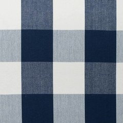
    I love black/white buffalo check, but with the blue/white accessories would you consider navy/white? Just another option.

    laughablemoments thanked patty_cakes42
  • 9 years ago

    I don't know...I already have buffalo check in the dining room...wouldn't another set of buffalo check be overkill?

  • 9 years ago

    I did mull that over.......Guess you need to try it to see if it's too much. If you were to do the *same* as the DR I think that would continue the flow. I hate that word but can't think of a better one to get the point across. Would that work with the LR wall color?

    laughablemoments thanked patty_cakes42
  • 9 years ago
    last modified: 9 years ago

    I think that new black floral is gorgeous with your couch and your wall color (eta: oh, wait. Is that soft gold wall in your room?) and complements the black furniture in the dining room, as well as your piano.

    Oh, olychick! I thought I was all settled to watch it sail on by, lol!

    No, the soft gold is not actually in our room. The living room is currently "sooty white", half finished drywall, and preprimed beadboard. Rather charming, gag. I can't wait to get to the painting point, I'd just like to know what we're doing when we get there.

    My guess is that even more of the taupe buffalo check would be too much of a good thing.

  • 9 years ago
    last modified: 9 years ago

    No more buffalo check - don't dilute its impact in your dining room by using it again; reconsider the black floral - look how nice it looks with your dining room draperies! The rest of the fabrics really don't hold up to the heft of your upholstered pieces, imo. Too lightweight, flimsy looking to my eye.

    laughablemoments thanked Olychick
  • 9 years ago

    Well...this is the buffalo check in the living room...if we did the switcharoo with the black floral...but, I really do like the checks in the dining room.

  • 9 years ago

    I actually love the floral print in your first picture posted. I think it gives the room an element of sassiness. I also agree with you that it could use a few splashes of black. I might suggest using the pinstripe or even a small grey check as inside drapery panels on your large window. You could hang the drapes on clip rings and choose a dark curtain rod & hardware. I would also paint the window frame of the smaller window white to match your other window. I think that is a perfect spot to install some white wood shutters. Since you love to sew, you could make another ottoman cover with perhaps inverted pleat corners in a larger stripe or plaid the same color scheme as under panel drape. The cane top of your end table is lovely. I think a piece of glass cut to fit would look nice and also provide protection. Canvas like fabric (think drop clothe) could be used to make couch throw pillows. I would also change out the candle sticks for crystal or distressed painted ones. It looks like a fun project. Good luck.

    laughablemoments thanked Christy Reves
  • 9 years ago

    I like the checks in your dining room, too. And the black print in this room. Oh, wait, I think I've already made that clear. Sorry, don't want to become one of those "dog with a bone" posters, but I just had to make sure my previous post didn't sound like I was suggesting a switch - I guess others did, though. :-)

    laughablemoments thanked Olychick
  • 9 years ago

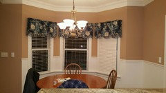
    DD/DH just closed on a second home near Nashville, and she just sent me pictures. I had to laugh when I saw the valance in the dining area.

    laughablemoments thanked patty_cakes42
  • 9 years ago

    NO, NO, NO to the black! Unless it is much brighter than it appears in the photographs, I still like the your very first choice. It just seems to work with your home and decor.

    laughablemoments thanked torreykm
  • 9 years ago

    What if you try to soften the color of the first set by washing it several times or tea staining as someone suggested?

    laughablemoments thanked nosoccermom
  • 9 years ago

    Thank you, Christy, you've given some really good suggestions. I hadn't thought to get glass made for the end tables. I picked them up second hand, and the finish is in poor condition so they need to be either restrained or painted, too. Maybe once I doll them up, they can get glass.

    I understand, olychick. Sheilaaus122 suggested a switch, so I brought a spare checked panel in to give it a shot. I have to admit, I really like the black curtains in jjam's new rug thread here: Should I get a larger rug?

    However, I'm not such a fan of the black curtains in your dd's new home, pattycakes, (sorry!) Go figure. It's a lovely, place though! : ) That looks like a wonderful spot for a window seat. It is funny how similar the colors are to the black curtains I've been looking at.

    Thanks, Torreykm. I feel this battle in my house between formal and casual, dark and light.

    I could try washing it more, no soccer mom. Since it's 100% polyester, I'm not sure how it would take to tea staining. I'd hate to ruin it in an attempt to change the colors.

    I've hung the original geranium fabric by the slider so I can stare at it in indecision a little longer...

  • 9 years ago
    last modified: 9 years ago

    I didn't dare suggest a bit of dye, but there IS some made for polyester -

    https://www.ritstudio.com/2015/04/15/announcing-rit-dyemore-rits-new-polyester-dye/

    You might be able to use the Sandstone color to get a tea dyed look. I'd use just a small amount of it to test the results. I'll just say again how much I love the first ones, too!

    laughablemoments thanked My3dogs ME zone 5A
  • 9 years ago

    I still love your first floral best of all. It's fresh and happy and so what if it looks like summer all year round? It's very cottagey. I don't care for any of the other options you've posted (especially not the black). That floral has my heart ... but I don't live in your house, so your mileage may vary. ;-)

    laughablemoments thanked User
  • 9 years ago

    Well, just tossing in, of all options I like what the bright freshness of that floral does for the room. Nothing wimpy or almost about it. Too bad that one green can't be muted a bit, but living with it a while longer might accomplish the same thing. When I hung 14 white 108" panels with light gray squiggles to frame the window sets in my sunroom-style living room, there were squiggles coming at me everywhere, but soon they settled into the background and I loved them.

    What I especially noticed, though, are that all your inspiration rooms keep the darker contrasts lower and that what window treatments there are have pale backgrounds that blend with the white/pale walls. With the exception of your armoire arrangement (very nice!), your own rooms follow that pattern. Trading the white background for a black or any dark one, running panels of strong contrast up the walls, would take you a very different direction.


    laughablemoments thanked hamamelis
  • 9 years ago

    Am happy you said that~neither is she! ;)

    laughablemoments thanked patty_cakes42
  • 9 years ago

    Hmmm...anything cotton that I've died with rit dye in the past has quickly faded. That's great to know they have a poly dye, though. Doing large vats on the stovetop to dye long panels sounds overwhelming, lol.

    I still love your first floral best of all. It's fresh and happy and so what if it looks like summer all year round? It's very cottagey.

    Yes, yes, that's it there. Fresh and happy, Christy even said sassy, which sounds better than outdated. Seeing that we have many more gloomy days than sunny ones, that made the cheeriness all the more appealing.

    Glad you and your DD weren't offended, Patty Cakes. Even though the gold is in those curtains the paint and fabric aren't bringing out the best in each other, imo.

    I did find a different floral this morning. Is it worth pursuing?

  • 9 years ago
    last modified: 9 years ago

    Based on your inspiration photos and the style of your seating, I would say no. There is nothing cottagey about your couches, and again this pattern would overwhelm everything in the room, and there will be a disconnect. I think what you really need is more color in the room itself, perhaps floral pillows, and something different that the white covered coffee table? in the middle which doesn't make any kind of statement. If you were to accessorize using your inspiration pictures as guidelines first, then you might be able to make a better decision about the curtains. You have a very nice room but it's lacking in color, which I know you're trying to introduce with the curtains, but you need to carry the theme through all the way for the cottage look. One good place to begin might be a different, more colorful rug. Even in your inspiration photos, and this is just a personal opinion, I'm afraid I like the one that has your curtains the least.

    laughablemoments thanked ingrid_vc so. CA zone 9
  • 9 years ago

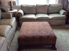
    You've sent me searching, trying to figure out what I really like, Ingrid. I guess I was thinking the color of the couches lent themselves to a cottage look. But, you are right in that they are very traditional in their arm shape. The end tables are dark, and I haven't painted them yet because I like them the color that they are. I love the look of the cherry armoire and wouldn't dream of painting it. The ottoman, well it has dark secrets of its own:

  • 9 years ago
    last modified: 9 years ago

    I still maintain that your sofas are completely neutral. I've been in quite a few honest-to-goodness English cottages, and your sofas would have fit in just fine. Because they are so neutral, the cottagey aspects come from the rest of your décor, and I think you are well on your way to creating a cheery, country-English cottage look. Real English cottage is not perfect and not contrived. (That little bit of 'neon' green you're seeing in the fabric? Not a problem at all; it adds to the charm. Take a look at Cabbages & Roses and note their bright pinks if you don't believe me about how seemingly "off" colors do have their place.) You don't want your porcelain collection to match the drapes. Try to keep "imperfect" and "uncontrived" in mind when you start overthinking this if, in fact, English cottage is truly the direction you want to keep going.

    laughablemoments thanked User
  • 9 years ago
    last modified: 9 years ago

    Omigoodness, why is that ottoman kept covered up? It's gorgeous!

    laughablemoments thanked Olychick
  • 9 years ago

    When I speak of imperfect and uncontrived, I can't help but think of Daphne du Maurier's family home at Polruan, Cornwall. The lines of her slipcovered sofas aren't too far from your own.


    laughablemoments thanked User
  • 9 years ago

    I agree with Ida, the sofa is neutral and the floral drapes say cottage. Just add in pillows to bring it together. I would do a sea grass rug to help lighten the space and a buffalo check, plaid or striped slipcover for the ottoman.

    laughablemoments thanked Kitch4me
  • 9 years ago
    last modified: 9 years ago

    I've been in quite a few honest-to-goodness English cottages, and your sofas would have fit in just fine. See, I don't have this first hand experience. I've only been in English cottages via photos. The link you gave is very fun. I could roll in some of those fabrics, at least for a little while. ; )

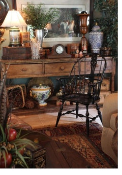
    While you've been finding those links and photos (thank you!), I've been putting together a board of my favorite more traditional spaces. I'm wondering if this direction makes more sense, considering the sum of the furniture that we have. I find this a little challenging in that these darker cozy spaces are so appealing in the winter, and lighter colors and prints are more enticing come summer.

    I keep gravitating to this picture:

    Omigoodness, why is that ottoman kept covered up? It's gorgeous!

    Thank you. It felt bossy, craftsman style, and it's very nubby, so I shushed it for a bit with the slipcover.

  • 9 years ago
    last modified: 9 years ago

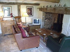
    You can certainly go towards a more muted, darker color palette and still maintain an English cottage look. Here's a couple of cottages I've stayed in that a decidedly masculine version of English cottage going on:


    Of course, it helps tremendously to have ancient wooden beams overhead, but this is certainly a look that can translate to our more modern homes.

    There are some really good, inspirational books out there if you're interested. Here are a couple that I own and particularly enjoy, even now when my overall style is no longer English cottage. I still like to look and dream.

    The English Country Cottage

    Bringing It Home: England: The Ultimate Guide To Creating The Feeling of England In Your Home

    Perfect English Cottage

    laughablemoments thanked User
  • 9 years ago

    Thank you for the pictures and book recommendations, Ida Claire. I know our library has the first one you listed; I'll have to check to see if they have the others.

    We won't have ancient wooden beams overhead, but we do plan to plank the ceiling, so that is part of the equation, as well.

    DH articulated to me this morning that in the very first floral, the flowers are too big and bold for his taste. He'd like to see something more delicate. He also wants the colors to have some crispness to them, so that they don't look muddy when they are compressed into the folds of the curtain (some that I showed him, that I didn't put on here, looked way too muddy from a distance.) That's terminology I can make sense of and try to work with, at least. : )

    I'm going to take my oldest DD shopping and see what we can find today. Wish me well!

  • 9 years ago

    I think the problem is that you're putting all your eggs in the curtain basket to create a cottage look when you really need a plan to introduce other cottage accessories to complete the look. Otherwise all you have is 'cottage' style curtains that don't relate to anything else in the room. I think that's why all of the fabrics seem disconnected from the rest of the room.

    laughablemoments thanked k9arlene
  • 9 years ago

    k9arlene also articulated what I had said. I hope your shopping trip is successful and that you'll bring home some nice accent pieces such as pillows. Please do keep the ottoman uncovered.

    laughablemoments thanked ingrid_vc so. CA zone 9
  • 9 years ago
    last modified: 9 years ago

    Shopping all day is hard work. :-) I picked up a panel of the Waverly floral tablecloth that I asked about partway through this thread. It failed! None of us like it, and it's going back.

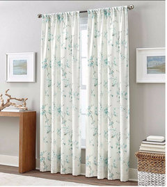
    I stopped at Bon Ton on a whim, and they had this curtain which I liked very much. I wish the photo did a better job of showing just how pretty it is. The leaves are the exact color of our couch, from what I could tell. They didn't have the size I needed in stock, so I didn't bring one home, unfortunately.

    Peri Home Botany Curtain

    I also found a 12' x 12' bound remnant of nice plush creamy tan carpet that looked a little something like this, It looked wonderfully soft for children to play on. We often have folks over drinking coffee in this room, so...that part makes me a little nervous.

    I checked into the indoor-outdoor carpet at Lowes, and there was one that I liked, but it didn't compare to the softness of this carpet remnant.

    I also found a rich rusty red oriental that had lots of pattern to it that felt really dense and high quality, but it had a medallion in the middle, which I don't think would work well with our ottoman. Coffee spills would not be noticeable, though! The ottoman's fabric wouldn't work with this rug, either. If we went with the red one, I'm pretty sure the curtains would need to be quite plain in order to not compete with the busy pattern of the rug.

    When I took photos of our room for GW, I stripped the couches of their throw pillows in order to give us a blank slate to work with. I didn't want my little thrift store pillows and diy covers to drive the decision-making process. Once we have the curtains and rug nailed down, then I can make or get pillow covers that work with everything else. The curtains and rug seem the trickiest, while the smaller details seem easier.

    I have to ask though, based on what you see of our room right now, what style does it lean toward the most? If I could have descriptors from outside observers, that would be helpful. I'm so used to seeing our stuff that my "true style" could be eluding me.

    ETA more pictures of items in this room:

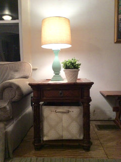
    End table, which is British colonial, I suppose?

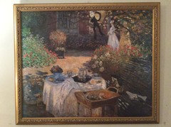
    (Artwork)

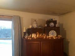
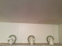
    (Dishes at top of bookshelves)
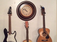
    (Clock. The guitars that I hope to move up to ds's room, eventually)

    (My chair that I sit and read to my kids from every day. It's been named The Sonlight Chair, which is the school program we are using this year. : ) Most comfy chair around!)
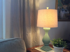
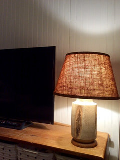
    A lamp that I love for all its earthy texture. It probably doesn't "go", but I do like it a lot. Note that the shelving unit that the tv is on will be moving upstairs in a few months, and then I'll need a plan b for the tv stand.

  • 9 years ago

    When I when I looked at your inspiration photos, my first thought was more English country, not cottage. Although I think you can meld the 2styles.

    My MIL had sofas the color of yours with tons of blue & white pieces & it was so gorgeous!!

    What if you did neutral creamy white linen drapes- like your adorable slip chair - Add 2 of the outdoor sisal look rugs from lowes, then you can change pillows & soft rugs to layer on top of the sisal? I could see using your ottoman uncovered in the winter with more of the rust reds & fall colors. Then switch rugs to something fun with pinks & greens in it, cover the ottoman & use pink pillows.

    laughablemoments thanked Peppapoodle
  • 9 years ago

    English country, that makes sense. I'll look that up and see where it leads. That's neat that your Mil had a similar scheme going on, it's reassuring that it all worked nicely together.

    Funny, I was wondering today if I should just do drop cloth drapes to keep things neutral. I'd rather buy premades, though, especially considering I've had issues with the quality of the drop cloth covers on the chair and ottoman ripping out literally from day one. I've learned that it's just as much work to make a cover with cheap as expensive fabric. Having them tear was discouraging, but not enough so for me to redo them yet... Glad you like them. : ) Changing the pillows etc with the seasons could be fun.

    Could you explain why to do 2 rugs rather than one? Is it so a bigger area would be covered?

  • 9 years ago

    I still like your original choice and am convinced that by adding accessories with a similar English Country/cottage vibe and in colours that pick out those in your panels, your room will look fab! I thought the panel went particularly well with the artwork adjacent to it in your post at 11.09 on Jan 25th (your other thread). I think you just need to bring in cushions/pillows in blue/white, pinks and green and layer the whole thing. Your dining room - which I love - has a more restrained country look imho, whereas this room could go the full-on Cabbages and Roses look as I think Ida suggested earlier :)

    laughablemoments thanked raphaellathespanishwaterdog
  • 9 years ago

    I like the green only print, the first as said is too prominent for the room. I'd do pops of color in pillows accessories not window coverings.

    laughablemoments thanked C Marlin
Sponsored
J.Holderby - Renovations
Average rating: 5 out of 5 stars4 Reviews
Franklin County's Leading General Contractors - 2X Best of Houzz!