Software
Houzz Logo Print
hzdeleted_22590553

Master redo – brainstorming and need feedback

9 years ago
last modified: 9 years ago

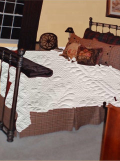
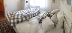
It’s time for a completely different look in here. I still like the fabrics just not all
together and I’m really tired of it in general. We will be installing oak hardwood flooring
in a medium stain throughout the house except bath and laundry rooms soon.

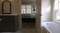
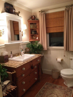
Only things staying the same are iron bed, dressers, curtain rod and I'd like to keep the brown curtains, bathroom flooring.


Comments (56)

  • 9 years ago

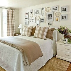
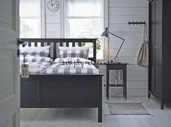
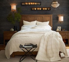
    I looked back at that blog and I used to follow her (before she quit and started a new one). Probably one reason I love that home is because that is the colors in our home. I have more aqua and neutrals with some brown and a bit of a deeper turquoise over most of the house. The office is just a bit different - for my hubby. I looked back at that picture on her blog and the paint is SW Sea Salt. I believe she said the pillow fabric came from somewhere abroad.

  • 9 years ago
    last modified: 9 years ago

    My3dogs - I've been wanting to use buffalo check for a few years now and then I saw your bathroom recently and swooned. Then I stumbled across the inexpensive Ikea bedding and decided I was going to run with it. And hey, feel free to come decorate my house please. :)

    2Pups - That may work with the curtains. If it came down to it and the brown just wasn't fitting in I'd do what I had to do, even if that means blinds, for the room. I love your plates. I only have one Spode plate and want to get more!!

    Ida - Yes, breath of fresh air. Sadly, these rooms no longer feel cozy and relaxing to me. I may try and make a couple of small changes until I can get this underway. I also have been wanting to change the other bathroom, but still lacking inspiration piece. How I wish I had some great architecture!

  • 9 years ago

    I love your bed and your inspiration bedding selection. The dark brown drapery just doesn't seem to work IMO either. Can you add a blackout shade and do a neutral linen curtain that would complement the bedding more in keeping with the inspiration photo?

    For paint, are you thinking of using pale blue? The inspiration photo does look more like Sea Salt as tinam identifies. It definitely has more green tones than blue-gray. I would use the same in the bathroom.

    Your bathroom tile doesn't look so gray to me, but photos can be deceiving. I like your ideas for freshening the bathroom. If you want to keep the current height, you could always sew a colored fabric panel to the bottom of a white shower curtain. I'd probably just lower the rod and use a white shower curtain since the beige would seem to clash with gray. You could then accent with blue or chocolate or whatever you decide to use in your bedroom or as a paint color.

  • 9 years ago

    I just love what you have now, but I get wanting a change :) Is this the shee with 2 young kids? for that reason I would be hesitant to go with so light, but it is gorgeous. I can't wait to see your "new" room. :)

  • 9 years ago
    last modified: 9 years ago

    Outsideplaying - I could probably add a blackout liner. I really like these Ikea curtains. They're the Aina unbleached and I think they're linen. Hmm.. maybe woven romans with blackout liner.

    Fortheloveofahouse

    I've also always really loved this bedroom by pinkpaula. These curtains look velvet to me. I still love me some faux fur. I believe I want to go the buffalo check route though.

    I don't know what I'm looking to do for paint. I've never been a light blue paint person, but photos have been appealing to me lately. (I'm turning into my mother liking blue!) Either that or a creamy color. I do really like My3dogs Irish Cream. I also like the color SW Aria Ivory, but it may be too pale.

    The left side of the bathroom flooring photo is more accurate. I

    Boop - Aw, thanks. I really loved this look in here for probably 7 or so years. At the time I really thought I'd love it forever. :) I tired of the paint color about two years ago, but changing it would have had a domino effect on the rest. Now it feels tacky and too much of everything. I think I would enjoy bits of it around Christmas time though. The plaid on the euro pillows is very red and green. I'm also finally tired of so many pillows.

    Yes, it's me with two young kids! White makes me a tad nervous, but the kids don't sleep in here, we don't eat or drink in here, and the cats don't get on the bed these days. This will be a test for me to see if I can keep it looking nice.

    I'm also now liking the idea of adding those Spode plates somewhere in the room.

  • 9 years ago

    I think a pale blue would look great with your bedding choices. Just be careful to make it VERY pale with a hint of grey/black mixed in to keep it from reading like a baby boy's nursery.

  • 9 years ago

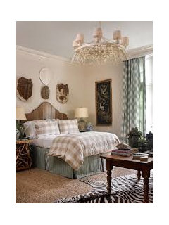
    Love your inspiration picture, but I'm not totally sure about the brown curtains with it.

    Perhaps a darker blue?

  • 9 years ago

    Nosoccer - That's a pretty picture but I definitely want lighter paint this time. Sounds like I'll most likely be swapping out the curtains and adding bamboo roman shades.

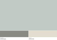
    Maybe something like this? Is this headed too gray? Once I get wood floors that should also help warm up the room.

    fortheloveofahouse

    Without checking I think this is BM Halo. Looking again I do think I need something more blue. I don't want gray.


    Today I made the bed without the euro pillows and only one other accent pillow and it feels a little better for now.

  • 9 years ago

    With wood floors, a cream paint and a lighter coverlet your room looks a lot like pinkpaula's

    User thanked roarah
  • 9 years ago
    last modified: 9 years ago

    I looked at your buffalo check on the Ikea site and it looks very creamy. Almost too creamy to use a very pale gray-blue on the walls. I was going to recommend Gray Owl but it can look both pale blue and pale gray at different times of day, so I hesitate. You might be better off to go with a warmer shade of creamy Linen in the bedroom and use the pale gray blue in the bathroom.

  • 9 years ago

    I'm not sure if the sea salt is blue/grey or more blue/green - of course you'd need to sample it in your room. BUT, that IS the paint color of the photo you shared and her bedding is the ikea bedding and I think that room definitely works. Just not the brown curtains :(.

  • PRO
    9 years ago

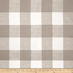
    Shee, I do believe the plaid you’re interested in is probably Anderson Buffalo Check Ecru made by PremierPrints. I’m working with it right now for a customer.

  • 9 years ago

    IKEA also sells the buffalo check fabric. You mentioned the AINA. I love them, just as nice as my more expensive PB curtains.

    How about a creamy wall paint.


  • 9 years ago
    last modified: 9 years ago

    I remember when you put together your current bedding scheme and how much I liked your choices. I like the buffalo check, too. You might consider using the buffalo check for warmer months and your current bedding for colder months and choose your paint accordingly. I know I get bored with my bedding, so changing it seasonally really helps to keep it fresh for me, besides the fact that I want warmer, heavier bedding when it's cold and lighter, cooler bedding when it's warm outside. Anyway...just a thought.

  • 9 years ago
    last modified: 9 years ago

    Roarah - I think I can see it happening. Tell you what, that gold paint I have now (SW Restrained Gold) is really hard to see past. It's very intense. I have a fluffy fur throw that I believe looks very similar to the one she has on the bed.

    Outside - Gray Owl was another one I did look at. I don't think I would like a blue gray in the bathroom. With the other finishes I'm pretty sure I'll find it cold. Problem is, there's nothing WOW about the bathroom so I can't really see a white (or linen) shower curtain working with just a bamboo roman and pale wall color. Maybe I could take it up a notch with some art, but... I think I'm going to need something more in here since there's not any stand out items. And I would have to be careful with cream in the bathroom because nothing in there is creamy and is more white or off-white.

    I was actually, rolling around the idea of tiling the floor myself. Good old DIY project. I bet I could do the actual work but trying to figure out the layout and math, ew. Annnnd the dollar sign keeps rising for this project. :)

    Tina - That is the paint color for that inspiration photo? Can you point to the direction to contact someone about the fabric on those pillows? When I did a search for the watermark on the photo I couldn't find anything by 11h designs.

    Heidi - Nice! Thank you. I made note of that in case I need it.

    Nosoccer - I didn't know that, thanks. Is it online? I looked the other day but couldn't find it. I like the creamy color very much. Really wish I had an Ikea near me. I like both those photos and pinned them the other night. In general I think I'd like to be able to make minor changes to the room and get a different look without having to repaint, buy rugs, etc.

    Fun2BHere - Thanks! I was thinking about that earlier today. I am going to keep the bedding I have and do think I would enjoy it in the winter. I thought it was all the pattern that was bothering me, but I actually think it's more the in your face COLOR. The gold and red are both strong. When I started to tire of the gold I considered painting it BM Manchester Tan. It doesn't seem to work with the plaid euro pillows real well and I think the toile is too warm/yellow. I wasn't sure what direction to go so I just put it on hold. My eye is pleased with the pillows I took away from the bed earlier today.

  • 9 years ago

    Shee, if you go to her blog, she has a post on the room. She says the paint is SW sea salt. She says the pillows (or the fabric, I can't remember) was bought in Provence, I believe.

    You could do creamy as nosoccermom mentioned and just add in the blue as some of your accents. I think either would work, but my favorite is the room you posted with the blue walls.

    User thanked tinam61
  • 9 years ago

    Tina - Could you please provide a link? I can't find it!


  • 9 years ago

    I also have the Lenda IKEA curtains (they have a little textured line pattern.

    Anyways, the Aina white is the creamiest of the bunch. Here's a previous GW thread on the various whites.

    If you scroll down, there are pictures of Aina, Lenda, Ritva.

    Also want to say that the light blue/green you posted could be lovely and very versatile.

  • 9 years ago

    http://www.llhdesignsblog.com/ 

    She doesn't write on that blog anymore but it's still available. Don't remember how I found her, she moved here to Tennessee. I loved her home/decorating.

  • 9 years ago
    last modified: 9 years ago

    Nosoccermom - Thanks for the link. That's very helpful with the names and photos.

    Thanks Tina. I was hoping to find some contact info there, but no luck.

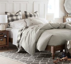
    That Ikea bedding is labeled as beige on their site and I think it looks beige. Then there was mention that Ikea also sells the fabric and I stumbled upon this photo and it was mentioned it's Ikea Bertaruta buffalo check in taupe. I didn't see either online in the fabric section. Do (or did) they sell both colors or is it the same thing? They look different to me - one beige and one taupe. I just wasn't sure if the Emmie Ruta was for the 'bedding' and the Bertaruta name was for the 'fabric'.

    I can't save the photo. It's on Bespoke Studio's Instagram.

    Bespokestudiollc - taupe fabric on a chair

    Different photo of the same fabric on another chair.

    Pretty sure the bedding and fabric shown are different, but wanted to be sure before my friend makes an Ikea run!

  • 9 years ago

    Go to her new blog (linked on the old one) and there is a connect tab where you can send an email.

  • 9 years ago
    last modified: 9 years ago

    Hmm... her webpage doesn't load for me. It says the server DNS could not be found. The Ten10Farm doesn't have any contact info. ?

  • 9 years ago

    The cushion fabric looks like a traditional quilted provencal fabric like the ones popularized by Pierre Deux and Souleiado. I'd check on Etsy and eBay, and even try Googling blue block print floral fabric for something similar.

    I'd also wait to get the fabric/cushion before deciding on the wall color so they can work together.

    You might want to consider a cushion with a blue/brown toile, like this, which would work well with the existing dark brown curtains, new Aina curtains, Ikea buffalo check bedding, and also any Spode/brown transferware.

    If you want a neutral shower curtain that ties in with the bedroom, you could use an Aina linen curtain with a poly liner.


  • 9 years ago

    That's weird. It comes up for me but I believe the last post is 2014. Her new blog is http://braveheartedbeauty.com/.  Contact tab there.

  • 9 years ago
    last modified: 9 years ago

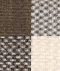
    Shee, I just looked at Ikea online and their buffalo check fabric, Berta Ruta, is called gray on their website. HERE.

    You may want to order a swatch of the Premier Prints Anderson in Ecru - HERE

    Here is a 'wheat / cream' buffalo check,but it's only 45" wide, all cotton - HERE.
    But at $6.25 a yard, maybe you can get it to work, if you're looking for a warmer color.

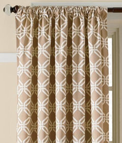
    ETA - I just checked Country Curtains clearance area, and while this isn't a Buffalo Check, at $3.97 a yard, thought I'd show it to you. HERE

    Here it is made up in curtains - Elegant Links in 'Khaki'. They also have the fabric in light sage and blue.


    They also have a Buffalo check on clearance for $9.97 a yard, previously $20.95 but only in 'chocolate'. They send free swatches...

    HERE.

    User thanked My3dogs ME zone 5A
  • 9 years ago
    last modified: 9 years ago

    Becky - Thank you. I really wasn't even sure what words to search for similar fabrics.

    It's interesting I've never been big on brown and blue. I like the room in my inspiration photo, but it needs to be just the right lighter shade of blue for me to like it. I prefer it not to lean aqua. I am going to see if I can fined a fabric that ties everything together and agree about waiting to see what I come up with before selecting paint.

    I didn't think about using the Aina curtain for the shower. I guess could I could make gromits as the top. I prefer button holes, but have never tried to make any. I can sew, but just basic stuff.

    Tina - Thank you!!

    My3dogs - That's weird - I went to their fabric and that isn't showing up but it does for your link. I find their site somewhat difficult to find things. It also says beige on mine. Typo? Thank you. I don't really want to sew a duvet, but I'll keep those in mind. Great about the free samples! I definitely prefer a more beige color than taupe/gray.

    I love the look of them, but I've never had a duvet. Hopefully they're like the new greatest thing. :)


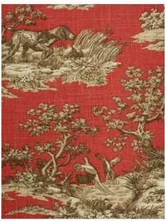
    ETA - Before I found that inspiration photo I wanted to add this brighter rust/red/boardering on pink color. I have this fabric in my kitchen as a roman shade. I have different fabrics in that shade or similar in other areas of the house. Thought it might be nice to carry the color in here.

    Roman shade fabric. I didn't want to repeat this exact fabric but it does have brown and beige in there. No white though so I wasn't sure it would work anyhow with wanting a white coverlet and there being white in the duvet and shams.


  • 9 years ago

    Bumping because it's not showing up unless I go into my activity and I want to see if this does anything.

  • 9 years ago

    Bump?

  • 9 years ago

    shee - I have the Ikea duvet in the other color - you can get a glimpse of it here. I saw both while there and the light one looked anemic to me, not like it looks online. (ignore the propped mirror please - we're still moving in!) You might find this colorway to be easier to mix with your existing curtains but it's hard for me to tell how much red is in that brown - if it's a red/brown it won't work.

  • 9 years ago
    last modified: 9 years ago

    Hi Dlm - That's exciting you're moving in! Congrats!

    Oh, anemic is just bad. I did find a few photos online that gave me pause because they looked really washed out. Thanks for posting that photo. I think there's only three colors and I'm assuming yours is the gray one. Is it a brown gray? Green gray? Curious what's your bedroom wall color?

    Assuming these are the same, but I think it looks pretty different and prefer how the color reads on yours and this first bed. I wish they had a brown check.

    1.

    2.

    Maybe the second one is also reading that way because there's more gray in the room.

  • 9 years ago

    It's def a grayed brown, no green in it at all. Wall color through the whole house is B/M Natural Cream OC-14 and you can see how different the walls look from the bathroom to the bedroom. What you're seeing most in your second pic is the lighter of the check colors - you can only see the doubled/overlapped color on the shams in that pic. And who knows what was done to edit the photo - the whole room looks like it's been washed. I can get more pics for you later if it'll help. It def does not read as a straight gray - it's brown with a gray undertone, no green no red. Look at the color of my vanity - same thing, grayed brown.

  • 9 years ago

    Thanks for all the info. I wondered if the wall color in the bath and bedroom were the same. Yes more pics please would be great when you can.

  • 9 years ago

    I'd be happy to take a picture of the beige/white duvet next time when I'm at IKEA (soon). The way I remember it, it looks pretty much like your inspiration pic.

    User thanked nosoccermom
  • 9 years ago
    last modified: 9 years ago

    Thank you Dlm! I do have a deck and that is helpful with the colors. My current curtains do have too much red in them to work but they can go if need be.

    Nosoccer - That would be great! Thank you!

    I did contact the women from the inspiration photo asking about the pillow fabric but didn't hear anything back.

  • 9 years ago
    last modified: 9 years ago

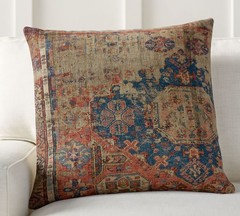
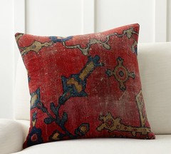
    I'm going to pull a 180. I don't even remember how I ended up at PB's site tonight but I forgot all about these pillows and I just love them. I don't like them with the buffalo check though. I'm not scratching the buffalo check idea I'm just working up another.

    Since we're installing hardwood in the next year a LR redo will be in order and I would use these today in some combination if I had a solid light couch. It got me thinking why couldn't I use one in the bedroom. ?

    White covers & skirt, white shams or euros and one of these in front. Fur throw at the bottom. Walls and curtains would change. Add art to tie colors together. Figure out bathroom later. :P

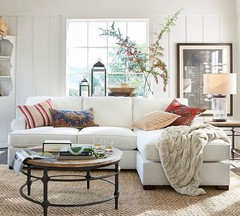
    ETA - White may be too stark and would have to go creamier like the couch shown below.

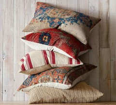
    I really like certain kilim rugs/pillows/ottomans. I really like and would like to continue the rust/coral color in the bedroom. I also would like blue.

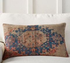
    They're 22" and the lumbars are 16"x26".

    1

    2 - Think I might slightly prefer the lumbar shape more but I like that there's more coral in #1 and that light strip.

    3. If I used this one I may even be able to keep the bathroom wall color. (I still do like it.)

    Two of the pillows on a couch. I think all the pillows look so dinky here but again, they're 22" and 16"x26".

    Maybe use #2 lumber and #3 red together on the bed? I did want to keep a minimum of pillows though.

    To clarify a little, the first inspiration photo I posted mainly because I was trying to show white bedding with the buffalo check. I do really like the blue fabric, from what I can see, on the pillows and think the room is pretty but it wasn't necessarily that I wanted to copy that whole room.

    A general question about the first two pillows - If it were from a real rug, the center medallion wouldn't be on both, right? As in if you were trying to pretend these were real, you wouldn't use 1 and 2 together because the pattern is too similar. Hope I'm making sense!

  • 9 years ago

    Very pretty, but probably not so soft if indeed from a real rug. However, I could see some old velvety tapestries.....

  • 9 years ago
    last modified: 9 years ago

    Nosoccer - The ones from pottery barn above - 1 & 2 are cotton and linen and 3 is a cotton velvet I believe and none are actually from rugs.

    a pb pillow

    So this morning, as much as I like those pillows, I don't think it's really me. You know how that goes. I need to back through my favs inspiration folder again.

    Still believe I'm going to go a buffalo check direction in here. One thing's for sure, my style is wanting to shift somewhat. And I struggle between wanting really simple things and more is more.

  • 9 years ago

    I read the latest post this morning from the Blake Hill House blog and thought of you, Shee, and then remembered that you had changed direction. But now that you're back on the buffalo check path, I'll post it here : ) .

    Blake Hill House blog guest room plans

    The ones she's using are from Overstock, the prices look pretty good depending on the size.


  • 9 years ago

    Becky - Thank you for the links! I like both the tan and navy.

  • 9 years ago

    When I find photos that inspire, I save them to go through later and make a list of what it is about them that I like. Mine always come with lots of cream, neutrals and green, touches of neoclassical style, gold framed paintings, med to light toned warm wood finishes, LOTS of natural light, white china, etc. The list is long, and the same things tend to catch my eye, but I do the exercise again from time to time to see if I'm still drawn to the same elements or if I've gotten past some of them. It helps keep me focused. I even take my list shopping with me when I'm looking for accessories so I don't get distracted by the latest trend.

  • 9 years ago
    last modified: 9 years ago

    Say - That's a great idea. When I went through them again yesterday there were some I found myself deleting and still many others that I've had saved for years that I still really love to look at. I think what makes it sometimes hard for me is the lack of bones in my house compared to a lot of the photos I like. I can pick and choose certain things but need to remember it's not going to be the same. I think the exercise of making an actual list would help me. Thanks!

  • 9 years ago

    Shee, I got a new PB catalog the other day and was looking through it. They have a similar buffalo check bedding with a quilt (not a duvet cover) and shams. Thought you might want to take a look. The thing about PB as I'm sure you know is it might be easy to return and also match draperies and other items if you have one nearby.

  • 9 years ago
    last modified: 9 years ago

    Thank for the heads up Outside. I just looked and I do like it but think I prefer the larger checks. ETA - I didn't scroll far enough; found larger check. Only comes in gray though. :( I do like the ticking stripe duvet with it.

    Unfortunately there isn't a PB near me. I like a lot of their solid colored duvets and shams. I like the white ones and I think this one is really pretty.

    ella ruched quilt and sham

    Side note, it really bugs me that PB doesn't have reviews on their site. I wasn't happy with a crib skirt I bought (I had to do altering I shouldn't of had to.) and couldn't leave a review.

  • 9 years ago

    My mistake, Shee. I thought it came in the creamy beige, but I see now it was the smaller check in another item, not the quilt. Sorry.

    Yes, I have bought a couple of their solid matelassé quilts and some other bedding and have been really happy with them. Agree with you on the reviews. It would be helpful, especially as to color and things like you mentioned.

  • 9 years ago
    last modified: 9 years ago

    So, I took pics at IKEA, but the lighting and my phone were really crappy.

    I'd say the lighter check is probably closest to BM Elmira White, with the darker check somewhere between Grant Beige and Bennington Gray, kind of like Bleeker Beige. The underside is striped.

    User thanked nosoccermom
  • 9 years ago
    last modified: 9 years ago

    Nosoccer - Thank you!! I'm surprised it's a little more taupe than beige. I'm surprised I'm not tired of beige with it being on most of our walls. Hmm.. I'll be sure to get my fan deck back out. Again, thanks!!

  • 9 years ago

    My picture is, of course, horrible --- and the packaging around the duvet doesn't help matters, either.


    User thanked nosoccermom
  • 9 years ago

    This is for Shee from a request I just got from her - carry on! :-)

    User thanked My3dogs ME zone 5A
  • 9 years ago

    Thank you! Sending you an email back.