Software
Houzz Logo Print
gavavemom

Help with bathroom wall color

9 years ago
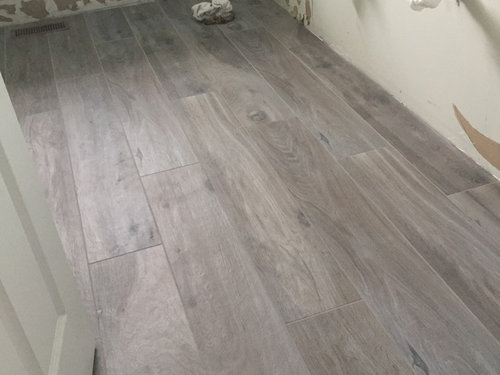
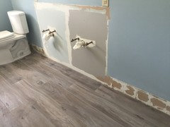
In midst of minor bathroom remodel of our hallway bathroom and could use some help with wall color. Want to try something other than blue this time. Going for a coastal/rustic look. Appreciate your help!

Comments (48)

  • 9 years ago

    I actually love that blue with the floor, but I can certainly understand wanting to change it. What about a warm white? And- what is that floor- make and color?


  • PRO
    9 years ago
    last modified: 9 years ago

  • 9 years ago

    I think it may be safe to say that Benjamin Moore equates "coastal" with blue...

  • 9 years ago

    Guess I'm not completely devoted to coastal. Farmhouse/rustic I love as well.

  • 9 years ago

    What is your shower tile or surround and vanity going to be?

  • 9 years ago

    We are not doing shower tile and will keep our basic shower/bath stall. Vanity we are thinking of replacing. Haven't decided yet but leaning towards a simple white vanity with white carrera top.

  • 9 years ago
    last modified: 9 years ago

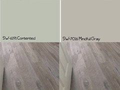
    Two colors that remind me of the Long Island sound water mixed with a stormy sky, which is my favorite beach view, are contented and mindful grey. I like mindful grey best with your floors but it is not the spa beach look that most people gravitate towards with bathrooms but a rather "Moore" moody feel.

  • 9 years ago

    blush pink:)

    don't kill me..just trying to live vicariously through others

    but -will work with the floor, has rustic/nostalgic notes about it, and is great for complexion

    obviously depends on what else will go in there..tiles, vanities, countertop, etc

  • 9 years ago

    Sample of Sea Salt on left and Mindful Gray on right. Thoughts? I like Mindful Gray but it's pretty dark and so close to the floor and worry it would make a 5x10 bathroom look small.

  • 9 years ago

    I love the mindful gray.

  • 9 years ago

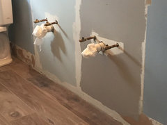
    And with lights on how is Mindful Gray?

  • 9 years ago

    I was going to suggest SW Sea Salt or BM Quiet Moments. You can find tons of bathroom pictures with those colors on the walls with a google or Pinterest search.


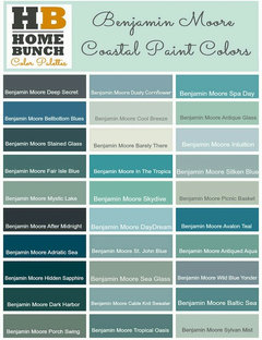
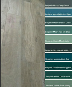
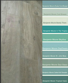
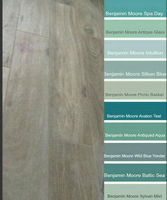
    the first set of BM colors up top are a bit too intense to me. I'd cut many of them to 25% if they were contenders.

  • 9 years ago
    last modified: 9 years ago

    Are you hoping for a spa rustic costal or a moody rustic costal? Sea salt is lovely and I actually played it safe in my nautical bath with a blueish, greenish grayish color but so does everyone else. What is your gut telling you? I think both colors work with your beautiful tile!

  • 9 years ago

    I haven't looked at any other colors but right now my gut is saying Mindful Gray over Sea Salt.

  • 9 years ago

    I like sea salt better but only bc I think the mindful gray is too close to your floor color. I love dark colors though. I think navy would look good too.

  • 9 years ago

    I jotted down a few colors that caught my eye on BM website:

    Barely There

    Skipping Stone

    Beach Glass

    Quiet Moments

    Cool Breeze

    Do you think any of these will work?

  • 9 years ago

    I absolutely LOVE the mindful gray. I never saw it before and now I want to use it somewhere lol.

  • 9 years ago

    I love Mindful Gray, but have to say that on my monitor it looks very brown and doesn't really go with your (beautiful) floors, especiallt with the lights on. Different undertones.

  • 9 years ago

    Have to say that the second picture with lights on makes the floor look really brown but the more accurate representation of what the floors look like whether lights are on/off is in the first picture. The floors (which I'm living more each day) are gray with some warm brown undertones embedded in. Mindful Gray is a really nice color but I struggle with greige because it changes with light. In this case it looks more gray during day but at night takes on more brown. It does at times look similar to the tile color.

    Think I need to look at more colors. I have a few in mind as mentioned above but if anyone has any other suggestions, I really am appreciative.


  • 9 years ago

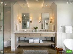
    Any of these tones would work perfectly. I like the second from the right. It has the perfect spa feeling. suggestions

  • 9 years ago

    If you scroll down on the page you can see it in a bathroom.

  • 9 years ago

    I think you should do white ship-lap on the bottom and agreeable gray on the top.

  • 9 years ago

    Hmm not finding a good example of white shiplap on bottom? Can you provide more detail as to what you are thinking?

  • 9 years ago

    I have seen it done a lot lately but I don't have any great pictures myself but here are a few you might pick something from. There are a ton of ways you can use shiplap or paneling. I just thought it would look nice with your floors.

    half wall

  • 9 years ago

    BM Barely There looks fascinating, blending with the floor, yet being noncommittal. Can you get a sample pot to try it out? Computer monitors are not conducive to choosing colors.

  • 9 years ago

    Check out BM Wickham Gray I have it in my bathroom and love it. I think it's the perfect coastal color.


  • 9 years ago

    I know I need to paint some samples on the wall but at this point trying to narrow things down from these paint chips I got today. Left to right on the ones I circled: Collinwood, Balboa Mist, Pale Oak, Gray Owl, Sterling, Quiet Moments, Wickham Gray. When I look at the tile, it's definitely reading more of a blue gray, but it's not a cool gray.

  • 9 years ago

    I love gray owl. It is warmer blue green gray.

    Here is a pic in a bloggers house.

    http://fortheloveofahouse.blogspot.com/2011/01/kitchen.html

  • 9 years ago

    I like Sea Glass. Funny as I am trying to get away from gray. Previous homeowners put gray with orangy tiles.


  • 9 years ago

    I also like the Sea Glass. Quiet Moments is going to look more blue than gray.

  • 9 years ago

    I assume you mean Beach Glass, the color below Quiet Moments on the strip? I'm ok with a gray that reads a little blue or a subtle blue-green shade that changes with light.

  • 9 years ago

    Recently painted our Master Bath in Gray Owl after going through what seemed like 100 samples. It was really about 10 actual paint samples but felt like more it was so agonizing. Very happy with it, as it is so quiet. Very pale soft blue-gray. In some times of the day you see mostly the gray and others some pale bluish-gray. Love it.

  • 9 years ago

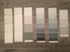
    Got some paint samples today from BM. Left to right are: Gray Owl, Quiet Moments, Beach Glass (small patch), Wickham Gray and finally Artic Gray (right before blue edge). Leaning towards either Gray Owl or Quiet Moments.

  • 9 years ago

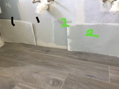
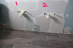
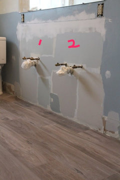
    Bumping post up as I need to come to a decision soon. On left (marked as 1) is Gray Owl and on right Quiet Moments (#2). Interesting how it appears slightly darker on wall vs poster board. Thoughts? Both are really nice, warm muted colors. Husband likes Quiet Moments and I'm leaning towards Gray Owl.

  • 9 years ago

    I think gray owl looks the best with your floors. Plus I love the color!

  • 9 years ago

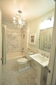
    If it helps, here's Quiet Moments in the bathroom of my last place. It's a beautiful color! I worry that gray would get old faster?

    http://www.smallchichome.com/2013/02/my-marble-bathroomall-of-it.html


  • 9 years ago

    Gray Owl

  • PRO
    9 years ago

  • 9 years ago

    that's great choice mdln

    the question is-how it will look in the evening, with lights on?

    obviously I wouldn't know the answer..gavavemom you probably checked how all of these behave in artificial lighting?

    (we did repaint our bath lol..they installed these goddamn LED s..totally turned the color into something else..)

  • 9 years ago

    Mdln Beach Glass is a wonderful color but we felt it was too dark for a small bathroom. To confuse things more, I just came home with 3 more samples, Nimbus, Sterling and Balboa Mist. Sigh. One of these has to work. Stay tuned.

  • 9 years ago

    lol. we will

    good luck!

  • 9 years ago

    just to say that I read the tile as -probably-violet gray (one of my favorite colors ever so not objective here)

    so in the daytime the blue part comes through

    in the evening the pink part does

    at least that's what I see on my monitor

    (I wouldn't worry too much about the dark paint making small space smaller..small spaces can handle dark paint much better than large ones. Not oppressive. Cozy)

  • 9 years ago

    With lights off during day. 1 (Sea Salt), 2 (Sterling), 3 (directly below #1 Gray Owl) and then going left to right is Quiet Moments, Beach Glass, Nimbus, and Balboa Mist.

  • 9 years ago

    Side view during day with lights on. I don't think I made my decision any easier by adding 3 more colors in the mix. Of the 3 I added though, I like Nimbus the best.

  • 9 years ago

    Quiet Moments

  • 7 years ago
    @Gavavemom could you update with the final product? Was thinking of getting the same tile and would love to see what the final product looked like.