

Investor with an *ugly* elevation
9 years ago
Featured Answer
Sort by:Oldest
Comments (9)
 9 years agolast modified: 9 years ago
 9 years ago
Related Professionals
Fort Worth Interior Designers & Decorators · Dubuque Interior Designers & Decorators · Norfolk Interior Designers & Decorators · Bennington Interior Designers & Decorators · Little Rock Architects & Building Designers · Syracuse Architects & Building Designers · Marinette Architects & Building Designers · Bozeman Architects & Building Designers · Vancouver Architects & Building Designers · Calgary Architects & Building Designers · Cowansville Architects & Building Designers · Natchitoches Kitchen & Bathroom Designers · Hilton Head Island Kitchen & Bathroom Designers · Lufkin Kitchen & Bathroom Designers · Norfolk Kitchen & Bathroom Designers 9 years ago
- 9 years ago
 9 years ago
- 9 years ago
- 9 years ago
- 9 years ago

Related Stories
KITCHEN DESIGNA Stylist’s Secrets for Giving Your Kitchen the Wow Factor
There’s more to getting a fabulous kitchen than designing and installing it. It's the little details that elevate its look
Full Story
LANDSCAPE DESIGNSee 6 Stunning Patio Transformations
New amenities, plantings and paving elevate these outdoor living spaces
Full Story
MODERN HOMESHouzz Tour: Chic and Fun Texas Party House for Longhorn Fans
A designer uses bright colors, lively patterns, layers of texture and bold artwork to elevate this Austin home’s design
Full Story
DECORATING GUIDES9 Things for Every Home’s Wish List
A splurge, some sparkle and a great place to read. Elements like these can dramatically elevate your interior design
Full Story
HOUZZ TOURSMy Houzz: Accessibility With Personality in an 1870 Home
Hand-painted murals and personal touches fill an accessible home with warmth and charm
Full Story
KITCHEN DESIGNWorking the Room: What’s Popular in Kitchens Now
We break down 9 kitchen design ideas that are making people happy — and show how to make them work for you
Full Story
LIGHTINGWhy It’s High Time to Reconsider Flush-Mount Lights
Look past your negative perceptions and see how versatile these lights can be
Full Story
EXTERIORS7 Exterior Makeovers Show How Details Matter
These dramatic before-and-after photos could inspire your own exterior update
Full Story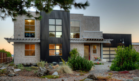
COASTAL STYLEHouzz Tour: Major Face-Lift Gives a Beach House New Life
The transformation of this Puget Sound island home is so remarkable that many residents think it was torn down and rebuilt
Full Story

emmarene9