Software
Houzz Logo Print
willow22

What colour

8 years ago
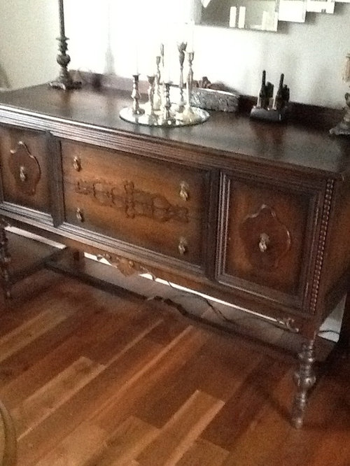
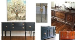
I have looked at this buffet for months. Some of you send not to paint. Have decided I want to paint it.

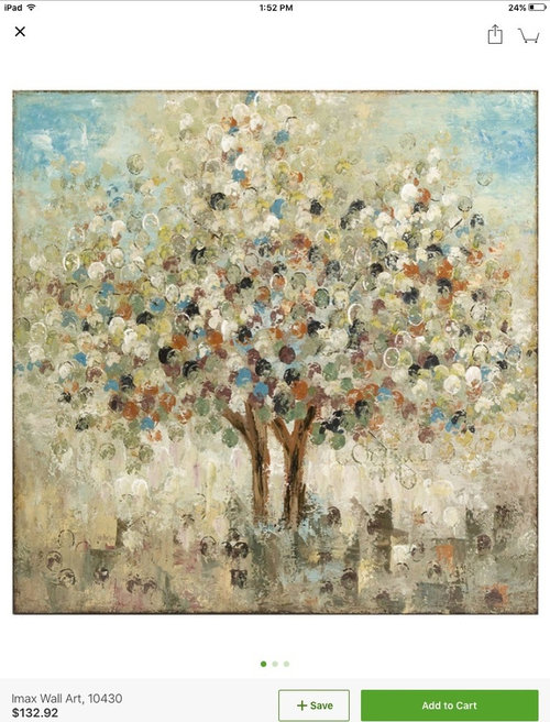
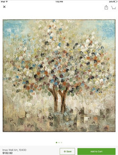
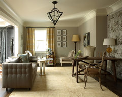
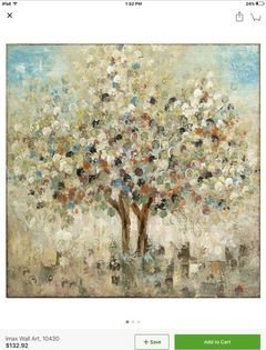
Diningroom is painted in Revere Grey and the picture is what I have ordered for the room. Dining room table is dark brown...what colour does everyone think. Would like Buffet to look happy. Thank you for your ideas.

Comments (34)

  • 8 years ago

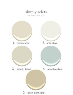
    there is gray in the painting. you could do a pale blue, a sage green, any of the off whites or beige tones, darker grays, even a blush color,,,all of those are in the painting.

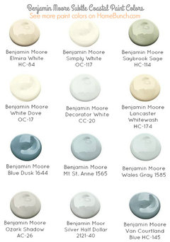
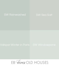
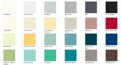
    any of these should work

  • 8 years ago
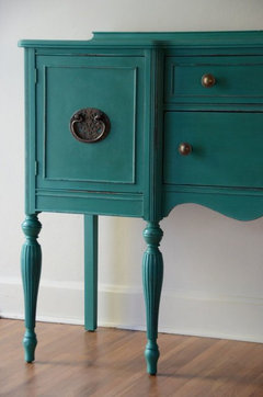
    Beth, which would be your favourite colour. I like the blues and greens. Idon't what to make it cheap..
  • 8 years ago

    can you post a pic of the entire room? hows the lighting? with your flooring, any of the sages or the pale blues and blue/greens will look great.

  • 8 years ago
    Thank you Beth. I think I like the blue green idea.
    Anyone else have an idea.
    Would love to hear from all you Houzzer's
  • 8 years ago
    Hard to tell if Duck Egg blue will work with your picture but there are other very neat blues and greens in that line of paint and tutorials on line with examples where colours are mixed for custom shades.
  • 8 years ago
    Rosealynn it is beautiful
  • 8 years ago
    Thanks-it took some time as it was my first time using the paint and I wanted a smooth even finish (not distressed). Total cost ~50$. Still isn't "styled" to Houzz standards but a great working piece in an open dining/kitchen/family area. The room is in the back of the house (north), the walls are BM baby fawn and trim BM simply white.
  • PRO
    8 years ago

    Would you clarify? Do you mean Revere Pewter?

  • 8 years ago
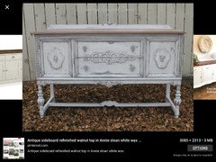
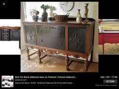
    Found this photo by entering painted walnut sideboard. Is the first one identical to yours?!
  • PRO
    8 years ago

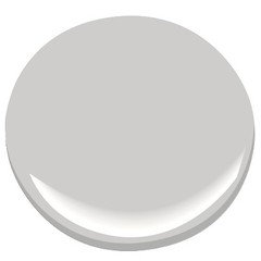
    If you want the sideboard to coordinate with all the colors…the table, the wall color, and the artwork, I would definitely do a light gray with a brown undertone..specifically…B.M Cement Gray.


  • 8 years ago
    JudyG, my wall is baby fawn, the picture doesn't really show the true colour.
  • 8 years ago
    I painted a similar piece Knoxville Gray by BM and it's beautiful - gray blue with green undertones. It was initially in my dining room which is also Revere Pewter, and now it's in another room that is painted Comfort Gray by SW. Looks awesome in both rooms.

    It's important to note that when you paint a piece of furniture it will come out significantly lighter than it does on the wall. (I don't know why). So pick something a shade or two darker than you really want it to be. I didn't know this at first and had to repaint whole thing because it was way too light. Also use a good primer - I use Stix and am very happy with it.
  • PRO
    8 years ago

    Not seeing the space is hard to guess what color would look best regarding to your other furnishings and textures of the room and adjacent spaces. Is the art going over the buffet? Inspirations and options.

  • 8 years ago
    If you choose chalk paint, no priming or sanding is necessary.
  • PRO
    8 years ago
    last modified: 8 years ago


    Oh…off white for the walls.

    Then I am with Jodie and Roslyn…because you are leaving the table as is, I, personally, would not go light on the side board.

    B.M Bella Blue. And I would do full coverage, no shabby look, in a satin finish…or what ever is closet to the dining room table top.

  • 8 years ago
    Judy G. The dining room is Revere Pewter.
  • 8 years ago

    By dark brown, espresso-dark, or walnut?..... you want happy... though sounds like room is on the conservative side... ok...hm.

  • 8 years ago

    I meant to add - where's the app that shows paint colors from photo of an item???

  • 8 years ago

    Annie Sloan's Greek Blue? [Greek has to be a happy color!! might not be muted enough, but I think it's in the painting's sky?]

    https://www.anniesloan.com/annie-sloan-products/paints/chalk-paint/greek-blue-chalk-paint.html

  • 8 years ago
    last modified: 8 years ago

    Annie's Greek blue says: "It’s also a colour that works well in a neoclassical interior deepened a little with dark wax." Adds dimension..... and less contemporary...

  • 8 years ago
    last modified: 8 years ago

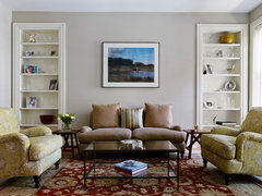
    Rasmussen / Su Architects: "It's one of our favorite colors: Benjamin Moore Revere Pewter HC-172."

    fitler square renovation · More Info

  • 8 years ago
    last modified: 8 years ago

    Your painting seems to have "spring green" leaves/ buds in yellow-green [not yellow?].... but I see lots of gold in RPewter rooms. Would that work for your piece? idk!

    J. Hirsch Interior Design Portfolio · More Info

  • 8 years ago
    last modified: 8 years ago

    Harley, I'm sorry,,,I didn't read the question correctly,,I thought you were asking what color to paint the room. I'm very familiar w/painting these buffets,,,I've done 5 of them.

    I like milk paint on the raw wood. I also like to redo the top if it's in good shape.

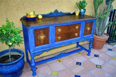
    This is one I did in a ultra marine blue milk paint. It was purchased by Lucilles BBQ and now sits in their restaurant in Las Vegas!

    This color is a bit too strong for your room, but I like the walnut wood. I didn't want to cover over the beautiful graining on the front. You could do a soft blue or green in the milk paint. Real Milk Paint Co. has some great colors.

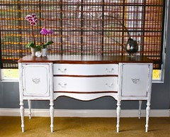
    This was another one I did in the white chalk paint. I also kept the wood top. I don't like to paint them unless the wood is too far gone.

    If you do the chalk paint, do one of the colors suggested above. you can mix it w/white/or other colors to make your own shade. You can also make your own chalk paint w/a sample pot of Behr paint and plaster of paris.

    perhaps this color would work for you. It's a mixture I created but the main color is Aubusson by Annie sloan chalk paint.

    you can lighten it w/white paint or use it full, use a dark wax or tung oil as a finisher.

  • 8 years ago

    ProBeth: please tell where and how much to buy plaster of paris? thank you!

  • 8 years ago
    last modified: 8 years ago

    everdebz,,,PP is at HD...a carton is about 7 bucks. I always use the behr paint because it's mixes the best w/PP. just regular behr paint, not the fancy paint/primer super enamel stuff. ratio is 2 parts paint to 1 part PP. use a tupperware container. take a plastic cup or old measuring cup, put your paint in it, then dump in container. then fill the cup halfway w/your PP. (use a clean cup) For instance, 1 cup of paint and 1/2 cup of PP. (Don't pour the powder into the paint w/o mixing w/water!) In the PP cup, mix w/hot water until you get pancake batter consistency. (it varies so just add water slowly and stir to mix) After the powder is mixed well, slowly pour into the paint and stir. Voila! chalk paint. if you want more chalky, add more pp,,, Paint your first coat, fine sand when dry,,,Paint second coat,,,fine sand again,,,top w/wax, tung oil, hemp oil, or a poly.

    Oh,,one of those little Behr sample pots mixed w/the PP makes enough CP to do one dresser or buffet.

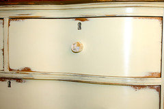
    this was an old piece I did about 6 years ago. I used my own CP with martha stewart paint (HD used to carry her paint). color is Custard. To see what the fine sanding does, look at this finish. super smooth. all I used on it was clear wax. you can't even see where I filled in the previous handle holes!

  • 8 years ago
    Beth H..... thanks for the great information on chalk paint
  • 8 years ago
    Thank you everyone for great advise. I think I'am going to paint it with a paint called FUSION. I did put a question on the board to see if anyone knew anything about it. The colours are very nice and no sanding required or a primer.

    Going to try on the buffet first as next on my bucket list is going to be my kitchen cabinets. Buffet will give me a chance to see what this paint looks and wears like.

    If you all have a minute...look it up and tell me what you think of the paint and colours.

    Looking forward to hearing your thoughts.
  • 8 years ago
    last modified: 8 years ago

    same stuff as chalk paint, more or less. You can make your own for cheaper and get the exact color you want. that's a very small jar you get for that price. and don't buy their brush. you can use a regular paint brush. one of the inexpensive ones for 5 bucks will work

    but, the inglenook is nice

  • 8 years ago
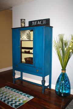
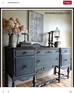
    This is the colour I'am thinking of painting the buffet.
    What do you think with the print?

    I really like the barn board sign and may also make one.

    This is done by a blogger I watch and uses Fusion Paint.

    Let me know your thoughts...good or not
  • 8 years ago
    last modified: 8 years ago

    I like the ash color mixed w/homestead blue. maybe do a little layering w/the blue first, then the ash over it. Although, I think since you have gray walls, bring a little color into the spot. all that gray is so depressing. try the homestead blue first.


  • 8 years ago
    Beth, you are right about that color. I think it goes nicely with the painting and the rest of the room.

    Thanks again for the help, Harley
  • 8 years ago
    Beth, love your wooden signs. I wouldn't even attempt the stencilling.

    Your work is beautiful. I like the smooth shine of the vanilla coloured one.

    And, what an honour to have your piece in Las Vegas.

    Harley
  • 8 years ago

    Just to say, it looks historic, and not exactly happy, but that's just fine.