Software
Houzz Logo Print
anomoley

Dining Room Help

8 years ago
Just constructed a long thread with many images, and it didn't upload... so going for a shorter version:


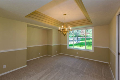
We're repainting our dining room. Here's the before:


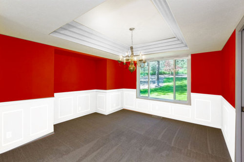
We loved the look of red dining rooms, and are going for white wainscoting on the bottom with red on top... here's the goal version (photoshopped because it's currently a mess as you'll see below):


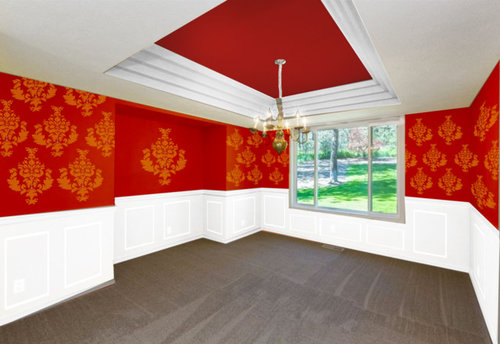
Alternatively, we're considering patterning it with a damask pattern in a light gold color... as well as possibly paint the very top of the ceiling red. This would look like this:


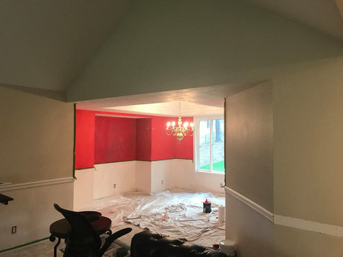
We've already begun, but are now having doubts. Primarily, because it seems so out of place with our otherwise VERY neutral, lightly painted home. All the other rooms are some shade of white with the exception of this dining room, which is visible from the front entrance and looks like this (again, excuse its current state with tape and mess all around... also only one coat of the red on it so far, will be a much deeper tone like in photos above):


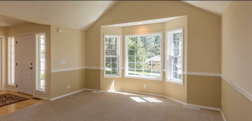
As you can see, it's connected to the formal living room, which looks like this from the other side (door on the left is the main entrance door, from which the above pic was snapped):


Again, bottom of chair rail is in the process of being turned into white wainscoting. Top will be repainted, but we have yet to decide on a color -- will likely be a light cream/possibly a cooler white.


Here's what I'd like to know:


1. Your thoughts on the red idea. Is it too much? Should we go to a shade of white just as we did with the rest of the house? Does it look out of place from the front entrance?


2. If you like the red, what color would you paint the top of the living room walls to tie it all together?


3. If you like the idea of the red, which of the two options do you prefer -- the plain red walls, or the patterned walls/red ceiling? Some combination of the two?


Any thoughts/opinions will be much appreciated. :)

Comments (10)

  • 8 years ago

    I used to have Red dining, previous owners and I lived in it for several years. I gave it an asian feel with dull gold silk curtains, Red and gold abstract art and black and gold Buddha. Recently painted my walls light blue. I think you can do red if you really love it. If you have doubt, you can even do powder blue with gold damask pattern you were going for. That's classic and timeless.


    anomoley thanked Zita Shroff
  • 8 years ago

    If you like the bold red but are not sure, try a navy blue instead, which looks fab with white, and is also bold. The blue may not create such a departure from the neutral tones in the rest of your home in the way red might. Obviously a mockup navy to view first will help you visualize it.

    anomoley thanked weathy
  • 8 years ago
    How about instead of damask, you line the wall with a series of oversized pictures in the same size, with an extra oversized picture in the alcove over a hefty piece of furniture? you can use a sepia tone to tie any pictures you want together, & it will help tone down the red. Use a white mat in the frame to help connect the top half to the bottom half & it won't feel like such a contrast. Once you repaint the rest of the house the color won't feel so out of place. Use the color of your furniture as a launch point to accentuate a bold paint, or as a neutral to tone down a bold. Good luck! What fun!!!
    anomoley thanked Sara LeBlanc
  • 8 years ago

    Thank you so much for your thoughts so far! :)


    That sounds interesting, Sara LeBlanc... I wouldn't have thought of it on my own! Will think about it; thanks for the out of the box idea! :)


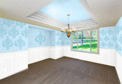
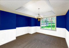
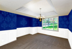
    I'm attaching a few images here I mocked up using Zita Shroff's and weathy's ideas -- navy blue, and powder blue...


    So this would be either plain or patterned, but here we'd probably go tonal as it seems to suit the color better... and still unsure what we'd do with the ceiling, but here's one idea:


    Navy blue, plain and tonal pattern...


    I'm even more torn now... it all looks great to me in pictures but I have a hard time figuring out what suits our neutral place better and whether it needs the bold punch of color or something more toned down, so again, your feedback appreciated. :)

  • 8 years ago
    last modified: 8 years ago

    Do you mind me asking which software you are using for your design? I am in the process of building and the design center doesn't offer anything like that. I hand drew stuff and pencil colored to see how it will look. But software will be handy.

  • 8 years ago
    Zita.... I have the same question. Curious on the software!

    PS.... love the navy. How are you doing your wainscoting? We are starting that project in our dining room shortly as well.
  • 8 years ago

    Zita Shroff: I do some web design and made the mockups in photoshop; no special program... rushed through it and made them in about 5 minutes each, which is why they look embarrassingly messy =-/... can't imagine not having the ability to do this when working in home design; sorry you're having to deal with that!


    Jennifer Reynolds: Thanks for the vote! The wainscoting has been quite the adventure for us because we initially wanted to just paint bottom of chair rail white, and put up picture frame mouldings throughout... but that didn't pan out because the walls are orange peel textured. So, off we went skim coating the entire bottom section of both rooms to smooth out that orange peel texture! It was incredibly arduous and tedious, but we're finally coming to an end... and it's turning out great because the plaster is giving it some much needed dimension. We'll put picture frame mouldings over it, then paint it all white, and should be good to go! Good luck with your project. :)

  • 8 years ago
    Why not bring the ' red' into your dining room in red patterned upholstery of dining chairs and have the same wall colours as your living room. I think the colours you have shown are harsh and make the room look a lot smaller. Good luck.
    anomoley thanked Sue Tamblyn