Software
Houzz Logo Print
priyanka_lingegowda

Kitchen wall colour

9 years ago
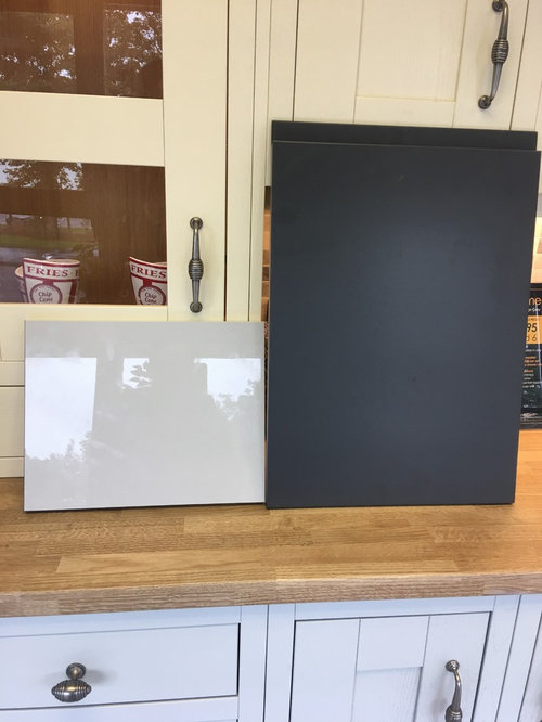
I am having a light grey gloss kitchen units with Matt graphite island and silica white quartz worktop. What wall colours would work well with these ? I want to keep the room airy and light.

Comments (47)

  • 9 years ago
    What floor are you putting down
  • 9 years ago
    Light grey.
  • 9 years ago
    I'm doing F & B dimpse or fired earths pearl ashes. I'm having light grey floor as well.
  • 9 years ago
    Have you considered a pale grey-green colour?
  • 9 years ago
    I have not decided on the tiles yet. Considering white washed wood effect tiles or light grey Matt effect tiles. I have actually brought the f&b dimpse, cornforth white, blackened and dulux rock salt samples. Would it look odd to go more on the whitish colour like f&b strong white to make units stand out?
  • 9 years ago
    Pale grey green sounds interesting, any colour suggestions ?
  • 9 years ago
    I think strong white would work. As you have gloss cupboards I'd worry the green colour would reflect from the cupboards and totally change their colour.
  • 9 years ago
    Thanks Dan, ah I see your point on greenish grey. My doors seem to be having some sort of Lilac undertone when you see them during dull day light.
  • 9 years ago

    Have you got a sample of the worktop and the floor so it can be photographed all together? You need to work out a palette that works for everything.

  • 9 years ago
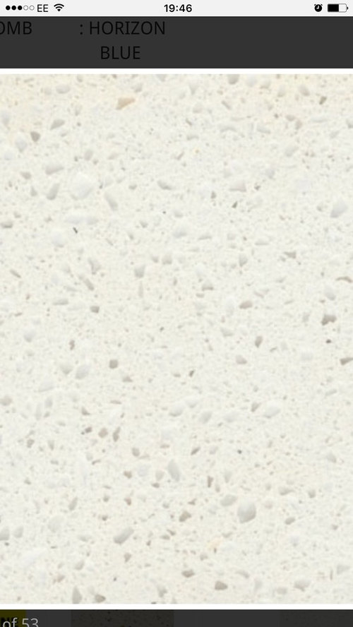
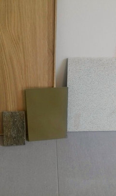
    Have not selected the tiles yet. Would love to hear any tile suggestions :) Attached the doors for units and worktop( the worktop sample was old and my worktop would have tiny bit bigger grains that this)
  • 9 years ago

    I think you need a mid tone for the floor to tie it together. Have you any photos of the room or plan?

  • 9 years ago
    Or a porcelain wood effect tile with grey undertone. Alternatively marble effect tiles
  • 9 years ago
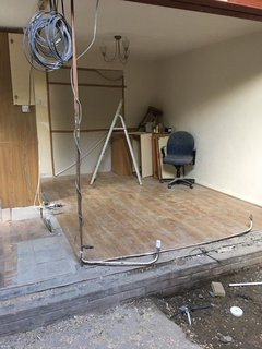
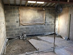
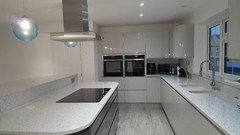
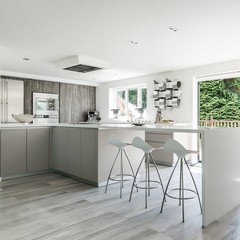
    Attached the pics of the room. It's still under work. First pic is the open dining area and second one is kitchen. Window open n the middle and French door to the side patio
  • 9 years ago
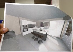
    Kitchen plan attached
  • 9 years ago
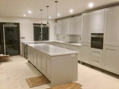
    My kitchen units are light grey, the walls are strong white (have one coat on so far), white carrara quartz worktop & we are having a mid wood (Karndean/Amtico) floor. It's working well :)
  • 9 years ago

    Wow, it will look amazing. Looks like it will have lots of natural light which gives you even more options. What type of look do you like? Eclectic, mid century, ultra modern?

  • 9 years ago
    I am after a contemporary look. Want to keep the clean lines without making it too clinical. My doors and windows are going to have anthracite grey panels.
  • 9 years ago
    That sounds lovely LTS. Do you mind sharing few pics please?
  • 9 years ago

    In terms of tile suggestions, Mandarin Stone do a gorgeous range in different colours:

    https://www.mandarinstone.com/product/_/9284/mortar-sand-porcelain#.Wb5NByMrL68

    if you were to select one that had the same undertone as the cupboards it could work. They are beautifully matt with just the slightest suggestion of texture, slightly reminiscent of concrete.

  • 9 years ago
    Thank you very much for all your suggestions colourhappy. Any wall colours suggestions ? I see many people suggesting strong white. I kind of like it too though I have not tried a tester yet
  • 9 years ago
    last modified: 9 years ago

    For me, getting a room right is all about tone, not necessarily colour. You need a real balance of darks and lights. I would paint some samples really flatly and neatly onto large pieces of card and wait until you are nearer the time. Get the flooring right and then look at whether you need the walls to be lighter or darker than the units. It may be that it all looks too pale (or insipid) and you need to go darker on the walls, or you may want to do the walls lighter than the units but do just one wall really dark to tie it together. If the room is really sunny and light you can get away with lots of greys that have a violet or blue undertone, but if it's not then I would consider a warmer wood floor. Anything from Skimming Stone down is violet undertone and Strong White down is cool bluish. In my kitchen (which is not very light) I chose a triad of secondary colours (green, violet, orange). The wood is orange, the walls and tiles violet and the rest green.

  • 9 years ago
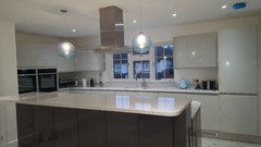
    Hi - here's a pic ( pint the greatest)...it's work in progress at the mo...blinds need changing (wrong ones installed), white sockets on island need changing to match the others & wood on the island for corner breakfast bar needs adding/choosing once have decided on floor....
  • 9 years ago

    Looks gorgeous. What type of handle will you have?

  • 9 years ago
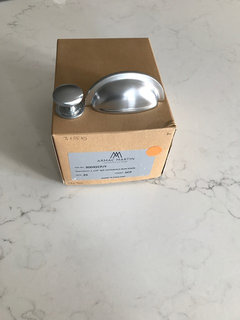
    Thank you colourhappy. I am having Satin Chrome knobs with cup pulls on the bins & dishwasher doors.
  • 9 years ago
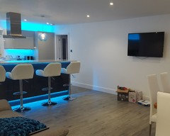
    My kitchen is similar colours to yours and we went for white walls using Dulux diamond paint as it's washable (it washes well). We went for grey wood effect tiles and love them, easy to clean and they don't show dirt, bonus as we have a big dog! We've added a bright blue blind and more colourful accessories since these photos were taken.
  • PRO
    9 years ago

    上浮空间可以用浅色调 下沉空间区域可以用深色的

  • 9 years ago
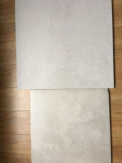
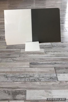
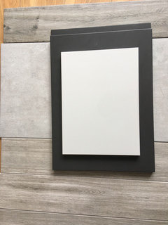
    Ok I have a couple of tile samples. Any opinions will be really helpful :)
  • 9 years ago

    Are you able to photograph them on the floor with the cupboard door upright next to them?

  • 9 years ago
    I think top, it's more grey. Put everything together in one pic
  • 9 years ago
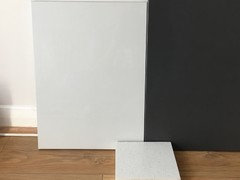
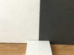
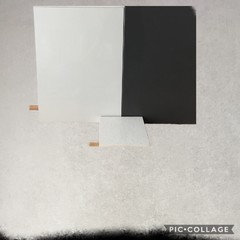
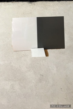
    I don’t have the door and worktop samples at the moment but have just tried to collage them together the background is the first tile and doors and worktop in the front pic.
  • 9 years ago
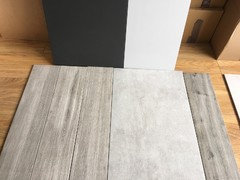
    Second tile
  • 9 years ago
    last modified: 9 years ago

    Personally, I like the colour of the second tile on it's own, but the first one does seem to have the better match with the cupboard. What you want to avoid is a violet undertone issue fighting with a cream undertone issue. The unit doors seem to have a violet undertone so you need to avoid tiles with a cream bias, if that makes sense. Any others?

  • 9 years ago
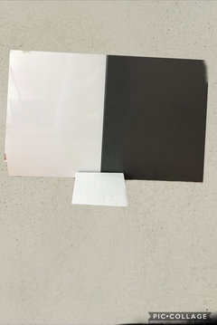
    Another one which I don’t have the sample with me.
  • 9 years ago

    I think that is making the cupboard look pinky violet.

  • 9 years ago
    Thank you colourhappy and dan for your patience and all your valuable opinion. Looks like I need more tile hunt this weekend lol
  • 9 years ago

    I would narrow it down to three samples, preferably the same colour but different tones (darks and lights) and then don't order until plastering is done etc. It's all got to work together.

  • 9 years ago
    This came out of the bule and I kind of liking it more. This was never my choice but seem to be blending well???
  • 9 years ago
    last modified: 9 years ago

    Yes a textured wood tile could work. This is nice from Mandarin Stone -it seems to have the slight violet undertone there is in the unit colour.

    https://www.mandarinstone.com/product/_/10743/argento-larch-porcelain-(end-of-line)#.WcT9TSMrL-U 

    or this......

  • 9 years ago
    Yes textured wood tile works but get all the colours together. I think it will become obvious when you see it together. It's so hard with so much choice isn't it?
  • 9 years ago
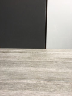
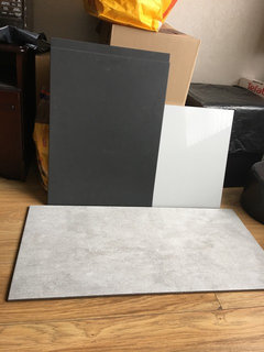
    Hello everyone so I have got 3 more samples. Any thoughts ? I think the last on right is ruled out. Any suggestions on the other 2 ?
  • 9 years ago
    More pics
  • 9 years ago
    Both work very well, personally I prefer the wood effect tile.
  • 9 years ago
    The grey is lovely. Just in case you want to compare the look and price, the grey wood effect I have is http://www.tradepricetiles.co.uk/treverk-way-frassino-wood-effect-150-x-900mm/
  • 9 years ago

    I'm just throwing a spanner in the works here.....how about herringbone parquet? If it was mine, I would consider how to make it look a bit more personal and less generic. I do slightly worry about the whole world going a bit grey. I love patterned floors, yes they are currently 'trendy' but they also were around in the sixties and seventies. Herringbone parquet, again is timeless. I wouldn't rule anything out, as long as you are not ordering from abroad you may want to keep your options open for a bit...

  • 9 years ago
    Thanks for all the inputs. That grey in the link seem to be better than mine. Got to order a sample now :). Well the reason I am not looking for parquet is I am not a big fan of wooden floor. With a toddler and a 5 year old at home I need something easy maintainable. Apart from being trendy greys are my favourite colours so I am kind of biased towards them. However I understand it might look all too pale so planning on adding some mustard/yellow accessories in the kitchen.
  • 9 years ago

    Yes I agree about easy to maintain - I have two kids myself. I kept my options open until the last minute as I am a total commitment - phobe when it comes to getting things right. If it's any help, we opted for unglazed vitrified porcelain as it is really forgiving when it comes to showing dirt.