

Kitchen paint colour
9 years ago
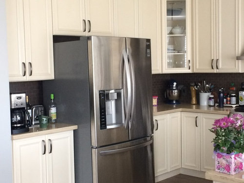

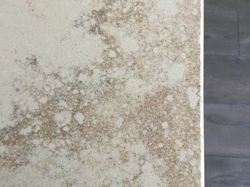
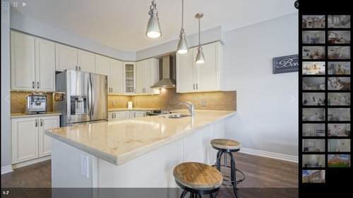
Featured Answer
Sort by:Oldest
Comments (13)
Related Professionals
Toms River Interior Designers & Decorators · Olean Interior Designers & Decorators · Poughkeepsie Interior Designers & Decorators · Erie Interior Designers & Decorators · Philadelphia Bathroom Remodelers · Watertown Bathroom Remodelers · Tacoma Kitchen & Bathroom Designers · Cincinnati Interior Designers & Decorators · Rolla Architects & Building Designers · Little Rock Kitchen & Bathroom Designers · McAlester Kitchen & Bathroom Designers · Sheridan Kitchen & Bathroom Designers · Austin Kitchen & Bathroom Designers · Tyler Kitchen & Bathroom Designers · Mount Vernon Kitchen Remodelers 9 years ago
 9 years agolast modified: 9 years ago
 9 years ago
- 9 years ago
- 9 years ago
 9 years ago
 9 years ago
 9 years ago


Related Stories
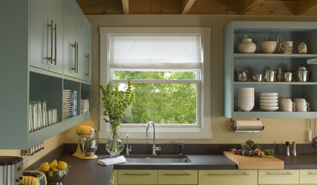
MOST POPULAR8 Great Kitchen Cabinet Color Palettes
Make your kitchen uniquely yours with painted cabinetry. Here's how (and what) to paint them
Full Story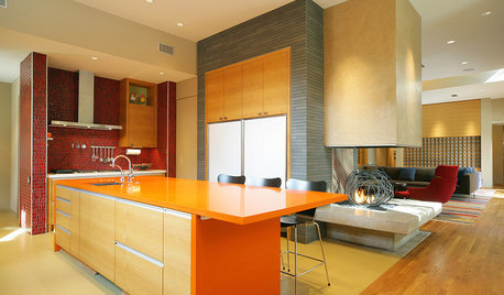
KITCHEN DESIGNPalatable Palettes: 8 Great Kitchen Color Schemes
Warm and appetizing or cool and relaxing? These 8 paint palettes can help you choose the best colors for your kitchen
Full Story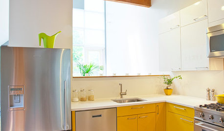
COLORCrazy for Color? Your Kitchen Cabinets Want In
Make over your kitchen in spectacular fashion with just colorful cabinet paint? Now there's a bright idea
Full Story
CURB APPEAL5 Bright Palettes for Front Doors
Splash bold green, blue, orange or red on your front door, then balance it with a more restrained hue on the rest of the house
Full Story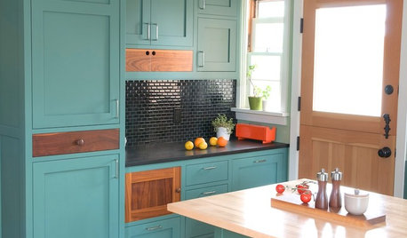
KITCHEN CABINETSKitchen Cabinet Color: Should You Paint or Stain?
Learn about durability, looks, cost and more for wooden cabinet finishes to make the right choice for your kitchen
Full Story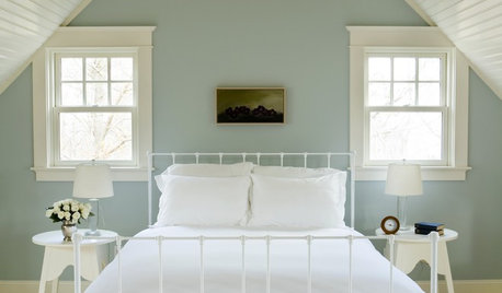
COLOR12 Tried-and-True Paint Colors for Your Walls
Discover one pro designer's time-tested favorite paint colors for kitchens, baths, bedrooms and more
Full Story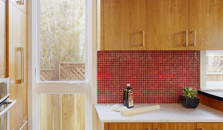
KITCHEN DESIGNKitchen Color: 15 Ravishing Red Backsplashes
Bring some zing to your kitchen with a backsplash of ruby-colored tiles or back-painted glass
Full Story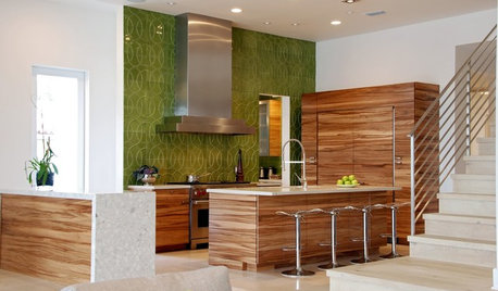
COLORKitchen Color: 15 Fabulous Green Backsplashes
Get the feel of spring all year round with a tiled, painted or glass backsplash in colors from pale celery to deep olive
Full Story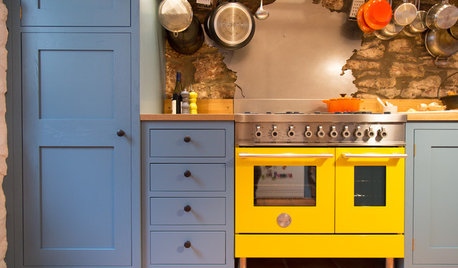
KITCHEN DESIGNA Kitchen That Cooks With Color and Creativity
Painted cabinets, eye-catching appliances and personal touches give this country kitchen a playful, personal feel
Full Story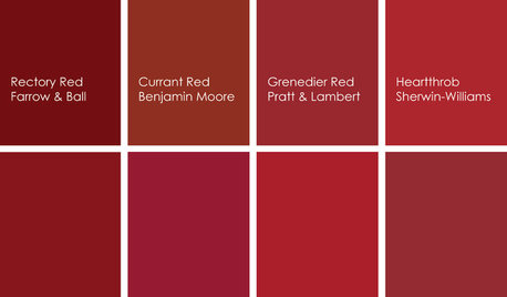
KITCHEN DESIGNCooking With Color: When to Use Red in the Kitchen
Candy Apple Red, Red Licorice and more for your kitchen walls, cabinets or island? The color choices are as delicious as they sound
Full Story
zibbe