

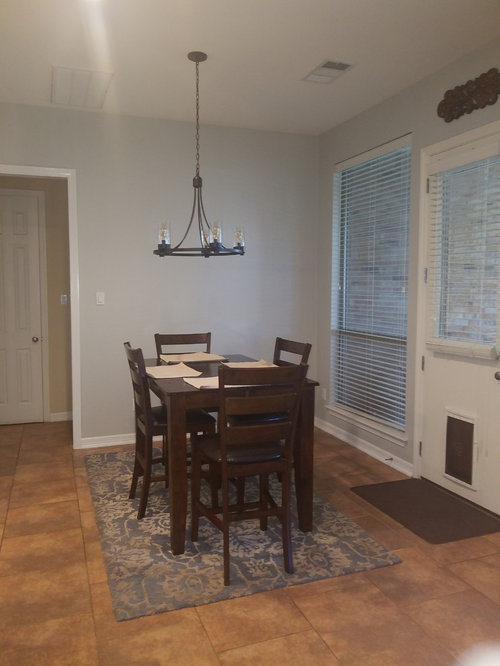
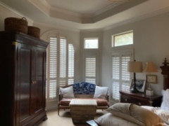
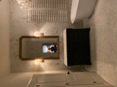
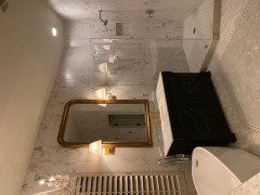
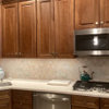
Agreeable Gray does not agree with my space
8 years ago

Featured Answer
Sort by:Oldest
Comments (16)
 8 years ago
 PRO8 years ago
Related Professionals
Tallahassee Interior Designers & Decorators · Baton Rouge Interior Designers & Decorators · York Interior Designers & Decorators · Aiken Interior Designers & Decorators · Texarkana Interior Designers & Decorators · Eureka Interior Designers & Decorators · Toronto Interior Designers & Decorators · Richmond Architects & Building Designers · Richmond Architects & Building Designers · Auburn Architects & Building Designers · San Bernardino Architects & Building Designers · Sarnia Architects & Building Designers · Brooklyn Kitchen & Bathroom Designers · Potsdam Kitchen & Bathroom Designers · Orange County Kitchen & Bathroom Designers- 8 years ago
 PRO8 years agolast modified: 8 years ago
- 8 years ago
- 8 years ago
 8 years ago
- 8 years ago
 8 years agolast modified: 8 years ago
 8 years ago
- 8 years ago
 6 years ago
- 6 years ago
- 5 years agolast modified: 5 years ago
- 5 years agolast modified: 5 years ago

Related Stories
MOST POPULARHouzz Tour: Easygoing and Elegant in White, Cream and Gray
The renovation of an 1860s Massachusetts home creates a sophisticated, serene and comfortable living space
Full Story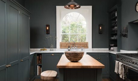
KITCHEN OF THE WEEKDark Gray Sophistication in a Shaker-Style Kitchen
Rich paint used throughout this compact London space helps create a kitchen that’s contemporary and inviting
Full Story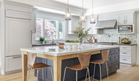
ROOM OF THE DAYRoom of the Day: Soothing Gray Cabinets Update a Modern Kitchen
Custom storage, light woods and a cool palette create an easygoing space for a California family
Full Story
BEFORE AND AFTERSBefore and After: Gray and Marble in a Serene Master Suite
A designer helps a California couple create an efficient and stylish space where they can relax, rest and rejuvenate
Full Story
MOST POPULAR50 Shades of Gray
Gray is hotter than ever, thanks to a hit novel full of risks and dark secrets. Tell us: Which paint shade possesses you?
Full Story
MOST POPULARWhat’s Your Neutral: Beige or Gray?
A designer shares 10 tips for using the neutral shade that works best for you
Full Story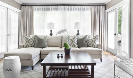
GRAYChoosing Paint: How To Pick the Right Gray
Which Version of Today's 'It' Neutral Is For You?
Full Story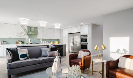
KITCHEN OF THE WEEKKitchen of the Week: A Soothing Gray-and-White Open Concept
A smart redesign gives an active family a modern kitchen with soft tones, natural elements and mixed metals
Full Story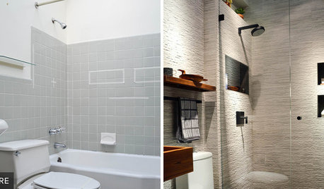
BATHROOM MAKEOVERSReader Bathroom: Basic Gray to Soothing Spa for $20,000 in Virginia
A leaky shower valve turns into a full bathroom renovation for this couple — resulting in a luxurious retreat
Full Story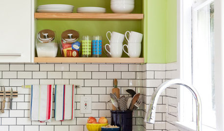
KITCHEN DESIGNSubway Tile Picks Up Gray Grout
Heading into darker territory, subway tile offers a graphic new look for kitchens, bathrooms and more
Full Story


TJW