

Paint shade
9 years ago
Featured Answer
Sort by:Oldest
Comments (15)
 9 years ago
- 9 years ago
Related Professionals
Newport News Architects & Building Designers · Buffalo Architects & Building Designers · Gaithersburg Kitchen & Bathroom Designers · Cookeville Kitchen & Bathroom Designers · Marquette Cabinets & Cabinetry · DeRidder Kitchen Remodelers · Boston Kitchen & Bathroom Designers · Morgantown Interior Designers & Decorators · Aurora Interior Designers & Decorators · Pierre Interior Designers & Decorators · Gaithersburg Kitchen & Bathroom Designers · Lebanon Kitchen & Bathroom Designers · Emporia Furniture & Accessories · Tacoma Furniture & Accessories · Cheyenne Furniture & Accessories- 9 years ago
 9 years ago
- 9 years ago
- 9 years ago
- 9 years ago
 9 years ago
- 9 years ago
 9 years agolast modified: 9 years ago
- 9 years ago
 9 years ago
- 8 years ago
- 8 years ago
Related Stories
MOST POPULAR50 Shades of Gray
Gray is hotter than ever, thanks to a hit novel full of risks and dark secrets. Tell us: Which paint shade possesses you?
Full Story
FLOWERS AND PLANTSKalmia Latifolia’s Origami-Like Flowers Shine in the Shade
This shade-tolerant shrub, also known as mountain laurel or calico shrub, thrives in East Coast woodland gardens
Full Story
LANDSCAPE DESIGNFind Yourself in an Epic Garden in the Shade
Feeling hot and tired gardening in the sun? The world of shade gardening beckons you to its cool mystery
Full Story
PLANTING IDEAS8 Sumptuous Shade Garden Plant Combinations
Enjoy these plant combinations made for spots with varying levels of shade and different garden zones
Full Story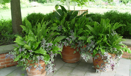
GARDENING GUIDES7 Fabulous Shade-Loving Ferns for Containers
Shade-loving ferns can add color and texture to your container designs
Full Story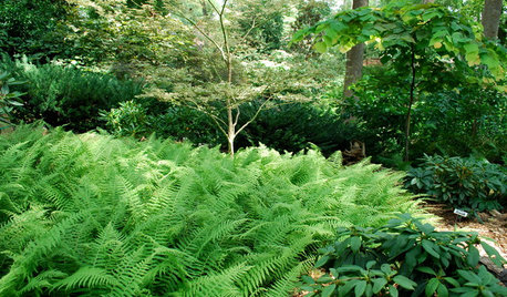
PLANTING IDEASFerns: A Shade Gardener’s Best Friend
Bring rich texture and contrast to a dark woodland landscape with wonderfully diverse ferns
Full Story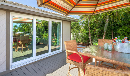
PATIOS6 Patio Cover Types to Shade You in Style
Protect yourself and your deck from the blazing sun with umbrellas, cloth, built structures — or nature's perfect shading solution
Full Story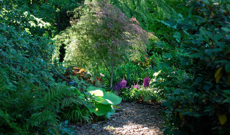
LANDSCAPE DESIGNSet Your Shade Garden Aglow With Light
Invite brightness to the dark corners of your garden for a magical dance you won't want to miss
Full Story
PRODUCT PICKSGuest Picks: Sophisticated Shades of Pink for Summer
No need to get stuck with bubble gum. These posh pink home accessories have a more grown-up flavor
Full Story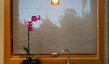
WINDOWSNo-Fail Window Shades
A Go-To Look for Any Room: Window Coverings Made With Woven Woods
Full Story

beckysharp Reinstate SW Unconditionally