Software
Houzz Logo Print
kr9772

Need design help

8 years ago
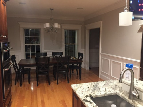
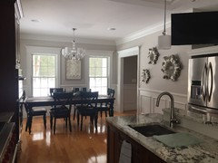
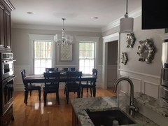
I need help with selecting decor for my eat in kitchen.

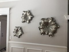
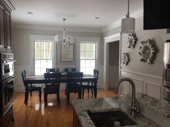
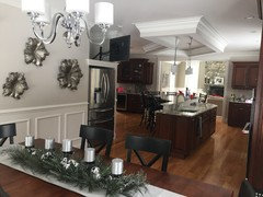
I put up 3 metal flowers on a rather large wall (I was having a very hard time finding art work to fill the space without being overwhelming-as this is part of the kitchen) It took me just over a year of looking for wall decor to decide on these.

I do like the flowers and now am in search of wall decor and table decor to compliment them.

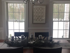
There is picture currently hanging between the 2 windows that needs to be removed. It does not flow with the room (not sure why it is still up.. lol)

I am also open to changing the light fixture over the table.

Any advice or ideas is welcome

TIA


Comments (31)

  • 8 years ago

    last modified: 8 years ago
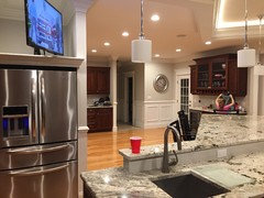
    Below are pictures with the current wall decor


  • 8 years ago
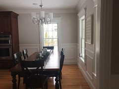
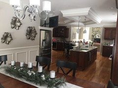
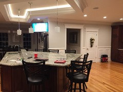
    Below is an angle looking from behind table into kitchen

  • 8 years ago

    If your trying to keep with the floral theme I think [[(https://www.houzz.com/products/allegra-3-piece-framed-wall-decor-set-silver-and-brown-prvw-vr~82404482)[these[(https://www.houzz.com/products/allegra-3-piece-framed-wall-decor-set-silver-and-brown-prvw-vr~82404482) in a vertical line between your windows would be nice. However something like [this[(https://www.houzz.com/products/wood-wall-panel-12x36-prvw-vr~58428957) would give you more of a contrast against your walls. And then of course [something[(https://www.houzz.com/products/cobalt-delft-tile-iii-medium-prvw-vr~35221337) to add some color. Happy decorating!!!!

    kr9772 thanked User
  • 8 years ago

    Hi Tia,

    Very Nice home. What I typically bring up is whether a) it flows or whether b) its predictable styling. Style is onto its own. As for the item between the windows, anyone would naturally find whatever is there to be glum since either to the right or left is activity outside the window. That wall pc deserves another location like on the wall of a stairway or a bedroom.

    You've acquired these wall flowers but they're not accented. perhaps a small offset shadow (semi gloss black/dark emerald ) behind them would be good. So with a green accent in there,then you can be off to find the correct wall item that owns the space between the windows. Big bold and clunky as in high contrast to that ornate over table light

    I picked some out on the internet , perhaps this helps.


    the very red one is a city scape.. not particularly clunky but very big as color-blotch for the wall. Under that is what I call 'highly predictable". along with the city scape. Its like that diner scene where the guy is sitting at the counter that you see everywhere. The brown piece is color friendly to your kitchen but wheres the interest? people sitting around a table It transports you nowhere. people sitting at the table can do that without buying new art. Its virtrual reality experience of plain wall.

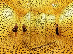
    On the food theme, pigs are very in style lately. Now the yellow one illustrates a point of decoration without art. I like this. It should sit low on the wall as to 'be the action of light" between the light and the surface of the table. Its actually a photograph OF an art exhibit by Yayoi Kusama. So we're talking a twofer of the photo and maybe above it a pic of Yayoi. If The yellow print were set up. I'd suggest a very thick frame.

    And of course . Richard Nixons head from an episode of Futurama. Can't go wrong there.


  • 8 years ago

    @Junee Bug-

    Im not saying that I am not up for changing them out-

    I just need a piece to but there. I am having (and have had) a very had time finding something that I like at the right size.

    Every time I find something I like it is too big/small for space.

    I need something in the range of 40-48" wide x a min of 27 tall up to 39".

    It would depend on if it is one or 2 pieces...

    Which brings me back to not knowing what to put there

  • 8 years ago

    I love your serene space, but the metal flowers are bumming me out. With your very subdued color scheme, I would like to see some floating picture ledges on that wall, white like the trim with various sized photos and art in an assortment that includes silver and black frames.

  • 8 years ago
    last modified: 8 years ago

    it's very pretty,,,but very sedate. while I don't mind the flower things, they wouldn't be my choice. all the beautiful art out there and you can't find anything? custom artists abound on Etsy. find something.

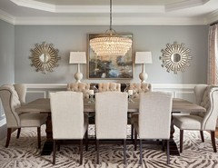
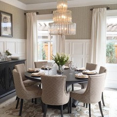
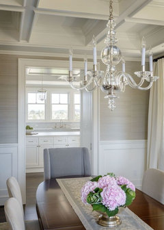
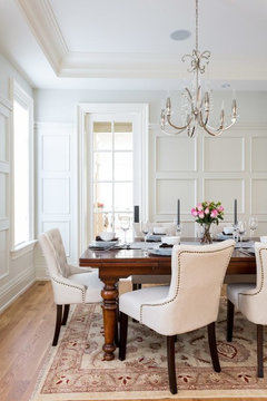
    the other issue that jumps at me are the chairs. I think if you did some lighter ones, it would work better. something like in these pics. A rug is a personal choice, but it would add some color and pattern. and a beautiful chandelier would really stand out (the one you have is hung a bit too hight)

    some nailhead trim, lighter chairs. a rug. blingy chandy. custom artwork. pick one, two or all, and see what you think.

  • 8 years ago

    I like the room as it is but did you try the silver flowers vertically between the windows and the picture placed horizontally on the side wall next to the fridge with a narrow console underneath it with stone top to use as a serving stage for food for the table?

    Patterned tone on tone valances or floor to ceiling curtains or fabric roman shades on the window would add softness. I think to move out of your color palette would be a mistake; I like what you are doing, you just need a bit more stuff int he room.

  • 8 years ago

    I like your choice of metal art flowers for the wall. They don't add any color but do compliment the stainless steel appliances.

    Are you wanting to add art "IN" your kitchen cooking area itself or the dining area beside it?

    In the kitchen, you might be on the lookout for some attractive colorful trivets.

    https://images-na.ssl-images-amazon.com/images/I/51svQyvSXSL.AC_UL246_SR190,246.jpg

    https://www.google.com/search?q=images+large+colorful+metal+trivets&tbm=isch&tbo=u&source=univ&sa=X&ved=0ahUKEwi7-f6yk7DYAhUQziYKHQgtA8MQsAQIJg&biw=1366&bih=650

    It the dining room, you could also use pressed metal art would work -- choose a subject that interests you.

    http://mediad.publicbroadcasting.net/p/kstx/files/styles/x_large/public/201401/swirly_music_notes.jpg

    https://i.pinimg.com/236x/17/fd/1a/17fd1aaa409cef9968bf307754c30724.jpg

    https://img0.etsystatic.com/216/0/8383354/il_340x270.1339252710_mb5t.jpg

    http://www.patioandterrace.co.uk/user/products/large/s-l1600.jpg

    http://www.brilliantwallart.co.uk/userfiles/images/sys/products/Metal_Wall_Art__Fiddle_Violin_Music_Scroll_15359.jpeg

    https://i.pinimg.com/736x/7f/a1/27/7fa127f2104c1460f49c59e6e8ef5eec--metal-wall-art-decor-art-metal.jpg

    https://i.pinimg.com/originals/0d/c1/35/0dc1357099325eecf0818b3b5f9199a7.jpg

    https://media.kohlsimg.com/is/image/kohls/1879362?wid=1000&hei=1000&op_sharpen=1

    https://www.scottpurdy.net/metal-wall-art-decor-and-sculptures/metal-wall-art-at-dunelm-in-conjunction-with-metal-wall-art-decor-uk-also-metal-wall-art-decor-canada/

    https://ak1.ostkcdn.com/images/products/P17256799p.jpg?imwidth=320&impolicy=medium

    http://www.jeffsbakery.com/wp-content/uploads/2017/08/Beautiful-Large-Iron-Wall-Decor-Design.jpg

  • 8 years ago

    This is something like what I was thinking. It would be an opportunity to add some interest and personality to your space.


  • 8 years ago
    It is a beautiful space! Lower your light fixture, add some drapery panels to the three windows and find some art with color. The art doesn't need to read "kitchen". Use a color from the art to use on your table decor and something on your counters to tie it all together. Too "safe" for me at the moment.
  • 8 years ago
    This shows one example of drapes for color.
  • 8 years ago

    Wow! Just noticed the ceiling treatment over the kitchen island. I would remove that in a heart beat.

  • 8 years ago
    last modified: 8 years ago

    the prob w/the drapes, is they are going to completely cover that window (or a good portion of it) on the right. there's no room for them off to the side. you could do some roman shades or something, but regular drapes, IMO, won't work for those two windows. I do like those chairs that match the drapes though. I still think new chairs would solve a lot.

  • 8 years ago

    I do like the idea of adding lighter or cloth chairs. I will be on the lookout for those.


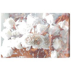
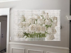
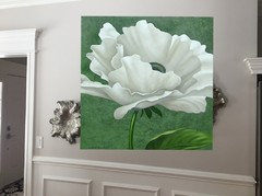
    What are your thoughts to replacing the flowers with this? It is a canvas print.

  • 8 years ago

    that's nice. bringing in some lighter chairs w/perhaps some nail heads to match the color in the artwork, would look good. you could even do something w/a bit more color. have you checked Etsy? look at Dionne over at the Turquoise Iris. I've known her work for years. She's recently gotten in to doing canvas painting. some beautiful work. I know she will do custom colors for you.

    https://www.etsy.com/shop/TheTurquoiseIris?ref=listing-shop2-all-items-count#items

  • 8 years ago
    this would look good with the wall color. get lighter upholstered chairs and fabric Roman Shades in a linen fabric.
  • 8 years ago
    Beth H- single width side panels don't take up much stack-back room. They would go into the corner on the immediate right side. I think it would add some much needed softness and colour.
  • 8 years ago
    last modified: 8 years ago

    amirault- Yes they would. I was just wondering if something would fit in that corner without taking up at least 1/3 of the window.


    and maybe artwork w/just a tad more color or pattern? or put a large piece where the flowers are. a horizontal piece. black and white?

    here's your flower canvas

  • 8 years ago
    I guess I am alone in liking the flowers but I think they just need to be clustered a bit closer as they look so spread out.
  • 8 years ago
    suzyq53 said something about removing the woodwork on the ceiling above the stove! PEASE DO NOT DO THAT! It gives the space some great architectural beauty. I think the flowers are ok, if you love them! I would consider moving them by the window, and lining them up vertically. But, that is also dependent upon what kind of window coverings you are thinking of. Also, regarding the architectural detail, I think that it would be stunning to carry it into the dining room. 2/3 chair rail looks nice in small areas, or even pull in a Farmhouse detail with high base. Excited to see the end result! You have done great! Love your Christmas tanlescape with the linen runner!! And no matter what anyone says, remember that you are the one who lives there. And if you love it, no other opinion matters!!
  • 8 years ago
    tablescape!!
  • 8 years ago
    last modified: 8 years ago

    christinalyjen,,lol. ok. calm down w/the exclamation marks, (all ten of them) and capitals. we get that your passionate.

    kr9772,,,,since she brought up the ceiling item, what if you coffered the dining room and kitchen area? It's nice what you have, but looks a tad large all by itself over the island. incorporation the entire space might look a bit better.

  • 8 years ago

    Beth, I actually love the soffit over my island.

    I originally wanted a full coffered ceiling but the layout of the kitchen did not allow it (without it being a nightmare for contractor). The kitchen wraps around (a full L shape and the two sides are not the same size) and there is an entry way tied in to the ceiling so it would not "flow".

    christinalyjen-

    Not sure I understand what you mean by 2/3 chair rail- There is a chair rail in the space already.

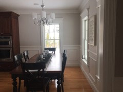
    I have included some more pictures of the space to help get a better understanding. Please excuse the mess (it is just post holiday and no school)

    Also, I am OK with moving the flowers but what do I put in the space that they are currently are in??


  • 8 years ago
    last modified: 8 years ago

    Beth-

    Thoughts on this? Instead of black and white.

    I also want to thank you for the photoshop pictures-

    I am very visual and they help me tremendously :-)

    And unfortunately I am not tech savvy and have no clue how to do that.

    Kuddos!!


  • 8 years ago
    last modified: 8 years ago

    kr9772,,,I only mentioned the coffered part because someone else brought up your ceiling molding. That's a nice island you have.

    my photoshop is elementary at best! It's done on the Mac desktop w/preview. that's about all I know how to do.

    as for the roses,,,I think because of the musical notes, it might be better suited for a piano room or something?

    If you can shoot a pic straight on showing that wall (not a close-up though) I could possibly try out some other artwork. (remove the flower things if you can)

    what do you think about the drapes idea that was mentioned? a rug? lowering the chandy?

  • PRO
    8 years ago

    Hi kr9772,

    Jumping in to this conversation...

    What do you think of this:

    Many more options, but wanted to get your thoughts.

    Best,

    DJ McCartney


  • 8 years ago
    I think the wall flowers look great just where they are. I like what you have done.
    kr9772 thanked Tina Moore
  • 8 years ago
    Just my opinion, but I like what you have and where you have it, and would not look for decor to fill the space. When something comes along that you fall in love with, you’ll find a spot for it. I dislike “staged” spaces — to me it’s better to build your decor through time with pieces that have meaning. Designers always look for appropriate artwork and pieces to make a space look balanced and beautiful, but many times those objects are meaningless to the homeowner.
  • 8 years ago

    Beth, I would have to agree with the music notes. Not a good option for the space.

    As you can see I am not much for bold colors. I don't mind the pop of color with accents (that can easily and cost effectively be switched out).

    Some color in the art work is OK, I just don't like the bold statement pieces.

    I am certainly open to a rug and window treatments. I do think roman shades would be best in there.

    There is not much room between table and back wall so I don't want drapes that you would be tripping over.


    I know the chandelier needs to be moved down- it is up 10" too high. I have been asking for this (not high priority on the hubby to do list I guess.. haha)


    @eWallArt- I do like the print, just a bit too much green for my taste.

Sponsored
Kuhns Contracting, Inc.
Average rating: 5 out of 5 stars26 Reviews
Central Ohio's Trusted Home Remodeler Specializing in Kitchens & Baths