Software
Houzz Logo Print
dusstbunnie

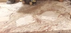
Backsplash color dilemma..

8 years ago
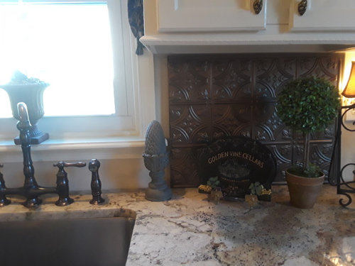
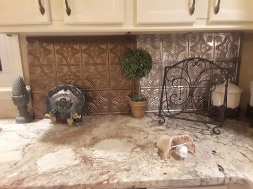
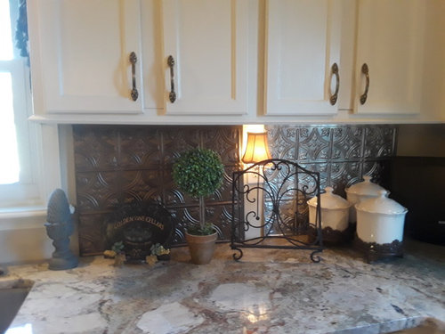
appliances stainless, fixtures bronze...which color should I choose? We cannot decide as we like both

Comments (34)

  • 8 years ago
    last modified: 8 years ago

    Of the two I prefer the lighter stainless panel on the right. Are you interested in other options?

  • 8 years ago

    I like the one on the right also.

  • 8 years ago
    Assuming you have undercabinet lighting, I'd vote for the one on the left.
  • PRO
    8 years ago

    Not crazy about either, but if that's what's happening, the lighter one on the right, for sure.

  • 8 years ago
    last modified: 8 years ago

    Have you discounted budget-friendly subway tiles from big-box stores? Your counter looks like the “star”of your kitchen; I like it; but your backsplash choice might be too buzy and, thus, detract from or fight with the counter.

  • PRO
    8 years ago
    A beveled bone subway tile would look really classic. Too much design on backsplash creates too much action.
  • 8 years ago
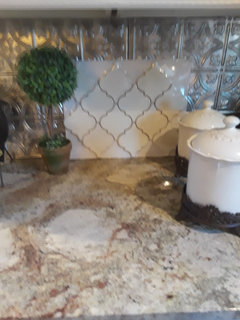
    good morning, I appreciate all of your feedback, and welcome ideas for other options .Here is a tile that I had considered..but again, not sure...
  • 8 years ago

    Still too busy. You have multiple focal points fighting for attention.

    The counter is a strongly patterned with a rounded swirling movement. You are trying to make it coexist with something that is strongly squared and heavily patterned.

    Plain cream counters with the embossed metal or fancy tile would be good. Solid color tiles with the current counters would be good.

    There is a reason why plain subway tiles sell so well: they are the inconspicuous supporting element for the fancy granites and cabinets.

  • 8 years ago
    last modified: 8 years ago

    the white tile is nice..and in keeping with classical stylish statement you desire. with regards the metallic piece: if your backsplash area is small, it would be a consideration if you really like it. I just wouldn't do a large area with it, even if I loved it. To me, the counters aren't super busy, the colors are neutral...you seem to want a classical feel layered with cabinets, counter. I think the goal is fine....maybe a little more searching.....but i do like the white tile you show. Do you like crackle tiles: in a warm bronze/tan could be nice.

  • 8 years ago
    If you have a feature range area I would use the darker just there and a beveled cream or plain subway with matching or slightly darker grout on the rest. Those two choices fight your granite which is gorgeous!
  • 8 years ago
    last modified: 8 years ago

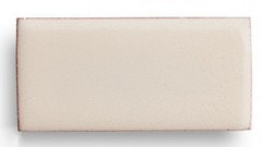
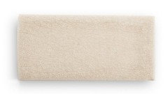
    You have other options! And they will be much easier to keep clean. Consider colors first - you’re looking for the right hue. You’ll want to pull candidate colors from your stone then make sure they look good with your cabinets, so you’re looking for neutrals. The tiles below are from Fireclay Tile and are Tusk, Milky Way, and Birch, a crackle tile (don’t pick birch).


    Now consider saturation. Generally speaking, the darker the color of the tile, the darker your space will appear, so keep it light as long as you like the color.

  • 8 years ago

    Re: "don't pick birch"...what is the rationale? In her setting, I think it works well. I would say, "don't pick tusk" because you can't get the real match with cabinet white....and that's what tusk attempts, but likely misses. Just need to bring in samples to the setting.

  • 8 years ago
    last modified: 8 years ago

    Herb, I chose it because it goes so, so well. I said “don’t pick birch” because it is a cracked tile with contrast, it has to be sealed and it is the most expensive tile I showed. Also, if you want the backsplash to dissolve and get out of the way of the stone, this is the worse choice of the three. I actually picked Tusk to go with the large, bright areas in the stone. It doesn’t match the white of the cabs but will look fine against it.

  • 8 years ago
    wow thank you! this is just what I needed .I will heed all of your advice and bring in more samples.to enhance not distract from my granite..hang in there for my next dilemma..my bland fireplace wall...
  • 8 years ago

    I'd like to see a wider pic of your kitchen too.

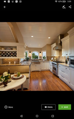
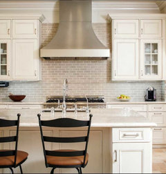
    Your granite reminds me of my mom's kitchen, just want to show you how a quieter tile looks. I think I'd prefer the even simpler tiles that eam44 is suggesting for your kitchen, since your granite pattern is more dramatic.


  • 8 years ago

    cali: what is that tile?....is it textured with some relief....that's what it looks like,not sure, but that's a kind of new different look. Do you have a close up?

  • 8 years ago
    I very much like the tile samples.thank you so much for taking the time and effort , it really helps to have a another's perspective ,as I thought I had some taste in decorating but feel as if I'm getting worse instead of better in choosing wisely..
  • 8 years ago
    hi caligirl5. That is a lovely kichen..makes my kitchen look very sad.the tile in your picture looks wonderful. and I actually saw something very similar at Lowe's which was discontinued..does it have a slight wave in it to the touch? I will upload a larger shot of kitchen area.
  • 8 years ago
    Hi herb, thank you for your help .I also am curious about Caligirl.tile very clean and yes quiet but not boring at all..
  • 8 years ago

    Frankly if there's just a small amount of backsplash, I happen to like the original tin tile on the left. If it's a small area, it won't detract from your stone. However if there's lots of backsplash, then yes, go quieter.

  • PRO
    8 years ago

    When one loves interior design and reads GW and devours Pinterest, it is very easy to get caught up with the "I want that in my kitchen, too" mode, and try to put EVERYTHING one loves all in one room. Sure, you can do that, but in the end, it will look like a junk shop with unrelated stuff everywhere. Simple and serene - you will NOT tire of it, and if you do, a bright bowl of fruit, a bright pottery pitcher, new dish towels, will do the trick.

    Kitchens are far too expensive and the re-doing of them so disruptive to living in the house, that they really need to go back to being pretty neutral the way they once were, when people lived in a house 40 years and only changed the paint on the walls and the old valance over the sink. I don't care if someone GAVE ME a new kitchen every 5 years - do not want to go through that again, and I had a reasonably undisruptive re-do as I did not move appliances or walls.

  • 8 years ago
    Here's another option. It's Walker Zanger Gramercy Park in Walnut. If that's too dark for you their Brownstone color might work.
  • 8 years ago
    Here's the Brownstone.
  • 8 years ago

    The tile Cali posted may be walker zanger cafe tile. I have it in my shower in blue. Not too expensive either!

  • 8 years ago

    Hanging around until we see a larger shot of the kitchen. You could do worse, but you could do much better too. Those options will be awful to clean too.

  • 8 years ago
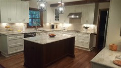
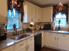
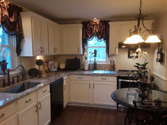
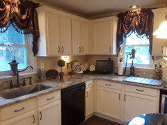
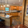
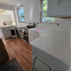
    here are updated pics.new dishwasher and range hood are stainless
  • 8 years ago
    last modified: 8 years ago

    I would retire the valances as they are too bedroomy for a kitchen. I only mention them because they affect the tile you'll select.

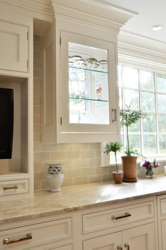
    I like the Brownstone that Blondelle posted. That color is a nice transition from a warm-toned counter to a white cabinet.

    This is a slightly different colorway but it illustrates how picking a color from the granite and grouting it in an off-white ties it all together.

    Stanwich Road · More Info

  • 8 years ago
    Yes curtains are going..tu! that looks great
  • 8 years ago

    That photo gets a lot of love here.

    You'll get a lot more light in your kitchen when you remove the valances. I'd do that now while you're picking backsplash because light affects color.

  • 8 years ago

    I like the Brownstone too!

  • 8 years ago
    Both are too busy
  • 8 years ago

    The Brownstone is LOVELY!!! it's a little pattern and color without being overwhelming. It can be cleaned easily. I don't like the cool of the stainless or the bronze. so the cappuccino colors tile with light grout - it will really set off those counters.


  • 8 years ago
    this space needs some contrast. I think something with the darker tones of the counters would look great, and not blend everything in similar shades. so consider darker, but still unpatterned, and typical shapes and layouts.
Sponsored
Hope Restoration & General Contracting
Average rating: 4.7 out of 5 stars35 Reviews
Columbus Design-Build, Kitchen & Bath Remodeling, Historic Renovations