Software
Houzz Logo Print
webuser_47381

Need help picking a grout color

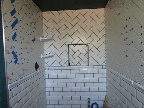
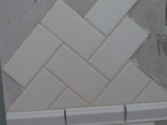
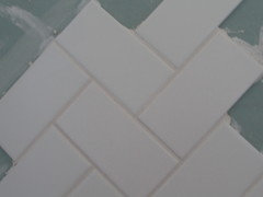
Small bathroom, bottom tile 3x 6 crackle bevel (gloss) biscuit subway, upper half matte biscuit herringbone, joints 3/16", grout close to the color of the tile or darker

Comments (30)

  • PRO
    13 years ago
    Lighter grout colors are usually used for wall tiles.
  • 13 years ago
    White
  • PRO
    13 years ago
    Keep it light , where it is a small space and a good amount of tile you need to have to grout that is subtle otherwise a dark grout would be too distracting for the eye in a small space.
  • 13 years ago
    Bright white is lightest (this is custom grout) or alabaster-the darkest of the whites, should I use the same grout color in the chair rails (these are artic white), I spend alot of money on the tile and labor for the herringbone, I want it to be the focal point
  • 13 years ago
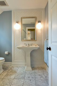
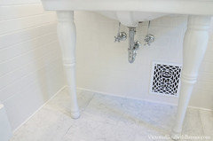
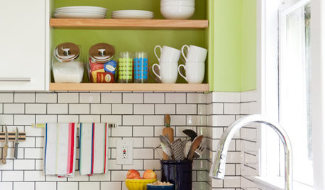
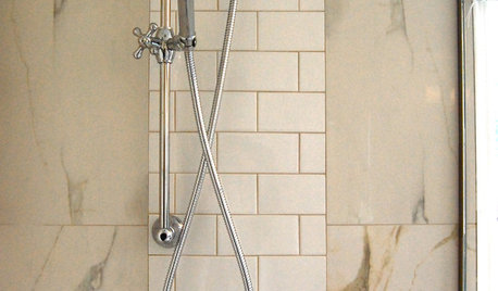
    These examples show that if you want the herringbone to stand out you'll need to go darker with the grout. Btw, I LOVE herringbone subway tile!
    Traditional Kitchen · More Info

    Classic Transformation · More Info
  • PRO
    13 years ago
    I agree with Wendy, a light to medium grey. You have obviously spent a lot of money and time on this layout, why make the patterns and sizes disappear with a light grout?
  • 13 years ago
    I agree with a light gray. If you keep everything in those neutral colors redoing your accessories can change your colors when ever you feel the need for change.
  • 13 years ago
    I am with Genevieve- white.
  • 13 years ago
    Why wouldn't you want it to match the bottom grout? I love the look of the dark, and I guess it would depend on the look your going for. From what I've seen, in very old homes, they used dark grout. But I have always loved that look:)
  • PRO
    13 years ago
    What's the floor going to be? Go grey! Too bad your shower valve wasn't a couple of inches higher.
  • PRO
    13 years ago
    I would keep it light. Choose a color that matches the tile as closely as possible.
  • 13 years ago
    I think it could go either way, but what is the rest of your house like? If it is contemporary, you might like the light, but in a historical home, the grout was darker becuse that is what they used back then.

    Great tiling job whatever you decide.
  • 13 years ago
    I like the contrast. I think bluenan's photos have given you a good visual of the herringbone (LOVE) disappearing if you match the grout to the tile.
  • 13 years ago
    I see two shades of white tile here. I would match the grout color to the tile below to tie them together. The upper tile is more of an ivory and the lower tile is a brighter white.
  • PRO
    13 years ago
    we did white for our subway tile...wanted to keep it bright. although, I do think dark contrast is very pretty.
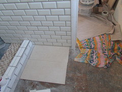
    Some photos of the finished bathroom:
    http://www.houzz.com/projects/245030/DIY-bath-remodel----a-vintage-design-for-our-Victorian-house-
  • 13 years ago
    With biscuit colored tiles, I suggest you use almond or a very light tan. I'm thinking of something with just enough contrast to highlight the herringbone pattern and the shape of the lower tiles. If you go with a high contrast dark color, the grout lines would draw the eye too much and the beveled shape and crackling of the lower tiles wouldn't be the focus. White grout would make the biscuit tiles look off-color or dirty, and gray would clash with the warmth of the biscuit color.

    My tiny bath has a warm (but not as warm as biscuit) white flat subway tile wainscot and shower. I tried lots of colors with it, and chose Spectralock Almond grout for the soft contrast. SpectraLock is an epoxy grout that is more expensive but it is stainproof and never need sealing -- worth it!

    A sample board is key with any grout choice. You really can't tell exactly what it will look like with just a tiny grout piece.
  • 13 years ago
    Restoring Our 1890 Victorian, your bathroom is absolutely beautiful!! I am just knocked out by your shower fixture! So elegant. And the register cover is perfect! We too are using white grout for our subway tiles in our kitchen.
  • PRO
    13 years ago
    @Marilyn- Thank you!! I was OBSESSED with that dial... It lived in my head for three years, before we even started the bath!!
  • 13 years ago
    I love the tile work! We're going to redo our small master bath in a similar fashion. If you'd like a different take on grout, check out this Ideabook: https://www.houzz.com/magazine/subway-tile-picks-up-gray-grout-stsetivw-vs~1613366

    See especially the comment by Beth Bathe (it's quite a ways down in the comments). She chose a taupe grout for the white subway tile, which looks quite nice. Good luck!
  • 13 years ago
    last modified: 13 years ago
    the shower and bathroom floor tile, have tons from a clearance sale, it leans towards the browns, having difficulty finding a grout with the slightest touch of almond, would say my style is traditional, do want the pattern to pop, like @bluenan picture #1
  • 13 years ago
    Sarah-thanks for the ideabook, ie Beth Bathe, have picked 3 grouts for trial run with extra tile, alabaster is one of them, shoutout to Joanie at Daltile in Phoenix for pattern design, i fell for the super expensive but gorgeous crackle bevel tile and she took it from there. Grout choice is tough, but crucial....im learning
  • 13 years ago
    tomorrow is d-day have to pick a grout color for the walls, here are my 3 options from dark to light, bone, antique white, alabaster, doesnt look this hard on TV ;)
  • 13 years ago
    Bone
  • 13 years ago
    Close to color of grout.
  • 13 years ago
    If you go dark eventually you're going to get tired of all the lines, :-/
  • 10 years ago

    I don't understand why anyone likes to highlight grout and make it a decorative item. It reminds me of the public bathrooms that have dirty floor grout. Grout should be minimized and the tile should be the focal point. People are always trying to clean their grout. To me the darker grout just dates a home and makes it appear "used" and unclassy where it undresses things. Also why mix white tile with biscuit. That makes it look like you added it later and could not match things. If you mix tile colors there should be a big contrast such as black and white. This is not to be insulting or hurt anyone's feelings. It is honesty like you really want someones opinion.

  • 6 years ago

    I agree with gsdd.


  • 6 years ago

    A light or white grout would be good. The other tiles' grouts are pretty dark, so you don't want it to look too busy

  • PRO
    6 years ago

    This post is from 2013.