Software
Houzz Logo Print
saypoint

Living room tweak

8 years ago
last modified: 8 years ago

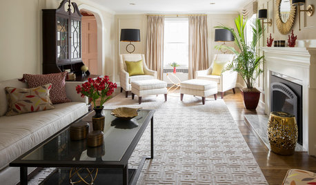
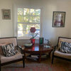
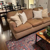
I’ve been struggling to pull this room together for a year. The paint color came with the house. Everything else except for a few accessories is stuff i’ve had for years. I think the clean wall color makes my stuff look dingy. The room just feels cold. I took out a patterned green rug because i was told it clashed with the chairs, but I think that was a mistake. I liked the sofa facing the fireplace better but the mister wants a tv in here. Ugh. i love green but can live with blue if i can warm it up. I tried mood boards with accents in green, fuchsia, brown, coral etc. nothing looked good to me. Drapes would be great but $$$.

Do I need a different wall color? Less clutter? More clutter? Another accent color? Patterned rug back? More contrast? Something‘s wrong but i can’t put my finger on it. Any thoughts appreciated.


Comments (45)

  • 8 years ago

    Your room is very lovely. I really like that rug, too. The wall color is very drab. I greatly dislike gray walls. As the budget allows I would paint the room a warmer color, replace the floral chairs/ottoman, and get drapery panels. Panels can be very inexpensive. ( as little as $12 a panel).

    Saypoint zone 6 CT thanked grapefruit1_ar
  • 8 years ago
    last modified: 8 years ago

    Lovely room! And I love that patterned rug. I'd add flowers. Yes, you could paint a warmer colour but it's a lot of work and expense. Try just adding a bouquet or two of flowers to add some accent colours.

    Saypoint zone 6 CT thanked tartanmeup
  • 8 years ago

    The walls are actually a very pale blue, close to BM In Your Eyes. The photos were taken on a cloudy day, so they look more gray.

  • 8 years ago
    Your home has the features of those found in high end magazines! The classic trim, fireplace, and size is very appealing (the room hugs guests). The floral chairs are dated however it is an easy fix. You might even want to scale your furniture. Perhaps their are to many large pieces. If you decide to paint a buttercream yellow with cream trim (classic combination) or a cheery yellow with white trim ( coastal classic) would be very inviting! Update some accessories with pops of color in your throw blanket, candles, and linens on your dining table to bring rooms together. You have 1 weekend to invest painting then, reap the fruits of your labor by adding pieces as you can. You have a beautiful home and will be a happy place for all since yellow i s a happy !
    Saypoint zone 6 CT thanked Stacey Carpin
  • 8 years ago
    last modified: 8 years ago

    I've always loved your taste. How frustrating that you have a room full of nice things but it just isn't coming together for you. I think the paint is a little cool but you might be able to counteract that with some natural linen look curtain panels. Your returns look a little tight, so I can see where that might not be an option.

    What about a darker natural rug to ground the room and some natural colored shades on your lamps? Here is a rough mock up.


    Saypoint zone 6 CT thanked deegw
  • 8 years ago

    I love the green rug - I'd put it back. I'd love to see a photo of before you switched it. I think you're right about drapes - they would make a huge difference. Custom is big bucks, but off the rack can be quite reasonable.

    In an ideal world, I'd select chairs with a more curved back, so they look great when views from front door. I'd probably make them a pale solid and add some colorful pillows.

    I absolutely love your plants, and the more the merrier!


    Saypoint zone 6 CT thanked mjlb
  • 8 years ago

    Here’s a photo of the room before changes. Also on a sunny day, which makes a big difference. DH wanted the tv in there, pro designer through e-consultation (won’t mention names) told me the rug clashed, and the dark lamps were faux-wood resin and the finish was peeling off the back where the sun hit them. Wish I’d left it alone. :o(

    So maybe I can bring back the old rug (it’s in a spare br) and get some lamps with more contrast? Put the tv somewhere else, DH be danged?

  • 8 years ago
    last modified: 8 years ago

    I think that version looks great. Why did you consult with the designer? What made you unhappy about the arrangement? Was it the TV issue?

    If you put the rug back, you can use your current lamps. Just get darker shades.

  • 8 years ago
    last modified: 8 years ago

    I agree -- the prior version was lovely! I think the big difference is that the art arrangement over sofa looks great, but fights with the taller tv furniture. It's hard to tell what is behind the sofa now, but possibly moving the artwork to that wall would help.

    Alternatively - in a passive/agressive act, you could relocate the tv over the fireplace! Actually, I do think that would be a solution.

    Saypoint zone 6 CT thanked mjlb
  • 8 years ago

    The consultation was for a possible change of wall color. I found the existing light blue chilly from the start, and had always planned on changing it, but the LR is open to the breakfast area and semi-open to the DR just past the front door. A change to the LR paint would likely mean going through the whole space. There are moldings on the walls that separate the spaces but i think it would look funny changing colors there. Kitchen backsplash tile is light gray blue.

    The tv thing came about because I didn’t want it in the MBR and there wasn’t a good place to put it. We have another tv in the family room. I should just put the second one in one of the upstairs BRs to get it out of the way. No one would watch up there, and in any case there’s no cable hookup. DH wanted it in LR because the family/sun room gets chilly with so many windows. We’ve since added additional heat to that room.

  • 8 years ago

    Yeah, i might have to rethink the gallery wall altogether. I liked it before. I had to raise most of it about 8 inches to clear the tv/bookcase. I don’t want to put the tv over the FP because it’s a decent antique carved mantel, looks like Adam style to me, with wood moldings above it.

    I may start with lugging the rug back down this weekend and see if that helps. I ordered a seagrass rug online last summer, but didn’t like the weave of the rug when it arrived. It was a very coarse weave. One that I had in the past was more of a tight herringbone pattern. DH hated it so when we moved I finally pitched it. It held up well for a number of years with pets, etc.


  • 8 years ago
    last modified: 8 years ago

    I would put the old rug back and buy some yellow or gold pillows without a pattern, and also do the previous furniture arrangement. I would keep the more modern looking white lamps. There should be a gorgeous mirror or beautiful painting over the fireplace, with a gold surround for the mirror or the painting should have yellow, terracotta and green colors. The gallery wall needs one or two small oil paintings to break up the scheme, which should also be arranged in a less linear fashion, with three informal rows. Lay it all out on the floor and don't put the two largest pieces next to each other. Drape panels in a soft yellow or gold color would further warm up the room and there would be no need to repaint the walls. These changes will make the room look livelier and more put together, and the yellow drapes and pillows will make a huge difference. I would move the furniture further away from the coffee table; it needs room to breathe. With fresh pillows, drapes and new artwork and possibly a mirror (I would choose one with a gorgeous rim, and not necessarily rectangular, but with some curves in it), your room will look even more beautiful and fresher. New pillows in the right color can make a huge difference.

    Saypoint zone 6 CT thanked ingrid_vc so. CA zone 9
  • 8 years ago

    Thanks, everyone for the encouraging comments. The wall color kind of disappears at night, it really does look best on a bright sunny day. I did feel the lamps were a bit wimpy, I think I was going for something, not sure what, lol. Becky, do you think putting the tv/bookcase in was a bad move?

    I’ll have to do some lamp shopping and bring the rug back. Then some paint samples. I want to avoid painting the trim, because there is a LOT of it and it’s recently painted. Unfortunately it’s also bright white, which might not work that well with a dirtier wall color?

  • 8 years ago

    I skimmed through the replies...not sure if anyone else mentioned it but the first thing my eye went to was the ottoman. I think that is the only thing I would pull out. Or do you need it for a certain purpose?

    Saypoint zone 6 CT thanked always1stepbehind
  • 8 years ago

    Posting at the same time, Ingrid. I’ve been keeping my eyes peeled for a painting for over the fp, haven’t found the right one yet. Have to photoshop in some pillows and drapes to play with color.


  • 8 years ago

    The ottoman is there because I have it, lol. Occasionally someone will sit there if all the other seats are taken, but it’s not very comfortable without a back. Sometimes i pull it up to the armchair and put my feet up, but i try to get into the room first and grab the sofa.

  • 8 years ago

    Becky, do you think putting the tv/bookcase in was a bad move?

    Well, I do prefer the previous arrangement. However, and it's a huge however : ) , the rooms in our homes are there for the people. We have to make compromises between form and function, especially when we have families lol.

    It's the reason I have a recliner (albeit a leather, nice one from Lee Industries) in my living room, for my husband...

    say, what is the white paint for the trim -- do you know?

    I love that ottoman, especially the fabric and the upholstery style. Plus to me it makes the room look cozier, and as if there's room for any- and everyone.

  • 8 years ago

    The only fan decks I have are BM. It’s whiter than all of the warm whites and not as cool as the blue-whites. The closest matches are ready mix interior “white” and ready mix exterior ”brilliant white”. Closer to brilliant white. Even “super white” has more yellow in it. From the color preview fan deck. The classic deck has few whites in it. I should go to the SW store and look at some of their whites. PO left no hints on paint colors.

    I shouldn’t be so obsessed with this room, but it’s where I spend most of my time and it’s really bugging me.

  • 8 years ago

    say, what are the light exposures in the room? What direction does the secretary/front door wall face? What direction does the gallery wall face?

  • 8 years ago

    Secretary faces East, gallery wall faces North.

  • 8 years ago

    Correction/clarification

    the wall the secretary is on is the west wall of the house. The wall the gallery is on is the south wall of the house. Bright light when the sun is shining.

  • 8 years ago
    last modified: 8 years ago

    Disregard this entire post lol. I wrote it before I saw your correction.

    gallery wall faces North

    Aha. I think that might be the problem. Not only is there less light, but north-facing light is cool. And blue as well as bright white tend toward the cool anyway.

    I think you might want a warmer color to balance out the cool north light.

    I just remembered that designer Laurel Bern had a post a few years ago about paint color recs for north-facing rooms,

    https://laurelberninteriors.com/2014/10/05/im-losing-sleep-north-facing-room-paint-color

  • 8 years ago

    Sorry about that. When the sun is shining, the color is much less chilly. While the sofa looks similar to the wall color, it has a a bit more green in it and a little dirtier. I think the cream and dirty vs. clean and bright white is causing a disconnect.

  • 8 years ago

    The gallery wall and ottoman are what bothers me . . . just at a glance you know? And I liked the green rung.

    Saypoint zone 6 CT thanked shari13
  • 8 years ago

    At night with artificial light, mostly incandescent bulbs and off white or natural colored shades. Could use more lighting but still looks a lot cozier than it does on a cloudy dreary day. Maybe leaning a little more toward green and adding a bit of gray to the wall color would do it. Might be hard to do without going minty or hospital green, or too gray. Maybe just paint the whole thing cream or off white. Cheaper to paint if i do it myself. I used to crank out two coats on a room in a day easily without stopping for lunch. Now i would probably do half one day and half the next. Easier to have slipcovers in a cleaner color as it’s less work for me. I found a couple of oriental porcelain lamps that I like but they’re on white backgrounds, with clean bright colors. The muddier ones didn’t appeal.

  • 8 years ago

    I like your room in all the photos. It's interesting how I usually like blue gray walls in pictures but I think I would feel chilly with it on the walls. Does your furniture have the blue gray color in it? It looks like it does. I think maybe it's the wall color that's bothering you. Your furnishings and detail in the house are great. The sunny day photos of course look much warmer and comfortable as do the night ones. I do prefer the old rug. I think it makes the room cozier. On my monitor it looks like the more solid one has a different undertone than the printed furniture. ? I don't know. My eye kept going back and forth between the rug and the furniture trying to figure it out.

    I like your current lamps but I like your old ones too. I think the color and wood look added more warmth. I like porcelain ones you posted but they may feel too stark and do you think they'll fight with your furniture? Are they a good height?

    I prefer original arrangement with the couch facing the fireplace because I think the art (which I really like and the arrangement) looks better above the couch buuuut, it's nice to be accommodating to hubby too. I don't dislike the other way, but the art seems like it's fighting above the tv somehow. At least in some of the photos. Maybe it's not like that IRL or maybe a slight tweak to the layout (art) if you keep the tv there.

    I wouldn't want to paint all that but if you think it's the wall color then I'd go for it. I like the idea of a green, cream, or other neutral. I think an earthy color with the white trim may depend on how earthy. If you went with cream I think it would look best with the trim that color too and you said how that's a lot of paint and it was just painted. I'd figure out the undertones in your furnishings and go from there. I can't tell what undertone the cream of the floral furniture has.

    I realize I'm just bouncing around ideas here and probably not being very helpful!

    Saypoint zone 6 CT thanked User
  • 8 years ago
    last modified: 8 years ago

    I remember your post about the rug, I was one who liked the rug a lot and thought it worked, but I like green and blue mixes. I think the color is lovely, I am also a cool color person but I think you would be happy with a different wall color. I think your room is absolutely lovely as is so you can take your time trying to get it right for you.

    Saypoint zone 6 CT thanked roarah
  • 8 years ago

    This is one time when I really, really (really) wish I could be in the room to see what it feels and looks like not through a screen. Argh.

  • 8 years ago

    I wish you could, too, Becky. I’m in the Northeast. I’ll gladly send you a ticket.

  • 8 years ago

    That would be fun, wouldn't it, especially for the chance to meet : ) .

    I was just saying to a friend that the very things that are making me need a vacation badly -- calving season, looking my husband who had a heart attack in January and now has bronchitis (mostly making sure he doesn't overdo things), and finishing up our new house -- are keeping me at home for the foreseeable future!

  • 8 years ago
    last modified: 8 years ago

    Added a piece of art above the fp that I had hanging around. I think it makes a big difference. Not sure the clock is ok in front of it. Cloudy day, lights on. Will have to wait until I have some help to drag the green rug downstairs.

  • 8 years ago

    I think the proportion of the tv cabinet is throwing things off. I wonder if you added light-colored artwork to internal shelf, or even wrapped the books in light paper, if it might lower the apparent height of the tv cabinet.

    I did prefer your old lamps to what you have currently. And very much like the oriental porcelain lamps that you are considering.

    Saypoint zone 6 CT thanked mjlb
  • 8 years ago

    Yes, the bookcase is huge. Sigh.

  • 8 years ago

    To my eyes the blue on the wall is very different from the couch and the green rug you had. It seems like they work individually but not together. I love your space.

    Saypoint zone 6 CT thanked Twosit4me
  • 8 years ago

    The walls are similar to BM In Your Eyes and the sofa is similar to BM Gray Wisp. The first clean, the second more muted. The rug is also more muted, with the green being a more minty green. I was never crazy about the rug color.

    I’m wondering if I should test the Gray Wisp on the walls or would it be too close to the sofa color?

  • PRO
    8 years ago

    Your living room is just lovely. I love the newer lamps and I think the current arrangement with TV is perfect. You arranged the artwork over it very well, and the TV (which is a focal point) and art balances the fireplace (the main focal point). I might have done a more neutral rug (similar to seagrass) to avoid introducing another pattern, but the one you have in the pictures works. I also love the new fireplace arrangement with the art. Altogether, you have a classic traditional room with a few newer updates to keep it from feeling stale.


    I can tell what's bothering you is the paint, it's just not working. Not only is it too "baby blue" light, it's also obvious you're a "green person" at heart and you'll never be able to love those light blue walls no matter how much you try and however many tweaks you make to the room (and really, it's quite beautiful as is right now). I recommend painting the walls BM Hazy Skies OC48. It's a light grayish-greenish-tan that can read a bit greener or bluer depending on the light, really a chameleon color. It will give you a warmer, more neutral background that will complement your artwork and also blend beautifully with the Gray Wisp color sofa and the pattern in your chairs. It will also help give a little more definition to the beautiful molding you have.


    I think once you fix your wall color, you will suddenly feel as if everything has fallen into place.

    Saypoint zone 6 CT thanked Tracie Craig
  • 8 years ago

    Open House, thank you for the compliments and ideas. Will check out Hazy Skies as a possible color. Thanks for the suggestion!

  • 8 years ago

    Perhaps switch bookcase and buffet (although I do love the buffet as is)?

    Saypoint zone 6 CT thanked mjlb
  • 8 years ago

    I’m wondering if I should test the Gray Wisp on the walls or would it be too close to the sofa color?

    I wouldn't get too close to the sofa color.

    I think the time might be here to get some test pots of paint in several colors that you're considering and start painting larger chunks of wall in the room to see what you think.

  • PRO
    8 years ago
    The room lacks contrast but overall is put together well. You mentioned liking green however you might leaning toward the wrong color green. Have you considered an apple green? That color pairs well with gray. But from a picture it's hard to see the true color. Some gray has green and some has blue tones. The art work is nice but you could add something with a little color. You could replace the two chairs or reupholster to add some contrast to the room. I think what would help is to remove the chairs (just to give you a visual) and then bring in some sample colors and that should help give you a better direction.
    Saypoint zone 6 CT thanked SJS Interiors
  • 8 years ago

    say, if you get rid of the chairs (and the lovely and somehow misunderstood and sadly maligned ottoman) I'm coming down from Canada with a trailer to save them.

  • 8 years ago

    At the risk of being annoying, I'll reiterate my suggestion of adding flowers and offer this link for picture inspiration.


    Honestly, I think your living room (in all the iterations you've shared) is the sort we see in shelter magazines: a room with great bones furnished with beautiful elements grouped in a considered yet not overly decorated way. I'm convinced adding flowers - real or artificial - will make it come alive. I'm craving orange ones in your blue vases on the mantel, flowering branches behind your sofa (see slide 19) and something cascading or hydrangea on your coffee table. Before painting or futzing with any other elements, I would try that. And I'm right behind Becky if you get rid of anything in that room! :D Especially the gorgeous lamps. And the ottoman? I'd totally reupholster it in a bright velvet.


    The important question is "Is this space functionally enjoyable?" If the answer is yes, then congrats are in order. You've created a beautiful living room. :)

    Saypoint zone 6 CT thanked tartanmeup
  • 8 years ago

    A lot to think about. I can’t move the bookcase because the tv is in it and it won’t work on the other wall.

    The gray wisp is almost identical to the sofa color. Hazy Skies is greener, but still quite close. Need to get samples.

    The poor ottoman does come in handy sometimes, especially when we have a fire and I want to turn toward it, the chairs are on swivel rocker bases and I can put my feet up. It and the chairs are sporting ten year old slipcovers over twenty year old badly faded red blue and green plaid. They’re still comfortable, will likely get a third life with new covers or upholstery at some point. Maybe this is the time to change to cleaner colors and keep the wall color, which is really very pretty.

    Tartanmeup, not annoying, lol, I love the way flowers will lift up a room. I get a bit lazy about picking them up at the market when I’m out. I wish the fresh ones would last longer, I’m not that keen on the artificial ones. The good ones are very expensive.

    Thanks for all the kind words and help.

  • 8 years ago
    last modified: 8 years ago

    Looking at your room again, I tend to think that adding curtains might change things for the better. I would use a solid linen-like cream color, similar to the background color of your furniture. I have a feeling it will warm up the blue on the walls, and make the room look more pulled together. The only other suggestion I have is to remove the clock in front of the painting to give it a chance to shine. The art adds so much to this room. I notice that your green rug has some rusty red coloring in it. I would use that color in some solid pillows to give the room some oomph. That would warm up the cool walls also and give a fresher, more contemporary vibe without taking anything away from the charm of your printed furniture fabric.

    Saypoint zone 6 CT thanked ingrid_vc so. CA zone 9