

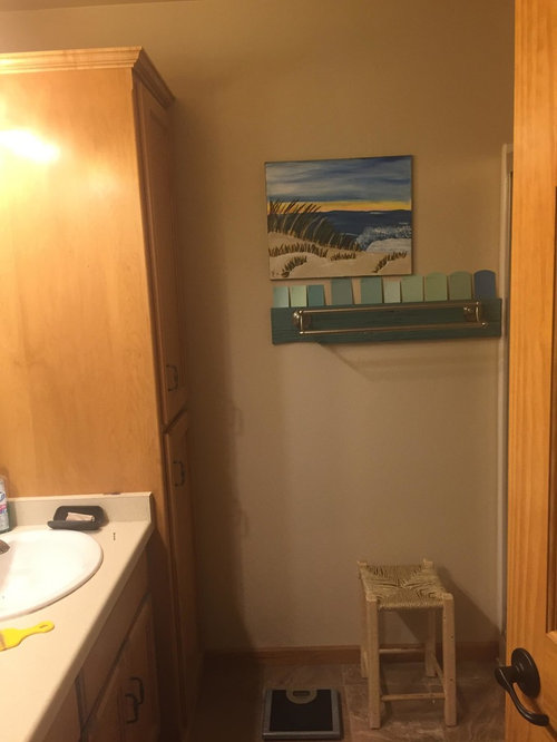
What comes after gray?
8 years ago
Featured Answer
Sort by:Oldest
Comments (9)
Related Professionals
New Haven Interior Designers & Decorators · Logan Interior Designers & Decorators · Magnolia Bathroom Remodelers · Crestview Bathroom Remodelers · Kissimmee Bathroom Remodelers · Amherst Bathroom Remodelers · Grand Rapids Bathroom Remodelers · Temecula Bathroom Remodelers · Palm Bay Kitchen & Bathroom Designers · Bainbridge Kitchen & Bathroom Designers · Cumberland Kitchen & Bathroom Designers · Fall River Kitchen & Bathroom Designers · Watertown Kitchen & Bathroom Designers · San Jose Kitchen & Bathroom Designers · Colorado Springs Kitchen & Bathroom Designers- 8 years ago
 8 years ago
 8 years ago
- 8 years agolast modified: 8 years ago
- 8 years agolast modified: 8 years ago
 8 years ago

Related Stories

BEFORE AND AFTERSBefore and After: Gray and Marble in a Serene Master Suite
A designer helps a California couple create an efficient and stylish space where they can relax, rest and rejuvenate
Full Story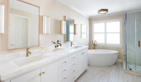
BATHROOM MAKEOVERSBefore and After: Brass Warms a White-and-Gray Bathroom
New features, fixtures and hardware update this remodeled D.C. bathroom to give it a fresh and inviting feel
Full Story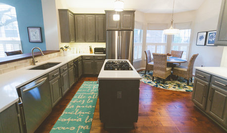
BEFORE AND AFTERSGray Cabinets Update a Texas Kitchen
Julie Shannon spent 3 years planning her kitchen update, choosing a gray palette and finding the materials for a transitional style
Full Story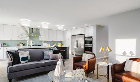
KITCHEN OF THE WEEKKitchen of the Week: A Soothing Gray-and-White Open Concept
A smart redesign gives an active family a modern kitchen with soft tones, natural elements and mixed metals
Full Story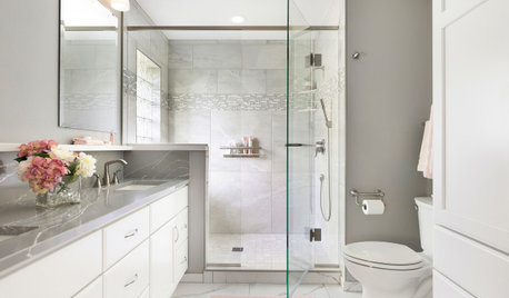
BATHROOM MAKEOVERSBathroom of the Week: Soothing White and Gray in a Roomy Layout
A Minnesota couple work with a designer to ditch their tub, create a larger shower and embrace a classic color palette
Full Story
BEFORE AND AFTERSKitchen of the Week: Gray Cabinets, Mixed Metals and Italian Love
Bold white, soft gray, touches of wood and brass, and a European-style coffee station enliven a new kitchen
Full Story
BEFORE AND AFTERSA Casual Gray Kitchen Effortlessly Blends Looks and Functionality
Durable, family-friendly finishes and cool tones help this San Diego kitchen keep a laid-back profile
Full Story
BATHROOM DESIGNBathroom of the Week: A Black, Gray, Gold and Glam Attic Retreat
A kitchen and bath remodeler turns an angular attic into a sophisticated teen zone that will work for grandparents later
Full Story
BEDROOMSSoothing Whites and Grays Create a Refreshing Master Bedroom
Strategic changes help a California master bedroom go from dark and heavy to light and bright
Full Story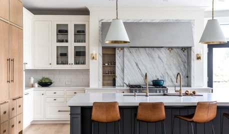
KITCHEN MAKEOVERSKitchen of the Week: White, Wood, Gray and a Backsplash Surprise
A Maine couple with three young daughters ask a designer to help them create a clean space with custom style
Full Story


mommyniki