Software
Houzz Logo Print
jeremia_froyland

House floor plan... yet again.

8 years ago
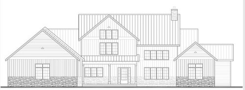
We scrapped old plans and started from scratch... (old posts: https://www.houzz.com/discussions/floor-plan-updates-again-dsvw-vd~5206825)


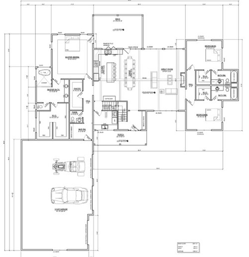
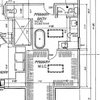
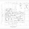
Here are our new plans, any thoughts or big things I'm missing?


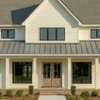
It's on a 4-acre lot and we're wanting an open, farmhouse-style (board & batten, metal roof, etc.)


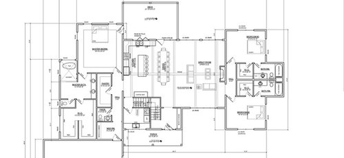
The second photo is just a zoomed-in version.


Thanks ahead of time! :-)


Comments (27)

  • PRO
    8 years ago

    What do the other elevations look like?

    Do you think the front elevation is rather "busy" and a bit bulky?

    Jeremia Froyland thanked Virgil Carter Fine Art
  • 8 years ago

    You have seating for fourteen at your dining table. And beds for four. (second story floorplan, are there five bedrooms up there?)

    Jeremia Froyland thanked miss lindsey (She/Her)
  • PRO
    8 years ago

    I can’t be of any help because the plans are small and I have old eyes. What I will comment on is doors…lots and lots of swinging doors. Can any be fitted with pocket doors?

    Jeremia Froyland thanked JudyG Designs
  • 8 years ago

    First thought: You have four acres, and this is a big /expensive house ... yet you've tacked the garage on the front as if you are building on a small city lot. This is the first thing people will see /their first impression of the house.

    Lots of jigs and jogs around the perimeter, which will make this an expensive-to-build house ... and will force the roofline to be complicated /more prone to leaks ... without adding any function or comfort.

    I like that the master and the pantry are near the garage entrance. That's just sensible.

    The pantry is huge, even by my standards. Is this really what you need? Since this door will be open most of the time, I'd consider either a pocket door or a swing-away hinge that'd allow the door to lie against the interior pantry wall.

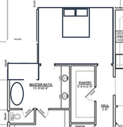
    No great love of the master bedroom. I see what you were trying to do: You wanted to bump it out far enough that you could have an exterior door ... but it's just so much wasted space ... and too much is just as bad as too small. I think if you make it "even" with the main house, you'll have a "just right" room.

    The master bath has the same issue: wasted space. All that empty space will just feel cold.

    Kitchen looks okay ... not strongly wonderful, nor anything really bad. I like the opening between the kitchen and outside ... this is an expensive detail though.

    However, the large dining table is entirely too close to the island. If someone's sitting at just one of these spaces, it'll be hard for someone else to walk by. The inswing door takes up even more space.

    I can't read the numbers, but the living room looks nice ... and big kudos for windows on both sides. You'll have wonderful breezes through this room. Is the TV going to the left of the fireplace? You'll want to insulate that wall so the person sleeping in that bedroom (likely a child) won't hear the TV at night.

    The laundry room is nicely located ... but you'll still be carrying clothes through the bedroom /through the bathroom to reach your closet ... if you open a door between the mudroom and the closet, you'll save many steps.

    Kids' bedrooms look nice /have good natural light ... but I'd go with one nice-sized bathroom with plenty of storage rather than two baths. This would likely allow you to remove the expensive bathroom-bump-out from the side.

    Jeremia Froyland thanked Mrs Pete
  • 8 years ago

    Virgil Carter Fine Art

    We don't yet, still working on the basement layout.

    We did like the front elevation, our initial elevation looked waaayyy too plain so we wanted to add some character to it.

    lindsey
    We often have lots of visitors and host family, friends, quite often - there are two additional bedrooms that will be in the basement (the floor plans of which we are still working on).

  • PRO
    8 years ago

    Is there a plan for the second floor?

  • 8 years ago

    Mark Bischak, Architect

    Not yet, this is still a work in progress - there is going to be a loft area above the kitchen (we like the more intimate feeling of smaller ceilings there as well) and then a basement, the only upper area will be the loft).

  • 8 years ago

    JudyG Designs

    We kind of steered away from pocket doors based on a bunch of feedback/input from others.

  • 8 years ago

    I don't have time to read or really look at it right now but the one thing that glared out at me is the entry to the bedrooms on the right. Why would you want to lose living room space and have to walk around furniture to use that hallway? Why not move the rooms down like this?

    Jeremia Froyland thanked cpartist
  • 8 years ago

    Much better; well done.

    A few thoughts -- not intended as criticism, just suggesting you consider possible options and make informed choices that suit your personal lifestyle and taste:

    If there is any chance you intend this to be your forever home, and if you truly want the master bath toilet in a tiny closet, then consider making almost the entire side wall a really wide door (at least 3') and have it open out to make it handicap accessible should that ever be needed. It isn't just getting old that could put you or someone in hour household in crutches or a wheelchair, temporarily or permanently, a skiing accident or a car wreck could, too.

    To put a window in the powder room off back hall/mudroom from the garage, could the back of the toilet be along the garage wall and the vanity/sink be across from it with a door in the middle. Alternately, having wider mud room may be more worthwhile for you.

    Having the laundry room near your kitchen island is great for folding laundry. Alternately, if the laundry room were accessible via a door from that back hall rather than through the kitchen, that could make a difference in how much laundry room noise and smell reach the main living area. Also, would you prefer the heat from the laundry room to be closer to the kitchen or to the back entry hall.

    Pay attention to whether the front of your home will face north or south or east or west and, with a four acre tract of land, how far from the road your front porch will. Consider whether or not you might actually want to sit on your front porch and relax and would having both a front and back porch give an option to enable adults and children to have a break from one another on a warm summer day when wanted/needed. With that in mind, ask yourself: would it be worthwhile to extend the front porch and create an "L" shape in order to include the space in front of the living room as part of the front porch.

    Do keep us updated on your build.

    Jeremia Froyland thanked suezbell
  • 8 years ago

    cpartist

    Makes complete sense, thanks again for everything! :-)

  • 8 years ago

    suezbell

    Thanks so much for the input, I'll look over the feedback with my wife - all valid points and the porch idea I like. :-)

    We did request that ALL doors be made to minimum 36" wide (not currently reflected in these plans).

  • 8 years ago

    cpartist

    I'll take a look at the front again, I value your opinion a lot :-)

  • 8 years ago

    I need to add a number 20. to my previous list: Furniture can be moved!

  • 8 years ago
    last modified: 8 years ago

    Afterthoughts:

    If you have son(s) and daughter(s), two separate children's baths will be appreciated as they become teens -- not only by them but by you: less stress. Each responsible for keeping their own bath clean. (Each bath needs its own window, even if it is just a small one.

    Didn't notice what appears to be bar stools around the kitchen island before reading another post. You might want to make your overhead lighting for your great room flexible enough to be able to move your dining table a bit one way or the other if these seating areas prove to be too close for comfortable use.

    Not sure the added expense of rock or brick above the foundation is worthwhile.

    As to the garage, you might consider adding an 8' screened breezeway between the garage and house and having cars enter from the left side so you can landscape the area directly in front of your home for more curb appeal.

    Overall, without seeing the upstairs and basement plans, it appears to be a good basic plan -- one that would be usable for most families that rarely have overnight guests, as is -- without either a basement or upstairs.

    Agree you should consider adding sound insulation between living room and children's wing and/or you could also have the option of adding a door to the hallway (if needed) and/or built-in cabinets in the living room on each side of the fireplace.

  • 8 years ago

    suezbell

    Yeah, we've had a lot of people try to dissuade us about the separate baths for the kids - but it's something we like and they're a young boy and girl.

    We're still looking at the lighting for the whole house, haven't really decided on anything yet.

    Our subdivision requires at least 1/3 of the house to be stone, brick, etc.

    Appreciate the input! :-)

  • 8 years ago
    Why are you putting your garage in front if you have so much acreage? Your entire front yard will be a slab of concrete.
  • PRO
    8 years ago
    last modified: 8 years ago

    In glancing at the first floor plan, there appears to be more space provided than needed (spaces are awkwardly bigger than they need to be). A more efficient layout will save you thousands of dollars.

    Designing one floor at a time is not a good idea. It can lead to designs that are busy and a bit bulky.

  • 8 years ago

    Overall, a vast improvement to the original design. Good job for taking the criticism as constructive and using it! I don't really have much else to add from what others are saying, other than please rethink the prominent 3 car garage on the front. Consider a detached side garage or a side garage with some separation from the house.

    Your bedroom is huge. Rethink the necessity of that.

    Consider making your pantry a bit smaller (lengthwise). Your powder room can move up a bit and your mudroom area can be made a bit bigger. You will appreciate lots of room for hooks, shoe storage, etc as the kids get older.

    I think your long dining table will end up moving a bit to the right (closer to the family room) in real life. Still plenty of room for everything, but carefully consider lighting placement.

    I like CP's idea of shifting the right bedrooms down for a better entrance placement to that wing.

    LOVE your windows on both sides of the family room. And I really like your tub/shower combined area with windows on two sides.

  • PRO
    8 years ago

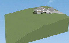
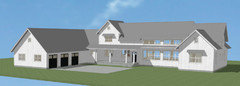
    I did a bunch of concepts for Jeremia several weeks ago, and this one might answer some questions about the building site.

    It slopes from the East, down more than is shown here, to the West. Lot is more rectangular, with much of it down slope. It's wooded, with a mix or trees.


    One concept is similar in plan, just less tall.


  • 8 years ago
    PPF, you are AWESOME!!!!
  • 8 years ago

    PPF I love the elevation on that!!


  • 8 years ago
    last modified: 8 years ago

    I didn't read all the comments so there may be some repeats.

    That is a giant dining room table. I love it. It's crowding the patio door a bit.

    The kitchen looks pretty good, but the fridge is far away from the sink, which is inconvenient for prep. A small prep sink in the island across from the fridge would fix that. The pantry is a little far away, but not unreasonable.

    Cpartist's concept for the right-side bedroom hallway is much better for internal flow and furniture placement.

    The great room looks like you might have trouble filling it as the furniture pictured takes up very little of the space. There are a lot of dilemmas on here about how to fill the empty space in an oversized great room. If you are fine with lots of empty space, then it's not a problem.

    The entire master bath is awkward to me with lots of wasted space. As someone who takes a lot of baths, I would hate having to walk through the shower to the bathtub. Honestly, the whole left master suite area of the house needs to be reworked. It's a lot of wasted space.

    It would be nice to have a door from the mud room to the laundry. Really nice when you come is super dirty and just want to throw everything straight in the wash.

    Don't indent the first spot in the garage. The two gables being slightly off is infuriating to me.

    On the exterior, I would only use the vertical siding and stone. Replace everywhere that has horizontal siding with the vertical stuff. PFF's mockup is great.

    What is upstairs? Just a bonus room?

  • 8 years ago

    I like cpartist's change to the kids' bedroom location to make access a little better.

    As for the large master bedroom and bathroom, I don't have a problem in theory with the amount of space, but I think you do need to think through how you'll arrange furniture - your actual furniture, not the generic bed plopped in by the architect. We have a large master with a sitting area and I love it, but in your bedroom as drawn I'm not sure how a sitting area would work with the traffic patterns. It could be great, but I'd actually work it out. Same with the master bathroom - I'd mark it out on the floor and see how it feels to "walk" through it.

    My first thought on the elevation was that it was too busy. If you're required to have the stone, I'd look to make everything else as simple as possible. So horizontal or vertical, not both, no unnecessary trim detailing, a simpler front door, etc..

  • 8 years ago
    last modified: 8 years ago

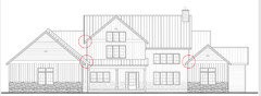
    These appear to be awkward spots, both visually and for drainage reasons. The lower two problem areas are not in the foreground, but the background where the roof meets the second story walls. The eave near the upper circle should be at the same elevation as the eave above your great room windows.

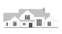
    As mentioned in the comments above, stone looks best when it's used in traditional ways. This means either as a foundation material, or as the entire facade. If you can can manage to get a variance/convince your architectural board that you're using stone how it would be used historically, keep the stone along the foundation.

    https://imgur.com/a/Fh54nn2

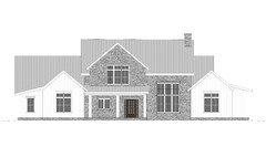
    If you are absolutely required to use stone, consider placing it as if this farmhouse was built a hundred years ago and has been added onto over the years. This means the center of the house (foyer, loft, and great room) would be stone, while the garage and bedrooms might look as if they were added on over time.

    https://imgur.com/a/VlD8xyU

    Speaking of the garage, a pet peeve of mine is when the garage gable is larger than any other gable on the house (there are exceptions, but this is not one of them). The massive garage just knocks the elevation off balance, and reduces the focus on what should be your front door/porch. What I've shown here is the same size garage, broken down into two smaller masses that reflect the proportions of the bedroom side of the elevation. Additionally, consider beefing up the columns and trim.


  • 8 years ago
    last modified: 8 years ago

    We kind of steered away from pocket doors based on a bunch of feedback/input from others.

    Don't be afraid of pocket doors -- just be aware of where they're appropriate /where they're inappropriate. They have their pros and cons.

    Pocket doors are perfect for places where your door is almost always left open; for example, a mudroom or a laundry room is often a good place for a pocket door -- we tend to leave those doors open most of the time, but we want to be able to close them when we have company.

    Pros of pocket doors:

    - Disappear when you're not using them.

    - No problems with "door swing" ... no need for a place to "park" the door when it's open.

    Cons of pocket doors:

    - With heavy use (for example, a bathroom door), they will break. Because the working mechanism is inside a wall, you may need a pro to fix the door.

    - They sometimes hinder other items in a build; for example, you cannot have plumbing and a pocket door in the same wall space ... similarly, you need to think about walls that you want to support cabinets or built-ins. Simple artwork, of course, can be held up with Command Hooks, which don't penetrate the wall.

    - They require a thicker wall.

    - With no real handles, the hardware is harder for children /elderly to use.

    - They often don't lock.

    As for the large master bedroom and bathroom, I don't have a problem in
    theory with the amount of space, but I think you do need to think
    through how you'll arrange furniture - your actual furniture, not the
    generic bed plopped in by the architect.

    Unless you're planning for your master to act as a sitting room /exercise room /whatever else, you can slash it significantly. Do you watch TV in bed? If so, imagine how far away the TV would be ... my old eyes wouldn't be able to see it.

    Consider this "downsized" master and bathroom:


    It's still a large master suite, but it's not bloated.

    Yeah, we've had a lot of people try to dissuade us about the separate
    baths for the kids - but it's something we like and they're a young boy
    and girl.

    I'd listen to the "lots of people". You'll spend so much time cleaning bathrooms ... keeping all those bathrooms stocked with TP and shampoo is just one more chore. I'd go with a simple bathroom opening to both rooms.

    That's not character. It's taking a classy lady and turning her into a
    hootchie mama. There is much more character in simplicity.

    Agreed. I think this "fear of my house being too plain" is a big concern these days, and people seem to be going too far the other direction. Elegance and simplicity are NOT the same thing as "plain".

    OP, remember, too, that you're looking at a house plan without landscaping. Adding landscaping to a new house is like adding accessories to a Little Black Dress ... they can dress it up /dress it down /make it personal.

    I like CP's idea of shifting the right bedrooms down for a better entrance placement to that wing.

    Yes, that was a very good detail.

    I like the central placement of the stone in this pix -- I would steer away from trendy stacked stones, which will be "out" one of these days: