Software
Houzz Logo Print
kipnwanda

minimal vs displaying collections

8 years ago
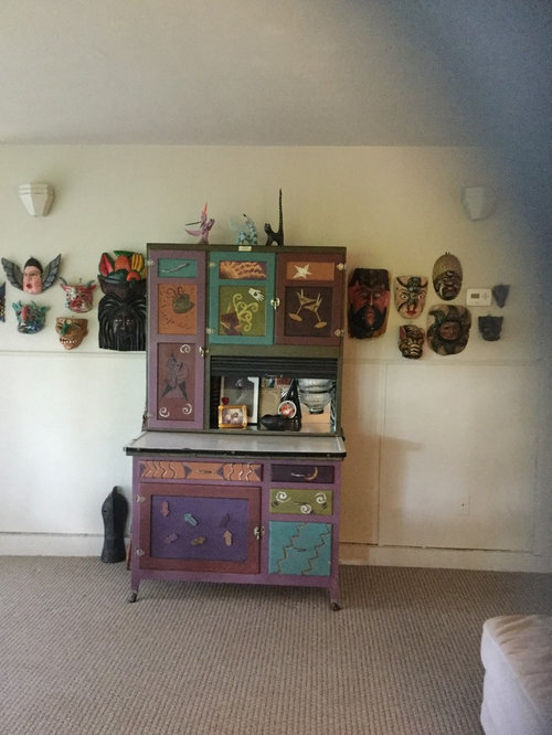
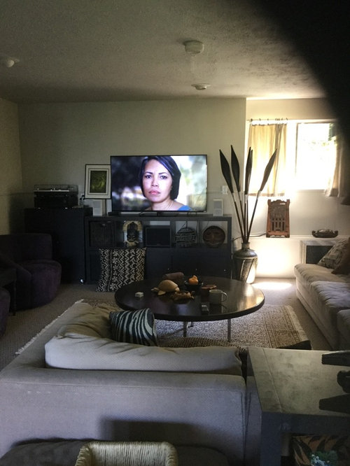
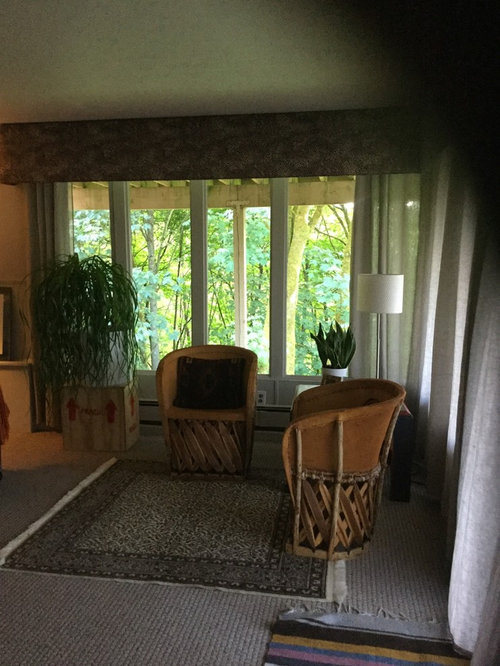
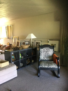
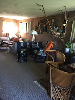
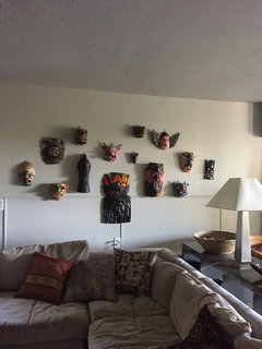
Just painted our walkout basement and purged some furniture and collections. Now trying to display the collections we kept. My minimalist mind is having a difficult time with this. Is there a better way to display these items? Still looks cluttered to me.....help!

Comments (28)

  • 8 years ago
    And still more art! What to do, how to arrange?
  • 8 years ago
    More art
  • 8 years ago
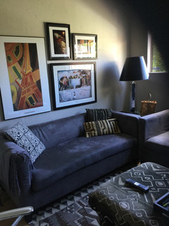
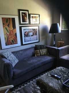
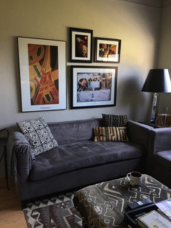
    Quick question, is this too low? Any recommendations? This is in our den.
  • 8 years ago
    last modified: 8 years ago

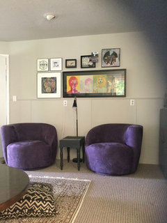
    The top picture: WHY that tight narrow band for the art? Spread it out, up and down.

    I think the art in the den over the couch is too low (I know there will be disagreement), but I say this because I can see guests bashing their heads back into the art. It just looks extremely uncomfortable to sit there. Up at least 8 inches, but you can leave the arrangement as you did on this one.

  • 8 years ago
    last modified: 8 years ago

    I don't think that art above the sofa is too low. Sit there and try to hit your head on it. If you can't then they won't. My personal "rule of thumb" is a generally good one that you can feel free to break. It is 5-5-75 (centered 5' above the floor, or bottom frame 5" above furniture, and never wider than 75% of the furniture's width. Are you grouping your galleries by color, theme, subject matter or just random? Sometimes you need to have a common thread tying things together. When frames don't match, I find that leaving one hand's breadth between the pictures works pretty well.

  • 8 years ago
    Thank you for responding.
    Artemis_ma
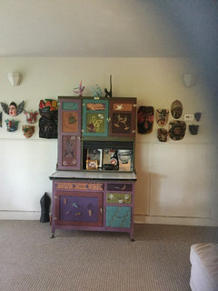
    when you said 1st picture, do you mean the TV? Or the cupboard with masks? Or the Beatles wall?
    decoenthusiasts
    I group the pics by collections, ex Masks, Beatles and in the den by color
  • 8 years ago

    Have you considered hiring a home stager to help you divide your art into seasons and then rotate them every few months. A stager will help you to divide and conquer and allow your art pieces to really enhance each other and the room. Just because you have it doesn't mean you have to use it all the time!

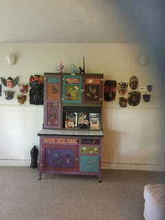
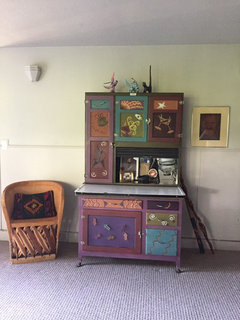
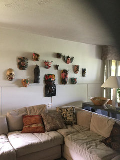
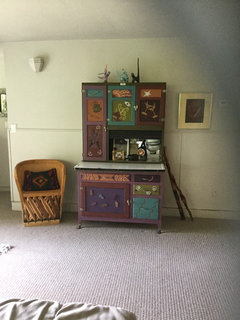
    I love the masks and think they need an important spot where they will shine and not compete with a multi colored cabinet.....the multi colored cabinet should be in a place that will reflect and to relate to similar colors.

  • 8 years ago
    Maybe the masks should go back to this wall? Pic is before condensing masks!
  • 8 years ago

    Too close together, crammed unnecessarily. Give them room to breathe.

  • 8 years ago
    If you are a minimalist, I don't know how you will reconcile displaying so many pieces. The seasonal rotation idea is a good one.
  • 8 years ago
    That is why I’m having such a problem with all this. I thought you had to place things close together to make it look like one! Haha Love all the information about crowding, spacing and color. Tomorrow the masks will be hung on their own wall. Haven’t decided on what to hang by the cupboard.
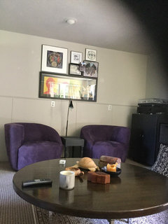
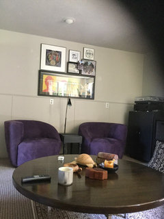
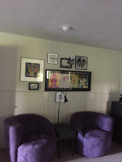
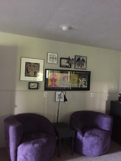
    How would you arrange these collection of the Beatles. Trying not to put anything over the electrical plugins but this does not look right. How would you arrange this?
  • 8 years ago
    The den before and after I raised the pictures by 2”. Now 7” above sofa. Feels better
    It’s the little things!?!? :)
  • 8 years ago

    Have you tried the Beatles singly, 5" above that trim and just marching around the room, a la Sgt. Pepper?

  • 8 years ago
    This is what I rearranged today
    Before and after
  • 8 years ago
    Deco
    Great idea if we didn’t have so much other stuff!
    Before and after. Better?
  • 8 years ago

    I like the masks spread out better. Beatles need some breathing room too. You should consider dividing up your stuff into warm and cool. Then you can swap it out twice a year when the seasons change (assuming you have 2 seasons there) and you won't have to struggle to find space for all of it. It makes for a nice way to refresh your home twice a year.

  • 8 years ago
    Deco
    It feels better down there! These walls are pretty spacious. Do you still think the Beatles wall is still not spread out enough? It really helps for “other” eyes to help me make these decisions.
  • 8 years ago
    last modified: 8 years ago

    Beatles are probably better if they stay within 75% of the chair arrangement's width, so may be OK. Can't always tell from photos at an angle. I don't like the item hung below the trim and pieces up top though. Try the little picture that is just above the rail on the left moved above the long one and then mount the two with white mats side by side above the larger white matted one which you lower so the bottom frame is even with the bottom frame of the long one.

  • 8 years ago
    Thank you so much. I can see that, will change out tomorrow.
  • 8 years ago
    Here you go, 3 walls in our basement.
    Better or more adjustments?
  • 7 years ago
    Minimalism is just about having less. It’s about only having stuff you love. Do you love ALL the masks? Are you keeping them all because they are a mask collection? Are there some that you can let go? Keeping only the ones you love will let you give them the space they need.
  • 7 years ago

    Looks much better.

  • 7 years ago
    Sorry meant to say minimalism is NOT just about having less. Can’t seem to edit comments.
  • 7 years ago

    Hi Susan...I'm hoping this is done by now (unless WE is like me, so maybe not).... :)

  • 7 years ago
    Getting there. I think the hutch should go between the purple chairs with a smallish lamp in the hutch tray. The wicker chair/s ? By the art grouping. Just a thought but like your direction!
  • 7 years ago
    Plus I think you gallery wall is still too high. Within 5-12 inches above back of furniture. You can hang it in the horizontal trim piece and it will look fine. Now it looks rather floaty. But maybe it is the photo? Just some suggestions!
  • 7 years ago

    Ummmm....Susan?