Software
Houzz Logo Print
stephanie_morrow4805125

Kitchen/Dining Indecisive Disaster...

8 years ago
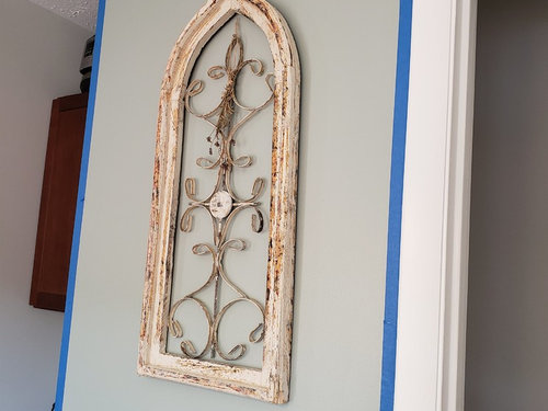
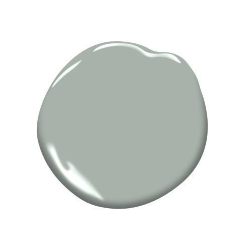
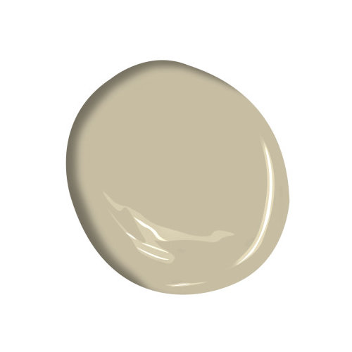
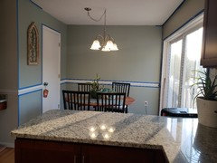
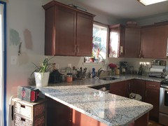
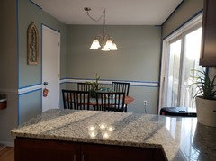
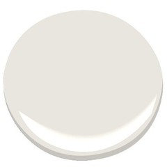
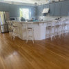
So I've been having a heck of a time trying to decorate my kitchen and dining area in a way that gives each space its own personality while complementing each other. I actually originally brought in an interior decorator to help me choose paints. I ended up having Sherwin Williams match the colors she helped me choose, Pearl and Market Square Shell. I absolutely love the Pearl in the dining area but I loathe the Market Square Shell. I think it's mustardy at best and the two colors clash in my eyes.


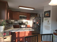
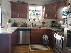
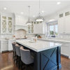
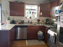
So while I was trying to decide on what color to choose (note all the splotches on the walls), I realized I would be better suited choosing a backsplash first and then making my paint choices off of that. Well that led to me to really look at the granite countertops and the cabinets and I am at a loss here. The red in the cabinets doesn't really match the yellow in the granite and it's making it really difficult to choose a color. Meanwhile, I don't want to go too dark since it's a relatively small kitchen and the cabinets are dark and the appliances are black and chrome. I tried bringing several samples home from the tile store but they all clashed. Any recommendations would be greatly appreciated. I'm at a loss here.


Comments (32)

  • 8 years ago
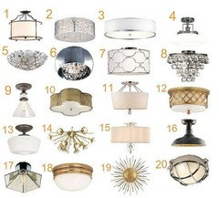
    "So I've been having a heck of a time trying to decorate my kitchen and dining area in a way that gives each space its own personality while complementing each other" You are having a hard time because you are trying to make them two separate rooms. It is an eat in kitchen and is one room. If you like the pearl color paint, I would paint the whole room the same color.

  • 8 years ago
    Would the Pearl clash with the cabinets and the countertop though? It is close to a sage green so it's a much different color from either of them.

  • 8 years ago
    Clear all the clutter from the countertops and take a better photo.
  • PRO
    8 years ago
    last modified: 8 years ago
    What you are saying is you hate the counter tops. Which we can't see and nor can we see the cluttered kitchen. One color for the entire space, please. Photos from all angles when tidied.

  • 8 years ago

    I'll do it when I get home tonight - sorry about that.
  • 8 years ago

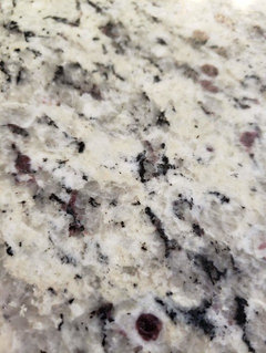
    The garnets in your countertop are so pretty, but I do think they make it tricky to work with colorwise (I rejected viscount white granite for our last kitchen for that very reason.). I can see why your pro suggested the color you hate—it goes with the granite. But if you hate it, then let’s find something else that goes.


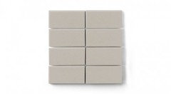
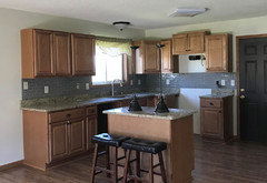
    For a tile backsplash, I would see if I could pull one of the pale neutral colors from the granite to use as your backsplash. Looks like there is grey and taupe? I think the taupe would probably work better with your cabinets.


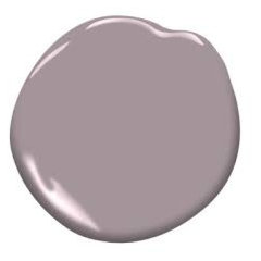
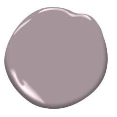
    . I’m no color genius but those grey/white counters with garnets always make me think of purples to go with them. I am not sure how that would work with your cabinets though. Maybe take a look and see what you think?


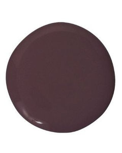
    Thats Benjamin Moore Amethyst Sky.

  • 8 years ago

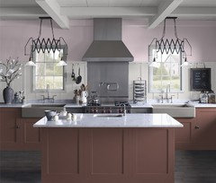
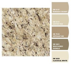
    Here’re the color elements I think you might consider. (Also, I can’t see your flooring in any of the pictures and you will need to take it into account.)


    The tile is from fireclay.

  • 8 years ago
    I would definitely bring the paint you like through the entire space. It will unite the two spaces and make it feel larger. The color definitely won't clash with your cabinet. Then you can decorate the two spaces a bit differently if you wish.
    I would keep the backsplash simple, maybe a white tile thats the same color as the whitest part of your granite.
  • 8 years ago

    I think the OPer’s instinct that the Pearl would not work with the countertop is likely right. I steered away from that kind of granite because I knew I wanted to use blue or green in my kitchen and they did not work well with that countertop to my eye.


    I do agree that that I would choose one paint color for the entire area.

  • 8 years ago
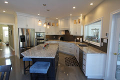
    Here are some updated pictures. I apologize for the clutter in the previous pictures.
  • 8 years ago
    crl_,

    Thank you for your ideas! I felt the same way, that the garnet was the most "forward" color in the countertop. I like the color that you suggested but it clashes with the red in the cabinets :(

    I picked up several neutral tile samples but they just didn't look right. I'm starting to think that I'm the problem!
  • PRO
    8 years ago
    last modified: 8 years ago

    Hon. all I see is the fridge and magnets. And still a lot of other stuff. You have to move it all to do a decent paint job. Starting with a BIG edit will help you see any color better. More stuff isn't "more" in any kitchen and it doesn't make it homey, it just makes it cluttered and harder to clean. . Spend some time on this aspect first. Get an electrician to move the dining light and rid you of the swag. Get the lighting addressed; the florescent light box in the center isn't helping you see either. Start with a ruthless purge of every item on the counter.

    Then....... try Benjamin Moore "Wish" or "Edgecomb". After you've done the ceiling which will need refreshing.

  • PRO
    8 years ago

    Fine! : )

  • 8 years ago
    last modified: 8 years ago

    Is it possible to paint the cabinets? the appliances don't work with the rest I could be wrong but from here it looks that way, if someone could be kind to photoshop the cabinets white you could get a better idea , your counter top and the grey paint would work to perfection, paint all one colour if you like wallpaper above the wainscoting do that . Here is an example .


    Woodsedge · More Info

  • 8 years ago

    Stephanie, you obviously spent a lot of time clearing up, which is great. As Jan says, there is more to do. Remove everything from the top of your cabinets and take everything off your fridge. Free up your counters by only leaving the things there that you use every day: toaster, coffee maker, etc. Clearing the decks will give you a much better feel for what will best suit your kitchen.

  • 8 years ago

    Stephanie, didn’t see your post. Sorry.

  • 8 years ago

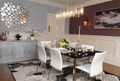
    For the dining room above the wainscoting I found this new wallpaper I think that it would look marvellous on your wall ,add white panel to your window.


    Peacock Green, Double-Roll · More Info


  • 8 years ago
    latifolia,

    Thank you for your insight and choosing a less abrasive tone than was previously used. I'll be sure to give it a shot to see if any new inspiration comes.
  • 8 years ago
    last modified: 8 years ago

    Oh No Stephanie, you are not the problem. You wrote that you think you are the problem. Not at all! You have a beautiful space. Give yourself a huge pat on the back. You are doing great. It often takes people a few times up at bat before they hit it out of the park for a home run. Don't give up.

    I like your countertops. I know they are not your favorite but they are very pretty and you can work with them. The blue/green color that you have in the dining area will look perfect too. I know you think it is going to clash but you need to understand the color wheel..

    Colors that are opposite each other often compliment each other. Which means that they can balance each other out in the right space and right amount. If you love the pearl it will look beautiful, but if you are doubting yourself here are some other ideas...

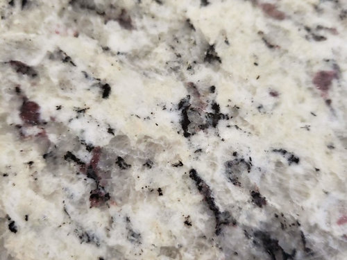
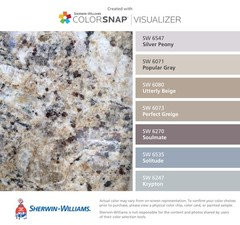
    I think your granite is also called River White and sometimes Giallo Ornamental White or Colonial White granite. It has lots of gray shades with cranberry flecs and various shades of cool whites and beiges.

    Sherwin Williams used to have a feature to find colors with common granites. Not sure if they still do it but here are some images to give you an idea.

    I also think lighting could really brighten up your space. If you have it in your budget think about changing that florescent light to something new. Here are some ideas for paint and backsplash with similar granites at yours. Maybe one of the ideas may inspire you.

    Finley · More Info

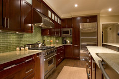
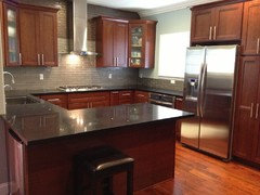
    Notice this green color tile with the red cabinets... it is a lovely balance.

    Janssen-Kitchen · More Info

    This might be a nice paint option that is soft but not overpowering.

    Seifert Kitchen · More Info

    Giallo Ornamentale Granite Counters · More Info

    tile ideas...

    Glass Herringbone 3"x1" White, Surrey Store · More Info

    13"x13" Whisper White Arabesque, Set of 30 · More Info

    Aspen White Marble Minibrick Subway Tile, Sample · More Info

  • 8 years ago
    Thank you, boxerpal! You've given me a lot to ponder. My other concern with the Pearl was that were I to do it throughout the kitchen and dining area that it would make the space feel smaller. I was contemplating using it but with some white mixed in to lighten it up.
  • 8 years ago

    I like your fridge magnets. One of my disappointments with our stainless steel fridge (when the kids were little) was that the magnets wouldn't stick to it :(

    I like the direction you're going with the paint. Getting the right paint color will make a big difference in the rooms. And when you have a busy family, sometimes, it's one step at a time. You're on the right track.


  • 8 years ago
    I really like your color but agree that it's too dark for the space. You can try it at 25% or even 50% lighter. You don't mix in white, you just ask the paint store to do it and they put in whatever % less color. That way when you come back for more they can match exactly.
    I think a plain ivory subway tile would be great for your space, but maybe your style is a bit more out of the box. Have you looked into stainless steel backsplash?
  • 8 years ago

    I think your instinct is correct, going with one color and probably a light one might make the room feel more spacious. But since you love the greenish color in the dining area I think you need to keep that color. It makes you happy and it is really pretty.


  • 8 years ago
    ElleN, I picked up a sample of a stainless steel and black backsplash but the black was overwhelming. I didn't see any metal ones that caught my eye. I'm trying to keep an open mind.
  • 8 years ago
    last modified: 8 years ago

    few quick points, and then I'll be back,,,

    remove the chair rail. why is it there? there is no need to chop your walls in half. none. If you want to do a white wainscot, great! do that. otherwise, take it off.

    wainscot or one, solid wall. Pick one.


    I actually like a bright white wainscot or a 2/3 high board and batten, and this SW Raisin shade for the top portion. too dark? Try BM Raindrops on Roses.
    Then bring in a nice dining room light w/some reflective qualities

    I also like the light white color for the kitchen walls. The kitchen is small, and you like your things, so having a lighter, non-fussy color would be best. Have you tried BM Lacey Pearl? Or Pale Oak, Or SW Passive? they are all nice neutrals that won't fight

    in the kitchen, that florescent light is horrible and can be removed without too much trouble. replace for a nice ceiling light

    as for the backsplash. you have one. that 4" piece.

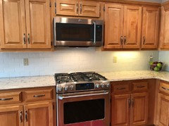
    are you willing to remove it to do tile? if not, and you still want tile, then do soft glass subway. Heres is what tile on top of your 4" piece will look like

    or remove that 4" piece and it will resemble this look. Let me know what you like and I can come back w/more ideas.

  • 8 years ago

    your kitchen is basically the same floor plan I had in my last home - I didn't use the granite as a backsplash (like you have done). My cabinets had been painted white by the previous owner. If I were you, I would simply put paint above your granite backsplash. Now getting the right color paint - that can be daunting - I purchased many 'sample' pots. Originally a pale peach color, eventually a pale mossy green color. Keep in mind I didn't use the same granite as you and I had BRICK PAVER floors to deal with! Good luck with finding the best color of paint.

  • 8 years ago

    BLESS YOU BETH!!!! I just knew you would come with some wonderful ideas for Stephanie!


  • 8 years ago

    Stephanie, following on from Beth’s excellent suggestions, consider simplifying your life and sticking with the granite backsplash you have.

    Here’s why: your stone guy knew he was installing the granite strip, so he possibly (likely) left a wider gap at the back than one would leave for tiling. If you rip out that strip, you may have to repair the wallboard and deal with the gap. Your current setup is fine.

    Focus on your paint color and lighting and you will have a kitchen you love.

    On the decluttering, that was a lesson I learned many years ago, after my husband and I combined apartments. I brought in a decorator and the poor woman stood there stuttering. Finally she said, “There’s just too much ‘stuff’”. She was right. It took us some time, but thinning out made for a much more restful space.

  • 8 years ago

    I "vote" in support of continuing into the kitchen with that lovely green you used in the eating area. Our cabinets are a similar color and green is a wonderful complimentary color. I will not post a photo of my kitchen as I don't need the clutter comments. There are people who enjoy a clear counter and there are people who enjoy having their things out. I wish they were able to leave each other alone in peace and harmony.

  • 8 years ago

    Your granite is Giallo Ornamental Light. I have it in my guest bath with a dark cherry vanity. I pulled the blue-gray from the granite with a paint like SW Solitude, which boxerpal posted. There may be a lighter color on that strip that could work so the rooms aren't so dark.

  • 8 years ago
    Thanks everyone! I have to run to work but I'll read through the comments more thoroughly when I get home.

    With regards to the little strip of granite on the wall, it looks nice but it's not doing me any favors when it comes time to cook. I am concerned about oil splashes on the walls and the likes.