Software
Houzz Logo Print
ejcw99

colour advice required please

8 years ago
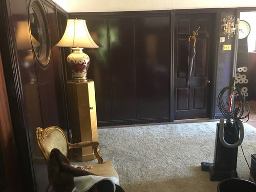
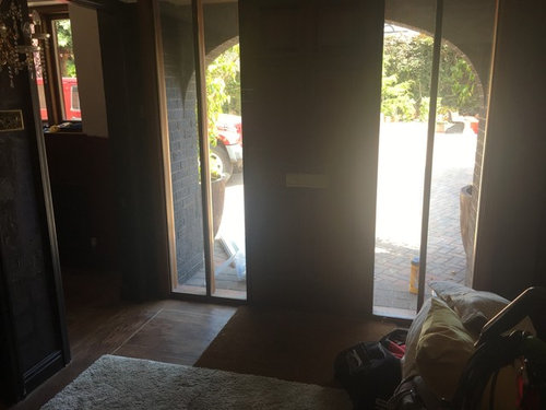
I’ve painted my dark north east hall a gloss version of Farrow and Ball Pelt. I had already tried light colours but it was still dark so I thought I’d embrace the dark and go reflective instead. But I’m not sure about it. To be honest I don’t even know the question I need to ask!! And I’m hoping Colourhappy will see this and just pull a suggestion out the air that helps me see some answers like I’ve seen her do before. Or someone else might see what I can’t. The only thing is I’d like the finished effect to be bold or brave. But I’m a good way not an abomination to the eyes way! Fingers crossed!

Comments (34)

  • 8 years ago
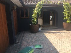
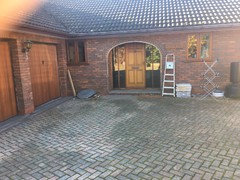
    I’ve painted my house exterior dulux version of Railings to update the 70s/80s brick and everyone so far seems to like it. Just saying that I’m willing to go unusual and take chances rather than appealing to the widest house buying population and being “safe”.
  • 8 years ago
    I love brave colours so I like the painting you have had done both inside and out.
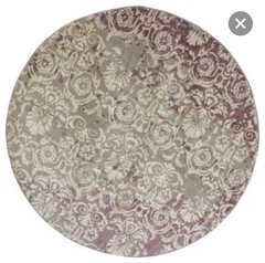
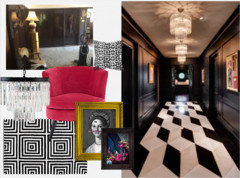
    I like the hall walls- if it were me I would edit some of the stuff out of the room. I would loose everything gold and in its place put Matt white furniture and accessories for a cleaner pared down look. Personally I think it needs a circular rug and I would choose one with pattern.
  • 8 years ago
    Thanks Jonathon. None of the furniture was bought for the room so don’t need to stay. And the rug is Ikea and I’m certainly up for a circular one. Do you have any suggestions for accent colours in addition to white or do you see it just white and dark strong shapes kind of thing?
  • 8 years ago
    Thanks Zeta. Yes I’ve been thinking for a while about what sort of art would help the space feel cohesive. But haven’t been convinced enough to take plunge. (Sorry art lovers I’m one who uses art to make the space rather than for its own interest! But I do enjoy art nonetheless)
  • 8 years ago
    Zeta when I replied I could see your text but not your pics. I love those examples. They are so strong visually. Together with Jonathons suggestion I think I want the white and dark contrast to be starker together with some mirror. ???
  • PRO
    8 years ago
    last modified: 8 years ago

    Happy you've found this helpful Emily.

    I think you've just found an answer to your question :)

  • 8 years ago
    Thank but I’ve got dogs so prefer a hard floor in living areas.
  • 8 years ago
    I love what you've done so far and think the gold accents work. I like the rug Jonathan has suggested to pick up the purple, but think that you could embrace the dark eclectic look and introduce more dark, rich colours, including above the dado. Maybe a grey? Also, could you add a big plant somewhere? It's the kind of look I'd like to experiment with but keep holding back on!
  • 8 years ago

    Something like this maybe?

  • 8 years ago
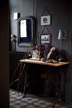
    In my humble opinion the vintage ephemera look is great in a space where you sit or in a high ceilinged period property.
    Personally I think painting the outside as you have demonstrates a more architectural aesthetic. I thing pelt and white alone is a great pared back look producing a modern monochrome.
    If your style is more organic then keep adding stuff until it feels full and homely and then perhaps get a second opinion to edit out anything that sits uncomfortably with the rest.
  • 8 years ago
    last modified: 8 years ago

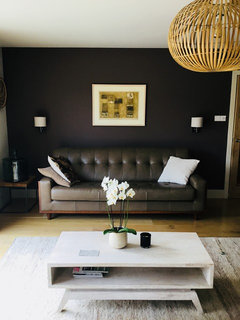
    Hi Emily, I love what you have done. I flirted with Pelt in my lounge but it didn't last as it's a room I read in and it reduced the light too much. However, for a hall or bathroom it works. This is my lounge when one wall was Pelt:


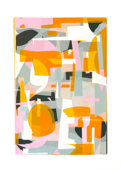
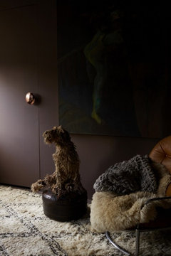
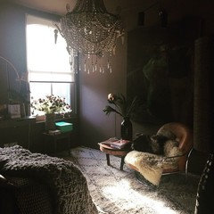
    Violets are notoriously difficult, perhaps due to pure violet being almost black. That means contrasts with white are very stark, so softer colours such as ecru or linen colours are easier on the eye. Moroccan rugs look amazing as they are natural but yours looks really good. Anything golden wood, wicker or brass/gold will create a complementary look as seen in my lounge, or you could go for an analogous look (red/violet. red and orange) and pair it with dirty pinks and burnt oranges. Saturated orange looks amazing with this colour. I would keep the rug and put some flashes of saturated colour in somewhere, perhaps an abstract screenprint on the large wall. See the Jonathan Lawes print. The bottom images are Abigail Ahern's bedroom, you can see it looks fabulous with lots of knobbly, natural slubby textures.


  • 8 years ago
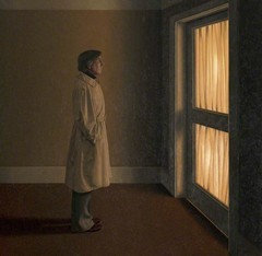
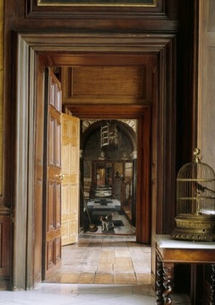
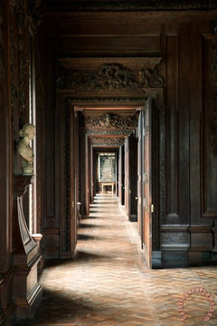
    Hi Emily, I love that colour! I think the blank wall needs a big impact of artwork to further enhance the moodiness of it, otherwise I think it looks great. Bear with me on this as I can’t find any image examples online, so how about an almost transparent glass panel but with a digitally printed or etched design of a corridor or doorways, sort of like the images below but the print just picks out the details in a sepia or goldish colour, the rest of the glass is left clear to see the colour behind (think of it as a trompe l’oeil but done in a modern way). Would have to be floor to doorway height to make an impact but think it would further enhance the reflectivity in the hallway. Maybe somewhere that does vinyl graphics for shop windows could do this? Also saw this painting by David Pugh Evans while browsing and I just thought...yes!! It’s called The North Corridor. P.s. love the clock with the loo rolls in it;)
  • 8 years ago

    I quite like Abigail Ahern's bedroom style, although for myself I would never choose a room to be that dark.


    But what is that (taxidermy?) dog doing on that pouffe?... Creepy.

  • 8 years ago

    Hi ED it's made of wool! :)

  • 8 years ago
    Agree with ED the colour looks amazing but can’t imagine living with it!
  • 8 years ago
    Thanks Rachel and as it happens at the end of the inner bedrooms hall I’ve got a 225cm by 85cm sheet of glass which I hoped at one point to have some writing on but not sure it needs it now. But it’s great because it acts like a mirror but not as “obvious” as a mirror since you can see through it at the same time as seeing reflection. (When my dining table was delivered the base was cracked and when they delivered a new one I ended up with two glass tops)
    Anyhow will post a pic later but don’t think I’ll be able to capture the reflection of the tree outside which I love when I pass that hall. And re clock and toilet rolls, I do love something that’s fun or quirky yet useful too :)
  • 8 years ago
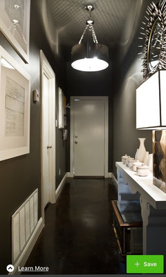
    Thank you Colourhappy. And yes I found out by chance that saturated orange does look good with Pelt. And it surprised me that Tiffany turquoise blue looks great against it too. And these were the colours I was wondering about adding with art so very glad you suggested orange. I am also liking the “modern monochrome” as Jonathon suggested though and have had success in a previous house with monochrome plus colour accents scheme. I already had the gold pieces from one of my earliest homes and there’s a Chinese screen (not pictured) that adds to that look and i just put them in the hall since I hadn’t changed the gold wall lights and I thought it might work. But I think I prefer other looks and the gold isn’t really flowing with the rest of the house. So thanks everyone! I love the pics of long atmospheric halls that have been posted and shjuly the plants that I had in the hall are outside having been given a “wash”!
  • 8 years ago
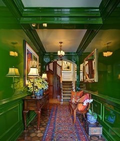
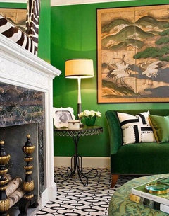
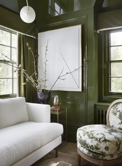
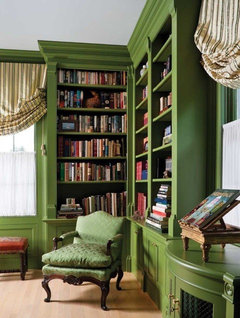
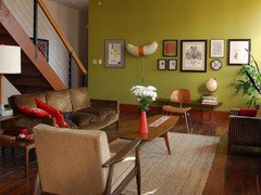
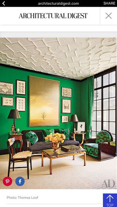
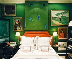
    Green is tempting me for the north east hall??
  • 8 years ago
    It’s embarrassing that I might change my mind again
  • 8 years ago

    Emily, I have painted my lounge so many times it's reduced in size!

  • 8 years ago
    I went to get some today but they only had enough for one of the greens I wanted to try. Im really hoping it’s the universe saying this is the right colour! It will either be fab or unspeakably bad!
  • 8 years ago

    What green is it?

  • 8 years ago
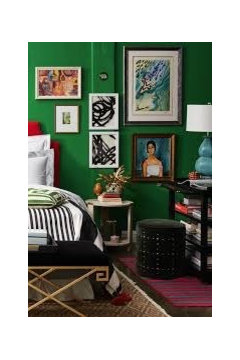
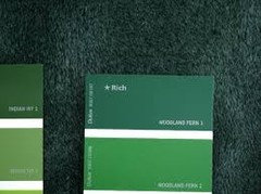
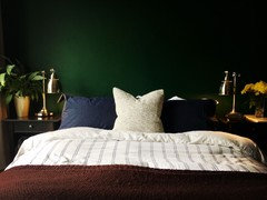
    Dulux woodland fern 2 in gloss. I had it mixed since I think the same colour in gloss or emulsion looks really different. I think I’m mad!
  • 8 years ago
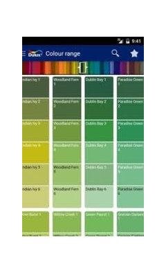
    There were three I wanted to try I can’t find the colour cards though. But looking at this colour card pic I’m now thinking I picked the wrong one. They’ve got more in on Wednesday but I’ll give this a try tomorrow
  • 8 years ago
    I think that’s woodland fern 2 in bedroom pic
  • 8 years ago

    Are you actually thinking of painting over all of that gloss Pelt?

  • 8 years ago
    Not tomorrow. There’s a cloak room 1.3 by1.7m that leads to the toilet that leads off the hall so was going to try it there.
  • 8 years ago
    Mind me asking a bit more info or pics of the wool dog, it great, just my sort of thing, would you have a link to when you got it?..
  • 8 years ago

    Hello Anthony, I think it's Dominic Gubb, sculptor.

    http://www.dominicgubb.co.uk/#/rope/4573736009

  • 8 years ago
    Ohh dear, I’ve a feeling this is going to cost me a lot of money!

    Thanks for the link, the leather is fantastic too...wow
  • 8 years ago
    Im confused is the green for the hall or the loo? I really like the pelt in the hall and think you should keep it... for now at least. I do like that jungle green (my son has chosen it for his room - next project!), but I'm not sure it'd work in a hallway.
  • 8 years ago
    I’m not sure shjuly. I can be impulsive and so will just try it out in cloakroom and see what I think. Will post a pic when I’ve done it :) and yes I love “jungle” and am thinking about it for a bedroom.
  • 8 years ago
    Would love to see a pic of the green. I'm trying to find a strong colour for a dark NE facing snug and I'm thinking a green might be good...