Software
Houzz Logo Print
hzdeleted_52688748

TV console decorating is nearly impossible...

8 years ago
last modified: 8 years ago

I just can’t get it to look right. I have googled & googled & still not satisfied with my look. I can’t get the “rectangle” effect that google mentions......The “my happy place” sign covers all my cords & outlets completely...so I like it there but I can’t get anything around it to work....this is hard. Should I just start all OVER with Aquas & Green again?


Comments (33)

  • 8 years ago

    following

  • 8 years ago

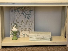
    Try leaving the Happy Place in place to hide the cords but if it can be inched out of the corner a bit it would be better, remove the lantern, place the box at an angle where the lantern is now and put the small globe item on top of the box. Completely filling the area isn't necessary.

    User thanked User
  • 8 years ago
    last modified: 8 years ago
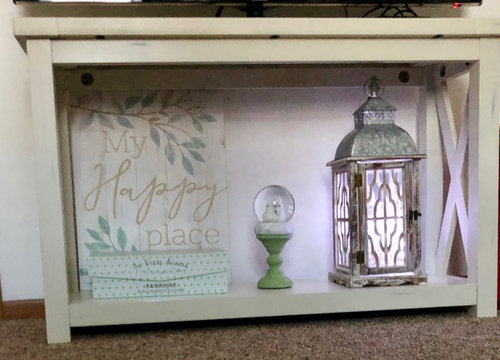
    Can the sign be moved over any at all? Even a tiny bit? Either way, place the snow globe on the far left. Move the box over to where the left edge is about a 1/3 in front of the sign. Lantern on far right (like pic #2).


    *looked at photos again - box over sign more than a 1/3, but less than 1/2. :D

    User thanked Allison0704
  • 8 years ago

    Patricia Colwell Consulting...okay gonna try that & I will post another pic...& Allison0704 I will try that...have another image in a few, after I rearrange..thinking about getting a wall mount & getting rid of console maybe??

  • 8 years ago

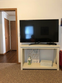
    I think that if you can swing it, a longer stand would work better for the size of your tv - the one you have now seems too small.

    User thanked Sammie J
  • 8 years ago

    Is this what you had in mind??

  • 8 years ago

    I would put snowglobe on the left, and not on top of the box.


    User thanked Allison0704
  • 8 years ago
    Show the whole tv stand farther back with tv on it and what else is in room.
    User thanked User
  • 8 years ago

    Better! Maybe move the box over and in a bit more and angle a bit more. (Don't you just love Houzzer commenters!)

    User thanked User
  • 8 years ago

  • 8 years ago

    Gosh!! Thanking you all with a big hug!! It is looking better!!

  • 8 years ago
    last modified: 8 years ago

    Am I getting there? Do you think I should get rid of the globe?

  • 8 years ago
    Just my opinion but you need a bigger console. Part of it for me is the tv and console look too similar in size. Also I think you need chunkier books to give the console depth. What you have there doesn’t look purposefully placed.
    User thanked User
  • 8 years ago
    What about a couple of baskets under it instead of all this stuff?
    User thanked User
  • 8 years ago

    I agree..it needs a bit larger console..just not much more room to work with..:(.I actually tried a white wire basket there but took it back...didn’t seem to look right? you think I should start all over with something different to place on it?? Maybe one tall basket, then a shorter one??..a taller & wide enough basket would hide the cords like the sign is doing...


  • 8 years ago

    is needs some height on the right doesn’t it?

  • 8 years ago
    last modified: 8 years ago

    Move the globe to the left so that about only half is in front of the sign. You want things to connect, but they don't necessarily need to be slap in front of it to do so.

    Also, try my first suggestion that has lantern on the right.

    User thanked Allison0704
  • 8 years ago

    okay will try it...lantern on the right means the decor box goes to front of the happy place sign, right?

  • 8 years ago
    Not directly in front. Only part of box should be in front of box.
    User thanked Allison0704
  • 8 years ago

    I would try it with just the happy place sign on the left (as in your most recent pic), and the lantern on the right. Nothing else. I like Alison's basket suggestion. Ideally the console should be about 25% wider than the TV.

    User thanked chloebud
  • 8 years ago
    You could put a smaller tv above the console?To get the proportions right.
    User thanked User
  • 8 years ago
    What about putting your sign on an easel so you can bring it forward a little?
    User thanked Molly
  • 8 years ago

    I don't see any new photos.

    User thanked Allison0704
  • 8 years ago

    I also don't see a new photo. The link you posted is for Molly's profile.

    User thanked chloebud
  • 8 years ago
    last modified: 8 years ago


    oooops. sorry. Thx for the heads up. Having a difficult time getting this image to post....working on it...

  • 8 years ago
    Sorry
    User thanked Molly
  • 8 years ago
    last modified: 8 years ago

    https://www.houzz.com/user/msherlock60614

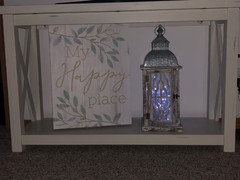
    I found an easel that didn’t elevate the sign & “BAM”...I think it helped. Thoughts..anyone? Is it getting there...or something else I can try???

  • 8 years ago
    I don’t think you need anything under it except your cords will be visible unless you move the electrical. Won’t the wall mounted console be the same size?
    User thanked Molly
  • 8 years ago

    https://www.houzz.com/user/msherlock60614

    Molly, thats right! I had forgotten about the electrical. The console will stay & the tv. I will just be happy with the console I have, although I know it should be at least 25% wider, and I believe the arrangement on the lower part of the console looks better than it did. (Thanks to all the comments)..it’s just too expensive to go purchase a smaller tv, as one Houzzer suggested, just to get my proportions correct? ..and it’s too expensive to go purchase another TV console, (this console is only approx. a year old)......so that my TV fits it better... I had a 40 inch sitting on it, and the proportions felt right. My mother passed away in Jan. of this year & I ended up with her “larger” size tv....and it changed it up for me. I really was just having a hard time with the lay-out, of my arrangement, on the lower part of the console. Everyone’s comments in relation to my question have helped me, in regards to it looking somewhat better. I thank every-one for their comments.

  • 8 years ago

    That looks good to me. I would just move the lantern a bit more to the right so it's centered in the space next to the sign.

  • 8 years ago

    I think it looks nice!

  • 7 years ago

    Big baskets with a black stripe on them. The bottom needs to look heavier than the top. Tv stand should be bigger.