Software
Houzz Logo Print
kimmk987

Need help figuring out if this counter selection will work

8 years ago
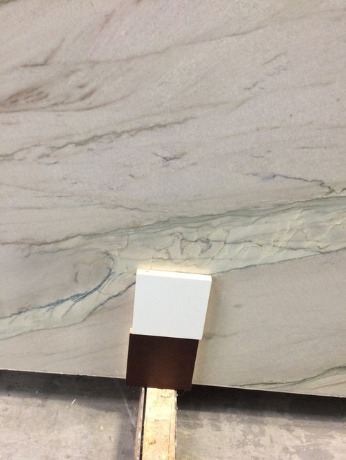
I'm having trouble deciding on a counter and would love help visualizing it in my kitchen before I commit. My goal is to end up with a warm, transitional kitchen. We will have white perimeter cabinets and a bordeaux stained cherry island. Dining table and chairs are black with stained wood tops.


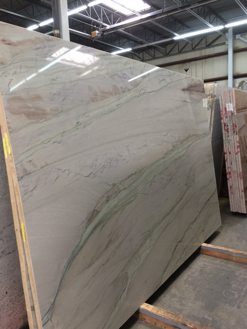
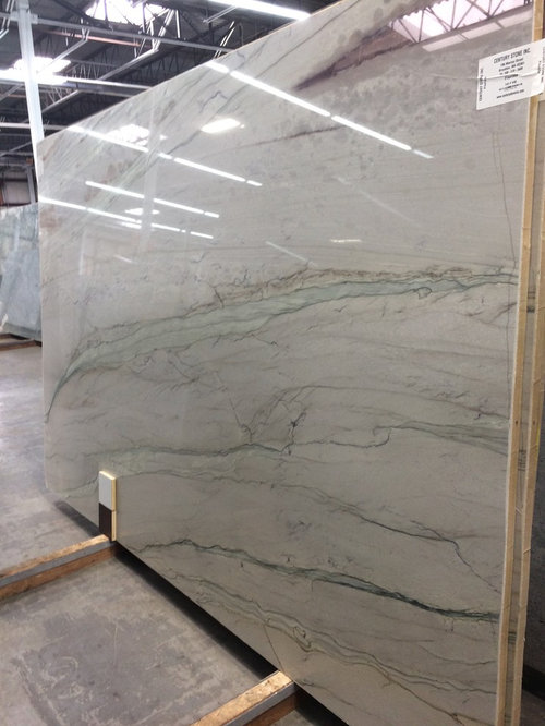
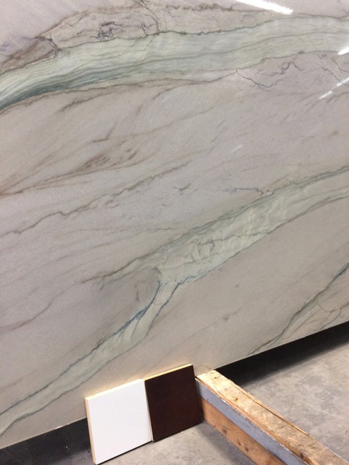
There's a slab of Florida quartzite I really love, but I can't decide if it is going to work as a kitchen counter. If we choose it we will have it honed in attempt to make the pink/purple parts less vibrant and also because I prefer a non polished counter. What backsplash colors would match? I love the light green streak and would love to compliment that in a backsplash, wall color or even with my pendant lighting. Is it too bold of a choice?


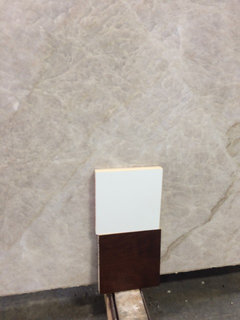
My other option is Perla Venata, which reminds me a bit of Taj Mahal but is less $$. That would be safer then I could incorporate color other ways... but I just can't decide. I do not want to end up with an all beige kitchen.


Any advice or suggestions are welcome, picturing all the elements together is overwhelming!


Comments (16)

  • 8 years ago

    Here's the Perla Venata and a closer look at our cabinet colors. Floors are existing oak which tend toward orange.


  • 8 years ago

    One more picture... was thinking these green pendants if I go with the Florida?


  • 8 years ago

    Thank you Catt! They quoted me the price to have it honed and I am ok with it. In your experience how are the colors affected by the honing process? Will they quiet down a bit? The Florida also happens to be the slightly less expensive of the two... which is also motivating me to make it work :-)

  • 8 years ago
    last modified: 8 years ago

    Beautiful but I definitely see a purple undertone (in addition to the pickish/purplish areas) in the slab which might show up even stronger in your kitchen. Of those 2, I would go with Perla, the purple undertone will not go with your orange floors.

  • 8 years ago

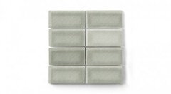
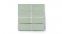
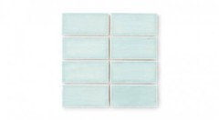
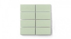
    I LOVE the FL. I also love the Perla, but the FL has so much more punch if you are not afraid of color. I love the elements you chose, but I would first pick a backplash before picking any colored pendant lighting just in case they would clash. Fireclay has some really great colors that would look fantastic!


    kim k thanked mark_rachel
  • 8 years ago

    Depends on the stone. I have seen colors pop more with honing and dull down. Without the polish on it i believe it will give you a more muted coloring.

  • 8 years ago

    Pink stone will clash with orange floor. Also stone looks like a marble = etching.

  • 8 years ago

    Are you already tied to the white cabinet color? I would go with something a little warmer. It's too stark white for me.

  • 8 years ago

    The Perla ia beautiful, and much safer. Do you know if you'd need the entire slab? That large area of purple in the upper right would scare me away, if there was any chance it would end up being used. I have leathered quartzite counters, Fantasy Brown, which has a lot of green in it (why I liked it) and the green wasn't diminished in any way.


    Is the PB Brandon rug going in your kitchen? If yes, that would be another reason that I'd chose the Perla Venata.

    kim k thanked My3dogs ME zone 5A
  • 8 years ago

    to be fair it does look like quartzite. but please test it before purchase

  • 8 years ago
    Thank you all!

    My3dogs- fantasy brown was my first choice! I was convinced by a stone seller it’s not true quartzite and will scratch and chip so i moved on (reluctantly). Have you had any issues? The soft greens and creams in it i love.

    The Brandon rug is currently in the adjoining living room. The house is not open concept so it’s a different room. It will be visible though so i was trying to bring out that sagey green color and incorporate it throughout the adjoining rooms.

    The white is a done deal cabinets are complete. It didn’t look cool to me in person but i plan on grabbing a door on my way to revisit the slabs so i can really compare. The color is called designer white if that gives anyone insight?
  • 8 years ago

    We need two slabs so I am pretty sure I can avoid the purple corner - it looks like a big red wine stain to me! I'm going to visit the yard Tuesday I'll bring my measuring tape and see if I can get an idea if I will have enough material to avoid that section.

  • 8 years ago

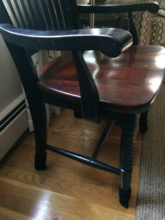
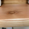
    Here's a pic of our dining chair with the floor. Not completely orange I guess...


  • 8 years ago

    I haven't had one single issue with the Fantasy Brown, and it's been over 3 years. I got a large sample to bring home and I tested it heavily with ketchup, mustard, grape juice, you-name-it, and it also scratched glass. They DID recommend that I have it leathered, which I did as I loved the 'soft' look of that finish.

    kim k thanked My3dogs ME zone 5A
  • 8 years ago

    My3Dogs- no issues with scratching? That was my concern more than etching. There was a table made of leathered fantasy brown in the showroom of the Daltile store and it had a pretty noticeable scratch. They said they have to cover it when they use it. I have 4 young sons so I need a surface that will not scratch... perhaps it depends on the slab?