Software
Houzz Logo Print
kimore

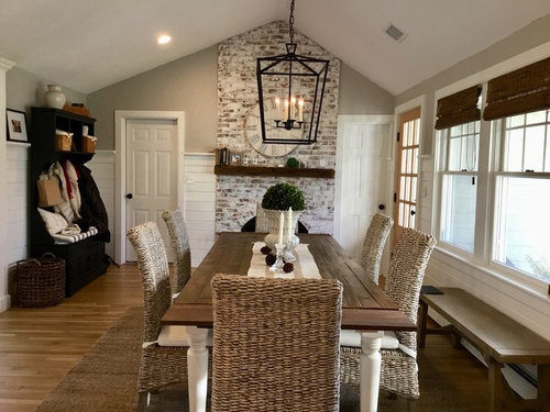
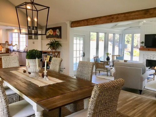
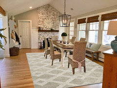
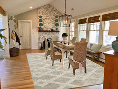
Dining area with fireplace wall

7 years ago
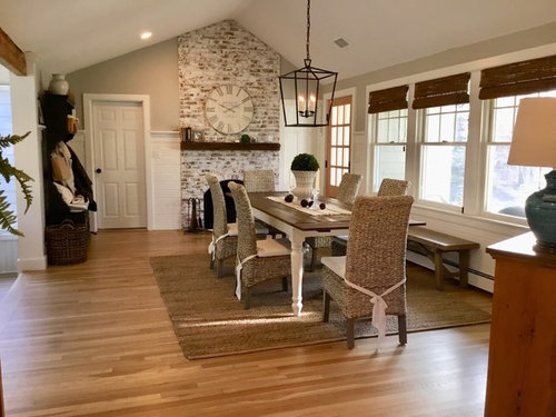
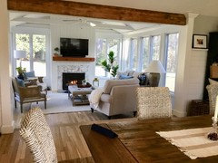
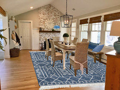
Looking for ideas to finish this space. Older colonial home, “breezeway” converted to farmhouse dining area/family room. Solution for asymmetrical fireplace mantle, rug to add color? Color for door to outside, refinish Buffet to coordinate with table? Also, the Hall tree coat rack on the left, something more current?


Comments (27)

  • 7 years ago

    Very pretty room but too busy looking for me... your kitchen is gorgeous as well!


    On the fireplace wall, I'd use a color closer to the lighter color in the brick so that line of demarcation goes away.


    For the storage, that dark wood kind of clashes. If you could paint them one of the whites and/or replace with some built in storage I think it would streamline things a lot.


    Can't see the buffet.. but if it's got a lamp on top, I'd remove the lamp and possibly the buffet itself :)


    I love your windows and all the light... So pretty!

  • PRO
    7 years ago

    I think you've got a great start!


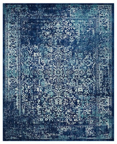
    You need some pattern and color. I'd start with changing out the rug (go larger). Since the space opens to the living room, make sure the colors coordinate. Maybe find a rug with a darker indigo/navy background that picks up some of the lighter blues you've got in the pillows on the chairs in the living room. Something like this:


    Safavieh Evoke Area Rug, Navy and Ivory, 9'x12' · More Info

    Then make a cushion for your bench in a coordinating fabric. You might even consider two stationary drapery panels: one between the window and the door, and the other on the opposite side. No need to put them in between the windows. Keeps the look cleaner, but still softens the space.

  • 7 years ago
    last modified: 7 years ago

    P.S. you might not have wanted to hear about paint ! I don't mind the asymmetry of the fireplace at all, just the sudden change to the darker colors on each side... to me, the brick abutting the white wainscoting and the right hand door looks better :)

    P.S. I like the natural fiber rug and chairs.

  • 7 years ago


  • 7 years ago

    These are the abutting rooms. I have a very similar blue rug in the living room that is on the other side of the kitchen.


  • PRO
    7 years ago

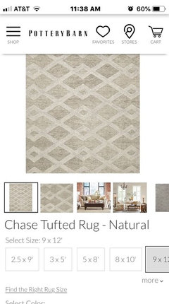
    Looks pretty great. Keep all woodwork the white, so don't paint the door. Biggest issue is the rug. You need a bigger rug, especially lengthwise. All chairs should sit on the rug when pushed back. Sit in one of the host chairs, and push back as you would to get up and down from table. Put a piece of blue painter tape on the rug or floor and then add a few more inches. Do this on each end, and you can then measure that length and size your rug accordingly. Do the same width-wise. I would not do a natural fiber as they shed and on your wood flooring, it will be a daily clean up. Just a nice, cleanable rug in the dining area. I would select something light with a two tone quality. Pottery Barn has some nice choices you might like. Keep it neutral. I would do a color as it will limit other décor. Lovely spaces and I'm sure you are enjoying this room a lot!

    kimore thanked Flo Mangan
  • 7 years ago
    Your space is beautiful, warm and comfortable looking! Love the neutrals. Since you like blue, maybe add some blue and white large chinoiserie ginger jars/vases to both the dining table and kitchen area to help tie them together with the living areas.
    I agree that the asymmetry of the fireplace wall doesn’t bother me.
    kimore thanked Cece
  • 7 years ago

    PB rug suggestions? 9 x 12

  • PRO
    7 years ago

    @kimore, get some blue painters tape and tape it out on the floor. Leave yourself ~3 ft for the walkway from the door through the dining area. After that, go as big as you can.

  • PRO
    7 years ago
    last modified: 7 years ago

    As for me, there are too much natural fibers : rug, blinds and chairs.Too much beige/brown too. But if you want to bring some color , I would get a rug. I painted door and coat rack in the same color as other doors.


  • 7 years ago
    last modified: 7 years ago

    It's all to your preference, Kimore.. The blue completely changes the look (that was super helpful to me celerygirl).

    A bold blue rug would be too much for me -- I feel it totally changes the peaceful look. I love the way the entry furniture doesn't stand out anymore thought!

    I love color, but I would add through the accessories... maybe even painting your buffet a stunning blue or red, if it's not a really good quality wood, or even some metal accents... I do like the pillows that were added though :)

  • 7 years ago

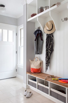
    I could see something like this for storage, as I think it would fade into the wainscoting...


    Clean & Classic · More Info


    kimore thanked User
  • PRO
    7 years ago
    Here is one from PB and there are others. I would stick to simple patterns. No medallion as it is a challenge with table and chairs.
  • PRO
    7 years ago
    last modified: 7 years ago

    Here is Flo's rug, actually repeats existing palette.


  • 7 years ago
    to me there are too many wood tones chopping things up.
    I would paint both fire place mantels white.
    I would paint coat rack lighter as suggested above so it blends in.
    change buffet seen in right corner to a coordinating lighter tone or remove completely.
    to me the exterior door being lighter and the darker window shades clash.
    for decorating I suggest the rule of 3s. three objects of varying sizes. The mantle in the dining room looks too busy with small objects.
  • PRO
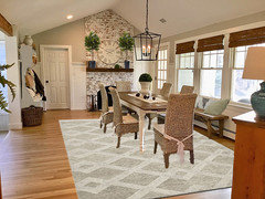
    7 years ago
    Thx celerygirl! How about a pair of topiary on mantel either side of clock and fairly tall.
  • PRO
    7 years ago

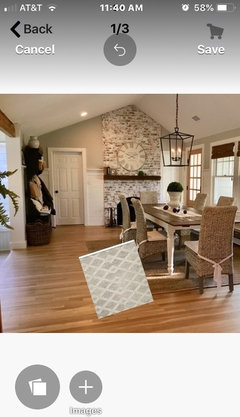
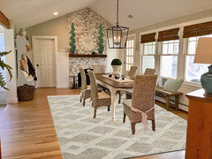
    Sorry I left a page. If I got it right...here are topiaries.

    kimore thanked Celery. Visualization, Rendering images
  • PRO
    7 years ago

    Thanks, I had something more like two balls larger one lower and smaller one higher and definitely sculpted not organic. But hey! You are great at this and I'm not.

  • PRO
    7 years ago


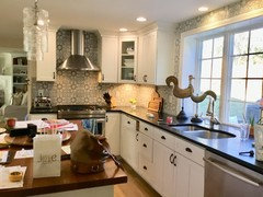
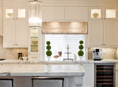
    Kitchen · More Info
    Kinda of like these. Only straight! haha!

    kimore thanked Flo Mangan
  • 7 years ago
    Beautiful! But do you really need the bench behind the table? Can your portly pals really push back with ease when they eat? Sometimes, less is more. Just a very minor observation on a lovely room!
    kimore thanked ptreckel
  • PRO
    7 years ago
    last modified: 7 years ago

    Ohhhhhhhh boy! It is 3-tier topiary.

    kimore thanked Celery. Visualization, Rendering images
  • 7 years ago

    Cold definitely remove the bench. Maybe put in place of the coat rack storage piece with hooks in the wall for coats?

    Should the white wood work go up to the ceiling? And the bricks possibly cove the whole wall up to the ceiling? different mantle treatment?

  • PRO
    7 years ago

    I like how it is now.

    kimore thanked Celery. Visualization, Rendering images
  • PRO
    7 years ago
    Haha. Thanks celerygirl. I think two tier topiary is best! I wouldn’t do anything to brick/mantel wall. Looks just fine.
    kimore thanked Flo Mangan
  • 7 years ago

    You have such a lovely space! I like it just the way it is. Would it be possible to store the coats someplace else? If not, paint the coat rack the same as the trim color. A larger rug but in the same style and color you have now.

    So I can be a bit fussy, if you put the bench where the hall tree is and added hooks above, I'd need everybody to have a coat that matched the wall lol.

    kimore thanked athomeeileen
  • PRO
    7 years ago
    And i would do built in locker/cubbies and paint the trim color! Haha. Hooks gather too much stuff so I would want that hidden a bit.