Software
Houzz Logo Print
adrienne_overton

Ideas Needed Please!! Kitchen Help- Modern /Chic Rustic

7 years ago
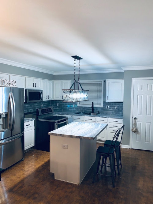
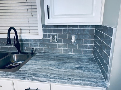
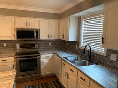
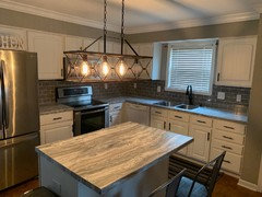
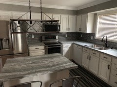
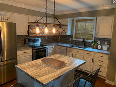
So I thought I would like the subway tile with the countertop but it seems really busy... but this is what I am stuck with! I would like to have more of a modern rustic look. So what can I do? I was thinking about painting the island a dark color and adding brackets but I do t want the room to become too dark. I also thought about painting the pantry door. I am open to your thoughts. I already stated that it’s a little busy... so please don’t go too hard on that! ((Smile))

Comments (46)

  • 7 years ago

    The biggest disconnect here is the juxtaposition of cool and warm; it makes your kitchen look blue and your floor look orange. First thing I would do is change all the light bulbs to a warmer color temperature and see how that looks.


    Your counter and backsplash are not too busy and look to be a good match. What color are the walls?

  • 7 years ago
    Thank you!!!! The color of the walls is Silver Fox. We have warm light bulbs. I thought it looked really blue as well!
  • 7 years ago

    I'd like to say that it's good to see ceiling light that seems bit rustic {?} and the handles too, are they dark bronze?... the metal chairs might be just fine... is there any one element that 'gets you' the most?

  • 7 years ago

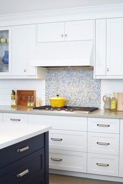
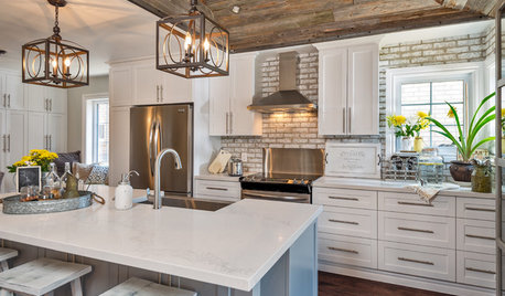
    You might be right about a dark island. I happened to see a similar kitchen, so thought I'd post it.

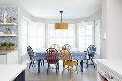
    chairs were painted in a glossy finish - 3 different colors - nice.

    Moody Blues · More Info

    Moody Blues · More Info

    Moody Blues · More Info

    [https://www.houzz.com/photos/moody-blues-contemporary-kitchen-toronto-phvw-vp~2098102[(https://www.houzz.com/photos/moody-blues-contemporary-kitchen-toronto-phvw-vp~2098102)

  • 7 years ago
    Darken the grout as suggested, and paint the back and sides of the island the wall color.
  • 7 years ago
    The wall color and the backsplash/counter colors are clashing big time. I’d be inclined to paint all walls white to match the trim/cabinets/door. Please do not paint the pantry door an accent color - no need to highlight that. A white wall above the upper cabinets will help the uppers appear more full height and will make the room brighter as less choppy looking.
  • 7 years ago

    I think it looks great and if you just paint the walls white you'll be happy. I would lose the kitchen sign, it's too cutesy for this fab space.

  • 7 years ago
    @thinkdesignlive the only problem with that is the the cabinets are not “white white” the house was built in 1997 and it’s a little more creamy than they probably once were. It’s not in my budget to paint them right now... perhaps a little later. The backsplash was literally just completed (tears) by a company. I don’t see how I can change that either.
  • 7 years ago

    I think the backsplash is fabulous - especially with your counters. I agree with others to paint the walls to match the cabinets and other trim in the room. I don't think it's busy at all - very serene. I love that you did a splash other than the expected white subways (spoken by someone who has white subways :).

  • 7 years ago
    The backsplash will be fine. It works with the counters. What you are experiencing is that something is ‘off’ and it’s easy to point your finger at the last piece of the puzzle. Really truly your walls are the problem. So much easier to paint than to redo a backsplash and counters. Even a light grey that works with the backsplash / counter tone will be better than what you have now. It’s a bit dark and too greenish grey where the hard surfaces are bluish grey.
  • 7 years ago
    And while you’re tweaking please raise the pendant light at least 6”. Isn’t it right in your eyes when standing at the island?
  • 7 years ago
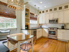
    Another tweak. Consider replacing your white blinds with a woven wood Roman shade like this. All your whites are off there between the blind, window trim and cabinets. This new shade will counteract that and bring some balance with finishes and make your floor feel more tied into the scheme.
    Traditional Kitchen · More Info
  • 7 years ago
    @thinkdesignelive I can do all of that!!! Yes!! Do you have an idea for the light gray color I should use!? Something warmer you said? I just keep seeing BLUE BLUE BLUE in the kitchen. I was going warm but... I’m new to this and obviously do t know what the heck I’m doing! LBVS
  • 7 years ago

    Kitchen is fine, one element it might be lacking (if you are after a rustic look) are things with a “hand crafted” feel, like bowls from wood burls, live edge serving boards, pottery that is irregular/with natural and muted glazing, wooden spoons, tools with a patina, cast iron/copper pans, trivets, local artwork etc. etc. If you have local craftspeople/fairs maybe you will find things there.

  • 7 years ago
    Are those Romans Blinds multicolored
  • 7 years ago
    Not multicolored but... different shades of wood?
  • 7 years ago
    last modified: 7 years ago

    If you think a warmer, light gray might work, look at BM Pale Oak....hard to see what the tones are in the counter on my monitor.

  • 7 years ago
    last modified: 7 years ago

    I was just about to write what thinkdesignlive and J Williams suggested

    more texture, wood, patina..real vintage, used things as opposed to new signage that is made look like old and distressed when in fact it's not..

    art? a plant? things that are very alive..

    Woven blinds above give impression of having several colors but it's rather subtle interplay of colors, yes, shades..makes for a very warm interesting look. They're both homogenous-but not exacly, due to that grass woven texture, Every normal company that makes them will allow you to order several samples first so you can see them in your place and compare before deciding

    it's a very nice kitchen, you don't need much besides bringing in accessories you love and that are of that more handmade or lived-in vibe imo

  • 7 years ago

    Good when you add items you like, some have said. This is quited distressed:

    Historic home · More Info

    https://www.houzz.com/photos/historic-home-traditional-wilmington-phvw-vp~5205023

  • 7 years ago
    @rantontoo The countertop is a Formica Fantasy Marble. There are hints of the backsplash color in the countertop. I do want the kitchen to look a littler warmer.

    I’m going to add in some wood accents. The company just finished so I wanted to see if there was anything I needed or could do to the main items in the kitchen.
  • 7 years ago

    as for the walls- hard to say as on my monitor, they do clash a tiny bit on the first pic, but look fine in the close up

    I suspect it changes with lights and all, and might be hard to capture on the camera as it is irl

    if you yourself feel disconnect-that's what'll give a pretty good idea it's the walls and then painting the walls it's the easiest thing to do.

    Again, it's a nice kitchen, that doesn't need much. An island pendant does look like it has to be higher, but then I'm not in the space

  • 7 years ago
    Thank everyone! I’m going to lean towards warmer lights. I am currently purchasing bulbs. I see warm, neutral, and cool. The ones that are in are cool, but I think I may need to lean more to warm, perhaps neutral. I will change a few bulbs and take a pic and post it!
  • 7 years ago
    The wall color is also in the pattern of the countertop.
  • 7 years ago

    These with natural slubby fabrics and "spatterware" {?} pieces....

    linen / burlap / aged pewter - iron looks:

    https://www.jcpenney.com/p/gibson-elite-lawson-16-pc-dinnerware-set/ppr5007316287?pTmplType=regular&rrec=true&rrplacementtype=product1_rr

  • 7 years ago

    Although the wall color may be in the countertop, the wall color is what seems the most off to me. Just because it's in the counter doesn't mean it will look great in huge blocks of color - and it clashes with the backsplash. You've gotten great advice - go for warm bulbs, raise your light fixture a few inches, and paint the walls white or pale neutral. I love your backsplash and counters.

  • 7 years ago
    Here it is with warmer lights and the last pic is with no lights
  • 7 years ago
    The room next to it is Balanced Beige- Sherwin Williams
  • 7 years ago

    You will have to decide if the wall color needs to be changed based on your perception of it in your light. Several others have said it clashes but I don't see that on my screen. The last pictures look lovely. I like the idea of the woven blind for the window.

  • 7 years ago
    Is there a certain shade that I need for the blinds? I’m trying to get the exact ones mentioned but I’m waiting on the owner to call back. Id love to go out and purchase some today if I could but I need to know what to buy. Something that is about the same shade as the floor?
  • 7 years ago

    these look like a different color altogether)) crazy

    but yes, on these-I get that vibe the wall is a bit warmer, more greenish vs blueish..even though a shade of it des exist in countertop, But you have backplash as well, and backsplash is the closest element to the wall, it's also a vertical one

    I love the wall color per se, it's something that I personally like-greenish undertones

    But it doesn't matter as paint colors dont exist as something separate, they need to work with the rest

    Maybe you need to lean just a tad cooler though, given your other colors

    even though I admit-on the second pic it looks like it works..and on first and third it somehow looks like it could be better..so..what do you think, as you're there, in the space?

    Now, Balanced Beige, it seems like a tad warmer color too..and has to work well with a new wall color if you're inclined to try it after all

  • 7 years ago

    Does any paint store let you borrow the paint fan? I did, years ago. You can easily find cabinet color, basically, and others.

    What about a fabric with slight pattern that blends // instead of a floor-color shade, placed next to light uppers?

  • 7 years ago
    I was wondering if balanced beige would work on the walls. After changing the bulbs I think that it looks MUCH better!!! I can see where a lighter wall would open the space up a bit much! Eventually I’m going to have to pain the cabinets white.
  • 7 years ago
    I hate the blinds. They have been there since we purchased the home
  • 7 years ago
    last modified: 7 years ago

    As said -- are the walls sort of beige? nice, and natural in color - I'd love it !!! Just replace the burnt bulb, and move on. :)

  • 7 years ago
    Are you asking if the walls in the connecting room are natural? They are balanced beige
  • 7 years ago

    Much better with warmer lights.


  • 7 years ago
    I LOVE THAT!! I need to find those shades!!
  • 7 years ago
    I want to make sure that I am hearing this correctly... are you all saying to go ahead with changing the wall color or to leave it (due to changing the lightening)?

    Should I do Pale Oak or a lighter color with more gray undertones? Remember my ugly cabinets aren’t “crisp white” they are what I would call “1997 Used -to-be White.” ((Smile))
  • 7 years ago
    last modified: 7 years ago

    Why lighten wall paint at this point. But I probably wouldn't add dark or textured window covering. I don't mind the floor and the island light being those.

    This linen/ cotton blend however, might softly compliment the rustic floor/ light, and not make heavy. Comes in ivory too, about $45.

    https://www.jcpenney.com/p/jcpenney-home-relaxed-cordless-roman-shade/ppr5007275054?pTmplType=regular&rrec=true&rrplacementtype=product1_rr

  • 7 years ago
    My comment has nothing to do with your dilemma. Add another row of tile behind the range. If you ever want a slide in range (yes!) you’ll be happy you did.
  • 7 years ago
    I think you’ve got a great looking kitchen. I love your counter and tile combo.
  • 7 years ago
    I like the backsplash and counter together, my only piece of advice to add is changing the outlet covers and switch plates on the tile to stainless or paint them to match.
  • 7 years ago

    are you all saying to go ahead with changing the wall color or to leave it (due to changing the lightening)?

    Based on how it looks on my monitor, I think the wall color looks great with the warmer light and in the natural light photo you showed. I would not repaint. But how do YOU feel about the look now? Does the new lighting alleviate the initial concerns you had?

    I would still replace the electrical covers on the backsplash with either stainless or even a brown/black to match your cabinet pulls. And replace the blinds - either with wood textured shades (like the example posted above) or with fabric (not white).