Software
Houzz Logo Print
nutty4style

Do you think this look is outdated or will be outdated soon?

7 years ago
last modified: 7 years ago
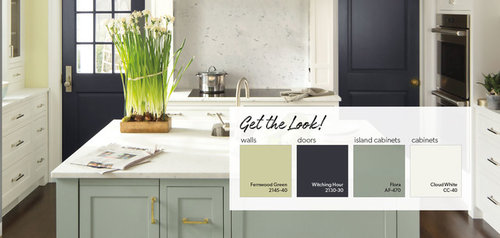
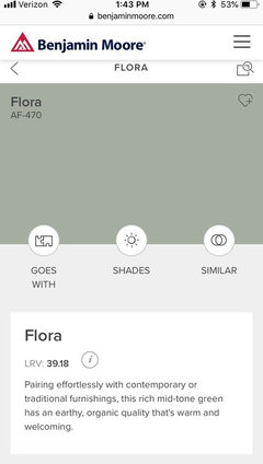
I am painting my kitchen cabinets. I do not want white or off white. I was going for gray but wanted something a little different. I looked at a lot of blue grays, then I saw Benjamin Moore Flora / AF-470 in the store. It's a very interesting color and I am wondering if it is neutral enough to remain current? My floors are whitish tile with gray grout. I have all stainless steel appliances. Everything else will be new. I really would like a white quartz countertop with maybe a small amount of gray veining. I also want subway tile for the backsplash. Ideas for subway tile color?? Wall color?

Attached is a picture I found online.

Thanks!!


Comments (31)

  • 7 years ago

    I think it is only another boring gray

  • 7 years ago
    last modified: 7 years ago

    I really like it, but more importantly you really gravitated to it. I think it's a great neutral. With whitish counters and classic backsplash, you'll have a ton of options as time goes by to tweak the look with the easily changeable items like accessories, wall paint, art, towels/rugs, etc.

  • 7 years ago

    Gray, plus marble looking quartz is pretty ubiquitous. That means the trend will be done soon. You could still choose gray, just work harder on other choices, so you have some originality and personality to the room. Gray alone is not the issue.

  • PRO
    7 years ago

    Flora BM color is is a medium light shade of green

  • 7 years ago

    Also, don't loose sight of the fact that it's only paint. It's a big decision, but not necessarily a permanent decision. In 10-15 years you may want to repaint the cabinets anyway. (This is an example of the type of things I need to remind myself of when I'm stuck in design-decision paralysis!)

  • 7 years ago
    last modified: 7 years ago

    It has a lovely green undertone but you won't know if you will get the look in that photo until you try it in your room. Not just the teensy paint chips, and beware some of the "samples" they mix that aren't the same as the actual color. dyliane is correct that it might muddy out to blah grey in your light, so check!

    There was or is a thread posted by someone looking for soft green cabinet suggestions. You might want to search for it for more ideas. I believe there have been some recent Houzz Stories featuring greens, including softer grey greens, too.

  • 7 years ago

    I am not a gray lover (although there are some lovely gray kitchens I see and admire) and I totally understand your question. I think that is a lovely color that is to me greengray and has more longevity to it. I agree that the accompanying components should be chosen with more care. I think it will look good and not look dated quickly.

  • 7 years ago

    that color is not green. it is gray.

  • 7 years ago

    All the gray-greens, sage greens, and colors of those types turned turquoise in my room because of the coating on the windows. I ended up having to choose a cream color that turned the sage-y gray green I wanted.

    Then I replaced the windows and am now looking to repaint. LOL!

    My point is supporting one already mentioned. Get those big paint squares at BM and put them in several different places. Natural light, evening light, direct sunlight, whatever. They'll change colors in your room depending upon the time of the day.

  • 7 years ago

    Thanks everyone! I currently have blue gray samples all over the cabinets. It is amazing how different they look at different times of the day. I want to get some with greenish hues now, to compare. Then when I narrow it down, I will get small cans and paint poster boards and leave those up for a few days.

    Any thoughts on subway tile color? White or light gray? Or something darker? I have not decided wall color yet, but it will be light, not dark.

  • 7 years ago
    last modified: 7 years ago

    Go with what you like. People have been saying gray is "on its way out" for many years and it clearly wasn't. No one knows what the future holds. Gray is a neutral and is no more "boring" than white or beige.

  • 7 years ago
    BM Aura is a green. It may have a gray undertone (and depending on the screen you are looking at may appear more so), but it is green. OP, I think this look is fresher than all the gray cabinets, and like another poster said, you can always change paint in 10-15 years.
  • 7 years ago
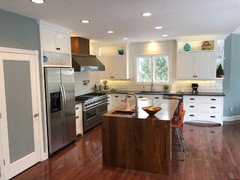
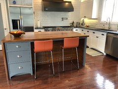
    You’ve had great advice about double checking the color in your room... on my iPad screen it looks like a light grayish green color and it’s very beautiful and neutral in my opinion! But with a white counter and white subway tiles, I think it probably runs the risk of looking blah pretty quickly. (And I love white subway tiles, I have oversized white subway tiles with a “wrinkled” kind of texture going on in my own remodeled kitchen and I absolutely adore them!) I would think you want SOMETHING in your kitchen to stand out and be the star, and while that paint color looks beautiful to me, it’s still quite neutral. (On my screen at least) So maybe either the counters or some patterned backsplash tile. I’ll include a photo of my own kitchen (ours was a DIY gut job, hubby designed and built all of the cabinetry) My cabinets are all either white or dark grey so they don’t really stand out, my backsplash is quite neutral, my granite is dark (and I love it, it’s leathered and feels fabulous) but it’s also very neutral and doesn’t stand out... but our stand out feature is the walnut waterfall edge island and walnut over the range hood. There’s a lot of trendy stuff going on in my kitchen...shaker cabinets aren’t exactly trendy but they’re still very popular right now, subway tile, waterfall edge counter... even the use of walnut which is very trendy, but it’s still my woodworking hubby’s favorite wood to work with because it cuts so nicely without splintering. But I also feel there’s enough classic design, like white and black was something I knew I wanted to incorporate, it doesn’t go out of style. Anyways... the island makes my kitchen stand out amongst all the other pretty safe choices. Paint color can easily do that... but that color reads very neutral. If it were ME I’d put it with a leathered and heavily veined stone (leathered because it looks softer than polished, and that paint color is a soft color) or some pretty painted tiles in soft colors. That would give you a stand out feature!
  • 7 years ago
    Oops! Forgot the photos. LOL!
  • 7 years ago
    BM Aura
  • PRO
    7 years ago

    When you get lots of samples of paint colors, please do not hang them all next to each other stuck all over the place..all you are doing is setting your self up to confusion. Get the largest sample you can and hang it by itself and watch it throughout the day when sunny and cloudy. Then do the same with another color. This way the color is not influenced by the other colors and you are choosing it because you love it.

    As far as outdated, I think things are outdated when they are all put together as part of a strong trend and don't match the style of the home - for example center hall colonials with the almond or white laminate cabinets with the wood trim as the door pull!

    If your design choices go with the style of the home and you love it then you are all set!!

    Good luck!

  • PRO
    7 years ago

    @Bri. Op mentioned FLORA.

  • 7 years ago

    SKMOM, your kitchen is gorgeous!! I love the wood.

  • 7 years ago

    "hollybar

    try here for help https://samplize.com/ The color is truer than the small pots for many shades."


    Wow, thank for that hint!!

  • 7 years ago

    I think the green will be lovely, and if it really pulls at you, you'll love it for a long time. I DO feel like it would work even better with at least a little natural wood to warm it up. Is there a way to work in an area of butcher block or something similar?

  • 7 years ago

    Pretty color. I could live with it for a long time. That’s always my guide.

  • 7 years ago
    @celerygirl that is a picture of flora, just captioned it wrong. Oops! Definitely green!
  • 7 years ago
    last modified: 7 years ago


    I love that shade! I would probably pair it with a pale blue or blue-green that has a slight similar undertone on the walls, along with the white counter.

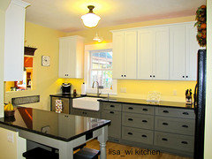
    Here is a kitchen posted a few years ago that used a very similar color in the lowers. The walls are painted in Sherwin Williams Compatible Cream, the trim in Creamy... I wouldn't choose those paint colors myself though.

  • 7 years ago
    Love that Flora color!! It's relaxing and easy to mix with botanicals etc...
  • PRO
    7 years ago

    I'm assuming you have an open concept kitchen. If so, what furniture/curtains/rugs are in the LR part of this room? If you have not yet purchased them, what do you want/plan?

    When a kitchen is the biggest thing in a LR, one must plan the entire space so it all works together.

  • 7 years ago

    Very nice! I think of it as a green (as does BM, judging from the name they gave it), but whether you call it grey or green, it's nice.

  • PRO
    7 years ago

    I would leave the cabinets paint the part that is painted on the island in the color you like and change the hardware. I happen to love gray/ greens but not sure how much I would love tha color next to other space wall color

  • 7 years ago

    I may be confused- highly likely- but I think the OP has not included pix of her space or what is around it as in adjoining rooms. I think all pix are either of suggestions or other posters' homes.

  • 7 years ago

    Lovely lovely island.

  • 7 years ago

    It is soothing, warm green. I really like it.