Software
Houzz Logo Print
blaine_jones15

winds breath undertones

7 years ago

So I’ve spent the last 2 months choosing paint colours for my living room. I think i’ve settled on winds breath BM. is there any undertones I should be concerned about? Also, might it be too light? I would have preferred to go a bit darker, and had hoped edgecomb gray might work, but it seems to pick up a pink tone. The walls are currently green, and i’m looking for a light neutral to go with natural oak floors. East facing windows.

I have tried revere pewter(too dark), pale oak(very muddy), gray cashmere(yuck), gray owl( too dirty)...and edgecomb, which was the best so far. I need to travel over a 100 miles to purchase a sample, so it’s not something simple.

Comments (21)

  • 7 years ago
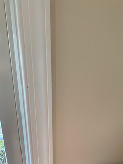
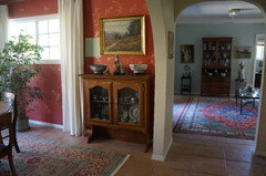
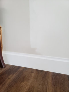
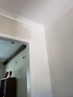
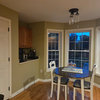
    I just painted my living room with the color this past weekend. Here is a photo:
  • 7 years ago

    I would say it is probably a bit lighter than I thought or hoped it would be. It is a very light beige. Sherwin Williams did a color match since we do not have a BM nearby. The color was a perfect match.

  • 7 years ago
    last modified: 7 years ago

    I ordered 12 x 12 inch samples of the colors I was interested in from samplize, which has BM, SW and Farrow and Ball samples of every color. You just stick them on the wall, and you can move them around since they're self-stick. It's a very useful tool for deciding on different colors, although it helps to narrow the colors down first since the samples are not super-cheap. Flo told me about this company and it helped me to eliminate two colors that I was fairly sure about as they turned out to be completely inappropriate. Below is the color that I will be using, BM Nob Hill Sage. I wanted to be certain that it would be demonstrably different from the SW Sea Salt paint that was used in my entry room. I didn't have to go to a store to buy samples (it comes in the mail) or mess up my paint while I decided, since it may be a month or so before I begin painting. It is the actual color of the paint, not just an approximation of it. It's been incredibly helpful.


  • 7 years ago

    I am in the same boat...Winds breath is beautiful. We have Edgecomb Gray in 2 rooms Check out SW Incredible white

  • 6 years ago

    I’m doing Winds Breath with a feature wall in Stonehearth. They’re both on the same colour palette sample

  • 6 years ago

    @angeladiblasi @Shelley Neilson I'm also considering Wind's Breath for interior walls. Which BM white trim colors did you pick? I'm deciding between Decorator's White or Chantilly Lace.

  • 6 years ago

    To be honest, I didn’t pick a specific trim colour. Just did the BM standard white trim paint. It looks good against the Winds Breath. The Winds Breath does change throughout the day. It’s a definite warm griege, which I wanted. I’m not a fan of a real grey, so the warmth of Winds Breath is good for me. I did one wall in Stonehearth....not quite the strong contrast between Stonehearth and Winds Breath that I was expecting, but I still like it. Cedar Key is also nice and warm. That entire colour strip is very nice....can’t go wrong with any of the colours on it: winds breath, cedar key, Smokey taupe, stone hearth. They’re all neutral and modern but with warmth added.

  • 6 years ago

    @Shelley Neilson Would Winds Breath have a yellow undertone under a different lighting?

  • 6 years ago

    No, I don’t see any yellow tone. More of a soft brown sand to a warm taupey grey. Get sample pots of the 4 colours on the strip. Paint a few squares of each colour on different areas of your room and put a post it note beside each one, indicating what colour it is. Really makes a difference when you live with them for a week. I learned that trick the hard way.....this is my 3rd painting of my bedroom..... in the last 2 weeks!

  • 5 years ago

    novice0 I would like to see if you have any other photos of winds breath!!!

  • 4 years ago

    @cdisimone this looks like the color I've been looking for. Could you share the trim color/brand that you used, as well as the ceiling color? TIA

  • 4 years ago

    I just had living room/dining Ballet White and love it. Winds Breath in kitchen and it looks green in natural light😩...looks great in my small bathroom....may need ti have kitchen re-painted...could it be done in one coat?

  • 4 years ago

    @christy25 sorry I missed your comment back in January. I’m sure you’ve already painted by now but I didn’t want to ignore you! Trim and ceiling are all Benjamin Moore, I think we did super white on ceiling to brighten things up (not 100% sure) and trim is just regular white off the shelf in semi gloss. I probably have the cans somewhere but neither were anything special. Just off the shelf whites.

  • 4 years ago

    Thank you! I tried Winds Breath in my Living Room, but it doesn't look anywhere near as pretty as yours.

  • 4 years ago

    Oh no! I’m sorry to hear that!! I hate when you spend so much time picking a color and then end up not loving it. What’s wrong with it?

  • 4 years ago

    I did windsbreath in my front living room and it looked greeny yellow- I couldn’t live with it, had to repaint and used calm , much better- no green

  • 3 years ago

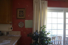
    I have Wind's Breath on my Kitchen cabiinets. As I heard one color expert say on you tube, it's a complicated color. There are times of the day when it looks a bit more grey, (but warmish gray) and times where it looks creamy - especially at night when we just have one not very bright overhead light on. And often it's just in-between. Personally, I like it alot. I think what makes it "complicated" is that it seems sort of cool, but also feels warm. Hard to explain! I have granite countertops that have gold, brown, deep taupe and beige throughout, and travertine wall tiles that are beigey-taupe with a very slight pink/rose undertone - barely noticeable unless you are really looking for it. I was worried it wouldn't all come together but it did quite nicely. Floors are honey which works, but slightly darker would probably be better. Right now I have BM Desert Tan on the non-cabinet wall and while I LOVE the color, it's not the greatest when paired with Wind's Breath. It doesn't look bad or "wrong" but I know I need to find something a little more toned down.

  • PRO
    3 years ago

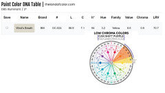
    Wind's Breath is a low chroma, light near neutral that belongs to the Yellow hue family.


    Its position in color space (Yellow hue family) and it's low chroma is why in some light sources it appears yellowish or greenish-yellow yet under other source it can show up as blue or even lavender.


    It's just the nature of near neutral colors in this hue family neighborhood.


    That's why bloggers/vloggers/everyone can't agree on Wind's Breath undertones - undertones aren't facts.


    The inherent quality of light is the #1 factor that defines color appearance. Change the light, you change how the color looks.


  • 3 years ago

    Winds Breath looks great in my parents house. A nice neutral, not too yellow and not too gray. I decided to use it when we built in 2021. Hated it once we moved in! Looked very mustard-yellow and darker than I had wanted for the space.

    I repainted not long after we moved in and used BM White Dove. All the trim,crown and ceilings are BM Chantilly Lace. You can see the difference when I was repainting.


  • 3 years ago

    I used winds breath on my main floor and hated it/ looked green and not a nice green- I painted over using calm, more off white with bit of gray tone, no green. Good luck