

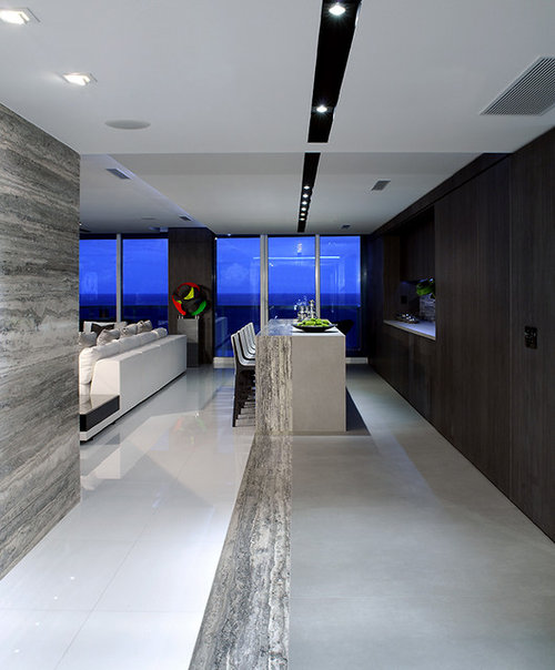
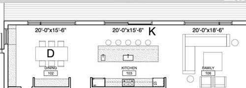
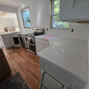
Beyond the waterfall (counter).
7 years ago
Featured Answer
Sort by:Oldest
Comments (14)
Related Professionals
Abilene Kitchen & Bathroom Designers · Huntington Kitchen & Bathroom Designers · Manhattan Kitchen & Bathroom Designers · Cleveland Kitchen & Bathroom Designers · Decatur Kitchen Remodelers · Aberdeen Kitchen Remodelers · Columbus Kitchen Remodelers · Miami Kitchen Remodelers · Provo Kitchen Remodelers · Great Bend Custom Countertops · Columbia Custom Countertops · Frisco Custom Countertops · Barnstable Custom Countertops · Rochester Custom Countertops · Missoula Custom Countertops- 7 years agolast modified: 7 years ago
 7 years agolast modified: 7 years ago
- 7 years ago
 7 years ago



Related Stories
MODERN STYLE12 Stylish Kitchen Counters That Seem to Float in Space
Take your culinary zone to new heights with a cantilevered countertop that’s visually appealing and practical
Full Story
KITCHEN COUNTERTOPSAdd Drama to Your Kitchen With a Waterfall Countertop
See how this look can work in contemporary and transitional spaces
Full Story
KITCHEN COUNTERTOPSElephants of the Kitchen? What to Know About Concrete Counters
Concrete countertops are beautiful, heavy and cool — and have their own peculiarities. And a lot in common with certain gray pachyderms
Full Story
KITCHEN COUNTERTOPSKitchen Counters: Concrete, the Nearly Indestructible Option
Infinitely customizable and with an amazingly long life span, concrete countertops are an excellent option for any kitchen
Full Story
MOVINGHome-Buying Checklist: 20 Things to Consider Beyond the Inspection
Quality of life is just as important as construction quality. Learn what to look for at open houses to ensure comfort in your new home
Full Story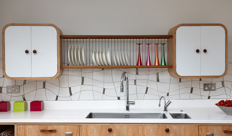
KITCHEN LAYOUTSWindowless Kitchen Sinks: Looking Beyond the (Lack of a) View
Does your sink need a focal point? Here are 12 ideas for creating visual interest where you scrub your pans
Full Story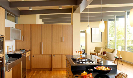
KITCHEN DESIGNThe Kitchen Counter Goes to New Heights
Varying counter heights can make cooking, cleaning and eating easier — and enhance your kitchen's design
Full Story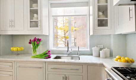
KITCHEN COUNTERTOPSKitchen Counters: Quartzite Offers Strength and Beauty
Eye-catching patterns and a natural pedigree make durable quartzite a popular alternative to granite and marble
Full Story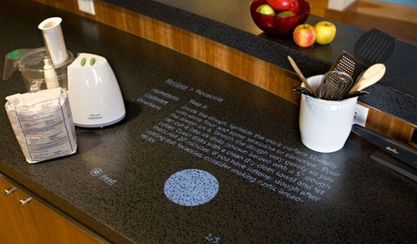
HOME TECHComing Soon: Turn Your Kitchen Counter Into a Touch Screen
Discover how touch projection technology might turn your tables and countertops into iPad-like devices — and sooner than you think
Full Story

Aglitter