Software
Houzz Logo Print
hzdeleted_55098596

Any suggestions on exterior neutral paint colors?

7 years ago
last modified: 7 years ago

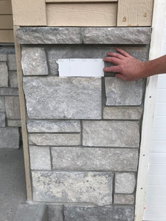
Our stone is going up and it's different than I expected. I like it though but there is a lot less "yellow" than the sample. So my original plan of Anew Gray may not work here. Any suggestions? I don't want a dark color. Anew Gray lrv is 47 to give an idea of what I was looking at.


Comments (15)

  • PRO
    7 years ago
    last modified: 7 years ago

    Yes, on my monitor the stone appears to be a range of "neutral" gray, without any yellow bias.

    Thus you may want to review true "neutral" range of paint colors from your desired paint manufacturer to find one which will work well with the stone. Have you considered something in the off-white to gray range?

    Good luck on your project!

    User thanked Virgil Carter Fine Art
  • 7 years ago

    I hadn't but now that you say it, that may be what I want. I was going for "mid-tone" but maybe mid-tone would be too matchy-matchy. Any suggestions for specific colors come to mind to give me a starting point? SW On the Rocks maybe? Our builder uses PPG but they will match colors. I don't see much chatter on PPG so I tend to look at SW and BM.

  • 7 years ago
    last modified: 7 years ago

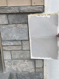
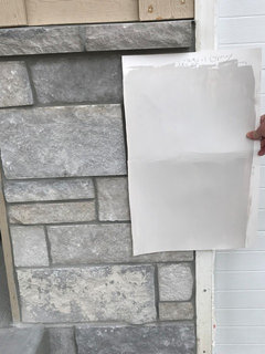
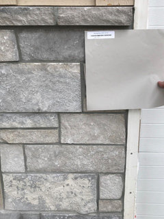
    not sure if I can "bump" this, but if anyone has any color suggestions. I took a bunch of chips to the house and a few samples and am not sure I'm going in the right direction. A couple shots:

    PPG Swirling Smoke


    SW Modern Gray:


    SW Amazing gGray:


  • 7 years ago

    whole front of house:


  • 7 years ago

    I think all of the samples you picked look good. I would go with the swirling smoke or amazing if you want more of a monotone look.....the amazing gray looks a bit warmer to me. I personally like the modern gray the most. It is hard to tell in your pic, what color is the roof? If it is something like weathered wood, I would go with a warmer gray

    User thanked CLC
  • 7 years ago
    last modified: 7 years ago

    I appreciate the feedback, CLC! I like the SW Modern Gray best of those as well .. BUT... I am worried it will look "pink" in the natural light when all over the house. I'll have to paint some different spots with it. Yes, the roof is Weathered Wood, and yes, that sounds right to me, a warmer gray vs cool.

    I'm going to share a few more of the samples and chips we have.

    This one- SW Anew Gray - is the favorite of our Realtor but I'm not sure of the monochrome look. I want the stone and black clad windows to pop out more. But maybe it will be lighter than I think...


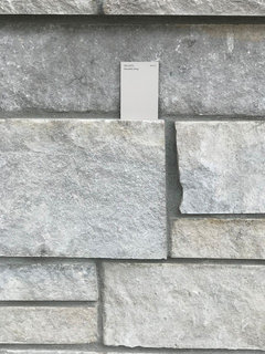
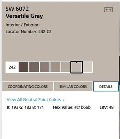
    This is just a chip but I'm thinking of getting a sample - SW Versatile Gray.


    and this is SW On the Rocks - an off white but looks pretty "cool" so I'm not sure:


  • 7 years ago

    I like Amazing Gray or Versatile Gray the best of your choices. I don't like that last one On the Rocks. It looks too cool. Stick with the warmer tones.

  • 7 years ago

    I also like agreeable gray and would include that color in my short list.

  • 7 years ago

    Just in case anyone wants to know:

    I pulled the RGB values from the Sherwin Williams web site - pull up the color and look at details.

    I find these RGB values to be slightly more accurate than the RGB Values in Easy RGB, but they are not vastly different. I have heard that Easy RGB pulls the data from fan decks.

    For brands that don't have the RGB Published you can look up the RGB value in Easy RGB.


    enter the RGB Values here:

    https://www.easyrgb.com/en/convert.php#inputFORM

    Find RGB Values here::

    https://www.easyrgb.com/en/compare.php

    User thanked Jennifer Hogan
  • 7 years ago

    @Jennifer Hogan, I am blown away by how much work you did here. Thank you so much!! I have a sample of Agreeable Gray but it was for interior, I didn't think of it for exterior, thinking it would look pink, but your point about Versatile gray looking pink makes more sense as a taupe. I didn't do Worldly gray in the samples, so I'm wondering which one you mean there.

    Thank you for the tips in the samples too, in taping it to the garage two by two, standing back and eliminating that way. That is a simple yet great idea.

    Thank you again. Great info!!


  • 7 years ago

    @Kate R


    I picked several samples that were not in your list because they were in the same family of hues that you were looking at or just a bit more gray or a bit warmer than the colors you picked.


    When I looked at the samples next to the stone I liked the way Worldly Gray complemented the stone on my computer screen.


    If you look at your samples and love one, but feel it is a bit too dark or bit too light or seems to go pink or green you can use tools readily available on the internet to get another color that is similar, but lighter, darker, less pink or less green.


    I do caution against just having the paint store lighten or darken colors. They will reduce the pigment my 25% or add 25% more pigment, but because they use black and white pigments and some pigments are more transparent or less transparent this can really alter the color in ways that are not expected. It often isn't just a lighter or darker shade of the same color.


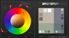
    I love EASY RGB and Encycolorpedia. Palleton is another great tool if you want to pick colors that work well together.


    I entered the hex color code (RGB color code converted from 3 binary values to a base 16 code - you can covert any rgb color to hex. SW provides both codes, but if you only have an RGB value you can convert it using a bunch of free converters on the internet)


    I then selected a Triad pattern, clicked the button to add the complementary color and then changed the angle of my triad from 30 to 45. You can play in this site till you find a color scheme that appeals to you. Basically the human eye likes geometry - if we pick colors from a color wheel in a pattern that creates a square or triange or rectangle the colors will look appealing to us.


    You may enjoy playing with this as you go about decorating your home.


    User thanked Jennifer Hogan
  • 7 years ago

    it is fun to learn so much about paint and color, Jennifer Hogan!


    @Kate R - have you tried worldly gray?

    User thanked CLC
  • PRO
    7 years ago

    I like the 4th down on the left. I think that's PPG Gray Stone. Looks great (at least on my monitor) with the stone.

    User thanked Missi Smith Design Co.
  • PRO
    7 years ago

    Top left. Avoid the dark ones.


    Have you looked at the sample in both direct sun and shade?

    User thanked Virgil Carter Fine Art
Sponsored
Mary Shipley Interiors
Average rating: 4.8 out of 5 stars34 Reviews
Columbus OH Premier Interior Designer 10x Best of Houzz