Software
Houzz Logo Print
hzdeleted_9017129

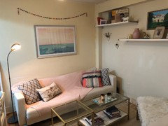
Big, tricky space above couch

7 years ago


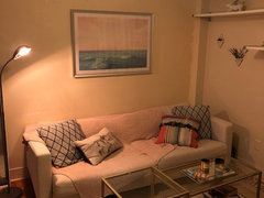
I purchased a beautiful print of an ocean at sunset/sunrise, but I couldn’t afford one large enough to fill the whole space behind my couch to make the impact I desired. My question for all of you design lovers & designers - how can I bring out the painting more and fill this space?


I am thinking perhaps a couple wall planters on each side OR shifting the painting to left or right and offsetting it with two other pieces to create a simple gallery wall. Thoughts?


Comments (17)

  • 7 years ago

    A photo that for some reason isn’t being included above:

  • 7 years ago

    It's hung too high. What you can do to balance the space is move the beading to under the art to fill in that space. Right now, both look like they are floating up in space.

    User thanked User
  • 7 years ago

    Yes...definitely hung too high. Lower it to 5-6 inches above the sofa. I'll leave the sizing/gallery issue to the pros since I struggle with it myself. I do think art about 75% of the sofa's length usually works well.

    User thanked chloebud
  • 7 years ago
    last modified: 7 years ago

    Thanks, Chloe & Espc10! That's a really interesting idea to move the beading underneath. I'll try that. My dad helped me hang it and did it too high - I felt bad having him do it again but I completely agree that it's too high. Once moved down, it might even not need other things next to it.

    Thanks again!

  • 7 years ago

    Miranda, if you check online for "art over sofa" you'll see some helpful examples of sizing/spacing. If there's no furniture below the art, a good tip is to hang the art so the center of it is about 58-60 inches from the floor. For years I placed things way too high on the wall.

    User thanked chloebud
  • 7 years ago

    following

  • 7 years ago
    last modified: 7 years ago

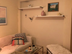
    I agree about lowering the painting & losing the beads - thanks, Jan. Sadly, those wall shelves are not removable. My landlord says they are a "selling feature" for the place. They are way too high though, I agree! I'll remove some of the stuff I have up there to make it feel more airy. Never even thought about how cluttered it looks.

    For the other piece of art, do you think it should be right next to the painting above the couch? Wasn't sure what you meant by tall & vertical hang. :)

  • 7 years ago

    The wall with The shelves is odd. Was it made for something special like a couch or buffet?

  • 7 years ago

    I have no idea, Erin, but I agree they're very high and odd. I think the lady before me had a big sectional?

  • 7 years ago

    I agree with lowering (a lesson I learned on Houzz!), but would you consider matting the print into a larger frame?

  • PRO
    7 years ago
    last modified: 7 years ago

    Have your dad take the shelves off. Fix the wall and paint. I guarantee you the landlord won't care..................just put them back when you leave! for heavens sake : ) Just shoot me will ya? ( some "feature" , he just doesn't want to BOTHER. ) If you'd said "I love the apartment, can't deal with the weird shelves, so I'll pass.........". What do you think then? ? lol

    While you're at it? Show the whole space.

  • 7 years ago

    Could you put your sofa underneath the shelves without bumping your head? Maybe a desk? Or your tv? You might as well take advantage of that nook since it’s not going anywhere!

  • 7 years ago
    last modified: 7 years ago

    Gargigg, this frame cost me an arm & a leg unfortunately, so I can't get a bigger one for now. It's actually quite big, but my couch is massive (88" long) so makes it look rather diminutive. I wish I could have gotten it larger... maybe I should have held off, but you live & learn with design mistakes like that, I suppose.


    Jan, you're very much tempting me to just take them down! I hate them as well. Ugly shelves from IKEA (don't get me wrong - there are some gorgeous IKEA shelves imo but these are heinous).


    Sammy, the sofa fits best on that wall just because I hated looking at my kitchen when I was relaxing at the end of a day. I'm in a basement unit and it just made me sad to look at my sink haha. I hope to get a sectional soon though, which would fill it nicely.


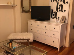
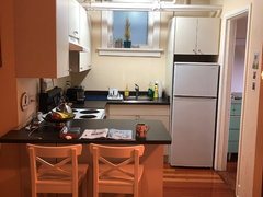
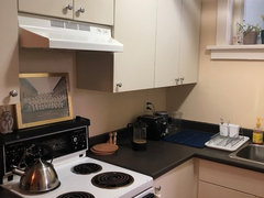
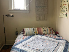
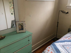
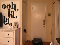
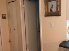
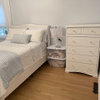
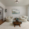
    I included pictures of the rest of the space below! As you can see, I have struggled with it. It's a combination of using hand-me-down furniture and, in my opinion, tricky spacing!! My couch is too long to fit on the ooh-la-la wall but the TV is so awkward there. I wish I had a flat screen. What are your thoughts?


    You have all been so helpful by the way - WOW! I removed the pom poms and decluttered the shelves and think the space looks much better already. :)


  • 7 years ago
    last modified: 7 years ago

    Not a Pro.

    Moving the art down above the sofa looks so much better. Your ooh la la wall looks great! Love the color of your bedroom dresser.

    Your place is coming along nicely.

  • 7 years ago

    What a cute apartment. Post more pics when art is lowered.

    I would try the oh la la art above your bed instead of the macramé.

  • 7 years ago

    What a cute little place! You've done a great job so far.


    I agree -- try the oh la la art in your bedroom. Do you actually use the mirror on the wall adjacent to TV? If not, I'd take that out or move it elsewhere.


    And take those shelves down! I wouldn't even bother to patch the screw holes. Even holes are better than those shelves. Just put the shelves back up before you leave.


    The colors in your print are beautiful, btw, and without the beads there you can really see that.