Software
Houzz Logo Print
melissa_mcnabb21

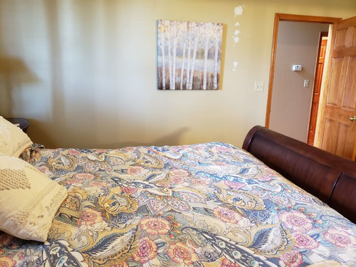
wall color ideas needed for master bedroom, Please help

7 years ago


Comments (36)

  • 7 years ago
    last modified: 7 years ago

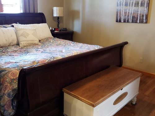
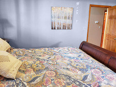
    It depends upon a lot of things. Are you changing bedding? If not, pick a color of blues etc from your bedding and then choose a lighter color that goes well with it or you could use white. The color it is now, is not a good color for your room, because of your oak colored wood trim. Blues, and greens, and of course white, and grays, etc all look good with the oak trim. No colors that have a yellowish tint to them. If you are changing bedding, then buy your bedding first and pick a color from it.

    Melissa thanked cat_ky
  • 7 years ago

    Bedding should dictate wall colors. Find bedding to love and use that for your inspo color in the space.

    Melissa thanked decoenthusiaste
  • 7 years ago

    cat_ky I am keeping the bedding. Do you have a specific white or grey paint color you would recommend?

  • 7 years ago

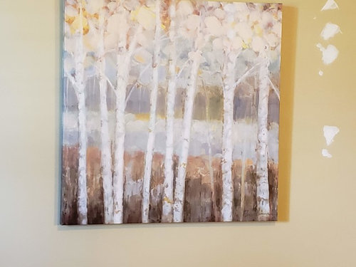
    A nice pale blue with gray undertones would be gorgeous with the bedding and art, and will go well with your orange wood tones too. Get a bunch of paint chips and lay them on the floor, and pick one that seems soothing.

    Melissa thanked ShadyWillowFarm
  • 7 years ago

    I would go lighter than what celery posted.

    Melissa thanked ShadyWillowFarm
  • 7 years ago

  • 7 years ago

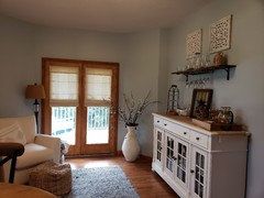
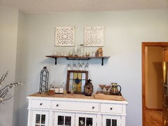
    my den/bar area is done in SW lulaby 9136. i still have some left. I think i will paint a board to try in the room.

  • 7 years ago

    i have a darker blue also . I think it is SW stardew 9138.

  • 7 years ago

    this is the darker stardew

  • PRO
    7 years ago
    last modified: 7 years ago

    SW Stardew is a medium light shade of cyan. I see in your bedding muted gray/blue than cyan. I would go with dusted blue/gray or even dusty purple.

    Melissa thanked Celery. Visualization, Rendering images
  • 7 years ago

    celerygirl, could you recommend a SW paint that is dusted blue/gray?

  • 7 years ago

    The color from celery girl is not bad with the bedding but way too much color. Personally i would prefer it or similar with only 50% of the color to make it more muted. It’s not very calming for sleep.

    Melissa thanked lmmcnitt
  • 7 years ago

    Immcnitt do you have specific SW paint suggestion? I do think a muted light color would look good.

  • 7 years ago

    You’d have to take the bedding in and look at the paint chips. Really the bedding could go with blue or blue/gray or the periwinkle shown so it just depends what you would like to see. I was only suggesting that once you pick the color family you’d like to go with you cut the color way down. You can tell them to put only 50% of the color in it. Get a few samples made up and then take it home.

    Melissa thanked lmmcnitt
  • 7 years ago

    immcnitt, I have never had a paint altered like that. Would finding a lighter shade be the same as having a darker one reduced by 50%? Thank you for your help.

  • 7 years ago
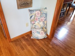
    • Here is the comforter pillow with SW lullaby. What do you all think about it? i will get some more samples at paint store and post some more options. hopefully later today or sometime tomorrow.
      the flooring and trim are the same in the bedroom.
  • 7 years ago

    It looks pretty good with lullaby! Let’s say that the room is more closed in and darker and lullaby comes across darker than you expect in different surroundings. To keep adjoining rooms similar, this would be a good occasion to go to SW and tell them you’d like lullaby at 75% color or 50% color. If you are starting from scratch, you are always better going with one of their official paint swatches as the color formula is a 100% match. When you ask for 75% or 50% formula depending on the color, the final result may alter a bit from the original color intended. ONly way to know is to have them mix it up. Personally I like to keep colors in my home similar or in the same family so working off lullaby makes the most sense.

    Melissa thanked lmmcnitt
  • 7 years ago

    Immcnitt, thank you for the explanation. The master bedroom is more closed off and does not have as much natural light as my room painted Lullaby.

  • 7 years ago

    Love the Lullaby - and great name for a bedroom color. Why not put some up on a couple walls and see if you like it? I think it’s pretty as is and you don’t need to cut it.

    Melissa thanked ShadyWillowFarm
  • 7 years ago

    shadywillowfarm, what a great idea. I will do that and it will save me the cost of a cut down sample if I end up liking it. If not, then I can always get a cut down sample and another color or two to try.

  • 7 years ago

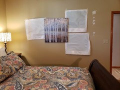
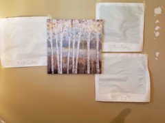
    After sleeping on it, I decided to get a sample of lullaby cut 50% and paint a sample of that and 100 % lullaby sample. I also got a sample of Ice Cube. what do you think of these


    3?

  • 7 years ago

    You got to work quickly! Ice cube is completely different in that I don’t see much blue. It might be a cooler color and not look so great with the trim. I hate to tell you this but to get the best visual of the colors you really need to prime a section of the wall, then put the samples over it. The gold on the walls now is kind of dark and just covering it once may not do the trick. Paint in a couple of areas: near a window, in a dark corner-do both sides and next to the trim. Make each square big enough to judge. Look at it in daylight and evening for a few days and make your decision. I’m sure one of those will work!

    Melissa thanked lmmcnitt
  • 7 years ago

    I like the Lullaby at full 100%. Cutting paint doesn't necessarily give you an accurate color. It's a bedroom so you want it to be a bit cozier. I would try it in a matte finish to eliminate any glare from the paint.

    Melissa thanked katinparadise
  • 7 years ago

    immcnitt, Ice cube was just a shot in the dark as I wanted to see a much lighter color. I agree that the next step is to paint some large squares on the actual walls. the color of my walls looks so dark in those pictures when in person they aren't that dark.

  • 7 years ago
    last modified: 7 years ago

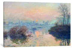
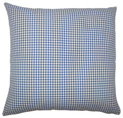
    Melissa, I don't think you need feel insulted if I ask: would bed work on 'empty wall' so that a softer [not tree lines as trees are] could repeat your colors? and to cool the walls [if that's partly why you'll paint] -- add chambray blue pillows? ok thanks.


    https://www.houzz.com/product/70095718-sunset-on-the-seine-at-lavacourt-wrapped-canvas-print-40x26x1-5

    Melissa thanked everdebz
  • Melissa thanked everdebz
  • 7 years ago
    last modified: 7 years ago

    One more - I like your home btw - with bit of style mix, why not get a match for paint and bring fabric to the store?

    If that's a denim/ jute rug -- yes you like a bit of mix -- a reason I posted farm/ natural shams....to play it up...

    Melissa thanked everdebz
  • 7 years ago

    everdebz, unfortunately the bed and night tables will not fit on that wall. l have in the past had a chambray pillow on the bed and I liked it. I just recently put the cream colored ones on there. I am always moving pillows around in my house. I agree, I do think the chambray looks better. :-)

  • PRO
    7 years ago

    Everdebz. When you post a photo from one of your ideabooks I am getting the “notification” but also ALL your ideabooks. This happened to me last week. I had to make any ideabook I used frequently “private” to prevent this. Just so you know.

  • 7 years ago

    Flo, and I confused why that happens, and don't know how to stop it - Do you …

  • PRO
    7 years ago

    I spent all last weekend making my frequently used ideabooks “private”. It’s a pain, but it seems to have worked. Just go to your ideabooks, click on one. You will see 3 little dots in upper right corner. Click on that. Get to screen that shows “private” and click or slide button to turn on private. I will try it again and make sure I am telling you right. This is using my IPhone houzz app.

  • PRO
    7 years ago

    Ok more info. Go to your ideabooks. Click on one. In upper right corner it says “select” and there are 3 dots ...
    Click on those dots. A menu will display. Click on “Ideabook settings”. That should bring up screen where you can slide button over to make that ideabook “private”. Then click “done” in upper right corner and you should see lock on ideabook when next displayed. Try it. Let me know if it works for you. There might be other ways but this seemed to work.

  • 7 years ago

    Couldn't we find out why it even occurs? Idk all the ins and outs of houzz for sure. If I make them private - it means what?