

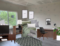
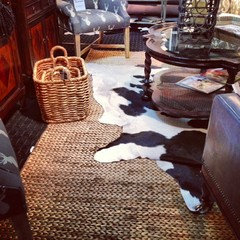
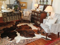
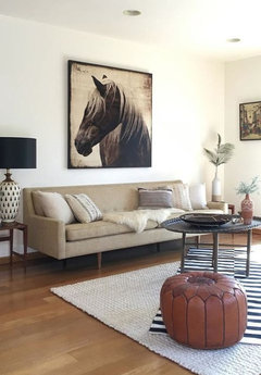
Which plan is your favorite?????????
7 years ago
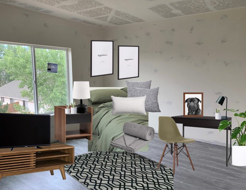
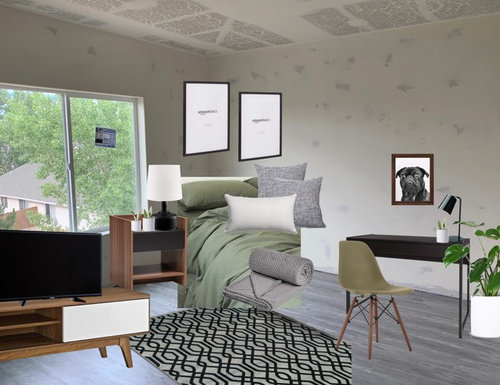
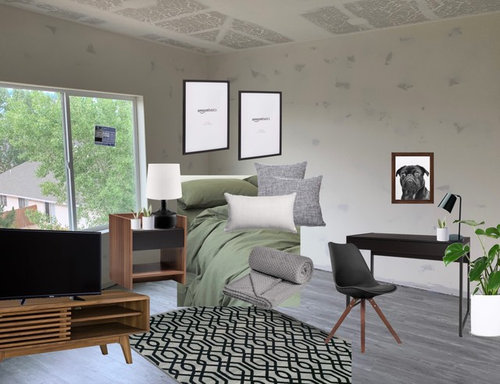
Featured Answer
Sort by:Oldest
Comments (16)
 7 years agolast modified: 7 years ago
 7 years ago
Related Professionals
Lewiston Interior Designers & Decorators · Juneau Interior Designers & Decorators · Missoula Interior Designers & Decorators · Emporia Kitchen & Bathroom Designers · Dodge City Kitchen & Bathroom Designers · Cookeville Home Remodeling · Paducah Kitchen Remodelers · Janesville Kitchen Remodelers · Pueblo Kitchen Remodelers · Myrtle Beach Interior Designers & Decorators · San Antonio Interior Designers & Decorators · Flint Interior Designers & Decorators · Medford Interior Designers & Decorators · Riverside Architects & Building Designers · Portsmouth Kitchen & Bathroom Designers- 7 years ago
 PRO7 years ago
- 7 years ago
- 7 years ago
- 7 years ago
- 7 years ago
- 7 years ago



Related Stories
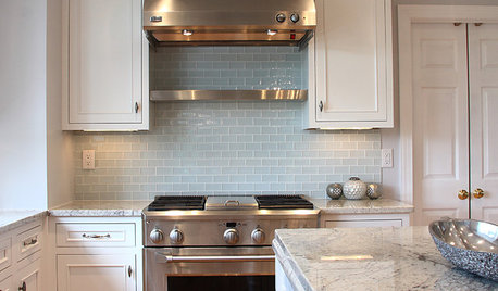
KITCHEN DESIGN5 Favorite Granites for Gorgeous Kitchen Countertops
See granite types from white to black in action, and learn which cabinet finishes and fixture materials pair best with each
Full Story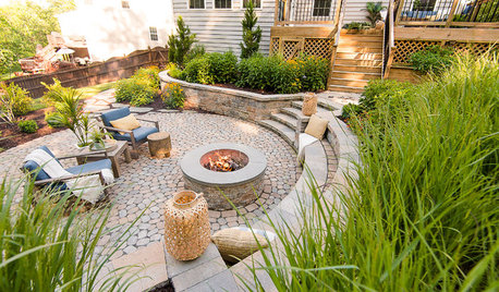
LANDSCAPE DESIGNPatio of the Week: Once Unusable Backyard Is Now a Favorite Spot
Native plants, lovely stone, thoughtful grading and careful planning transform a steeply sloped site in Virginia
Full Story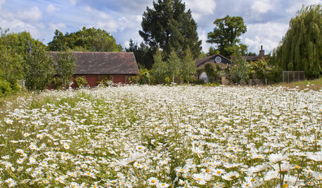
GARDENING GUIDESHouzz Call: What’s Your Favorite Backyard Beauty?
The simple, honest daisy is this writer’s go-to garden flower. We want to hear which plant, flowering or otherwise, gives you special joy
Full Story
TASTEMAKERSHouzz Call: What’s Your Favorite TV or Movie Home?
Movies and TV shows capture our hearts with their settings as well as their stories. Which on-screen houses do you love?
Full Story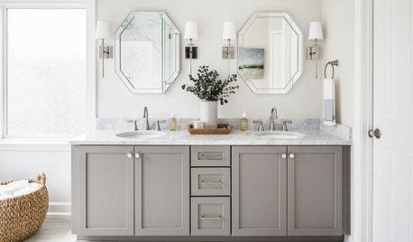
BATHROOM DESIGNDesigners Share Their 4 Favorite Looks for Bathroom Sinks
See which sink styles and faucet finishes these design pros recommend for a bathroom makeover
Full Story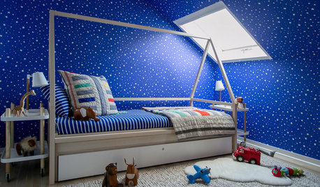
INSIDE HOUZZData Watch: Nature Themes and Blue Are Favorites in Kids’ Rooms
New Houzz research reveals popular colors, project costs and top priorities for children’s rooms
Full Story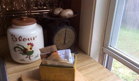
KITCHEN DESIGN5 Home Cooks Share Their Favorite Family Recipes
Peek inside the kitchens of these Houzz users and learn how to cook their time-tested, passed-down dishes
Full Story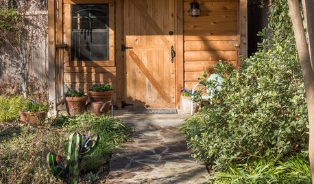
KIDS’ SPACESRoom of the Day: Playhouse Becomes a Favorite Spot for Grandchildren
Faced with tearing down her toolshed, this homeowner saw the chance to make a special place for some of her favorite people
Full Story
MEDITERRANEAN-STYLE DESIGN10 Favorite Features of Spanish Revival Style
How to Get the Warm, Rustic Feel of Spanish-Style Interiors
Full Story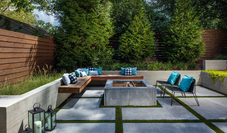
TRENDING NOWReaders’ Favorite Patio Renovation Stories of 2019
Outdoor living rooms, fire features and terraces feature in the most popular Patios of the Week
Full Story



User