Software
Houzz Logo Print
acebaker

Counter and Backsplash choice

13 years ago
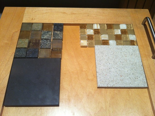
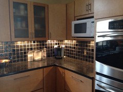
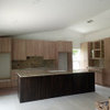
OK, we've come down to two possibilities and they are quite different. One is the glass and granite 1X1" backsplash with dark charcoal grey Silestone. The other is 1/2"X1/2" marble and glass backsplash with almost white Silestone. Pictured below with the natural maple shaker cabinet doors we already have.
We have stainless appliances and natural maple window blinds. The walls are mossy green but we might change the colour depending on the backsplash we choose.
Thanks!

Comments (33)

  • 13 years ago
    I should mention we might be selling, so resale potential is a question but the cost will be the same either way,
  • 13 years ago
    last modified: 13 years ago
    I vote #1. It's a nice contrast with your cabinetry and not as busy as the 1/2" mosaic tiles. There is too much contrast in the 1/2" tile. Be sure to have under cabinet lighting also.
    Anne thanked Darzy
  • 13 years ago
    Love #1 too! I think it's a really classy look! Good luck!
    Anne thanked daljoe
  • 13 years ago
    I like #1 also.
    Anne thanked Nancy Walton
  • PRO
    13 years ago
    If you plan to sell I would go with the white countertop and a white subway tile backsplash. That is a way more timeless look than the mosaics you are considering. This post might help: http://www.mariakillam.com/2011/11/one-more-reason-you-should-skip-accent-tiles-altogether.html/
    Anne thanked Maria Killam
  • 13 years ago
    For resale I suggest more neutral- many people won't like the very dark counter. Especially the countertops since it ends up dominating. What color are the floors? Something to consider as they are also a large horizontal
    Anne thanked laurakdesigns
  • 13 years ago
    I love the dark but not your green walls. If going dark go a gray wall. If selling soon. Go the lighter. Most people will be drawn to that look. But my choice up is the dark very dramatic
    Anne thanked Nancy Travisinteriors
  • 13 years ago
    If you want to resale, I agree with Maria and laura kaplan, something more simple and classic.
    Anne thanked mrscollie
  • 13 years ago
    Like others, I much prefer number one,but agree with Travis that grey would be a better paint color to go with it. But I also agree that number 2 might be better for resale. The green would look great with that choice.
    Anne thanked mcbriec
  • 13 years ago
    @Darzy the 1/2"X1/2" marble and glass backsplash is also available in 1"X1" 1/2X1 1/2" rectangles, or 1"X2" rectangles. I didn't get the sample of the rectangles because they are stacked rather than staggered, which is what I would prefer.
  • 13 years ago
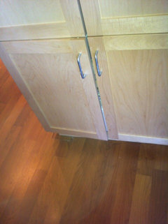
    @Laurakaplandesigns Floors are a reddish brown laminate. In this photo the cupboards look a bit washed out, but the floor colour is pretty good. We don't know for sure if we will sell. We will only do so if we can get a larger neighbouring unit.
  • 13 years ago
    Looks like the floor color coordinates nicely with either backsplash Which one do you Love? Just enjoy. Candace Olson likes to use the same color on the floors and counters for visual continuity. It does open the door for #3....
    Anne thanked laurakdesigns
  • 13 years ago
    I like the white counter with a white small subway tile - possibly a 1x3. more contemporary look than the traditional larger subway tile, but still has broad appeal, looks clean. Good luck!
    Anne thanked sullivandesign
  • 13 years ago
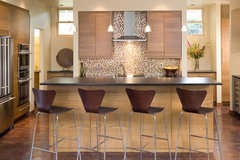
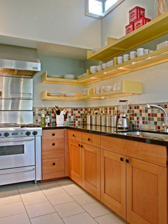
    Hi Anne..I wanted to show you a couple of difference mosaic tile options. One is high contrast that can show you how "busy" it can look. You may like it, but just wanted you to see. It was actually hard to find a high contrast tile in a kitchen backsplash.
    The Abbott · More Info

    Weyand Residence · More Info
    Anne thanked Darzy
  • 13 years ago
    @Darcy I see your point about the busyness of the small tile. What do you think of same colours/textures in a larger format?
  • 13 years ago
    For resale purposes, I think the light tones would be more attractive to buyers. Good luck!
    Anne thanked Veronica Montoya
  • 13 years ago
    last modified: 13 years ago
    Choice #1 definitely, but go with a gray or light tan wall color.

    We just installed a very dark gray granite countertop (actually an absolute black with a satin texture), and everyone compliments us on it!
    Anne thanked chatelaine9
  • 13 years ago
    1
    Anne thanked Justin Harris
  • 13 years ago
    I really don't like the white on white subway tile and marble look. It makes me think of hospitals, public washrooms in train and bus stations, and of course subways. It doesn't feel neutral to me, it feels stark and cold.
    As selling is only a possibility, I would hate to choose my decor to suit an imaginary buyer who might just rip out whatever I do to suit themselves. I don't want to choose something that's off-putting to a potential buyer either, but I do still have to live with it.
  • 13 years ago
    last modified: 13 years ago
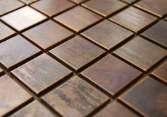
    You're right Anne. You should do what you like. And, I think you like the mosaic tile which is lovely. I just think you may get tired of the high contrast tile. How about an amber glass tile? Or this copper color? I have a glass mosaic tile also, in a low contrast, which is actually sort of busy but everyone loves its. BTW...how many square feet of tile do you need? If it's minimal, the 1" may be just fine, without being too busy.
    Eden Mosaic Tile Medium Square Antique Copper Mosaic Tile · More Info
    Anne thanked Darzy
  • 13 years ago
    @Darzy I do like the copper tile you show, but I dread cutting that metallic stuff. I'm planning on doing the tile myself so I've stayed away from the metallic options because of that. We'll only have about 30 sq ft of backsplash and about 45 sq ft of the countertop. The wall colour is even less as it is only around the window and above the upper cabinets (ducting in there so can't be removed unfortunately). Right now the green travels into the living room (as does the floor) where it is only on the feature wall. The rest of the walls are a tan colour.
    Right now, I prefer the high contrast and DH prefers the lighter counter because "it doesn't show the dirt:"
  • 13 years ago
    Actually, I think the lighter color will show spills more, as there will be a color contrast.
    Anne thanked Nancy Walton
  • 13 years ago
    last modified: 13 years ago
    @Nancy at last a kindred spirit! I too live on the grey "Wet" coast. I do not want more neutral (drab) gray inside my home. If I want to surround myself with grey I just step outside 9 months of the year. I must say the same thing happened when I bought my car. I had to special order it because I didn't want some variation on gray, white or black. I was told most people choose gray because of resale value, but I intend to drive my car into the ground so why not get a colour I love and is easy to spot in the sea of gray cars in the parking lot? My car is the same colour as this cricket and every time I look at it, I smile.
  • 13 years ago
    You are right! Is that a Boston College logo? I'm from New England, where it is grey about 300 days a year, if it isn't snowing, it's raining!
    Anne thanked Nancy Walton
  • 13 years ago
    It doesn't show as well in the photos, but the gray granite in the backsplash has green undertones and quite a bit if sparkle (mica?).
  • 13 years ago
    Anne...don't cut the mosaic tile! Dry set the tile before you install it and make sure no cutting is necessary. Even if there is 1/2" overhang at the cabinets, you do not want1/4" tile near the edge.
    Anne thanked Darzy
  • 13 years ago
    @Maria Killam and @sullivandesign The other aspect of the space is that it is open to my living room/dining room. I can't imagine how I could tie together a white kitchen with the rest of the room.
  • 13 years ago
    @Darzy I'm not sure I understand. How can I avoid cutting some tiles if the mosaics come in 12" sq sheets and the space I'm tiling is 18" high? What about around light switches and duplexes? I've never actually done tiling before.
  • 13 years ago
    Anne, if you have never done tiling before, please don't attempt it on this. I think you will be less than satisfied, and something this important should be done well.
  • 13 years ago
    There are outlet box extensions to bring your outlets and switches out to the level of the tile.
  • 10 years ago

    I like the darker choice. I think that it is also better for resale. It shows off the cabinets much better. Plus with white cabinets being all the rage a new buyer could come in and paint the cabinets white and not need to update the counter tops or back splash.


  • 10 years ago
    My kitchen has a similar color scheme to choice #1. We have birch cabinets, black granite, and dark tiles. The wall color is BM muslin. Floors are walnut. I agree that having under counter lights is important with the darker tile backsplash.