Software
Houzz Logo Print
decker11

Tile direction dilemma-horizontal or vertical?

7 years ago

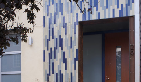
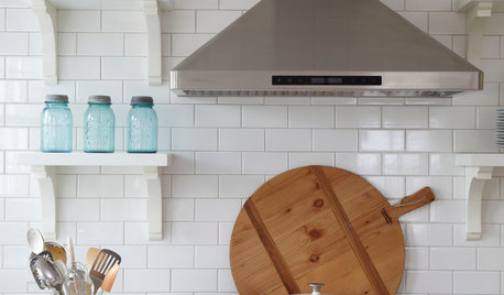
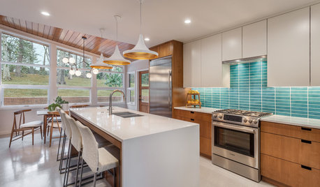
Other than “just because thats what I like”, what would influence you to set this style of tile horizontal or vertical? Is there a style difference between them depending on the direction you set them? I really like the long side being horizontal (parallel to the countertop like the first pic) but that strikes me as being a little more modern? Is that just me? What do you think Housers???

Comments (29)

  • 7 years ago

    I don't like all the tile "slivers" that the horizontal layout above shows. I feel like the vertical tile had "fuller" tiles. I think that would influence me. aside from, "I like this way better" , I would figure out tile "slivers" before deciding.

  • 7 years ago

    I would run it vertical if I had 8' ceilings.

  • 7 years ago

    I hadn’t thought much about the shape of the cut tiles-good point! Ceilings will be 9’ here. These tiles are close to standard subway- they are 3” wide by 6” tall. Pics of them are deceiving....

  • 7 years ago

    I’ve done a few searches on this one, and I definitely prefer it vertical.

  • 7 years ago

    Prefer vertical too.

    This is similar to when people lay arabesque tile on their side, it just looks wrong!

  • 7 years ago

    Generally, if you want a wall to appear wider, go with horizontal and if you want a wall to appear narrower but taller, go with vertical.

  • 7 years ago

    depends if your kitchen is wider then longer. If it's a stright long but not tall kitchen I would do vertical. If its wide but tall I would do vertical. It all depends if you want something to look longer or taller

  • 7 years ago

    Putting them horizontal will make the kitchen look wider as suezbell said and putting them vertical will make the room look taller.

  • 7 years ago

    I meant to put horizontal on the second one.

  • 7 years ago

    sorry

  • 7 years ago

    Given the two examples, I'd pick vertical. It looks taller and more spacious while the horizontal looks squatty and wide. BUT looking at my saved ideabook, I like it horizontal in this space:

    Mills Lake · More Info


    I am in a quandary.

  • PRO
    7 years ago

    Maybe you should go with square tiles in a stacked bond pattern??

  • 7 years ago

    I'm in the minority, but I really like the horizontal look. You get a nice long run side to side, instead of all those tiles pointing up toward the upper cabinets and looking suddenly stunted. Just personal preference.

  • 7 years ago

    It really is personal preference.

  • PRO
    7 years ago

    There is no functional reason to do either other than you just like it one way or the other. Neither is more or less "modern," and personally I don't think the arrangement of tiles on a backsplash is going to make a room look more vertical or horizontal. I like the vertical arrangement better, for what it's worth!

  • 7 years ago

    I am a good searcher for pics of things but I am always amazed at what I never find that others do. I really appreciate the input and the additional pics-especially the new horizontal pic. To date that is only the second pic I have seen of this tile set horizontally. Thank you for that cd7733! I love that pic but what I think I like about it is the fact that the pattern runs up the whole wall. My kitchen cabinets are set too close to my window for that. Mark-I love a good subway tile! (Subway tile is my second option). I do love the curved ends on this tile -it has a less linear appearance (and I have done subway tile before so I’m leaning towards something a bit different).

  • 7 years ago

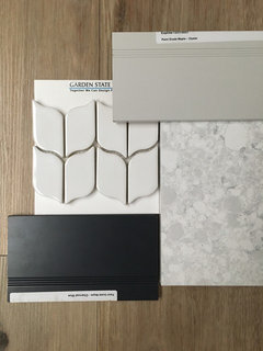
    Tile shown here (with my flooring, counter and cabinet colors (charcoal blue island and grey perimeter cabinets) is also in the running. Again, I like the curves on it)

  • 7 years ago

    Ah man, RES's (I think?) chicken wire comment got deleted.....I can't get that image out of my mind when looking at this tile now :/

  • 7 years ago

    Vertical placement resembles the look of an actual honeycomb more, so that’s why I prefer it over horizontal.

  • PRO
    7 years ago

    Your actual selection is a mosaic which really "goes" only the way you see in the photo. The pickets in the other photos are much larger; their directions can be determined best by the sizes they are.

  • 7 years ago

    Laughing at the chicken wire comment. Only walker zanger could make a tile that looks like chicken wire (and make you pay through the nose for it). Now I really may have to switch to the herringbone back-up tile I posted above! (Skippack-orientation question was about the “paddle” tile in the first post. Herringbone tile shown a couple posts above is my back up and I agree I would not do it “sideways”).

  • PRO
    7 years ago

    Vertical placement tends to make the room look larger. With the elongated hex you’re looking at I recommend placing it vertically. It’s a more sophisticated look, and again make the room appear taller.

  • 7 years ago

    I used this tile in French clay. It’s a small kitchen so I used it vertically. Pictures here:


    https://www.houzz.com/hznb/projects/showplace-concord-white-quartersawn-oak-oakwood-oh-pj-vj~1697821

  • PRO
    7 years ago

    I like it horizontal - it's different..

  • 7 years ago

    Mitchnna-beautiful kitchen. Love the tile I. That space!

  • 4 years ago
    last modified: 4 years ago

    I was told that you should have at least 3 picket lengths ( or an odd #) to use vertically. if you don’t horizontal would be better. But of course it is personal preference.

  • 4 years ago

    Vertical for sure

  • 4 years ago

    Merike Laigna, this thread is 3 years old. i'm guessing the OP has already had the tile laid a long time ago.